
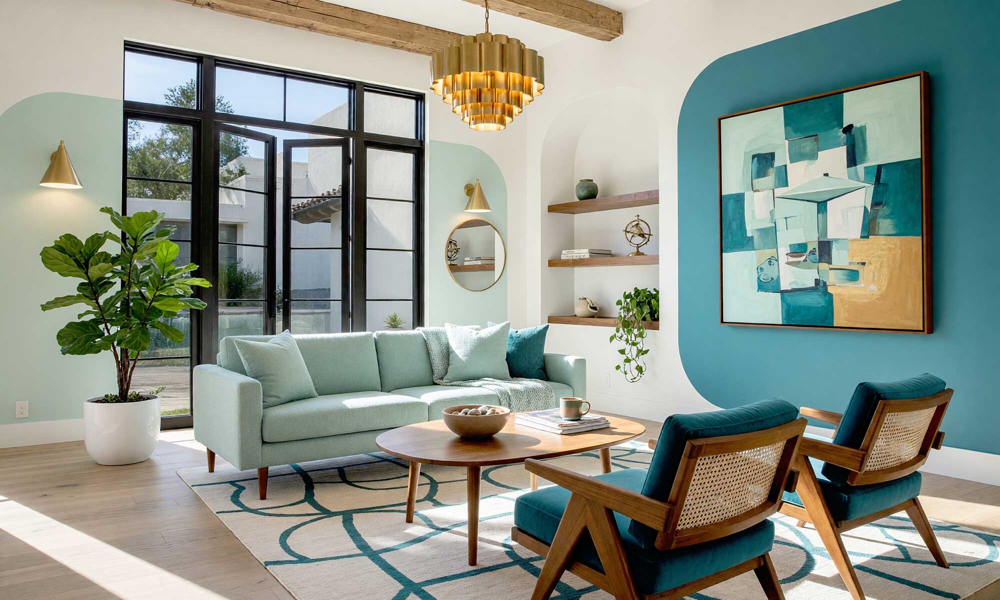
I’ve spent years watching homeowners default to the same move: pick a wall, pick a color, call it an “accent.” One wall, one shade, done. But somewhere between the wallpaper resurgence and everyone’s obsession with hand-painted wall murals, something more interesting started happening with paint. Homeowners are done treating walls like flat backgrounds — they want walls that do something: curve, frame, wrap around a room on purpose. That’s the idea behind painted wall graphics, and once you’ve seen a few done well, a plain accent wall looks boring. This isn’t the geometric shapes we’ve painted on exteriors before — it’s softer, built for the rooms you live in. For more, this collection of room wall paint design ideas is worth a scroll.
Why Painted Wall Graphics Are Replacing the Single Accent Wall
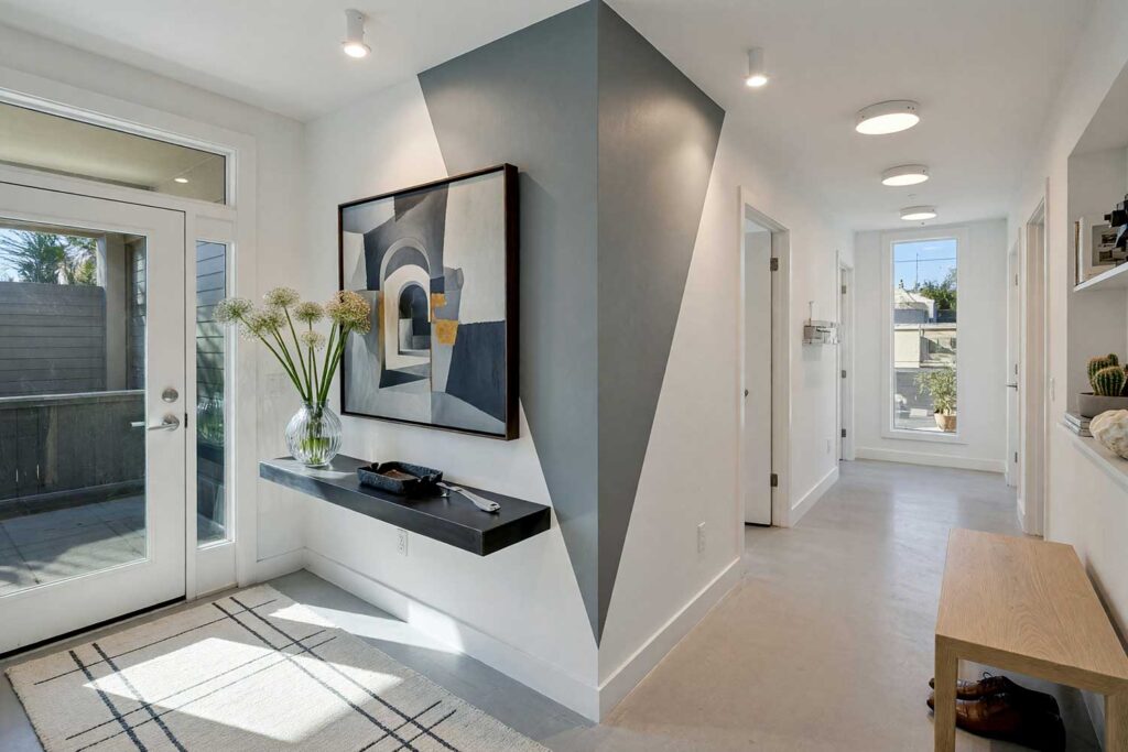
Solid accent walls are getting a little tired. They were never bad, exactly — just predictable. Painted wall graphics ask more of a room: shape that actually interacts with the architecture — a doorway, a headboard, a window. Better still, it’s dramatically cheaper than custom wallpaper, with none of the seams or pattern-matching headaches. You don’t need full painted murals for the wow factor — these aren’t overwrought wall murals that take weeks to finish. See how shapes and patterns can transform a room for more.
DIY Pro-Tip: How to Get Razor-Sharp Lines
Every idea below lives or dies on clean edges. Measure twice, use a quality painter’s tape rated for your wall’s finish, and press each edge down hard before painting. Seal the line first with a thin coat of your base color so the top color can’t creep underneath. See this guide to painter’s tape mistakes for more. And yes, your masking tape selection matters.
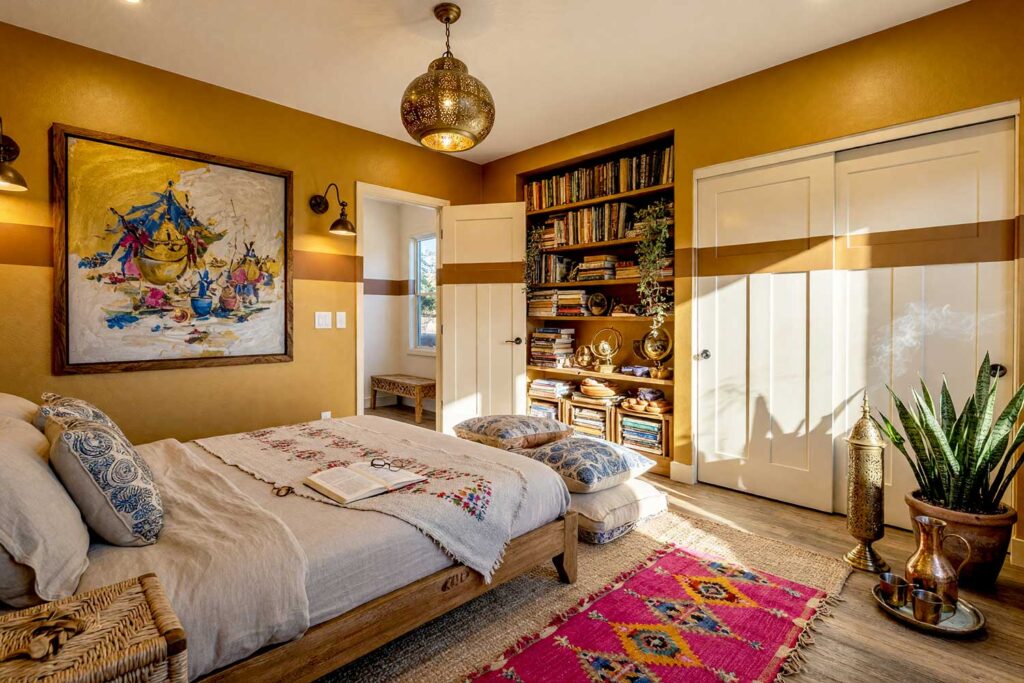
10 Painted Wall Graphics to Steal for Your Next Room Refresh
Below are some of my favorite painted wall graphics ideas, each built around a bold color pairing, an architectural mood, and an idea you can picture on your own walls. Every pairing is genuinely different from the next — different hues, different energy. None of these are how-to instructions… think of them as inspiration, a mood board translated into paint. Pick the one that sounds like you.
Terracotta & Ivory Linen: Mediterranean Escape Headboard
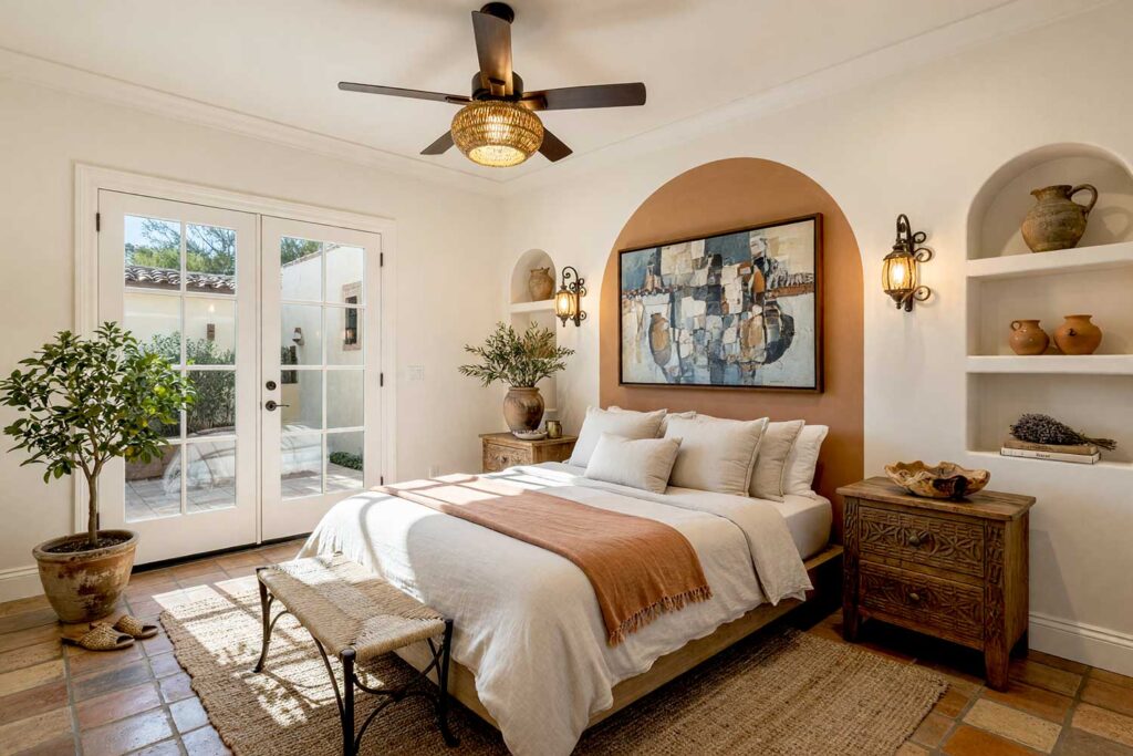
Walls: Ivory linen | Headboard Arch Graphic: Terracotta | Ceiling: Soft white | Baseboards/Trim: White
Forget the upholstered headboard — paint one instead. A soft, rounded arch in terracotta rises behind the bed like a sun-baked doorway in a Tuscan farmhouse, while the rest of the room stays hushed in ivory linen. This is Mediterranean revival in a single wall: wrought-iron sconces flanking the arch, dried olive branches in a stoneware vase. There’s a warmth you can practically smell — sun-warmed clay, a hint of citrus. It’s the kind of headboard graphic that makes a guest ask where you bought “that curved panel.” The answer is nowhere — just paint and an afternoon that turns an ordinary bed into the room’s center.
Cobalt Blue & Buttercream: Coastal Hallway with Doorway Halo
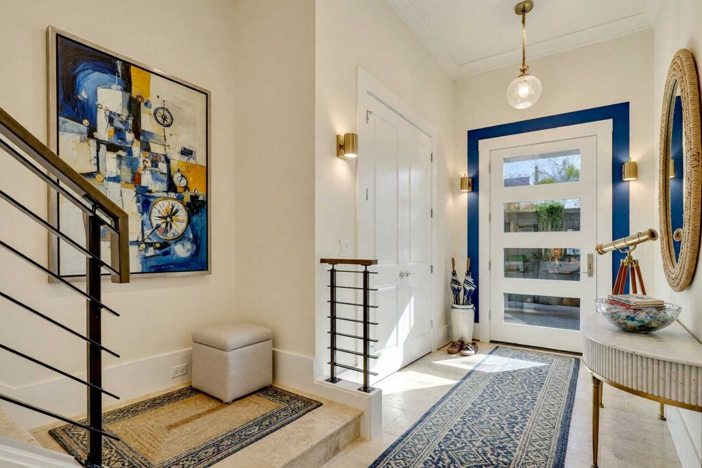
Walls: Buttercream | Doorframe Halo Graphic: Cobalt blue | Ceiling: Cloud white | Baseboards/Trim: Buttercream
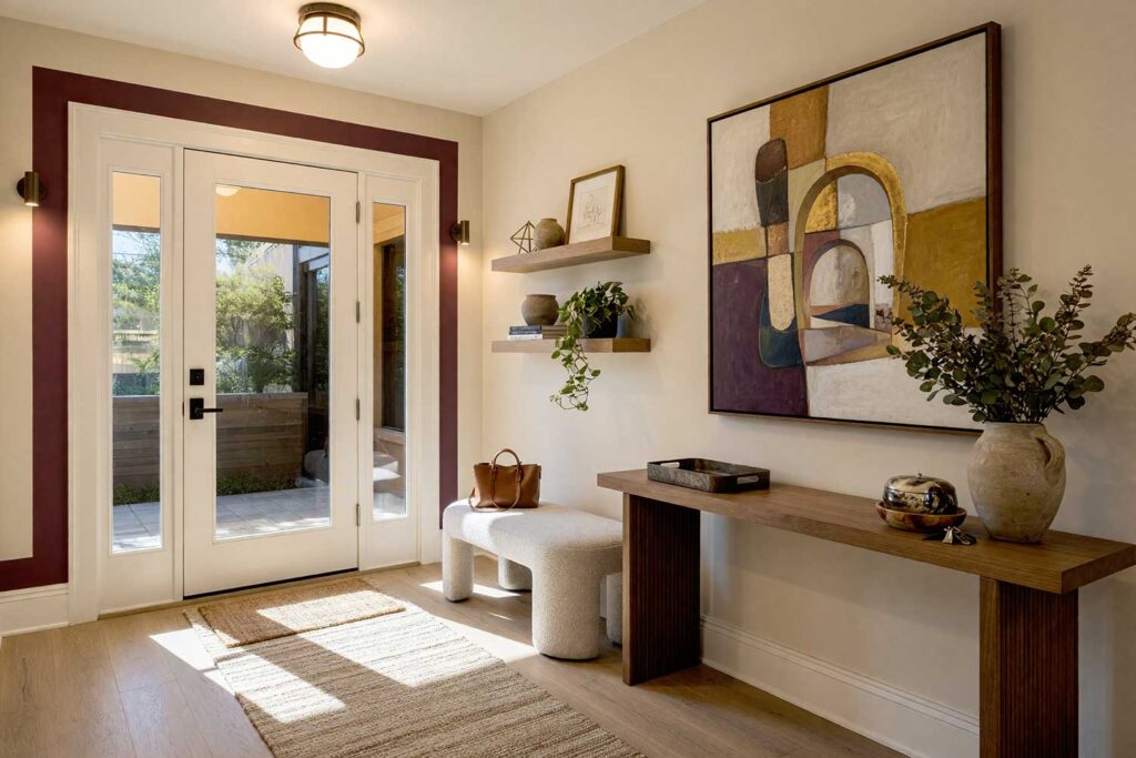
Extend your doorway casing eight inches out with a bold ring of cobalt blue, and a plain interior door becomes a graphic frame worth walking through. Buttercream walls keep the room bright and beachy, the glow you get two blocks off the water — no washed-out, all-white cliché, just one confident color at work. Picture a woven-rope mirror and a bowl of sea glass on the console. See painting interior doors with real personality for more. The halo alone makes a hallway feel like it’s leading somewhere.
Golden Ochre & Charcoal Black: Art Deco Portal
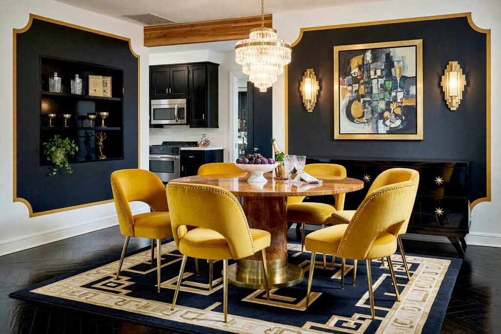
Walls: Charcoal black | Rounded Portal Frame Graphic: Golden ochre | Ceiling: Soft white | Baseboards/Trim: Golden ochre
This one’s for the homeowner who wants their dining entrance to feel like a 1920s supper club. Let the opening between kitchen and dining room be the negative space with a rounded, inward-facing radius-topped panel in golden ochre and charcoal black, then let the white walls handle the moody legwork on either side. It’s Art Deco nerve without the price of custom millwork — unlike full painted murals, this portal takes an afternoon, not a week. Add a fluted glass pendant and a botanical print in a simple black frame, and the passage feels like a grand entrance, not a hallway. It doesn’t announce itself quietly — it takes a bow.
Dusty Rose-Terracotta & Warm Taupe: Boutique Hotel Gallery Wall
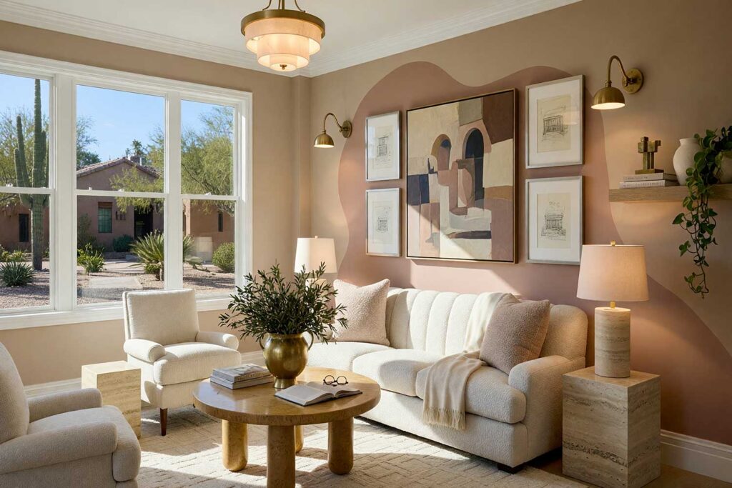
Walls: Warm taupe | Abstract Art-Frame Graphic: Dusty rose-terracotta | Ceiling: Soft white | Baseboards/Trim: Soft white
Behind a gallery of framed art, paint an oversized, off-center blob of dusty rose-terracotta directly onto warm taupe walls — asymmetrical, organic, nothing stencil-kit about it. This is boutique-hotel energy: a room that feels curated, not decorated. The soft pinkish brown shape makes ordinary black-and-white photography read like it’s hanging in a proper gallery. Add a low, tufted bench and a simple black reading sconce, and the room settles into a hush that smells faintly of eucalyptus. It’s understated until you notice the shape doing all the heavy lifting — restraint with one loud, deliberate move.
Moss Green & Chalk White: Japandi Home Office
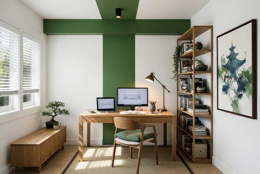
Walls: Chalk white | Ceiling Canopy Stripe Graphic: Moss green | Ceiling (remainder): Chalk white | Baseboards/Trim: Chalk white
Carry a wide moss green stripe up the wall behind a reading chair or desk and keep going — straight across the ceiling, like the color forgot to stop. Add some more green if you have an architectural feature. It lowers a tall ceiling and boxes in a cozy nook without adding a wall. Chalk white everywhere else keeps things calm, very Japandi: a low wooden stool, one dried branch in a ceramic vase. There’s something meditative about the stripe overhead. See painting bold wall stripes for more — a graphic wall that owns the room without raising its voice.
Aubergine & Pumpkin: Hollywood Glam Window Frame
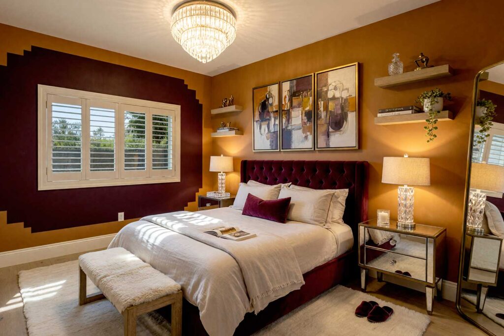
Walls: Pumpkin | Window Apron Graphic: Aubergine | Ceiling: Soft white | Baseboards/Trim: Ivory
Paint a wide, saturated aubergine border around a standalone window and let pumpkin walls turn up the wattage elsewhere — this pairing has zero interest in blending in. It’s old Hollywood glamour: velvet drapery and a crystal-cut lamp catching light through the window. The deep purple apron pulls the eye straight to the glass, making a modest window feel like the room’s leading lady. There’s a faint scent of good candle wax and fresh paint here, and it photographs beautifully at golden hour. This is one of those painted wall graphics that doesn’t whisper “accent” — it demands you notice the window every time you walk past.
Teal Blue & Cream: Industrial Loft Wainscot
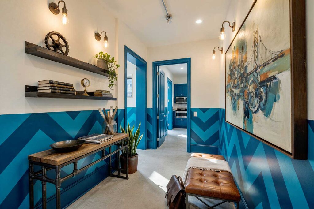
Walls (upper): Cream | Wainscot Chevron Graphic (lower third): Teal blue | Ceiling: Cream | Baseboards/Trim: Teal blue
Skip traditional wainscoting panels and paint a soft, repeating diagonal chevron in two tones of teal blue along the lower third of a hallway instead — same visual weight, none of the carpentry… or maybe there actually IS traditional wainscotting. Cream walls above keep things bright, while the graphic wall below reads like a scuff-resistant baseboard on steroids. It leans industrial loft: exposed-bulb sconces and a distressed leather bench at the hall’s end. The zigzag catches light differently by the hour, shifting from moody to bright. Run a hand along the wall and feel the crisp edge where the two colors meet — a small detail that makes the hallway a destination.
Periwinkle & Blush Pink: French Country Entry Arches
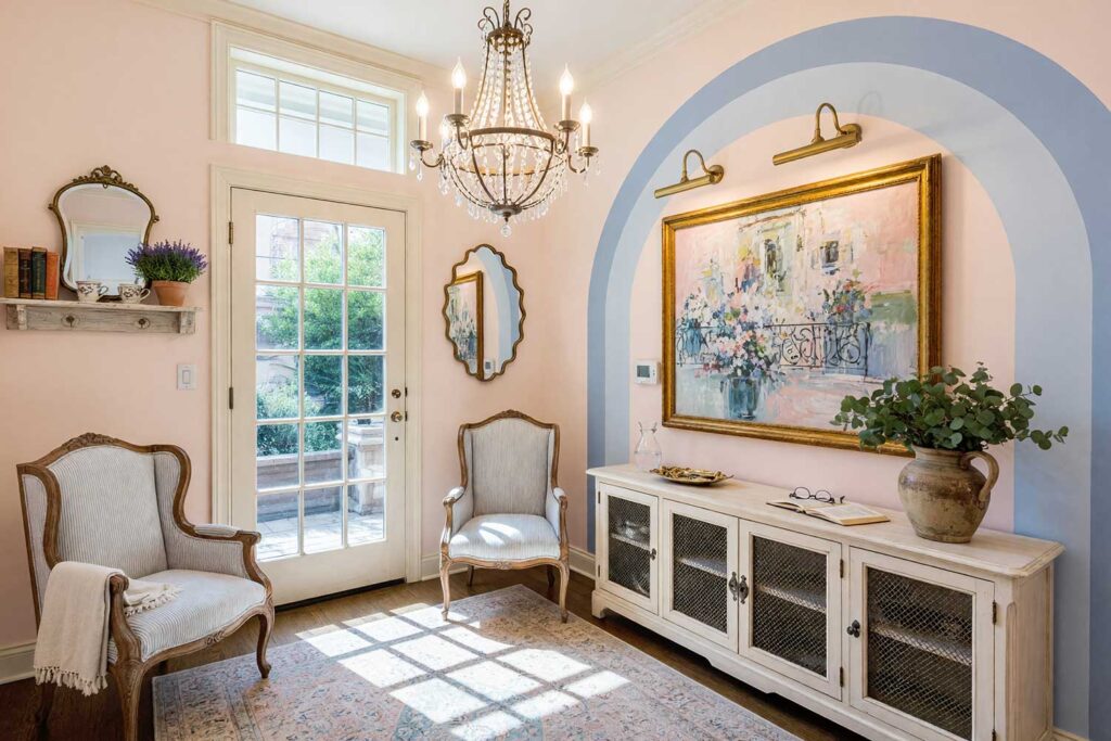
Walls: Blush pink | Nested Arch Graphic (behind console): Periwinkle | Ceiling: Soft white | Baseboards/Trim: Soft ivory
Layer two or three graduating arch silhouettes into one another, each a deeper shade of periwinkle, behind an entryway console — a softer cousin to the doorframe graphics above. Blush pink walls keep the entry romantic, very French country: a scalloped vintage mirror, fresh eucalyptus in a pitcher. Walk in and the nested arches practically curtsy at you. Concentric shapes have a softness a hard-edged stripe doesn’t. Foyers get overlooked constantly, but the right foyer paint colors set the tone, and graphics like this make an entrance hard to walk past.
Espresso Brown & Coral: Retro Atomic Starburst
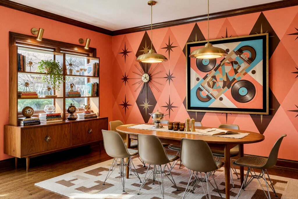
Walls: Coral | Harlequin Diamond & Starburst Graphic: Espresso brown | Ceiling: Soft white | Baseboards/Trim: Espresso brown
Layer tall, elongated espresso brown diamonds over a coral backdrop and finish the intersections with fine-line starburst motifs, and you’ve got full mid-century kitsch — the good kind. This is retro atomic energy: a low-slung credenza and a starburst clock keeping time on the wall. Coral keeps it playful, while the espresso brown diamonds add just enough weight to feel intentional. There’s a warmth here, almost nostalgic — fresh paint mixed with something that feels like a memory you didn’t know you had. It’s a graphic wall that commits fully to a bit, no half-measures — either you’re doing atomic starbursts or you’re not.
Forest Green & Sandstone Beige: Southwestern Desert Runner Stairway
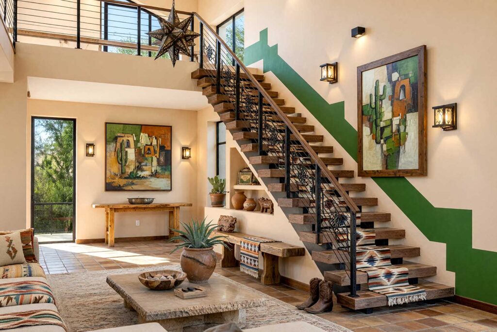
Walls: Sandstone beige | Staircase-Adjacent Runner Graphic: Forest green | Ceiling: Soft white | Baseboards/Trim: Sandstone beige
Echo the stepped diagonal rise of an open staircase with a bold forest green runner painted onto the adjacent wall, six inches above the treads, and let sandstone beige carry the rest. It’s Southwestern hacienda by way of stairwell: a potted agave and terracotta pots along a windowsill. The runner mirrors the architecture instead of ignoring it, so the graphic feels built-in. There’s a dry, earthy scent this palette conjures before you’ve added a plant — sun on stucco, something citrusy nearby. It’s a favorite way to turn dead stairwell space into something worth a second glance, for less than custom wall murals would cost.
Final Brush Strokes: Why Painted Wall Graphics Are Worth the Tape
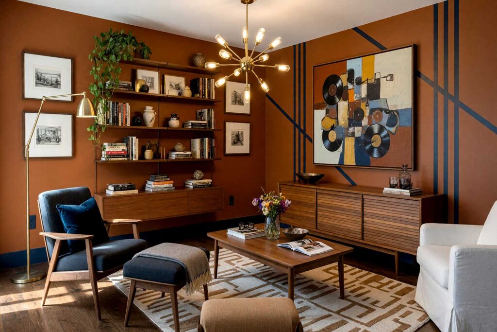
Great painted wall graphics aren’t about picking a trendy shape and calling it done — it’s about a mood and letting paint do something a plain wall never could. Whether it’s sweeping painted murals, a clean arch behind your bed, a stripe over your ceiling, or nested curves behind your console, the idea is the same: give your walls a reason to be looked at twice. This is inspiration, not instruction — take these ideas and adjust the colors to whatever makes you happy. Browse the full collection of painting articles, or give me a call.
Painted wall graphics are custom shapes, arches, stripes, or color-blocked designs applied directly to walls with paint instead of wallpaper — a budget-friendly way to add architectural personality, frame doorways or furniture, and give any room a bold, high-impact focal point.