The walls, the ceiling, the baseboards, the door—all of it, the same color. No breaks. No contrast. No “safe” white trim keeping everything in its predictable little lane. If that description just sent a flicker of excitement through you—or maybe a tiny, delicious flutter of panic—you already understand why color drenching interior paint is the most talked-about design move happening right now. I’ve been painting homes across the Phoenix Valley for years, and nothing stops people mid-sentence quite like a room that’s been completely, fearlessly committed to a single hue. It doesn’t just surround you. It absorbs you.
What Is Color Drenching Interior Paint—And Why Does It Stop Everyone in Their Tracks?
The idea is simple, but the impact is anything but: choose one color—or a closely related family of tones—and let it claim everything. Walls, ceiling, baseboards, door, door trim—all of it, unified. No visual breaks. No contrast for the eye to reset on. What you’re left with is a tonal paint technique that doesn’t just paint a room—it creates one. For decades, interior painting followed the same familiar script: color on the walls, crisp white trim. Clean. Safe. Reliable. But color drenching interior paint challenges that premise entirely. Instead of using contrast to define a space, it uses cohesion. The result is a monochromatic paint scheme that makes a room feel like it was designed with total conviction—every surface speaking the same visual language, fluently and without hesitation.
What makes color drenching interior paint genuinely compelling is that it’s not simply a technique—it’s a design declaration. The hue you choose becomes the emotional fingerprint of the room. Deep midnight navy turns a home office into a literary sanctuary. Warm terracotta transforms a dining room into something sun-baked and alive. Soft sage wraps a bedroom in a quiet you usually have to travel to find. Architectural character plays a major role here too. Craftsman-style homes with chunky woodwork practically beg for this tonal paint technique in deep olive or warm amber. Clean-lined contemporary spaces thrive in cobalt or slate gray—pure, uninterrupted urban drama. Warm Southwestern casitas drenched in terracotta look as though they were born from the desert itself. Match your color to your home’s architecture and the result stops looking like a paint choice and starts feeling like a personality.
11 Color Drenching Interior Paint Inspirations That Will Make You Rethink Every Room
These aren’t paint chip suggestions. These are full commitments—complete environments—with coordinating walls, ceilings, baseboards, doors, and door trim, plus accent colors to anchor every space with intention. Find the one that speaks to you. Then let it speak loudly.
Pure White Canvas — The Color That Contains Every Color
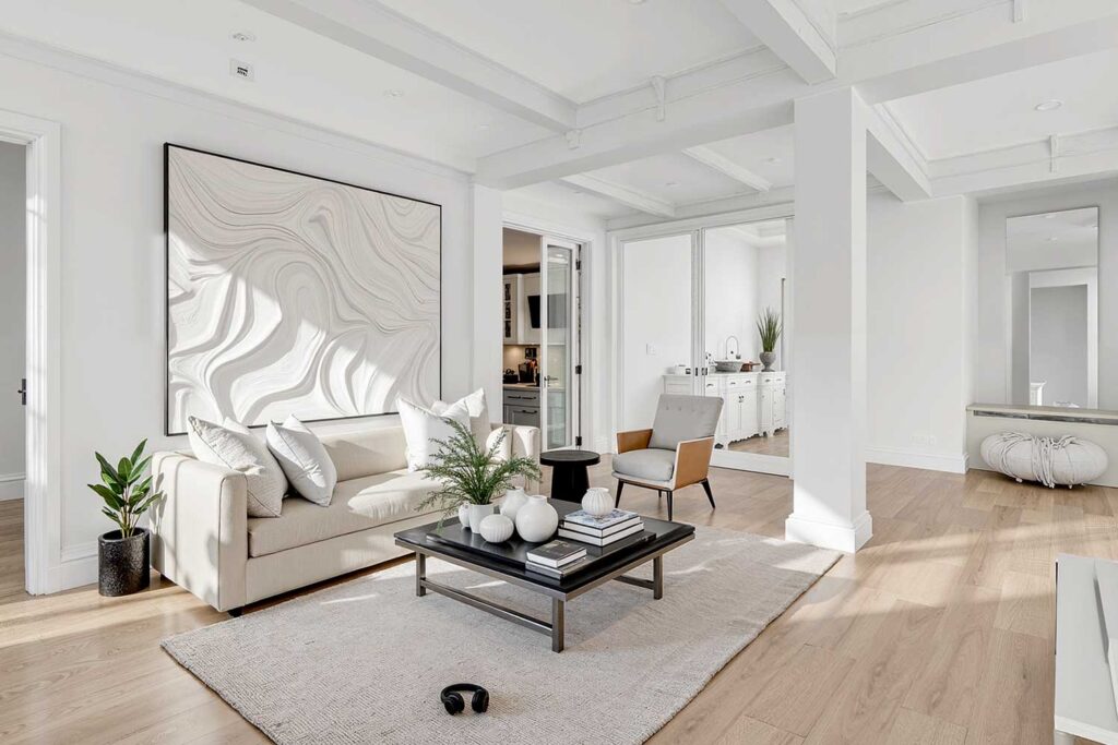
Walls, Ceiling, Baseboards, Door & Door Trim: Pure warm white (ceiling and trim shifted toward a whisper of warm ivory for quiet sculptural depth)
Coordinating Accents: Natural linen, raw plaster textures, bleached oak, matte white ceramics
White as a color drenching interior paint choice is wildly misunderstood—and that’s exactly what makes it so compelling. This is not the white of safe, forgettable rooms. This is the white of a Santorini cliff house, a Scandinavian studio, a space so architecturally intentional it needs absolutely nothing else. When every surface shares the same luminous tone, white stops playing it safe and starts playing an entirely different game.
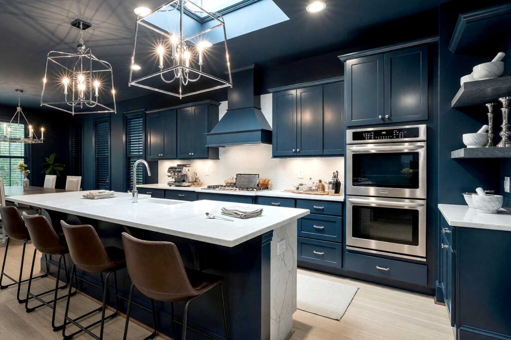
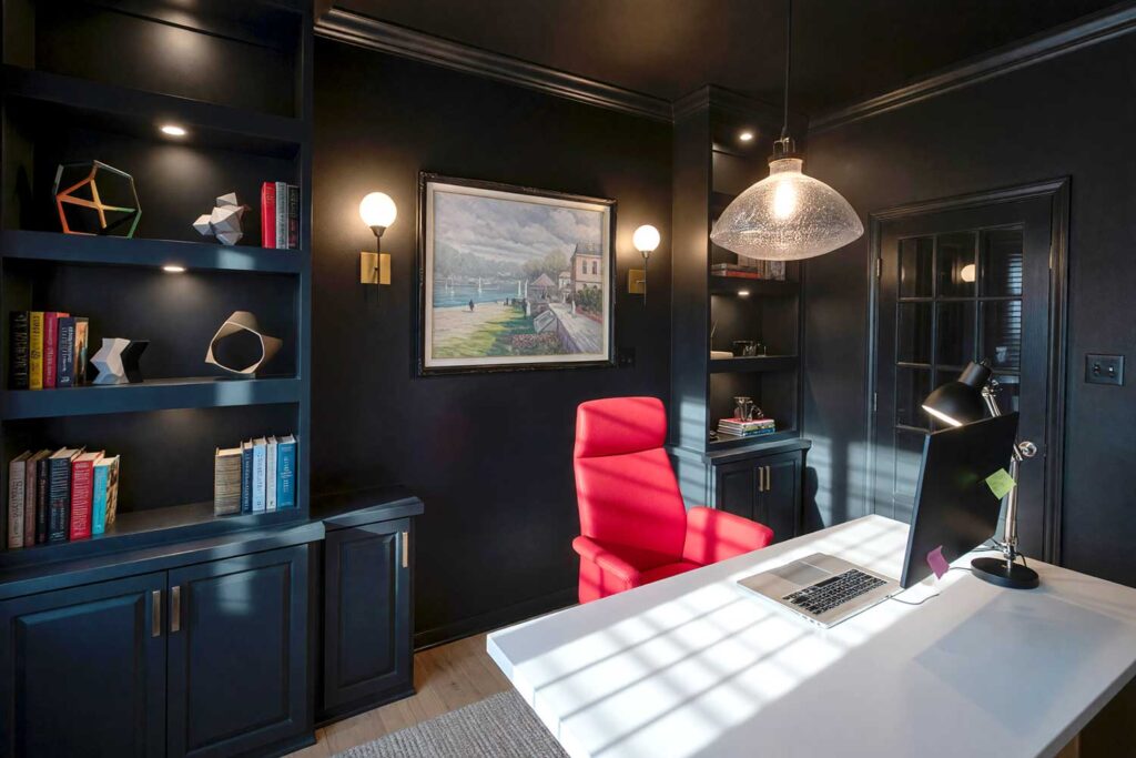
Midnight Ink — The Room That Reads Like a Novel
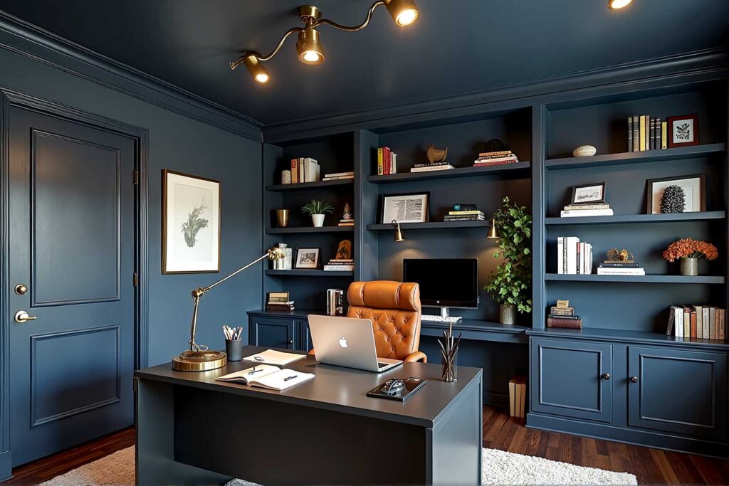
Walls, Ceiling, Baseboards, Door & Door Trim: Midnight navy (ceiling one tonal step darker for quiet depth)
Coordinating Accents: Aged brass hardware, cognac leather, warm ivory linen
Midnight navy as a tone-on-tone interior is devoted and atmospheric—the kind of space you never want to leave. Home offices and bedrooms thrive in this palette, feeling both sheltered and strikingly sophisticated all at once.
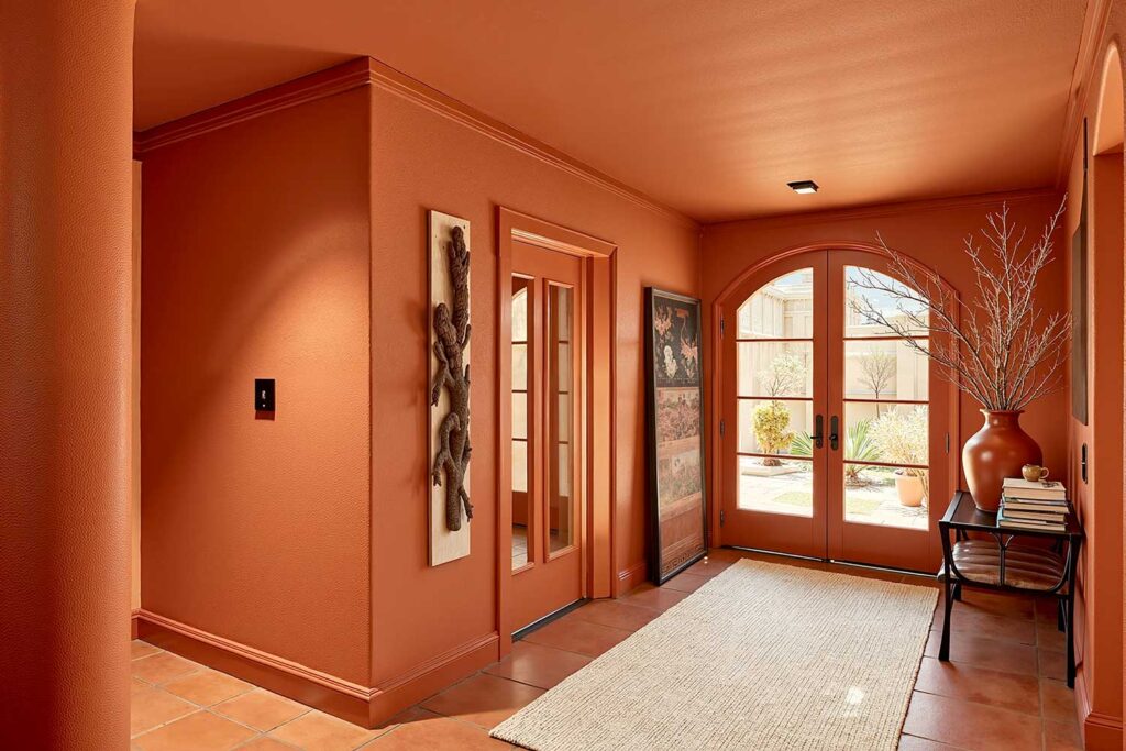
Terracotta Dream — Sun-Baked, Warm, and Completely Unapologetic
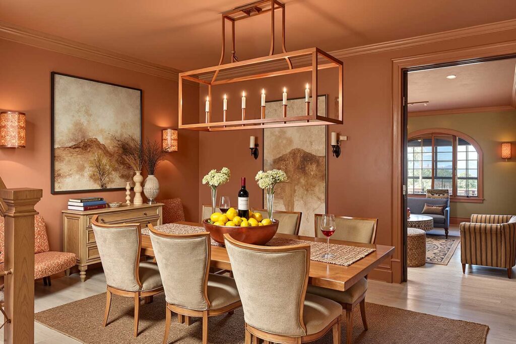
Walls, Ceiling, Baseboards, Door & Door Trim: Warm terracotta/clay orange (ceiling shifted toward peachy warmth)
Coordinating Accents: Bleached wood, warm sand linen, hammered copper details
Terracotta as a color drenching interior paint choice resonates deeply with the Southwest landscape. A dining room drenched in warm clay stops being a dining room entirely—it becomes a Tuscan escape that photographs like a design spread and lives even better in real life.
Dark Cream Immersion — Warm, Wrapped, and Impossible to Rush Out Of
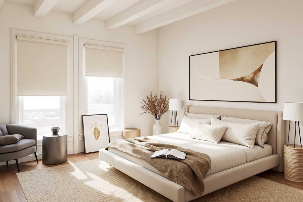
Walls, Ceiling, Baseboards, Door & Door Trim: Deep aged cream/warm parchment (door shifted one tonal step toward warm caramel for gentle, intentional definition)
Coordinating Accents: Honey oak wood, Belgian linen, aged bronze hardware, soft woven textiles
Dark cream as a tone-on-tone interior choice does something quietly extraordinary: it wraps a room in warmth without a single bold color in sight. This is the monochromatic paint scheme for the homeowner who wants to feel genuinely held by a space—the paint equivalent of a cashmere throw covering every wall, every baseboard, every corner. Bedrooms and living rooms simply melt into something irresistible under this palette.
Dusty Rose Reverie — Far Moodier Than Anyone Expects
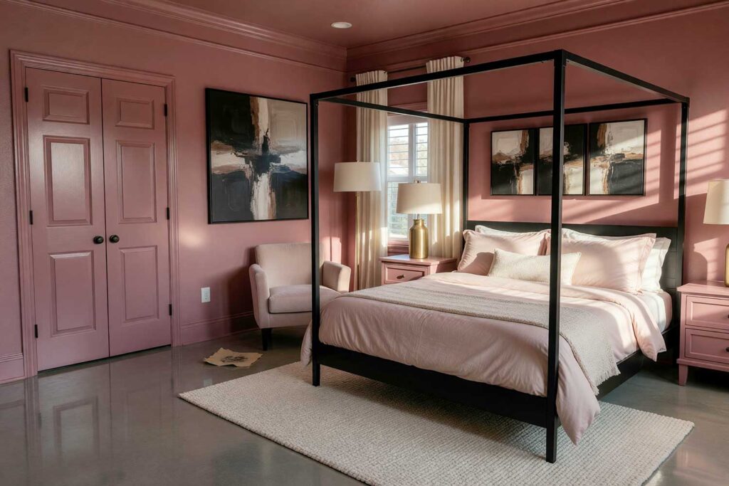
Walls, Ceiling, Baseboards, Door & Door Trim: Dusty rose/antique mauve (door one tone darker for quiet drama)
Coordinating Accents: Champagne gold fixtures, warm ivory velvet, pale blush textiles
Before you dismiss dusty rose, step inside a room fully drenched in antique mauve and let your eyes adjust. Less nursery, considerably more Parisian apartment. Powder rooms and bedrooms thrive in this palette—especially once the light drops and the room seems to deepen on its own.
Slate Storm — Minimalism with a Pulse
Walls, Ceiling, Baseboards, Door & Door Trim: Deep slate/blue-gray charcoal (seamless and fully committed throughout)
Coordinating Accents: Polished silver hardware, white marble surfaces, natural linen
This monochromatic paint scheme in deep slate gray creates a gallery-like atmosphere that modern Phoenix homes wear effortlessly. No visual breaks. No interruptions. Just a cool, immersive environment that looks like it cost twice what it actually did—and that’s a remarkable return on color alone.
Cobalt Immersion — For the Homeowner with Zero Hesitation
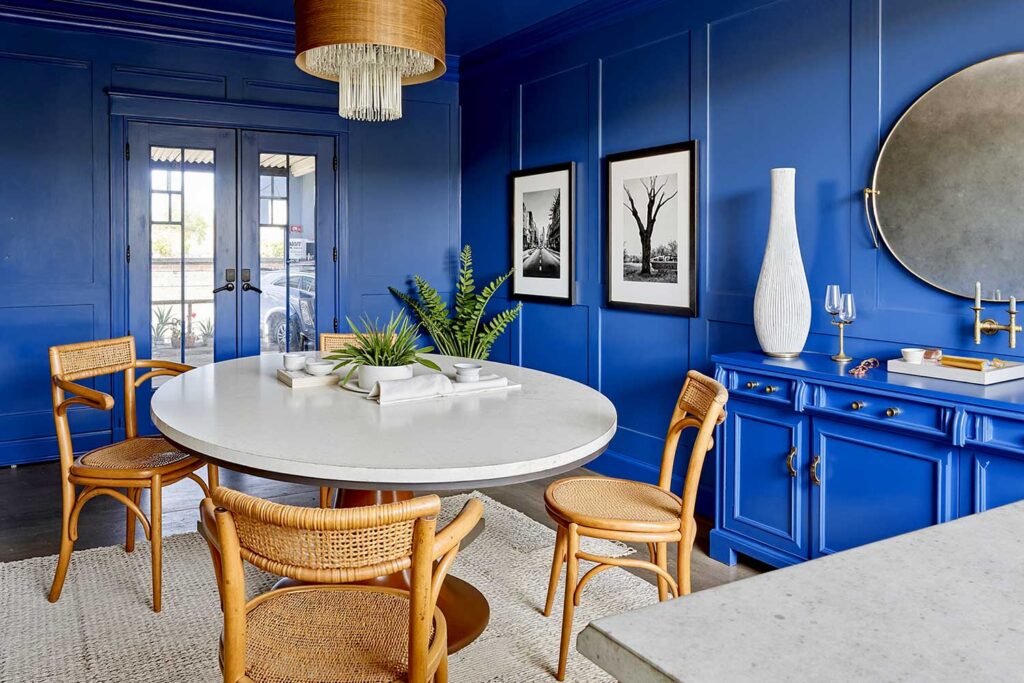
Walls, Ceiling, Baseboards, Door & Door Trim: True cobalt blue (ceiling with the faintest trace of white added for visual lift)
Coordinating Accents: Crisp white linen, natural rattan, matte gold hardware
Bold blue environments are known to energize a space while creating a sense of psychological depth and immersion. As a tone-on-tone interior, cobalt goes beyond dramatic—it becomes transportive. Studies, dining rooms, and daring bedrooms are never the same after a commitment like this.
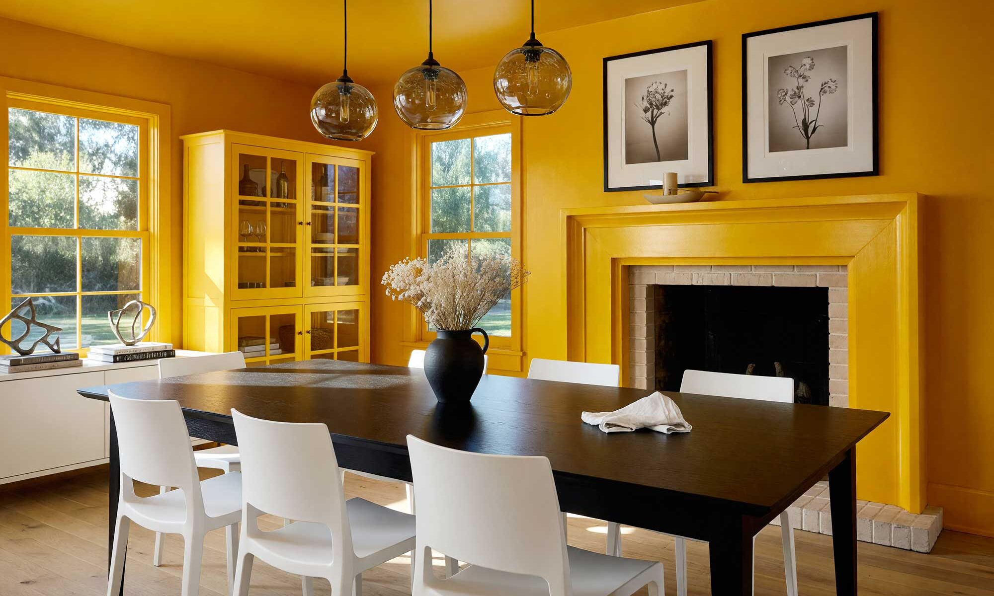
Deep Yellow Ochre — Liquid Sunlight Captured in Four Walls
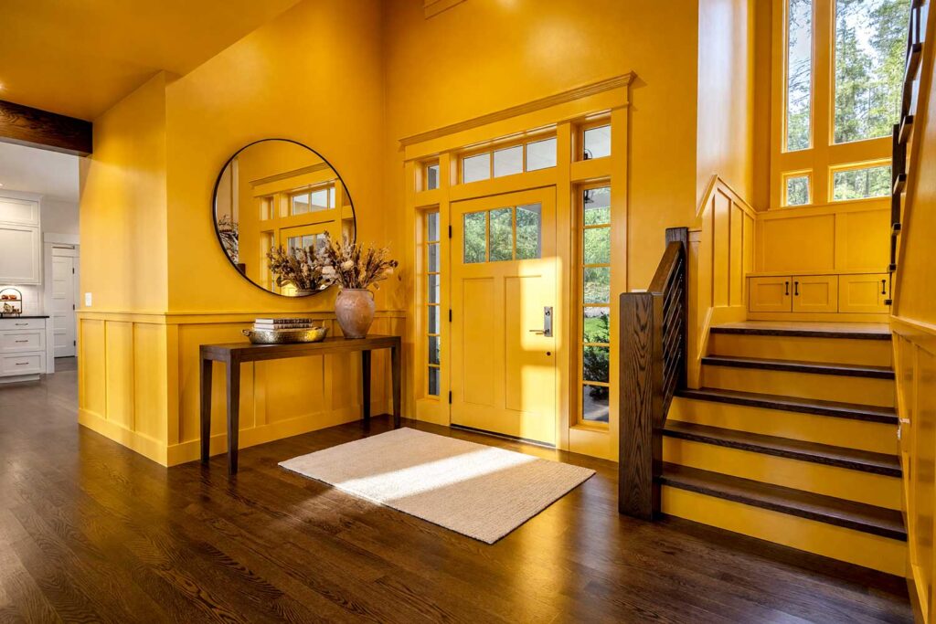
Walls, Ceiling, Baseboards, Door & Door Trim: Deep golden yellow ochre (ceiling pulled one tonal step toward warm amber for a glowing, radiant overhead effect)
Coordinating Accents: Rich terracotta pottery, dark espresso wood, hammered brass fixtures, creamy linen
Deep yellow ochre color drenching interior paint is for the homeowner who doesn’t want their space to whisper—they want it to radiate. This saturated, golden hue transforms any room into something reminiscent of a Moroccan riad or a Venetian palazzo—sun-drenched, deeply alive, and impossible to walk past without stopping. Dining rooms and entryways bathed in this ochre glow have a way of holding people right where they stand.
Velvet Plum — The Luxury You Actually Get to Live In
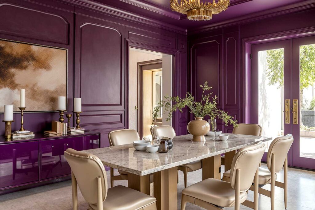
Walls, Ceiling, Baseboards, Door & Door Trim: Deep eggplant/plum purple (ceiling one tonal step lighter)
Coordinating Accents: Aged gold fixtures, champagne silk textiles, deep ivory stone
There is nothing more immediately luxurious than a dining room or master bedroom fully drenched in deep plum. This color drenching interior paint approach creates the atmosphere of a boutique hotel—except it’s yours, every single night. This monochromatic paint scheme hits its full peak by candlelight, when the walls seem to glow from somewhere deep within the color itself.
Sage Surrender — Permission to Finally, Actually Slow Down
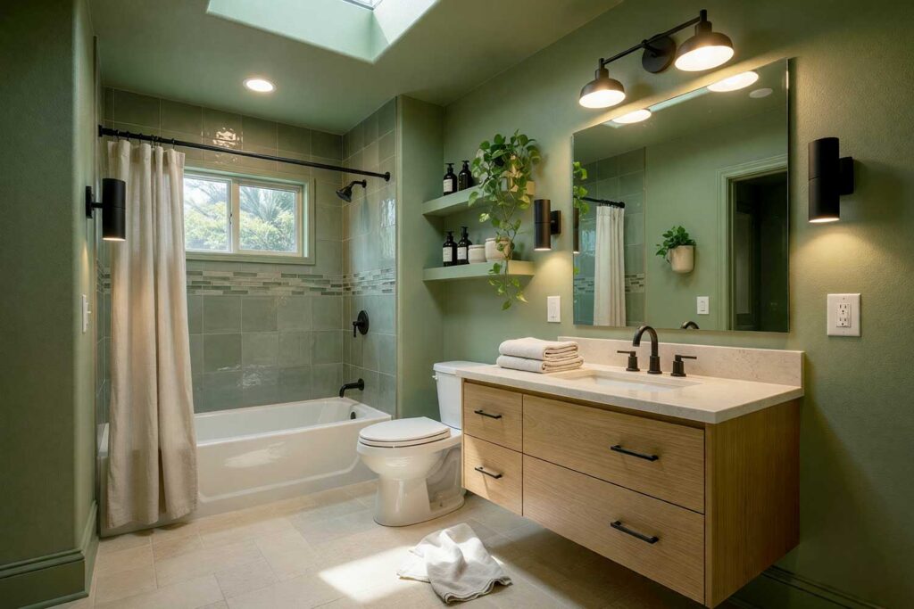
Walls, Ceiling, Baseboards, Door & Door Trim: Warm sage green (tile one shade deeper for quiet richness)
Coordinating Accents: Warm cream, honey wood tones, natural linen textures
When sage is used as a tonal paint technique across every single surface, it transcends trending and lands somewhere considerably closer to timeless. A bedroom or bathroom drenched in warm sage wraps you in a calm you usually have to leave town to find—and it’s waiting for you every single morning.
Burnt Sienna Awakening — Earthy Drama, Absolutely Zero Apology
Walls, Ceiling, Baseboards, Door & Door Trim: Burnt sienna/deep rust orange (warm amber undertones throughout)
Coordinating Accents: Chocolate leather, ivory plaster textures, raw iron hardware
Burnt sienna color drenching interior paint creates a warmth that feels almost physical—like the walls themselves are radiating something worth staying close to. Entryways and dining rooms were made for this treatment, especially in homes with exposed wood beams or strong Southwestern architectural character.
Final Brush Strokes: Color Drenching with Interior Paint is One More Extraordinary Tool for Your Creative Toolkit
Here’s what color drenching interior paint actually is, at its core: a design tool. A powerful one—but still just one option among many extraordinary choices available to any homeowner ready to think beyond the expected. Some spaces come alive through contrast—through the visual conversation between bold walls and crisp white trim. Others thrive through pattern, layered texture, or unexpected architectural detail. Color drenching is for the room—and the homeowner—ready to commit to something immersive, cohesive, and deeply intentional. It doesn’t replace other design sensibilities. It simply expands what you thought was possible.
If any of the ten palettes above sparked something—that quiet certainty that a particular hue could completely transform the way you feel inside your home—that instinct is worth following. Your home is the backdrop of your entire life. A monochromatic paint scheme applied with confidence and intention is one remarkable way to make sure that backdrop says exactly what you want it to say. The only question left is which color you’re bold enough to fully commit to.