You’re stuck in traffic on the 101, mentally somewhere over the Atlantic. Maybe it’s the electric blue of the Greek islands calling your name, or the amber warmth of a Tuscan hillside at golden hour. Whatever the destination—here’s something I know for certain: the most extraordinary interior paint color palettes don’t come from a fan deck. They come from the places that make your heart race.
Phoenix is full of travelers. People with restless spirits and bucket lists a mile long. And yet most of us come home to the same builder beige we’ve been staring at for years. That stops right now. Your walls are a canvas, and the entire world is your muse.
Why Your Interior Paint Color Palettes Should Start with a Boarding Pass
Every destination you’ve ever loved had its own color language. The blinding white and saturated cobalt of Santorini. The dusty terracotta and sun-baked olive of the Italian countryside. The impossibly vivid, enveloping green of a Costa Rican rainforest. These aren’t just beautiful views—they’re emotional experiences. And the paint color inspiration they offer is completely, powerfully transferable to the walls of your home. Passport? Not needed today.
Interior paint color palettes that draw from travel aren’t just aesthetically interesting—they’re personal. They say something about who you are, where you’ve been, where you’re going. That kind of home color scheme doesn’t just look good. It means something. And that is the difference between a house that’s been decorated and a home that actually has a soul.
Here’s what I love about travel-inspired color: it gives you permission to be bold in a way that “greige #47” never could. You’re not just picking a color—you’re choosing a mood. An identity. A world you want to come home to every single day. And while you’re dreaming up these destination palettes, don’t forget to look up—a painted ceiling can make the whole room feel transported in ways most people never anticipate.
10 Destination-Inspired Interior Paint Color Palettes That Take You There (Without the Jet Lag)
These are ideas. Moods. Starting points for something that becomes entirely your own. Take what you love, leave the rest—but don’t be afraid to go somewhere bold.
1. Santorini Dream — Bathroom
There is no interior color scheme more iconic than the high-contrast cobalt and white of the Greek Cyclades. And it translates breathtakingly into a bathroom setting.
Walls: Aegean Blue (deep, saturated cobalt)
Ceiling: Stark Bright White
Baseboards & Trim: Stark Bright White
Door / Door Trim: Crisp Linen White with brushed nickel hardware
Go deep with the blue—don’t hedge on it. The white trim and ceiling create the contrast, and suddenly your morning routine feels less like Monday and more like a sunrise view from a clifftop in Oia.
2. Tuscan Harvest — Kitchen
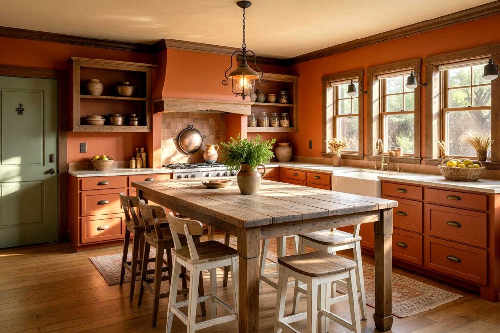
Warmth. Richness. The color of sun-baked clay and aged wine barrels. Terracotta walls in a kitchen are wildly underused, and the paint color inspiration they draw from the Italian countryside is undeniably gorgeous.
Walls: Terracotta Rust (deep, earthy orange-red)
Ceiling: Warm Parchment (soft off-white with golden undertones)
Baseboards / Crown: Deep Walnut Brown
Door: Olive Sage with aged brass hardware
Warm parchment above. Olive sage at the doorways. This home color scheme practically has a scent—and yes, that is absolutely a compliment. Next stop… Milan.
3. Costa Rican Canopy — Reading Nook or Den
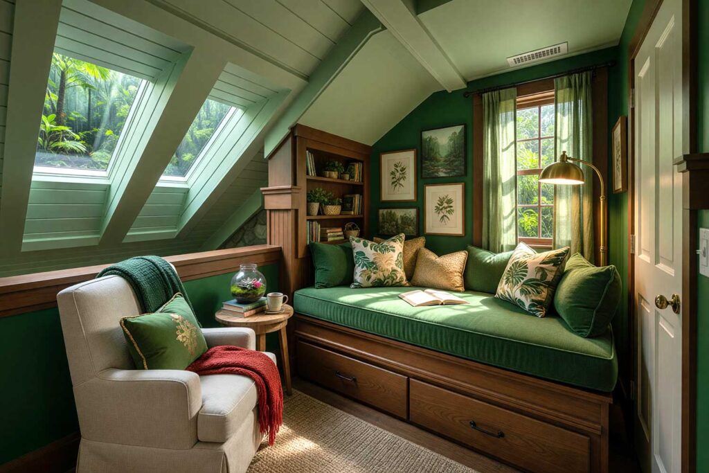
For anyone who’s ever stood beneath a jungle canopy and felt both primal and perfectly still—this interior paint color palette is calling your name. Lush. Enveloping. Completely unexpected.
Walls: Jungle Canopy Green (deep, saturated forest green)
Ceiling: Soft Fern (lighter, muted sage green)
Baseboards: Warm Chocolate Brown
Door / Door Trim: Natural Linen White
A reading nook in deep jungle green with a soft fern ceiling feels like its own ecosystem. It wraps around you. This is a room color palette that makes you want to disappear into a book for a week—and feel zero guilt about it.
4. Parisian Mist — Bedroom
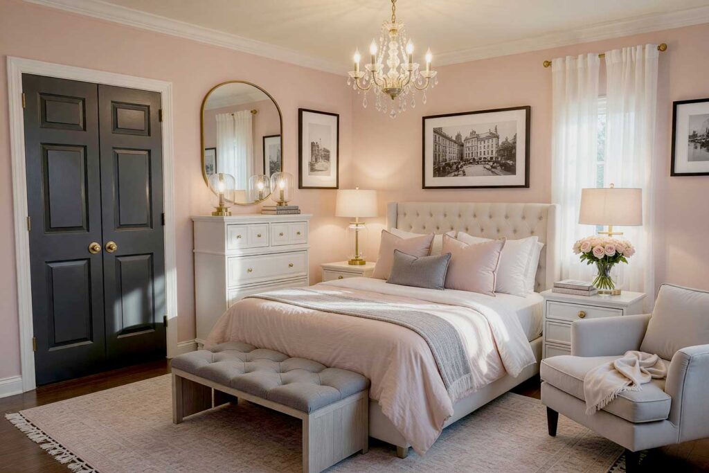
With the right interior color scheme, Paris doesn’t have to be a cliché. Done well, it’s moody, romantic, and completely intoxicating.
Walls: Blush Rose (soft, dusty pink with warm undertones)
Ceiling: Pale Champagne (barely-there gold-white)
Baseboards & Trim: Creamy White
Door / Door Trim: Deep Charcoal Gray with brushed gold hardware
That charcoal door against blush walls? That’s the move. It’s unexpected. It’s the room people walk into and quietly covet—the kind that makes them go home and wonder why their own bedroom feels so ordinary by comparison.
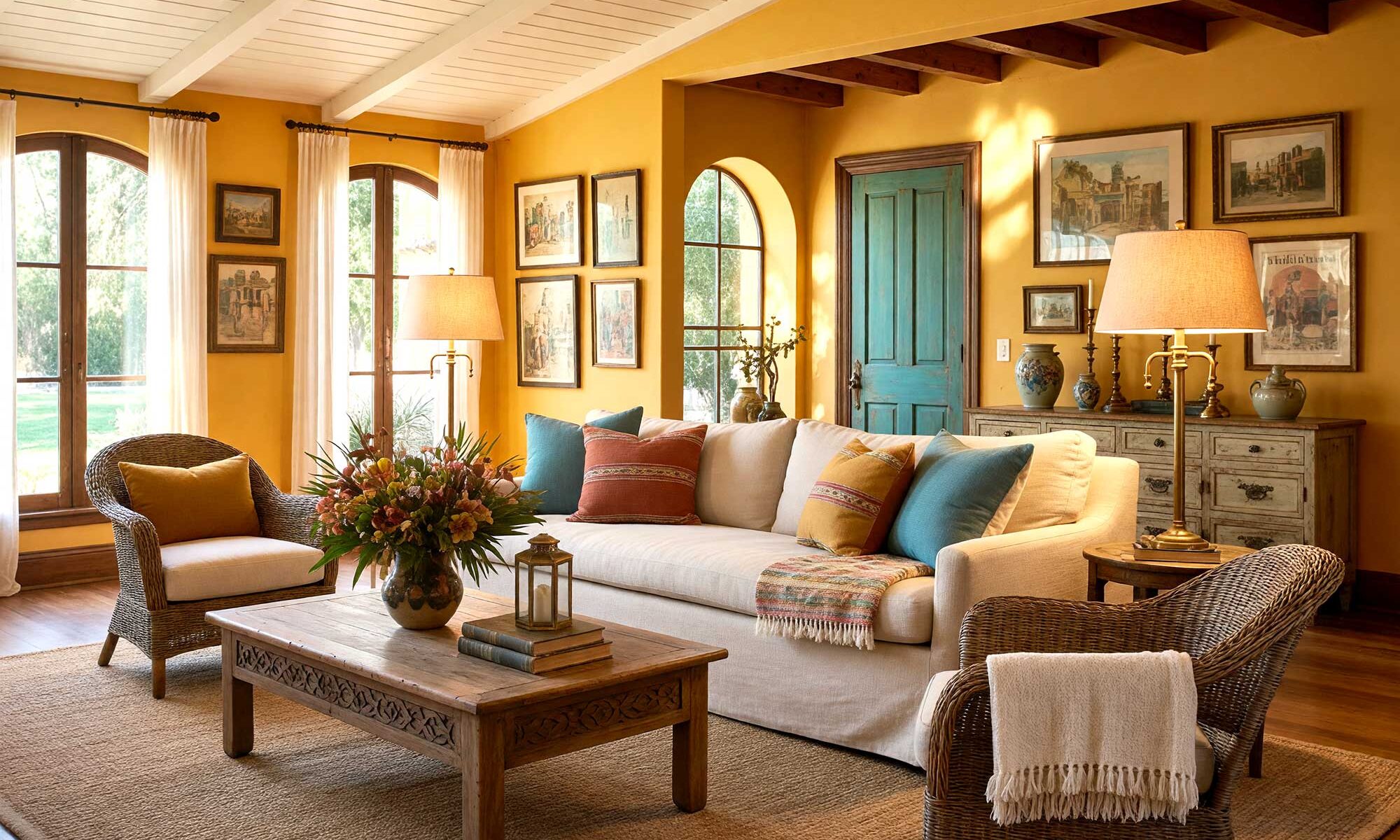
5. Marrakech at Dusk — Dining Room
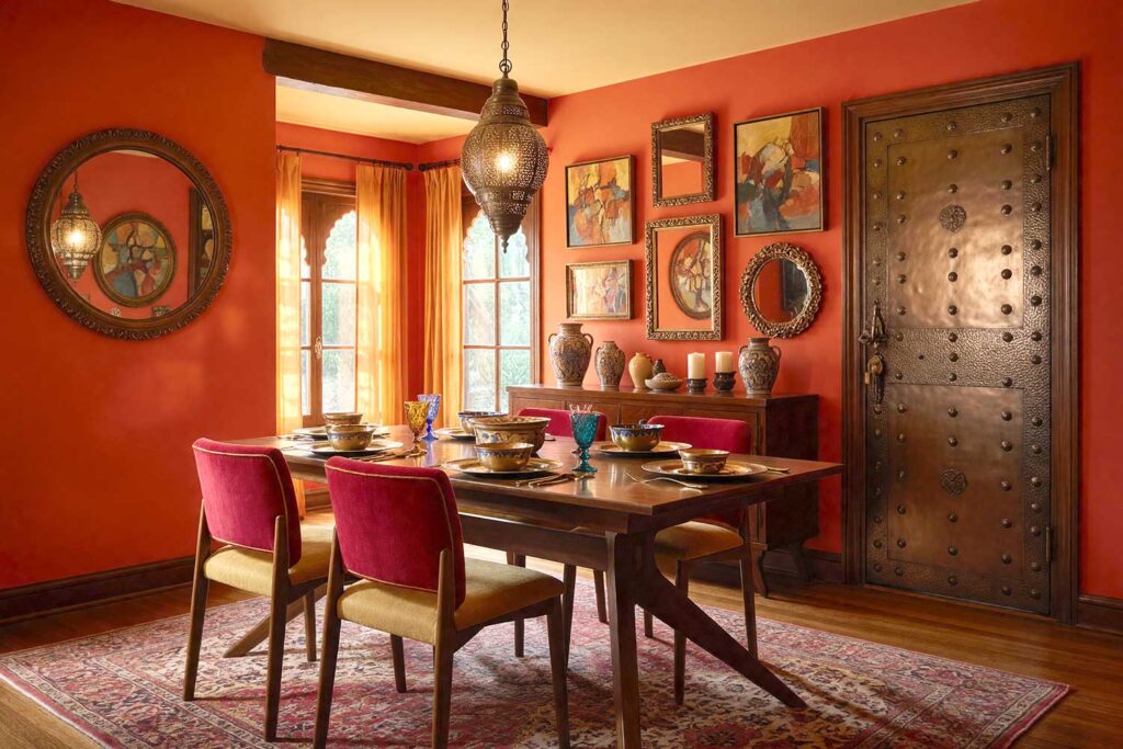
Interior paint color palettes don’t get bolder, more alive, or more unapologetically dramatic than this. Morocco brings heat, texture, and depth—and your dining room deserves every bit of it.
Walls: Spiced Paprika (warm, bold orange-red)
Ceiling: Saffron Cream (pale amber)
Baseboards: Rich Mahogany
Door / Door Trim: Deep Bronze with hammered metal hardware
The saffron cream ceiling is what keeps this room color palette from tipping into overwhelming—it’s the detail that transforms “bold” into brilliant. This is a space for people who eat well and laugh loudly. Bring the bazaar home.
6. Kyoto in Bloom — Master Bedroom or Hallway
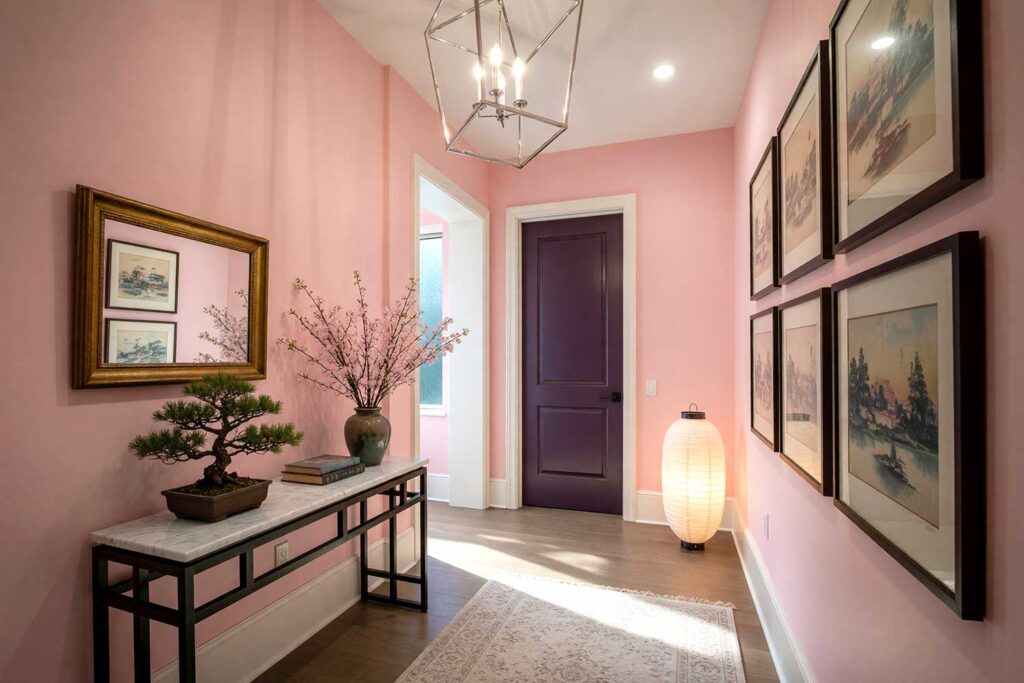
Cherry blossoms. Still water. That quality of spring light that feels almost too perfect to be real. Japan’s most beautiful season translates into one of the most serene interior color schemes you’ll ever commit to.
Walls: Sakura Pink (pale, barely-there blush with cool undertones)
Ceiling: Pure Bright White (no warm tones—this matters more than you’d think)
Baseboards & Trim: Soft White
Door / Door Trim: Deep Plum with matte black hardware
That deep plum door is critical. It takes this room color palette from “accidentally pretty” to intentionally stunning. Without it, it’s just pink. With it, it’s art.
7. Amalfi Afternoon — Kitchen or Sunroom
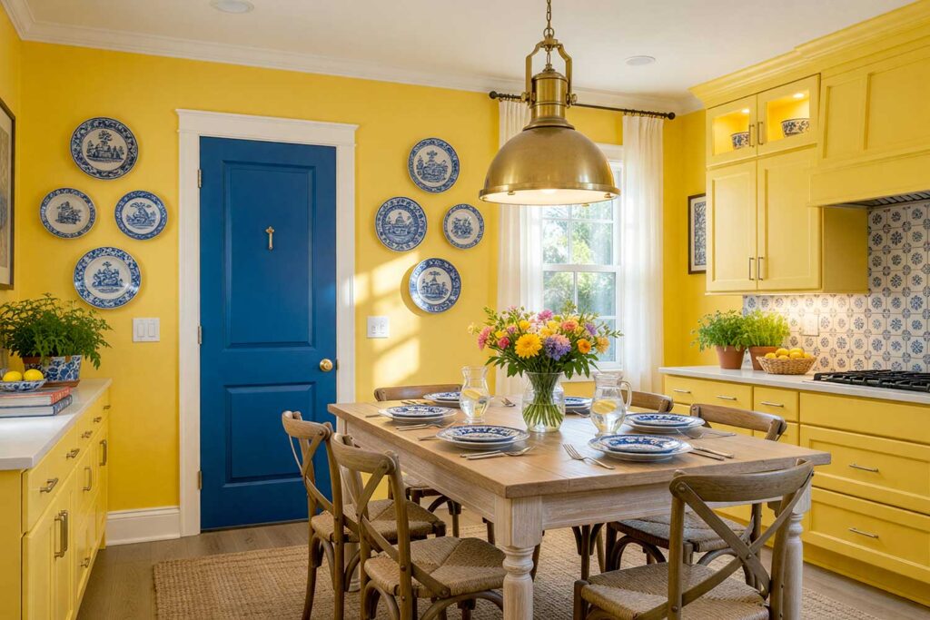
Lemon trees. Ceramic tiles. That impossible Italian coastline hanging from every cliff. The Amalfi Coast is pure color euphoria—and it absolutely belongs in your home color schemes.
Walls / Cabinets: Limone Yellow (soft, warm, sun-kissed yellow)
Ceiling: Bright White
Baseboards: Crisp White
Door / Door Trim: Cobalt Blue with white trim detail
Yellow kitchens are making a massive comeback—and for very good reason. They’re happy. Pair them with cobalt blue door trim, and you’ve got paint color inspiration that makes every person who walks through that door smile. Every. Single. Time.
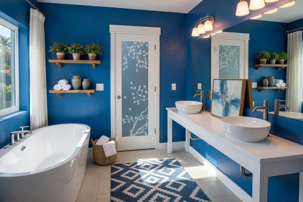
8. Caribbean Drift — Bathroom or Laundry Room
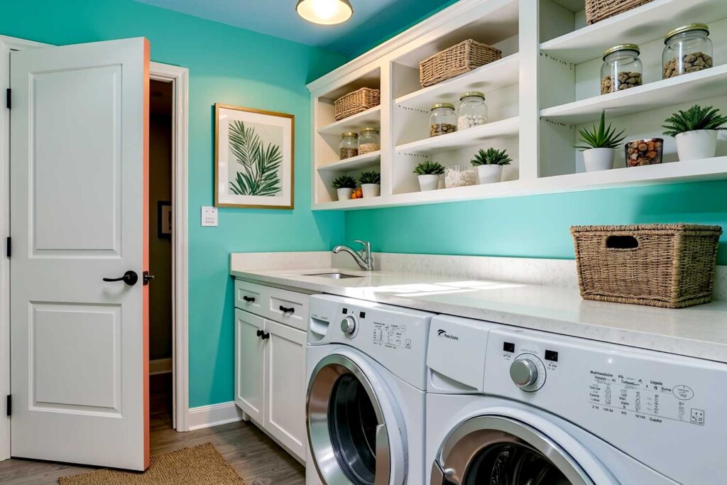
This interior paint color palette is for anyone who has ever stepped off a plane in the Caribbean and felt their shoulders drop three full inches the moment the warm air hits.
Walls: Aqua Tide (vivid, clear turquoise-greenish-blue)
Ceiling: Deep Sky Blue
Baseboards: Bright White
Door / Door Trim: Crisp White with a coral-painted interior edge
The secret is in the interior edge of the door—painted warm coral. It peeks out every time the door swings open. It’s a small detail. It’s everything—the kind of move that tells anyone who notices it that you were genuinely paying attention.
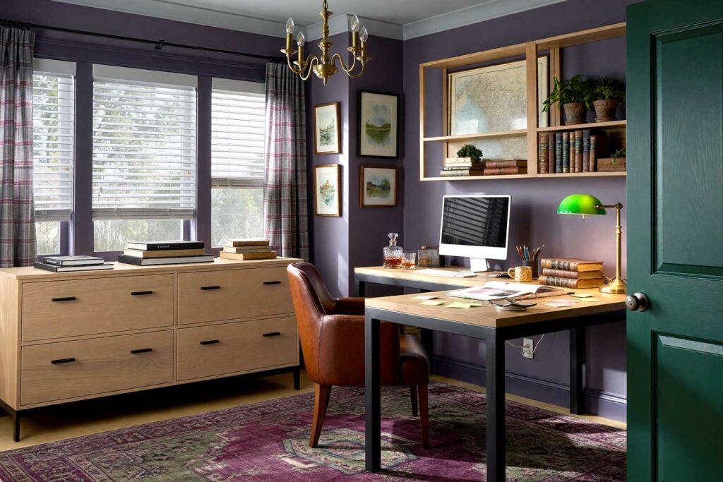
9. Manhattan After Dark — Home Office or Dining Room
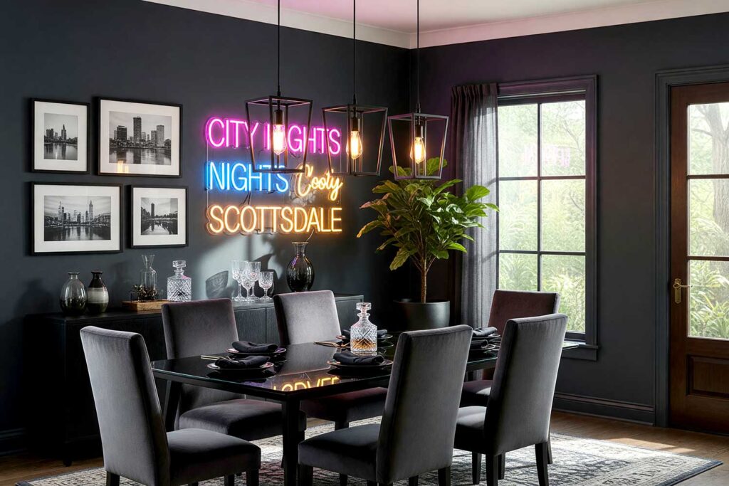
Not everyone’s wanderlust is tropical. Some people dream of concrete and neon. This home color scheme channels pure, unapologetic New York City energy—intentional, sharp, and impossibly cool.
Walls: Midnight Slate (deep charcoal with blue undertones)
Ceiling: Warm Off-White (keeps it from feeling like a cave—and trust me, this matters)
Baseboards: Matte Black
Door / Door Trim: Deep Espresso Brown with antique brass hardware
Dark rooms done right are powerful. This is paint color inspiration for the homeowner who means business—or just enjoys feeling that way over dinner. Both are completely valid.
10. Bali at Sunrise — Living Room
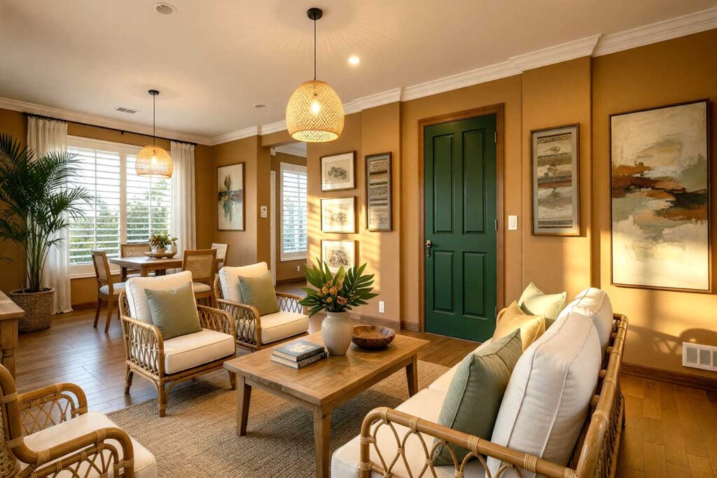
Gold light. Deep warmth. The feeling of the world finally slowing down to something you actually want to be part of. This interior paint color palette transforms a living room into the sanctuary you’ve been chasing on every vacation you’ve ever taken.
Walls: Warm Teak (golden brown, rich and earthy)
Ceiling: Warm Ivory
Baseboards: Natural Bamboo Tan
Door / Door Trim: Deep Jungle Green with teak-finished hardware
Layered. Grounded. Enveloping. Add rattan, linen, and a few well-placed plants—and you won’t miss the flight. Which is really the whole point of all of this, isn’t it?
Final Brush Strokes: The Most Stunning Destination You’ll Ever Visit Could Be Right at Home
Here’s the truth nobody says out loud: the most memorable rooms—the ones you walk into and actually feel something—didn’t happen by accident. Someone made a bold choice. Someone picked the Santorini blue, committed to the terracotta kitchen, or painted their hallway like a Kyoto spring morning in April.
Interior paint color palettes inspired by the places you love are more than decorating decisions—they’re declarations. They say: I live here. I love it here. And I have taste.
You don’t need a plane ticket to feel transported. You just need the right color on the right wall—and maybe a little courage to go somewhere unexpected. If you’d like help figuring out which destination belongs in your home, Bryce House Painting is just a call away.
Travel-inspired interior paint color palettes use the emotional character of global destinations — their light, texture, and mood — to create rooms that feel intentional and deeply personal. Instead of choosing colors from a trend report, you’re choosing them from a place that already means something to you.