
Last Updated on July 14, 2026
White trim. It’s on every baseboard, every window casing, every door frame in nearly every home you’ve ever walked into. It became the default somewhere around the same time builder-grade beige took over, and nobody really questioned it. But contrasting interior trim colors? They’re the design choice that makes a room suddenly mean something. The moment you paint those baseboards a deep charcoal, a moody navy, or a warm chocolate brown, the whole room snaps into focus. It gets a spine. It gets a story. A simple shift in trim color — same walls, same furniture — can completely change the energy of a space. That’s not a renovation. That’s intentional design. And it might be the most powerful, most underused tool in your home’s entire aesthetic arsenal.
Why Contrasting Interior Trim Colors Change Everything
Think about the last room that genuinely stopped you. Chances are it wasn’t the sofa or the rug that hit you — it was how defined everything felt. Contrasting trim colors have this architectural superpower: they trace the lines of your space. They pull your eye to the ceiling, the corners, the doorways. When your trim disappears into the wall because both are the same color, the room flattens out. You lose the detail that makes a home feel layered and intentional. Give those baseboards or crown molding a color that stands apart, and the whole composition shifts.
And it doesn’t have to be dark to be dramatic. Contrasting interior trim colors work warm, cool, earthy, or jewel-toned — what matters is the relationship between the two colors. Dark trim colors aren’t the only path to impact; even warm, earthy contrasts can completely transform how a room feels. That’s where design really gets interesting.
10 Contrasting Interior Trim Colors That Deserve Your Attention
1. Graphite & Warm White: Grounded Minimalism
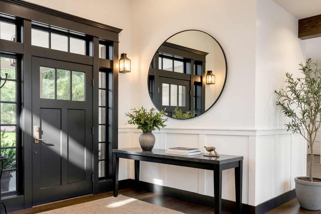
- Walls: Warm white (Benjamin Moore White Dove or similar)
- Baseboards & Crown Molding: Deep charcoal gray
- Doors & Door Trim: Matching deep charcoal
- Ceiling: Barely lighter warm white
This is the gateway into bold trim colors — and it converts skeptics fast. Graphite trim on warm white walls is clean, architectural, and instantly elevated. The room gains definition without drama. Your baseboards and crown molding stop being afterthoughts and start being features. It works beautifully in an entryway, a home office, or a formal hallway — anywhere you want that first impression to land hard. Start here if you want bold without the commitment anxiety.
2. Deep Navy & Creamy Linen: The Coastal Library
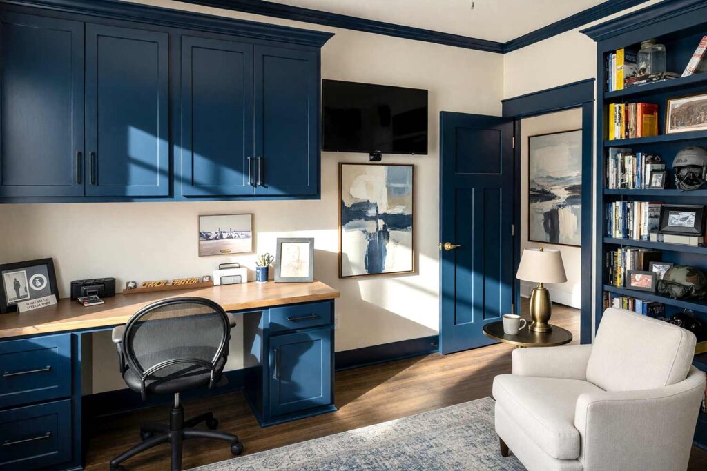
- Walls: Creamy linen (Sherwin-Williams Antique White or Navajo White)
- Baseboards & Crown Molding: Deep naval blue
- Doors & Door Trim: Deep naval blue
- Ceiling: Pale warm ivory
Navy is one of those contrasting trim colors that feels authoritative and grounded no matter where it lands. Against creamy linen walls, it’s warm enough to feel welcoming but bold enough to be unmistakably intentional. Living rooms, home offices, entryways, dining rooms — this pairing performs everywhere it’s asked to. It’s the trim color that makes a room feel like it was curated, not just painted.
3. Forest Green & Warm Sand: The Nature-Forward Den
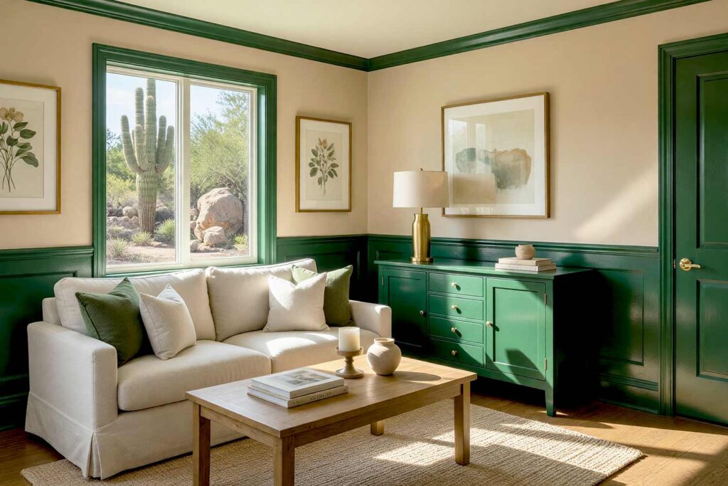
- Walls: Warm sand or soft camel beige
- Baseboards & Crown Molding: Deep hunter green
- Doors & Door Trim: Hunter green with brass hardware
- Ceiling: Pale sand (warm white with just a hint of yellow-green)
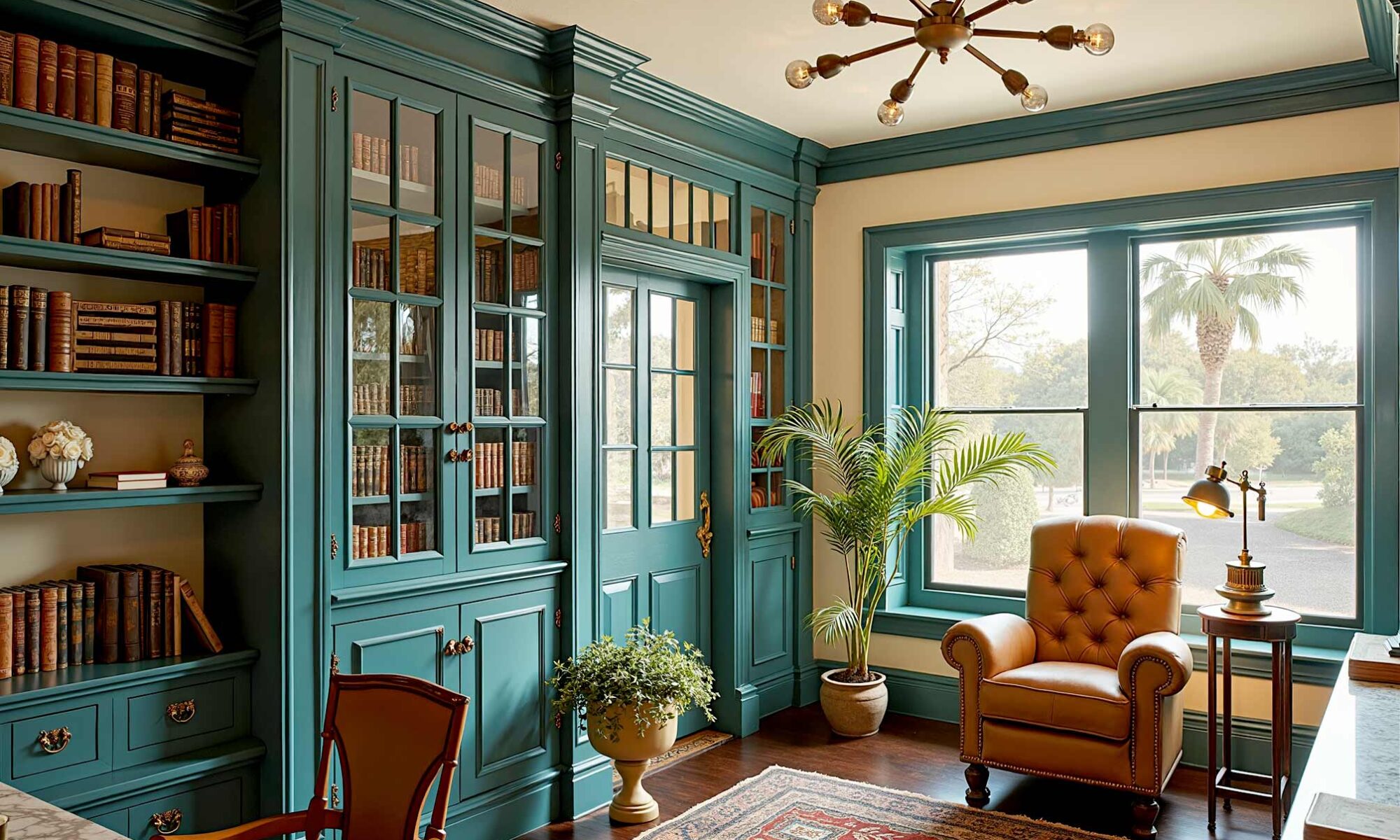
Bold trim colors in earthy green are having a serious moment. Against warm sand walls, deep hunter green trim feels rooted and collected — the kind of color move that makes guests stop mid-sentence. Add brass hardware on the doors and you’ve got a room that looks like it was lifted straight from the pages of a high-end design magazine. The ceiling in pale sand keeps it from going too dark, so the room still breathes. A home library, reading room, or paneled study is where this palette reaches its full potential — surround yourself with books, warm light, and those green baseboards, and you will never want to leave.
4. Soft Black & Dusty Blush: The Modern Romantic
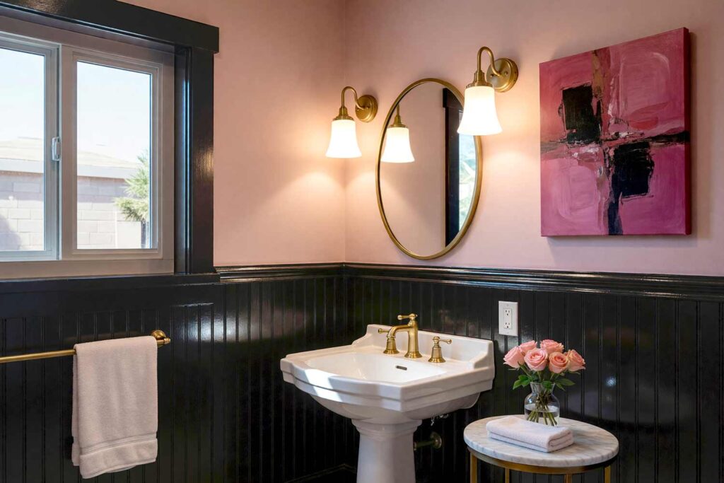
- Walls: Dusty blush (muted, chalky — not bubblegum)
- Baseboards & Crown Molding: Soft black (matte finish)
- Doors & Door Trim: Soft black
- Ceiling: Pale blush (a whisper softer than the walls)
If you think contrasting interior trim colors have to feel industrial to be dramatic, this combination will change your mind completely. Soft black against dusty blush is quietly stunning — romantic without being precious, modern without being cold. The ceiling in an even paler blush wraps the space in warmth. A powder room or formal sitting room in this palette is pure intention — intimate enough to feel genuinely special, bold enough to be completely unforgettable.
5. Warm Chocolate Brown & Pale Sage: The Earthy Escape
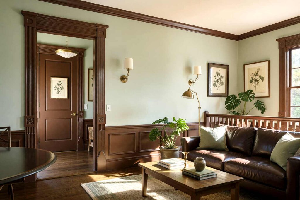
- Walls: Pale sage green
- Baseboards & Crown Molding: Warm chocolate brown
- Doors & Door Trim: Chocolate brown (matte or satin)
- Ceiling: Soft white with warm undertones
This one is nature-inspired in the best possible way. Chocolate brown trim on sage walls looks like something out of a beautifully curated boutique hotel — the kind of room someone actually thought about. Bold trim colors in warm earth tones ground the palette while pale sage keeps the energy calm and breathable. Den, home office, dining room: it works everywhere it lands.
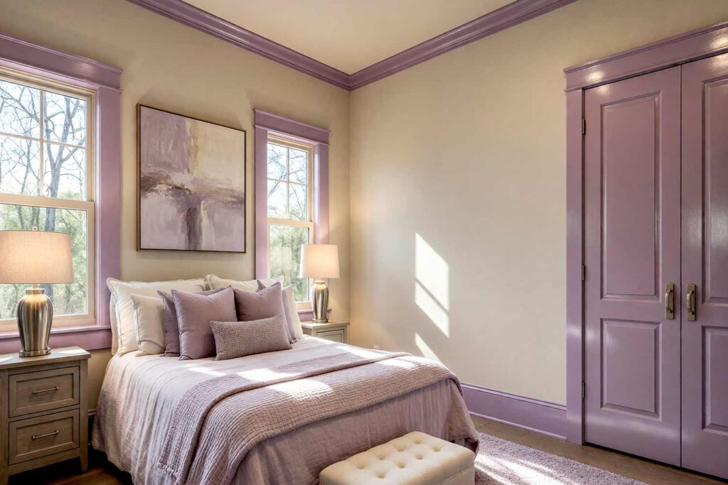
6. Deep Plum & Dusty Mauve: The Jewel Box
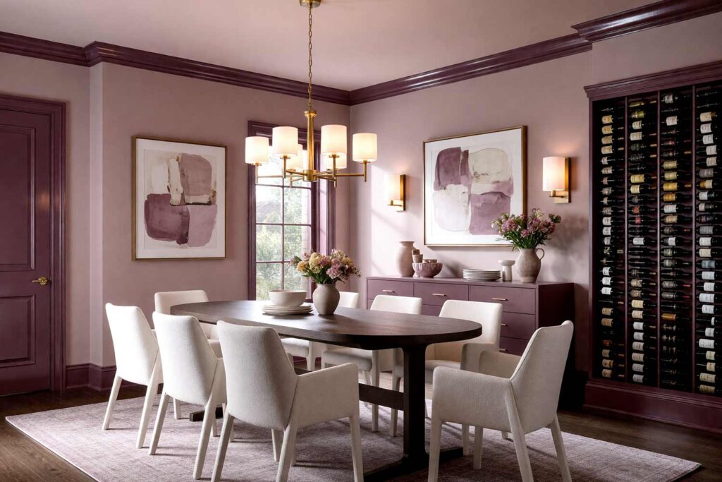
- Walls: Dusty mauve (muted rose-taupe)
- Baseboards & Crown Molding: Deep plum or eggplant
- Doors & Door Trim: Plum with matte gold hardware
- Ceiling: Pale mauve (softer whisper version of the walls)
Contrasting interior trim colors don’t get more moody-gorgeous than this. Deep plum trim in a dusty mauve room creates a gallery-like layered effect — each surface slightly different, each contributing to an overall feeling of curated luxury. The matte gold hardware on the doors is the detail that makes it art. A formal dining room or a richly appointed wine room is where this palette truly comes alive — somewhere candlelit evenings are the whole point. This is for the homeowner who’s completely done with playing it safe.
7. Terracotta & Aged White: The Mediterranean Revival
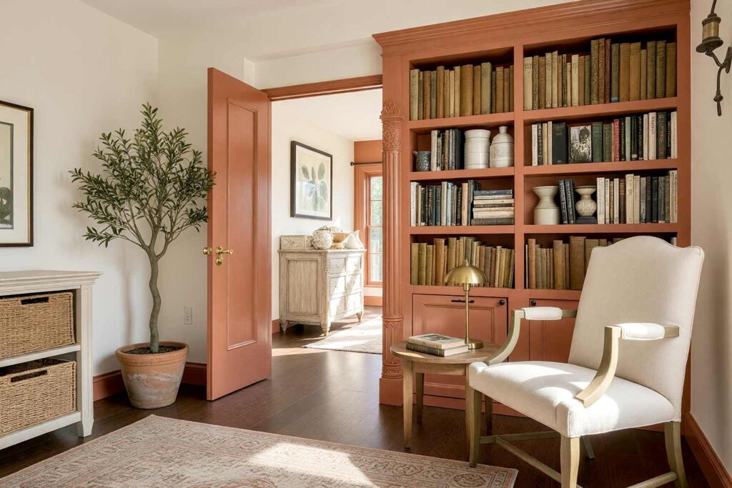
- Walls: Aged white or warm off-white
- Baseboards & Crown Molding: Dusty terracotta (muted, earthy — not orange)
- Doors & Door Trim: Terracotta
- Ceiling: Bright warm white (creamy, not stark)
Here’s what most people don’t consider: contrasting trim colors don’t have to be dark to be dramatic. A warm, earthy terracotta on your baseboards and door trim against aged white walls feels ancient, worldly, and completely unexpected. It’s the trim color that makes a room feel like it was designed by someone who’s actually traveled. Timeless and totally fresh at the same time. For something even more immersive — where one dominant hue owns every surface — color drenching is a technique that takes this thinking to its boldest conclusion.
8. Golden Ochre & Amber: The Perpetual Golden Hour
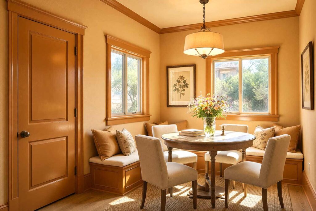
- Walls: Warm honeyed ochre (mid-tone — think aged parchment with heat)
- Baseboards & Crown Molding: Rich amber-ochre (deeper, more saturated)
- Doors & Door Trim: Deep saffron-amber with aged brass hardware
- Ceiling: Pale straw (a barely-there golden white)
Nobody expects tone-on-tone to qualify as contrasting interior trim colors — and that’s exactly what makes this combination so compelling. Deeper amber baseboards and crown molding against honeyed ochre walls don’t fight for attention; they create depth through layering. The contrast is quiet, but it is unmistakable. A kitchen, breakfast nook, or sunroom in this palette feels like perpetual golden hour — warm, luminous, and completely alive. The pale straw ceiling keeps things lifted and airy, while the richer amber trim anchors every surface with warmth. Add aged brass hardware on the doors and the whole room starts to feel like it’s been there for generations — in the absolute best way.
9. Inky Black & Pale Celadon: The Drama You’ve Been Avoiding
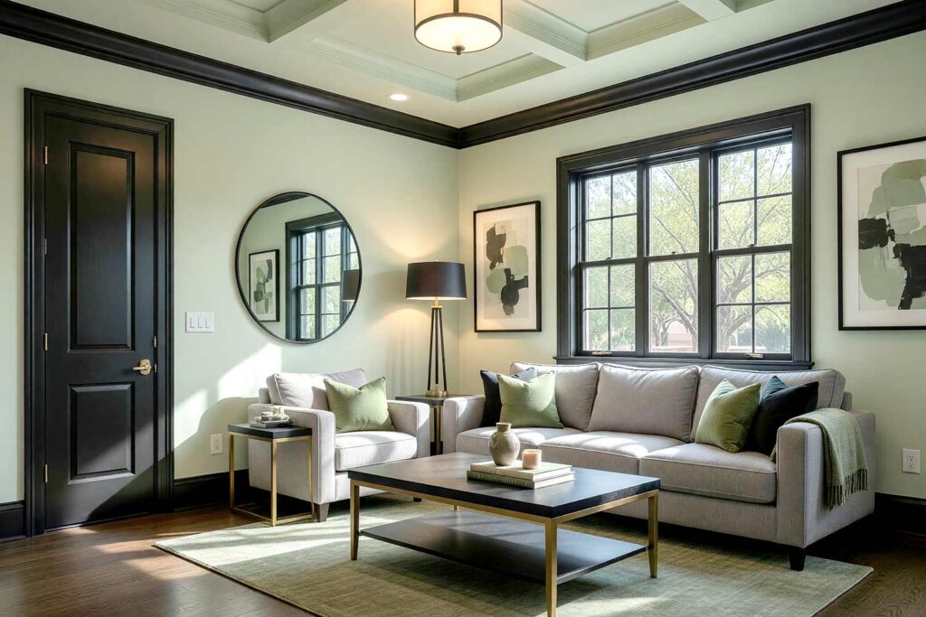
- Walls: Pale celadon or soft sage (light, cool green)
- Baseboards & Crown Molding: Inky black
- Doors & Door Trim: Inky black
- Ceiling: Barely-there celadon (even lighter than the walls)
These are dark trim colors that everyone keeps pinning but rarely commits to — and they are absolutely worth the leap. Inky black on pale celadon walls is architecturally stunning. Sharp enough to define every detail, while the soft green on the walls keeps it from going full gothic. The ceiling in a whisper-soft celadon wraps the whole thing together. A living room in this palette doesn’t need another statement piece — it is the statement. According to House Beautiful, dark-painted trim and millwork have become one of the most searched interior design trends — and this pairing makes the case for why.
10. Burgundy & Soft Warm White: The Vintage Maximalist
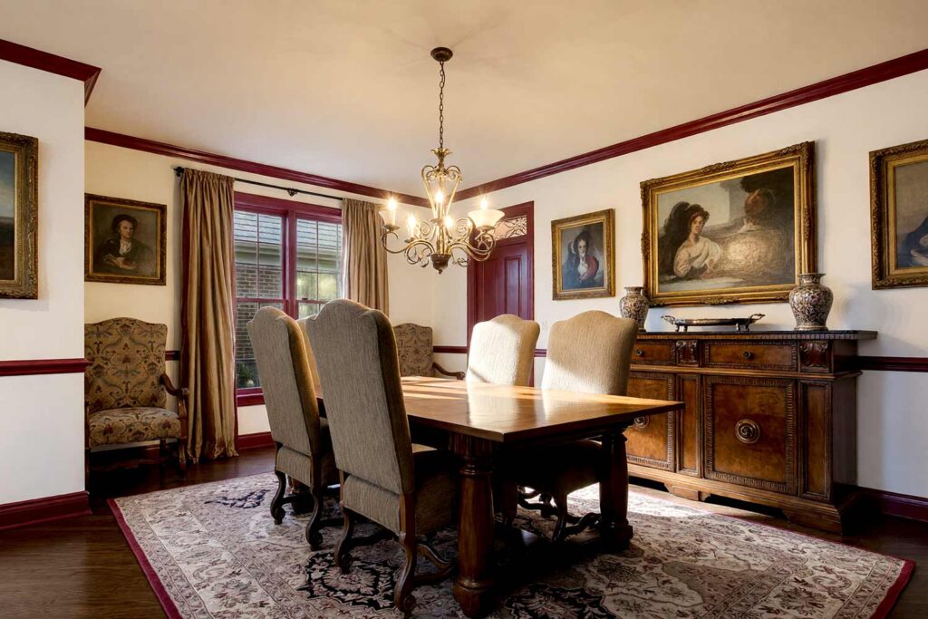
- Walls: Soft warm white (creamy, with yellow undertones)
- Baseboards & Crown Molding: Deep burgundy
- Doors & Door Trim: Burgundy with oil-rubbed bronze hardware
- Ceiling: Antique warm white (slightly deeper than the walls)
Burgundy trim is a whole personality. Contrasting interior trim colors in deep wine tones bring warmth and history to a room in a way no accent wall ever could. This is traditional architecture dressed for dinner — classic bones, unexpected execution. A formal dining room in this palette feels like theater. A hallway feels like an invitation. Dark trim colors in rich wine tones are experiencing a major revival in period and craftsman homes, where the architectural details deserve to be celebrated — not hidden. The Spruce offers a great look at how contrasting millwork and trim elevate period homes into something genuinely unforgettable — and burgundy is leading that conversation right now.
Final Brush Strokes: Your Trim Has a Lot to Say
Your trim isn’t a finishing detail — it’s the frame around every single thing that happens in your home. Every conversation. Every morning. Every first impression. Contrasting interior trim colors give that frame a voice, a presence, a point of view. And you don’t need new furniture or a bigger budget to get there. You just need to put the white paint roller down, pick a color that actually excites you, and commit. Your baseboards, crown molding, and door casings are already waiting to say something. Let them say it loudly. Whether you go graphite, forest green, plum, or burgundy, the right contrasting trim colors are what separate a house that looks finished from a home that looks designed. That difference is everything — and it starts with one bold choice.
Contrasting interior trim colors are baseboards, crown molding, and door casings painted in a shade that deliberately stands apart from the walls — typically darker or bolder — to add depth, definition, and intentional style to any room.