
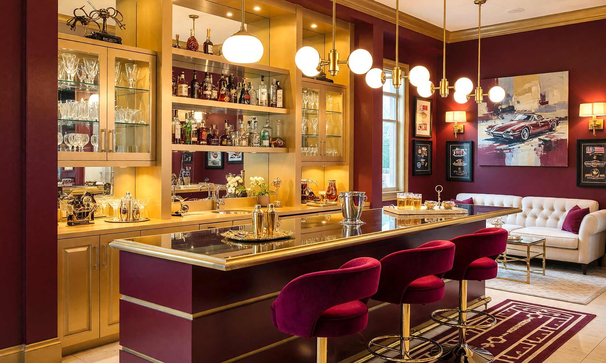
Every house has a dead zone. You know the one — that awkward alcove nobody quite knows what to do with, the dining room corner that’s collected junk mail since 2019, or the closet that’s technically “storage” but really just hides your regret. I look at those spaces and see something else entirely: a stage. A little pocket of the house just begging to become a place where the ice clinks, the music’s low, and your guests suddenly don’t want to leave. That’s the whole magic trick behind great home bar paint colors — they don’t just fill a wall, they turn dead space into the best seat in the house.
Choosing Home Bar Paint Colors for Any Style
Here’s a truth I’ve learned doing this work: an open-concept home can start to feel like one long, beige run-on sentence if every surface matches. A bar nook is your chance to break the sentence — to punctuate it with something moody and unexpected. Deep charcoals, sage greens, warm ochres, and terracottas don’t just look good; they act like a visual wall, telling your eye “you’ve entered a different mood now” without a single stud being moved. Think of your home bar paint colors as the outfit change between acts of a play — same house, totally different energy.
This isn’t about matching your existing palette. It’s about contrasting it, thoughtfully. A rich, saturated bar nook next to lighter living space reads as intentional, not chaotic, and it’s one of the easiest ways to add drama to a home without touching a hammer. If you’ve ever wondered how to give your cabinets a total identity shift, a bar build-out is basically that idea’s cooler, more social cousin. Good house paint colors do double duty in a space like this — they set the mood and the traffic pattern, pulling guests toward the drink station without a single sign. For layout inspiration before you even pick up a brush, Houzz’s home bar gallery is a great place to see how real homeowners are carving out these spaces.
From Dry Bar to Full Built-In
The beauty of home bar paint colors is they scale with your ambition. Maybe you’re just talking a slim dry bar cabinet tucked into a dining room corner — a few shelves, a mirror, a bold-painted back panel. Maybe you’re going bigger: a full built-in peninsula with a wine fridge, glass shelving, and a paint job so good it becomes the room’s focal point before anyone even notices the bottles. Easy Room AI’s rundown of 2026 bar designs breaks this scale down well, from mobile bar carts all the way to permanent built-ins. I’ve seen homeowners in Arcadia turn a forgotten hallway closet into a jewel-box cocktail nook that gets more Instagram traffic than the actual living room. The scale doesn’t matter nearly as much as the commitment to color — and honestly, some of the best house paint colors I’ve seen used in a bar nook were picked for a five-square-foot space, not a whole room.
And here’s the unexpected idea, the one nobody’s really doing yet: paint the inside back of your bar nook in a high-gloss, almost lacquer-like deep color — think aubergine or ink blue — and leave the outer facing cabinetry or archway in a matte, muted neutral. It creates a “portal” effect, like your bar is a hidden little world glimpsed through a frame. Nobody expects a home bar to feel like stepping into a different room, but with the right two-tone approach, that’s exactly the sensation you get. Homedit’s look at 2026 bar trends touches on this shift toward bars built into architecture rather than sitting on top of it. This is where paint color inspiration really earns its keep — a small, weird idea like this costs almost nothing and changes the entire feel of the room.
10 Home Bar Paint Color Combinations Worth Stealing
Here’s the fun part: ten fully realized home bar paint colors combinations, each tied to a specific style so you’re not just picking colors, you’re picking a whole mood.
Charcoal & Buttercream: Art Deco Drama
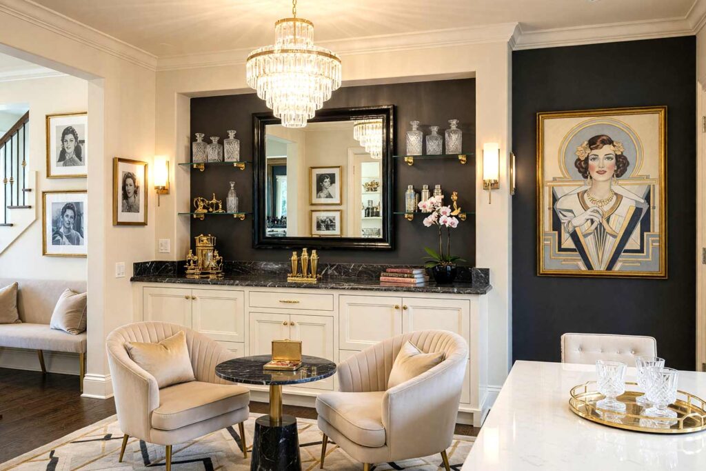
Walls: Champagne beige and graphite charcoal accent | Cabinet/Millwork: Rich buttercream | Ceiling: Champagne beige | Trim: Bright white
A graphite accent wall sets an almost theatrical backdrop, while buttercream cabinetry pops like a spotlight against a dark stage — this is Art Deco through and through, all geometry and confidence. A champagne-beige ceiling keeps things soft overhead, and crisp white trim adds the sharp lines the style demands. Lean into the era with fluted glass shelving, a sunburst mirror, and a small collection of etched crystal decanters lined up like jewelry — this corner gets photographed before anyone even orders a drink.
Terracotta & Cream Sand: Mediterranean Revival Escape
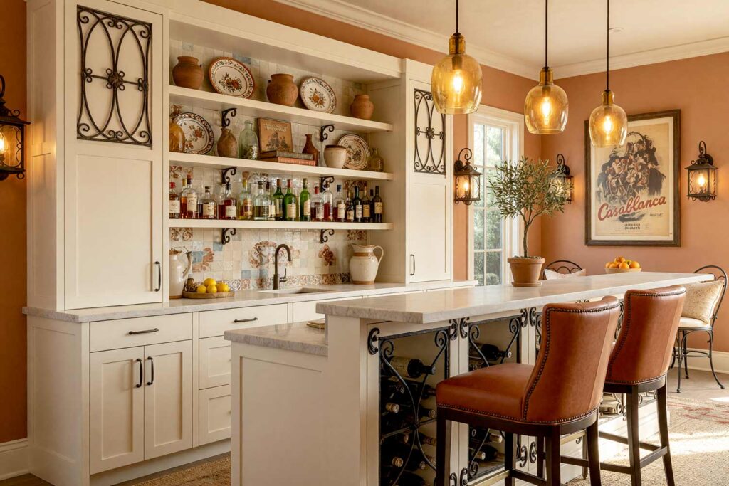
Walls: Warm terracotta | Cabinet/Millwork: Creamy sand | Ceiling: Pale plaster white | Baseboards: Cream
Terracotta walls bring instant warmth, the kind that makes you crave citrus and salt air — classic Mediterranean revival. Creamy sand cabinetry keeps things light and airy, while plaster-white ceilings mimic sun-bleached villas along the coast. Add a wrought-iron wine rack, a scattering of hand-painted ceramic tile as a backsplash, and a bowl of fresh citrus on the counter, and this nook feels like a stolen evening on the Amalfi coast.
Bottle Green & Camel: British Countryside Estate
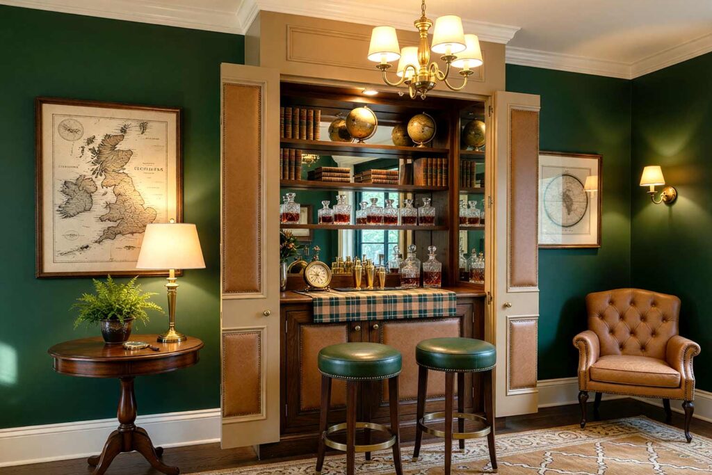
Walls: Deep bottle green | Cabinet/Millwork: Warm camel | Ceiling: Soft parchment | Trim: Ivory
Bottle green walls have that library-den gravity, and warm camel cabinetry adds a leathery richness that instantly says British countryside estate. Parchment ceilings soften the drama overhead, while aged ivory trim keeps every edge crisp and intentional. This is where a dark academia streak sneaks in nicely — think leather-bound books stacked on open shelving, a tartan bar runner, and cut-crystal decanters that look like they’ve been in the family for generations.
Slate Teal & Marigold: Mid-Century Modern Statement
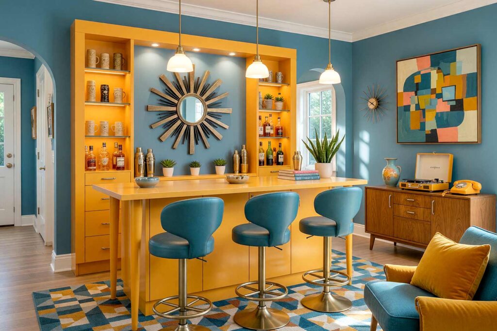
Walls: Slate teal | Cabinet/Millwork: Warm marigold | Ceiling: Soft white | Trim: Very light gray
If you love clean lines and confident color blocking, this one’s for you — slate teal and marigold are pure mid-century modern energy, similar in spirit to the palettes I explored in mid-century color inspirations for every room. Soft white ceilings keep the palette from feeling heavy, and warm grayish white trim ties things together. A starburst clock, a low walnut credenza, and a set of tiki-adjacent mugs on open shelving nod to the retro atomic kitsch this era loved.
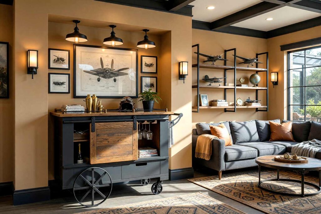
Espresso Brown & Ivory: Urban Industrial Loft
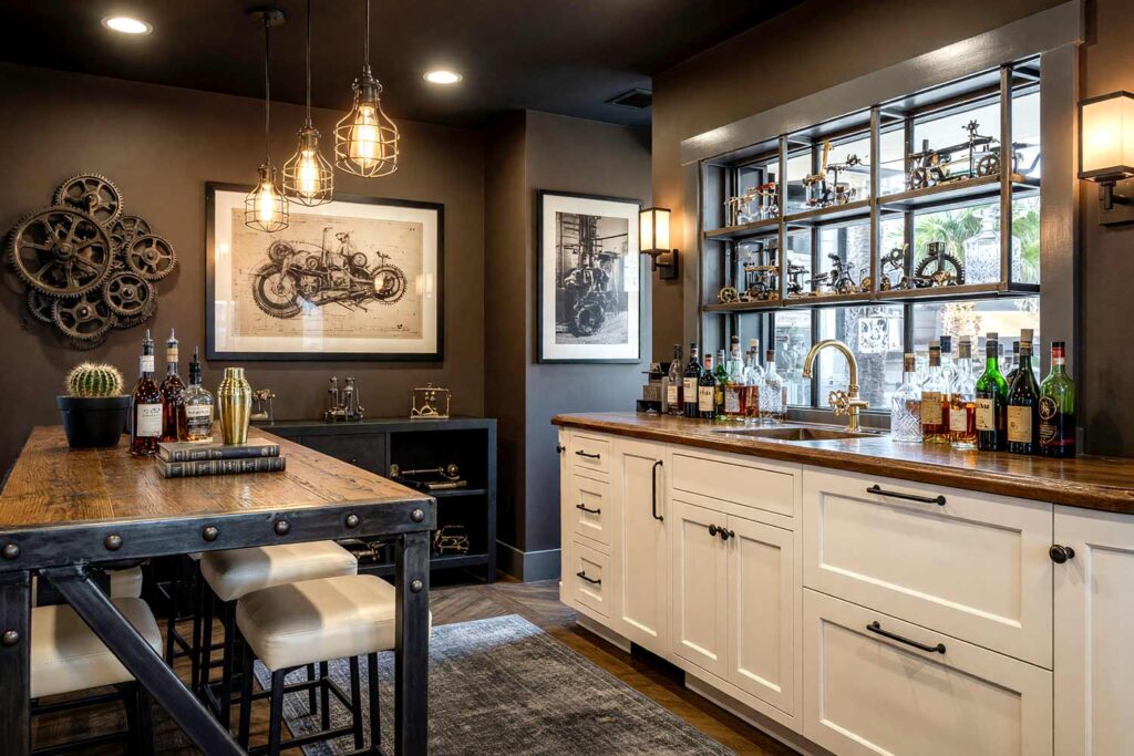
Walls: Deep espresso brown | Cabinet/Millwork: Warm ivory | Ceiling: Matte black (painted, not exposed) | Baseboards: Light charcoal gray
Espresso walls feel raw and grounded, the kind of backdrop that makes exposed materials sing — total urban industrial loft mood. Warm ivory cabinetry breaks up the darkness without softening the edge, and a black-painted ceiling (skip the real exposed ductwork) adds theatrical height. Charcoal baseboards keep the base weighty. Pair with a steel-look shelving unit, Edison-style bulbs, and a small gallery of black-and-white photography for that unmistakable loft-bar feel.
Warm Olive Drab & Cream: Safari Lodge Retreat
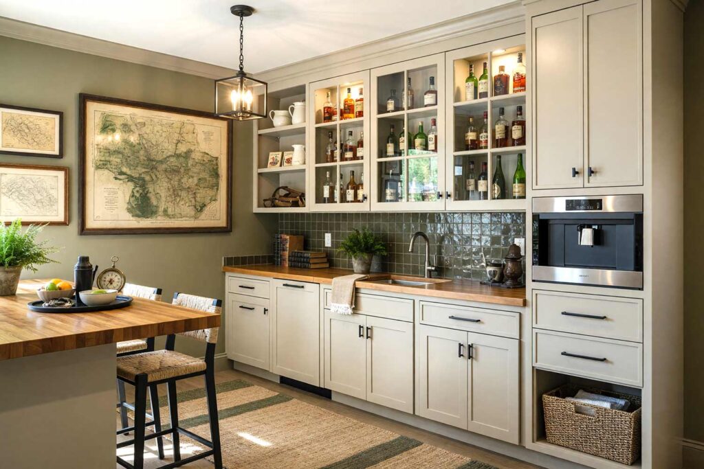
Walls: Olive drab | Cabinet/Millwork: Warm cream | Ceiling: Soft ivory | Baseboards: Deep olive
Olive drab has an expedition-ready seriousness, warmed up considerably by cream cabinetry — this is safari lodge without a single literal animal print. Ivory ceilings keep the room from feeling too dark, while deep olive baseboards add grounding weight. A framed vintage map of a specific continent and a woven basket collection nod to the travel theme, making the space feel earned rather than decorated.
Aubergine Purple & Honey Gold: Dark Academia Nightcap
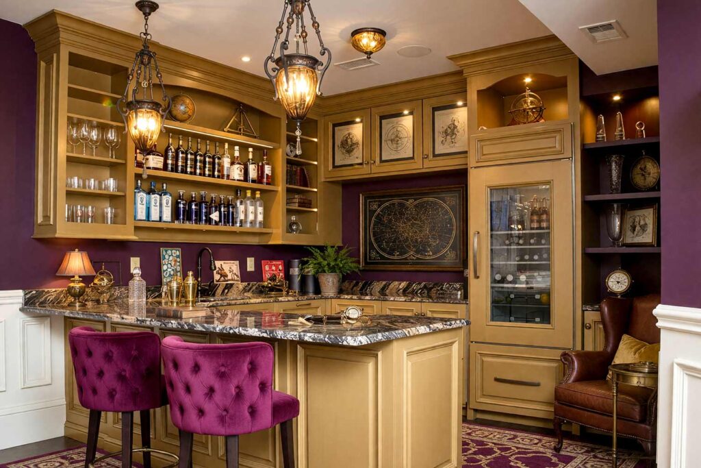
Walls: Deep aubergine purple | Cabinet/Millwork: Warm honey gold | Ceiling: Soft parchment | Trim: Aged ivory
This pairing is for the homeowner whose bookshelves outnumber their throw pillows. Aubergine walls have a moody, velvet-curtain richness, while honey gold cabinetry glows like the last page of a favorite novel — pure dark academia, minus the actual homework. A parchment ceiling keeps it from feeling like a cave, and aged ivory trim adds definition. Round it out with a small stack of leather-bound books, an antique-style globe, and low amber lighting for a nook that feels borrowed from a private study.
Universal Khaki & Cherry Red: Quiet Luxury with a Wink
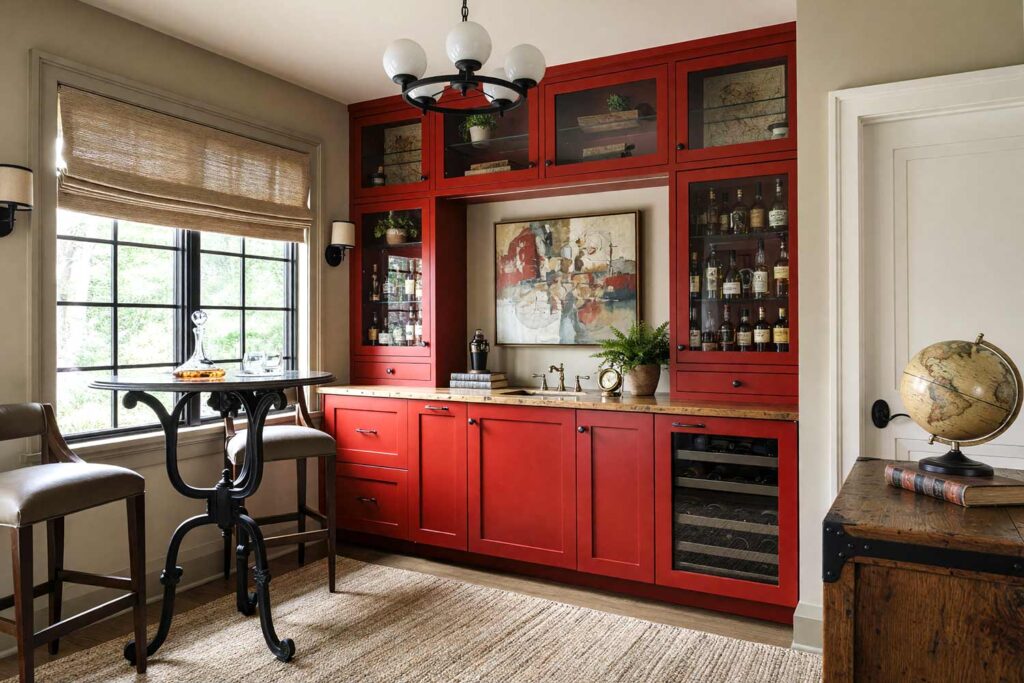
Walls: Universal Khaki (Sherwin-Williams’ 2026 Color of the Year) | Cabinet/Millwork: Cherry red | Ceiling: Soft ivory | Baseboards: Warm taupe
Khaki has gone from safe to sophisticated — Elle Decor’s coverage of Sherwin-Williams’ 2026 Color of the Year calls it “a non-boring take on a tried-and-true neutral,” and I couldn’t agree more. Paired with a punchy cherry red cabinet, it reads quiet luxury with a wink — refined but never boring. Soft ivory ceilings and warm taupe baseboards keep the palette grounded. Add brass-free black hardware, a curved bar shelf, and a single striking piece of framed art for a nook that feels expensive without trying too hard.
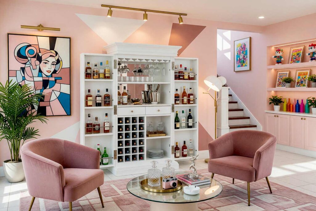
Soft Black & Dusty Rose: Old Hollywood Glam
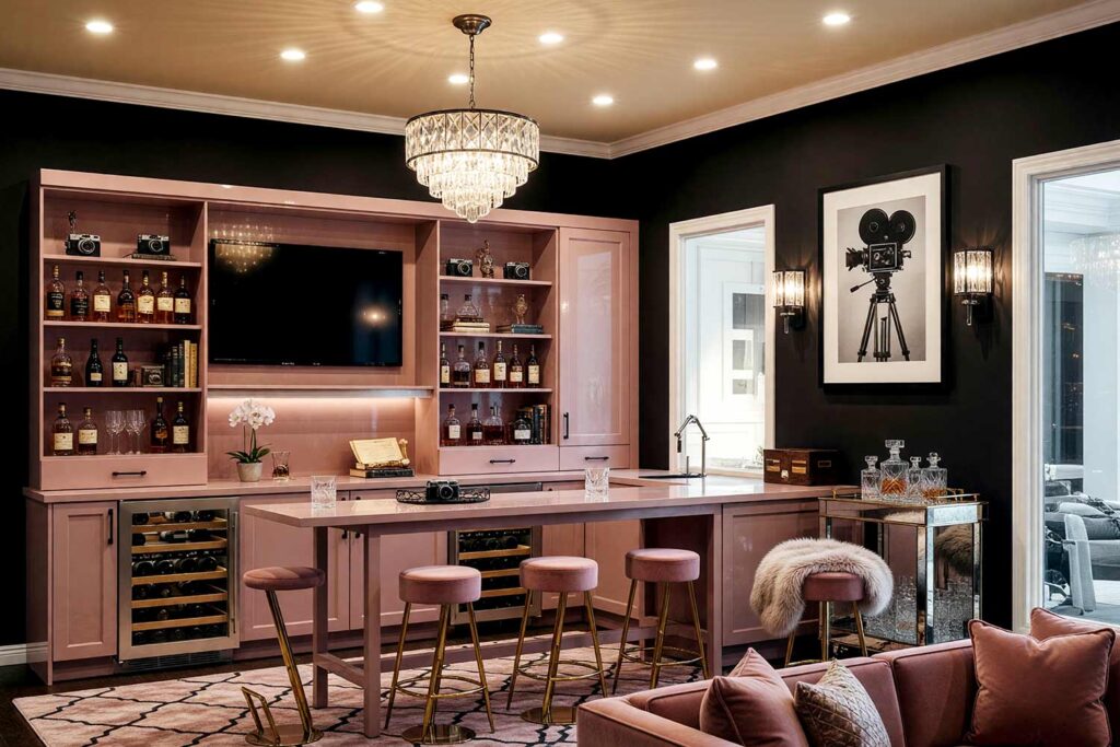
Walls: Soft black | Cabinet/Millwork: Dusty rose | Ceiling: Warm champagne beige | Trim: Bright white
There’s nothing shy about this one. Soft black walls create instant drama, and dusty rose cabinetry softens the mood just enough to feel glamorous rather than gothic — think old Hollywood glam, cocktail hour at its most theatrical. A champagne-beige ceiling keeps light bouncing through the space, while bright white trim sharpens every edge. Finish with a mirrored bar cart, a faux fur throw over a nearby stool, and a crystal ice bucket that catches every bit of ambient light.
Warm Marigold & Soft White: Retro Diner Throwback
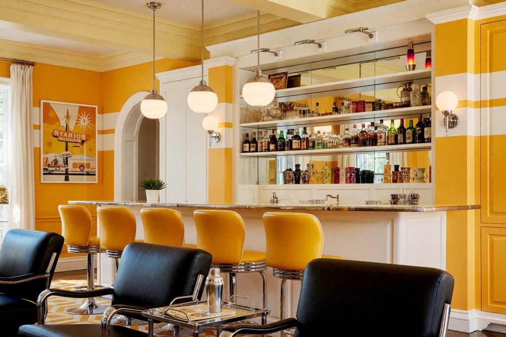
Walls: Warm marigold (with a bold horizontal stripe in soft white) | Cabinet/Millwork: Soft white | Ceiling: White | Trim: Bright white | Beams: Pale yellow
A bold marigold-and-white stripe treatment brings genuine retro atomic diner energy without a single checkerboard floor required. Soft white cabinetry keeps the palette from feeling like a cartoon, and pale yellow ceilings add warmth overhead. A small chrome-look shelf holding a lava lamp and a couple of tiki mugs finishes the look — playful, nostalgic, and genuinely fun to stand in front of.
Final Brush Strokes: Make the Bar the Best Seat in the House
At the end of the day, a home bar isn’t really about the liquor — it’s about creating a spot in your house that feels like yours, unmistakably. The right home bar paint colors turn a forgotten corner into the place everyone gravitates toward, drink in hand, without ever quite knowing why. Whether you lean Mediterranean-warm or old Hollywood glam, the goal is the same: separate the space visually, commit to the mood, and let good house paint colors do the heavy lifting. If your next project Is a full-on entertaining overhaul, it might be worth pairing this idea with media room paint inspiration for a whole wing built around good company — that kind of paint color inspiration tends to spread room to room once you start. Your dead corner has potential — go paint it like you mean it.
Rather than painting the whole nook one tone, try a single unexpected accent wall, like a bold sky blue behind the bar set against warm terracotta on the surrounding walls, for a burst of contrast that feels intentional, not random.