Last Updated on July 4, 2026
Somewhere between the all-white kitchen craze and the endless parade of “safe” neutrals, a quiet revolution started — and it goes like this: your upper cabinets and your lower cabinets don’t have to match. In fact, the moment they stop agreeing, something remarkable happens. The kitchen stops looking like a catalog page and starts feeling like yours. Two-tone kitchen cabinets are doing something that all-matching kitchens simply can’t: expressing real personality, defining space with intention, and creating rooms people genuinely can’t stop talking about.
The range of what’s possible — from electric complementary pairings pulled straight off the color wheel to dramatic contrasts that anchor the space with architectural confidence — is genuinely staggering. And the best part? You don’t need a full gut renovation to get there. You just need the right colors and the courage to commit.
Two Strategies That Make Two-Tone Kitchen Cabinets Work
Before the brushes come out, understanding the why behind these pairings makes all the difference. Dual-tone kitchen cabinets succeed through deliberate strategy — not happy accidents. There are two main approaches worth knowing: Complementary Colors and Contrasting Colors. Complementary colors live on opposite sides of the color wheel, and when paired correctly, each one amplifies the other — making both look more vibrant, more intense, more alive. Contrasting colors play an entirely different game, placing a bold, dark shade on the lower cabinets to ground the space while something light and airy rides the upper cabinets and keeps the room breathing. Think of it as dressing your kitchen the same way you’d dress yourself for an event where you actually want to be noticed. Both strategies are fearless. Both reward anyone who refuses to default to the obvious. For more boundary-pushing kitchen color inspiration, these provocative kitchen color schemes are worth a serious look.
Complementary Two-Tone Kitchen Cabinets: When Opposites Attract
Complementary colors sit directly across from each other on the color wheel, and when they meet on kitchen cabinets, something visually electric happens — each color makes the other look more saturated, more intense, more alive. It’s color science working entirely in your favor. Here are five two-tone kitchen cabinet pairings built entirely on this principle.
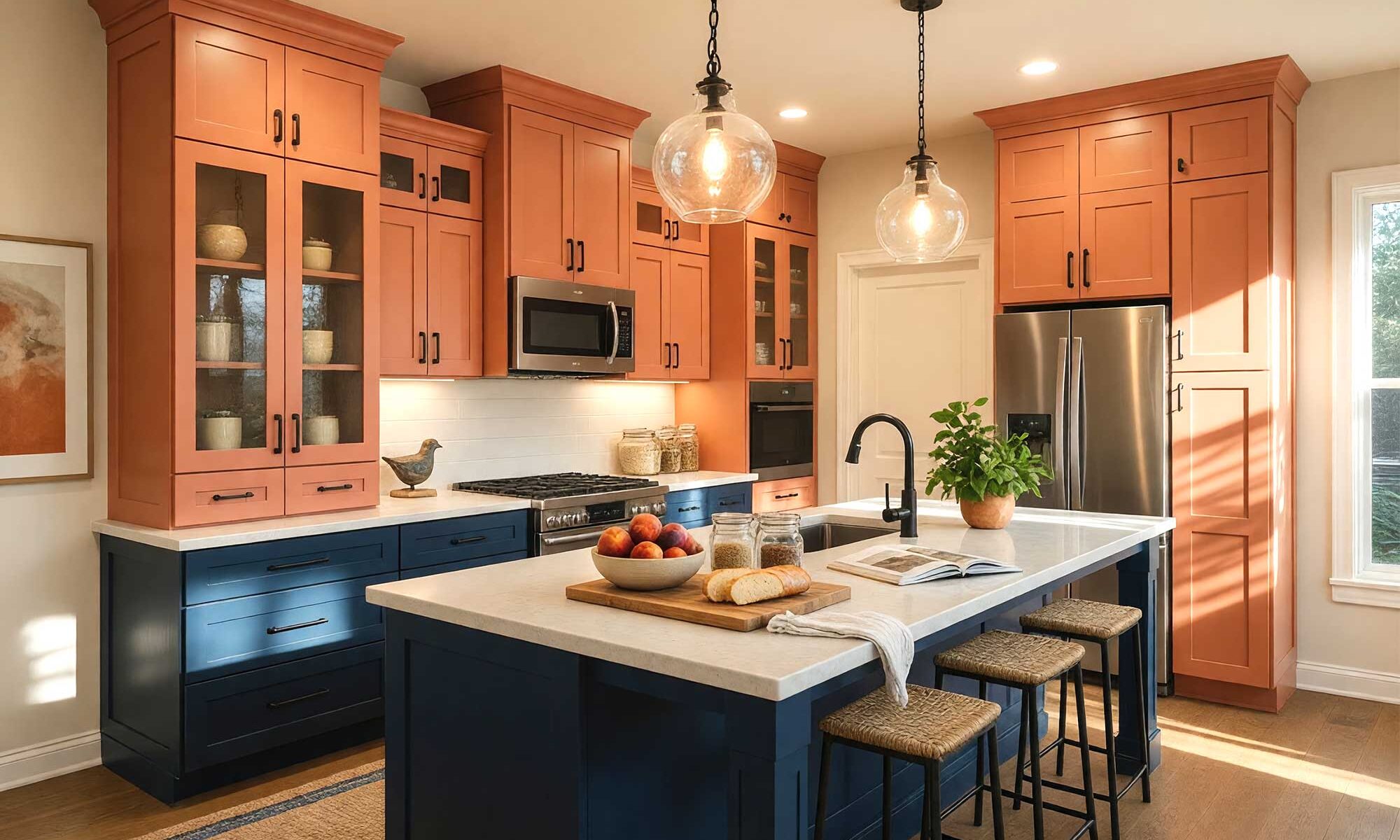
1. Deep Cobalt Blue (Upper) + Spiced Paprika Orange (Lower)
Walls: Warm linen
Ceiling: Pale warm ivory
Door & door trim: Crisp white
Baseboards: Crisp white
Blue and orange are direct complements — and this pairing is electric. Deep cobalt on the upper cabinets draws the eye upward and keeps the room feeling open and airy. Spiced paprika orange on the lowers is warm, earthy, and confident. Together, they hum with visual energy. Bold? Absolutely. Chaotic? Not even close.
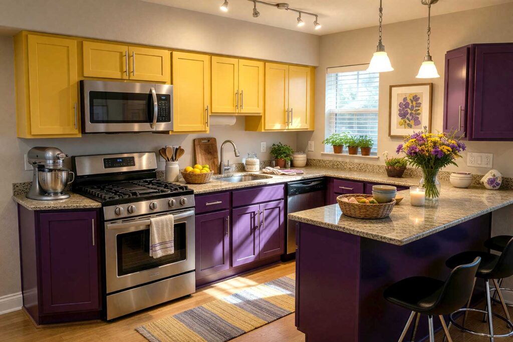
2. Marigold Yellow (Upper) + Deep Amethyst Purple (Lower)
Walls: Soft greige or warm white
Ceiling: Pale warm cream
Door & door trim: Antique white
Baseboards: Warm white
Yellow and purple — pure complements, pure magic. Marigold on the uppers has a warmth that’s almost nostalgic; deep amethyst on the lowers brings a jewel-box depth that’s straight-up glamorous. This is two-color kitchen cabinets at their most sophisticated — the kind of kitchen that genuinely surprises people with how beautiful bold color can be.
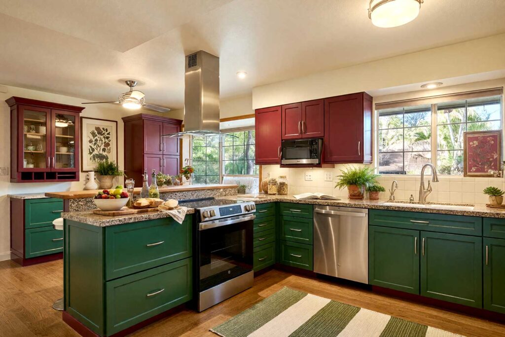
3. Cranberry Red (Upper) + Deep Hunter Green (Lower)
Walls: Warm cream or linen
Ceiling: Pale ivory
Door & door trim: Antique ivory
Baseboards: Crisp white
Red and green are textbook complements — but not the way you’re picturing. Forget holiday. Cranberry red on the uppers and deep hunter green on the lowers create something rich, moody, and genuinely striking. The secret is staying away from bright primaries and leaning into these deeper, more complex tones. For more on how earthy greens translate beautifully into kitchen design, these nature-inspired cabinet color ideas go deep.
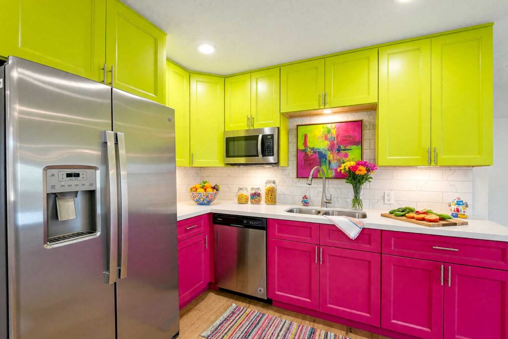
4. Electric Lime (Upper) + Vivid Magenta (Lower)
Walls: Crisp white
Ceiling: Bright white
Door & door trim: Bright white
Baseboards: Bright white
Yellow-green and red-violet complements — and this time, no muting, no aging, no sophistication filter whatsoever. Electric lime on the uppers is sharp, acid-bright, and completely thrilling. Vivid magenta on the lowers is fashion-forward and absolutely uncompromising. Two-tone kitchen cabinets like these are not for everyone — but for the homeowner who considers “too much” a fictional concept, this is exactly the kitchen they’ve been waiting for. It is the boldest pairing on this entire list. It is spectacular. And it is not sorry.
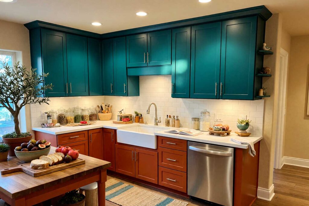
5. Peacock Teal (Upper) + Burnt Sienna (Lower)
Walls: Warm sand
Ceiling: Creamy white
Door & door trim: Warm white
Baseboards: Warm white
Blue-green and red-orange are complements — and this may be the most refined pairing on the list. Peacock teal on the uppers is cool, jeweled, and sophisticated; burnt sienna on the lowers is sun-baked and earthy. There’s a Mediterranean quality to this combination — alive with color, but deeply composed. Two-color kitchen cabinets in these tones feel like they were designed by someone who’s actually been places.
Now let’s flip the strategy — same commitment to bold color, completely different energy.
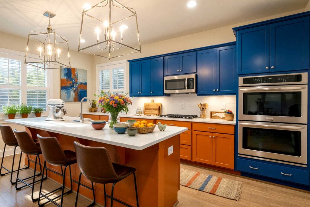
Contrasting Two-Tone Kitchen Cabinets: Dark Below, Light Above
This is the strategy that grounds the kitchen while keeping it breathing. Dark, rich colors on the lower cabinets create visual weight, permanence, and a sense of architectural intention. Light, airy colors on the uppers keep the room expansive and inviting. For a broader look at how the dark-and-light cabinet philosophy is being executed across kitchen styles right now, House Beautiful’s two-tone kitchen coverage is a good rabbit hole to fall into. And if you’re also thinking about what a bold contrasting color can do on a kitchen island, this deep dive into contrasting kitchen island paint colors takes that same philosophy somewhere spectacular. These five dual-tone kitchen cabinet combinations are some of the most searched kitchen looks right now — and it’s not hard to see why.
6. Graphite Charcoal (Lower) + Warm Ivory (Upper)
Walls: Soft warm greige
Ceiling: Crisp white
Door & door trim: Warm white
Baseboards: Crisp white
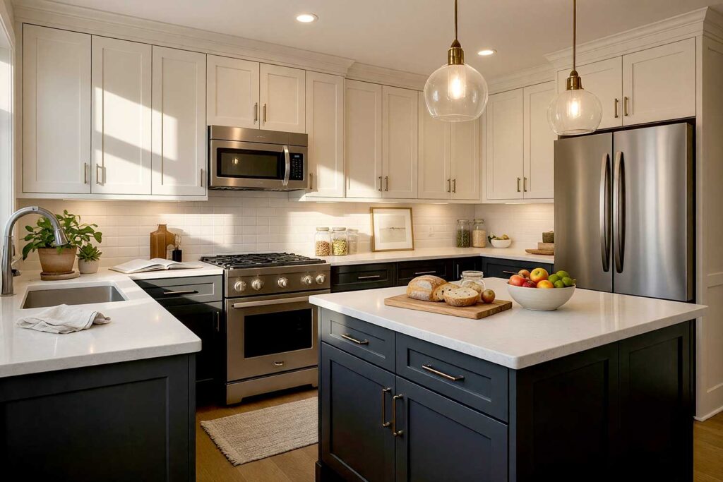
Deep graphite charcoal on the lower cabinets commands the room — modern, anchored, and completely confident. Warm ivory on the uppers lifts the space and keeps things from ever feeling heavy. The balance is deliberate and deeply satisfying. Dual-tone kitchen cabinets don’t have to shout to be extraordinary, and this one proves it beautifully.
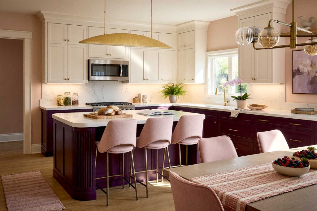
7. Deep Aubergine (Lower) + Pale Champagne (Upper)
Walls: Warm blush or soft ivory
Ceiling: Ivory
Door & door trim: Creamy white
Baseboards: Crisp white
Deep aubergine — saturated, rich, somewhere between purple and wine — on the lower cabinets is luxuriously moody without weighing the room down. Pale champagne on the uppers keeps the kitchen light, airy, and unexpectedly romantic. Two-color kitchen cabinets in aubergine and champagne stop people cold. This is the kind of kitchen that makes guests put their drinks down and actually look.
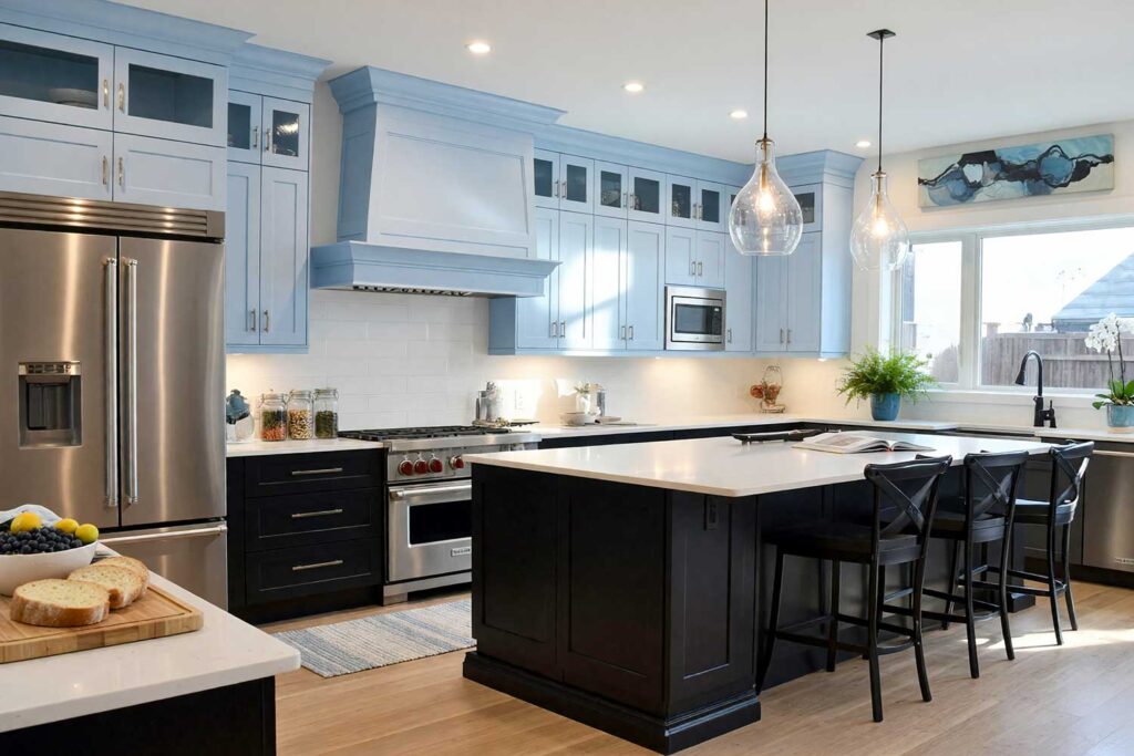
8. Midnight Black (Lower) + Powder Blue (Upper)
Walls: Crisp white or pale cool gray
Ceiling: Very pale sky blue
Door & door trim: Bright white
Baseboards: Bright white
This one is fearless. Midnight black lower cabinets are dramatic, unapologetic, and completely in charge. Powder blue uppers add a breath of lightness and whimsy that keeps the kitchen from ever feeling oppressive. The contrast is sharp, intentional, and visually stunning. Two-tone kitchen cabinets don’t get more dramatic — or more beautiful — than this combination. For even more unexpected cabinet color inspiration, these creative color combinations for kitchen cabinets go to some genuinely wild and wonderful places.
9. Deep Bottle Green (Lower) + Warm Butter Cream (Upper)
Walls: Warm cream or linen
Ceiling: Pale ivory
Door & door trim: Antique white
Baseboards: Warm white
Deep bottle green on the lowers has a richness that makes a kitchen feel like it has actual history — the kind of color that looks like it belongs in that room, permanently. Warm butter cream on the uppers warms the kitchen and adds a nostalgic charm that somehow feels completely fresh. This pairing is especially powerful in older homes with traditional cabinetry. Honestly? It’s stunning anywhere.
10. Oxblood Red (Lower) + Pale Sage Mist (Upper)
Walls: Warm cream
Ceiling: Pale ivory
Door & door trim: Warm white
Baseboards: Crisp white
Oxblood red — earthy, deep, and almost brown at its darkest — is one of the most criminally underused cabinet colors in existence. Pair it with pale sage mist on the uppers and something quietly extraordinary happens: the kitchen becomes a conversation between earth and air. Warm depth below. Cool, herbal freshness above. For more ideas on infusing personality into your cabinet color choices, this article on painting kitchen cabinets with a pop of personality keeps the inspiration going.
Bonus Palette: The July 4th Kitchen — Red, White & Blue (Done Right)
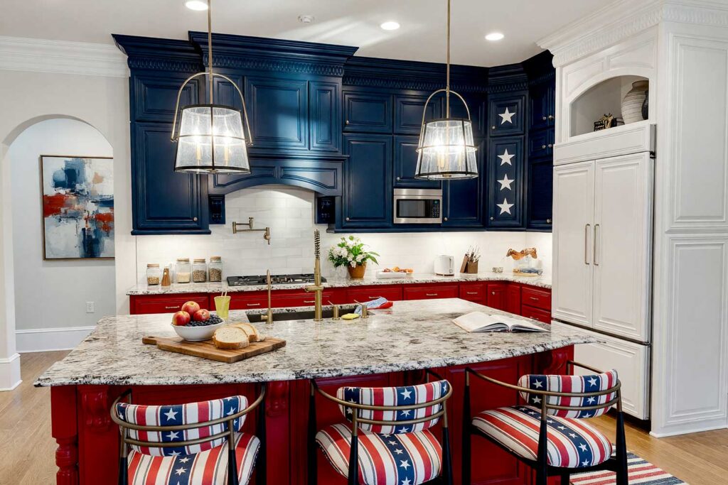
Walls: Bright white
Ceiling: Crisp white
Door & door trim: Bright white
Baseboards: Crisp white
This one is for the homeowner who’s ready to go all in. Patriot red on the lower cabinets. Classic navy blue on the uppers. And one detail that nobody sees coming: a single feature cabinet door painted with white stars on a field of navy — stenciled or hand-painted, it doesn’t matter. Either way, it becomes the most talked-about detail in the entire kitchen. Choose a corner cabinet, a pantry door, something that gets noticed without needing to work hard to earn it. That’s the one.
It’s celebratory without tipping into costume-y. Two-tone kitchen cabinets in red, white, and blue have something very few color combinations can claim: they tell a story. Patriot red grounds the space with warmth and confidence on the lowers. Classic navy rides the uppers with quiet authority. And that single star door? That’s the detail that seals the whole thing — part kitchen, part conversation piece, entirely unforgettable.
Final Brush Strokes: Your Two-Tone Kitchen Cabinets Are Waiting
Two-tone kitchen cabinets have a way of doing what very few design decisions can: they transform a room while revealing something true about the person who lives in it. Whether it’s the electric chemistry of complementary colors amplifying each other across the color wheel, or the grounded confidence of a dark base anchoring a light, airy top — these combinations are about far more than aesthetics. They’re about claiming your space.
Refusing to settle for a kitchen that could belong to anyone. The ten palettes here, plus a bonus that wraps your kitchen in a little national pride, are designed to do one thing: give you permission. Permission to be specific. To be bold. To be unforgettable. Two-color kitchen cabinets are the single most transformative decision you can make without touching a single cabinet box. Pick the one that scares you just a little. That one’s almost certainly yours.
Two-tone kitchen cabinets work best with complementary pairs — like cobalt blue with paprika orange, or cranberry red with hunter green — or with a bold, dark color on the lower cabinets and a soft, airy shade on the uppers for grounded, architectural contrast.