
Last Updated on September 12, 2026
“Neutral” gets a bad reputation, and honestly, it’s earned in most tract homes. Walk through a builder-grade spec house and you’ll find the exact same almond shade smeared across every wall, every hallway, every bedroom, with zero variation and zero personality. That’s not what a well-designed neutral color scheme looks like. A truly sophisticated palette built on neutral interior paint colors is layered, intentional, and anything but flat.
The difference between forgettable beige and a room that reads as expensive comes down to two things: contrast and restraint. Get those right, and even the quietest muted color scheme starts to feel architectural.
Why Neutral Interior Paint Colors Feel Expensive When Done Right
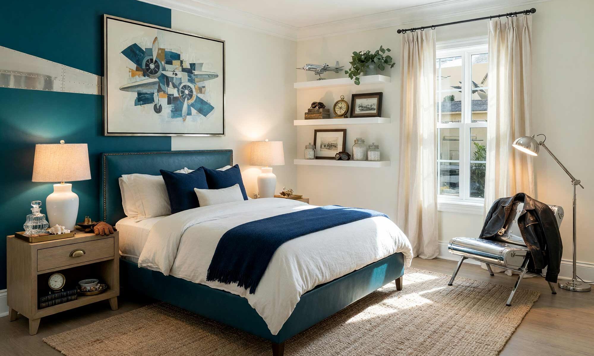
Flat, monochromatic neutrals almost always trace back to one mistake — using the same tone on every surface with nothing to interrupt it. A room with warm oat walls, crisp white trim, and rich walnut-toned cabinetry has depth the moment you walk in, while a room painted top to bottom in a single almond shade reads tired and a little clinical. That contrast is the whole secret behind sophisticated neutral paint colors: pair a warm base (cream, oat, camel, chestnut) with something higher-contrast, like a slate gray trim detail or deep charcoal accent.
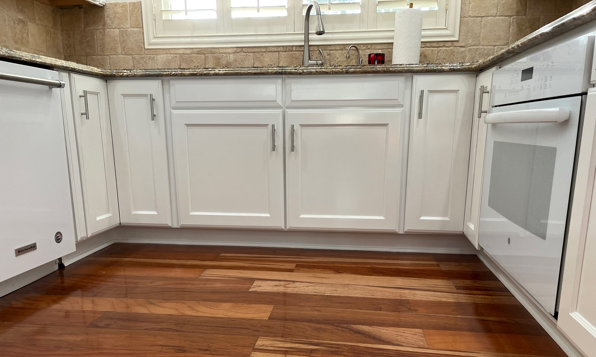
The 70/20/10 rule makes this easy to apply. Let a primary neutral wall color own roughly 70 to 80 percent of the room, then let a secondary tone or accent surface carry the rest. One of the boldest ways to put this principle to work is with contrasting trim against a neutral wall color, where the walls stay quiet while the trim does all the talking. A recent breakdown of core color rules for neutral rooms backs this up, noting that tone and contrast do most of the heavy lifting in any muted color scheme.
Committing to an undertone matters just as much as contrast itself. Pick warm or cool and stay loyal to it from room to room, shifting the intensity up or down instead of switching families entirely. A cool dove gray hallway can lead into a deeper charcoal study without feeling disjointed, but the moment a warm camel shows up in a house full of cool grays, the whole flow falls apart. That kind of discipline is what separates an accidental neutral color scheme from an intentional one.
Eleven Neutral Interior Paint Colors and Combinations with Real Personality
None of these pairings are safe-and-forgettable. Each one leans into a specific mood or architectural style, using neutral interior paint colors as the foundation and a smart accent to give the room its edge. Treat this list as a springboard, not a ceiling — mix, match, and adjust surfaces to fit the actual room.
Warm Oat & Chestnut Brown: Craftsman Study
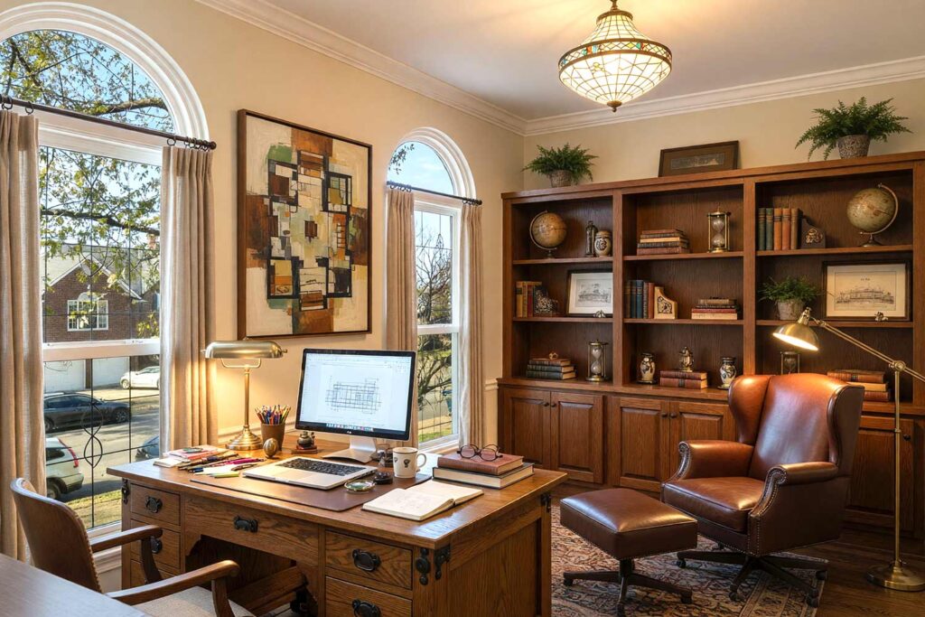
Walls: Warm oat | Built-In Shelving: Chestnut brown | Ceiling: Soft white | Baseboards/Trim: Soft white
This pairing is ideal for a home office that feels like it belongs in a century-old craftsman bungalow, minus the century of upkeep. Warm oat walls catch afternoon light like honey on old plaster, while chestnut brown built-ins add the gravity a reading nook deserves. A leather wingback chair, a brass banker’s lamp throwing a warm pool of light across a stack of hardcovers, and the faint smell of old paper mixed with linseed-oiled trim complete the scene. It’s a room that makes you want to slow down and actually finish a chapter for once.
Dove Gray & Deep Charcoal: Urban Industrial Loft
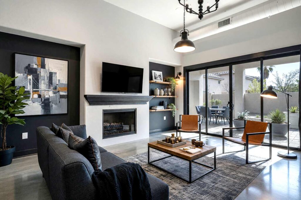
Walls: Dove gray | Accent Wall: Deep charcoal | Ceiling: Bright white | Baseboards/Trim: Deep charcoal
Light dove gray and deep charcoal form the backbone of a convincing industrial loft, and this combination proves that neutral paint colors can carry serious edge. The gray walls feel cool and architectural, almost like poured concrete softened just enough to live with, while a charcoal accent wall and matching trim ground the space with weight. Exposed shelving stacked with black-and-white photography books, a factory-style pendant hanging low over a steel-legged console, and the faint cool draft that seems to live in a room this crisp finish the look. It’s moody, confident, and never once apologizes for it.
Putty & Ochre: Mediterranean Revival Kitchen
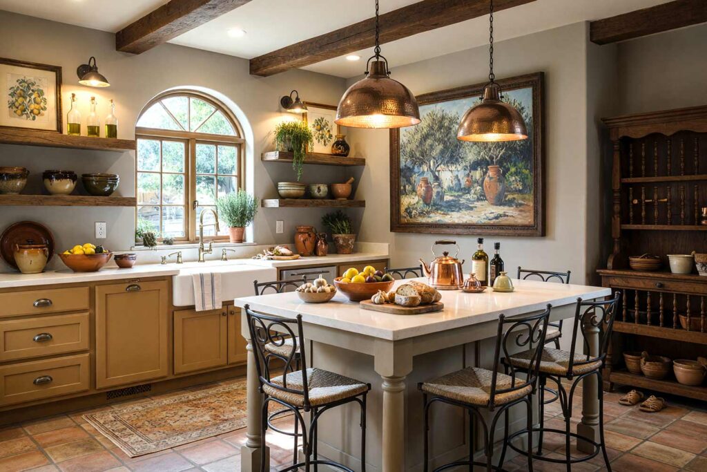
Walls: Putty | Cabinets: Ochre | Ceiling: Warm white | Baseboards/Trim: Bone white
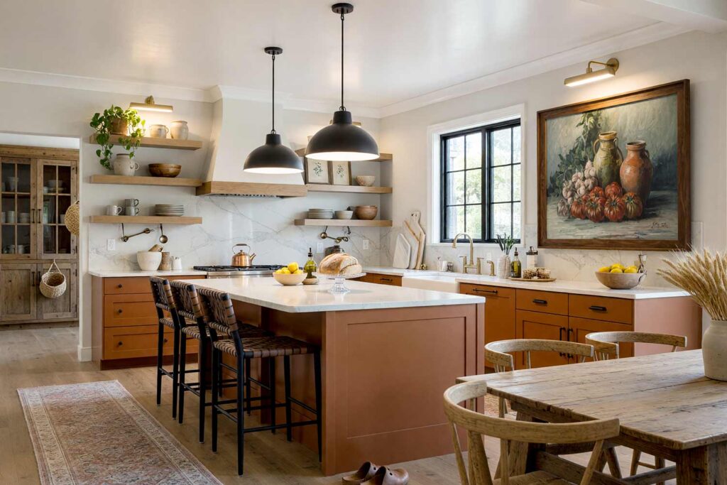
Putty walls glow like sun-warmed clay, and paired with ochre cabinetry, the room lands somewhere between a Tuscan farmhouse and a coastal Spanish villa. This is one of the strongest neutral paint color combinations for a kitchen that wants to feel collected rather than showroom-fresh. A hand-thrown terracotta fruit bowl, an open shelf lined with olive oil bottles, and the smell of rosemary drying near a sunny window round it out beautifully. It’s a kitchen that feels like it’s been lived in for generations, even on day one.
Chocolate Brown & Ochre: Boutique Hotel Bedroom
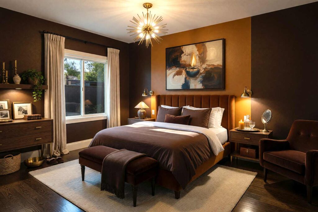
Walls: Chocolate brown | Accent Wall: Ochre | Ceiling: Soft white | Baseboards/Trim: Warm cream
I once asked someone if chocolate brown is really a neutral color. I was answered with a resounding “yes.” Dark neutrals get an undeserved reputation in bedrooms, but chocolate brown walls paired with an ochre accent wall create the low-contrast, cocooning hush of a boutique hotel that charges double just for the vibe. A velvet headboard, a brass reading sconce mounted low and warm, and heavy linen drapery that mutes the outside world completely all add to the effect. There’s a quiet, almost cave-like comfort — the scent of a lit beeswax candle, the softness of a wool throw at the foot of the bed. This is a room built for sinking into, not showing off.
Mushroom & Ultra-White: Scandinavian Minimalist Living Room
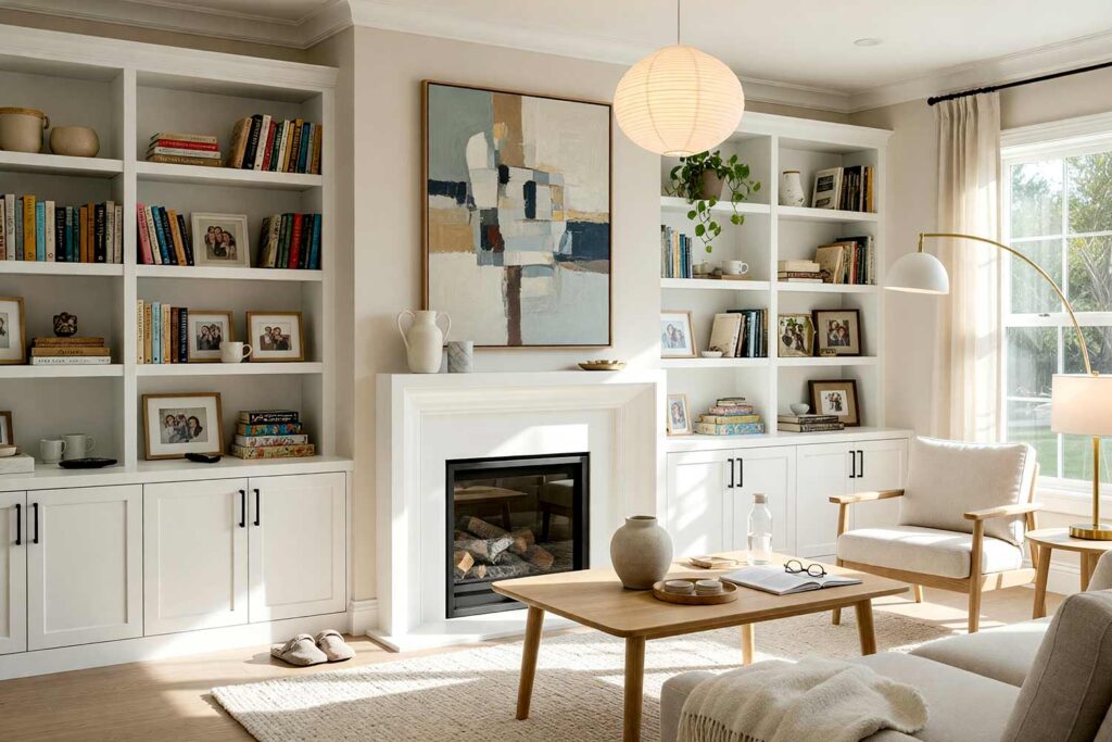
Walls: Mushroom | Built-In Bookshelves: Ultra-white | Ceiling: Ultra-white | Baseboards/Trim: Ultra-white
Mushroom is one of those quietly brilliant neutral interior paint colors that reads as sophisticated restraint rather than indecision, especially against crisp ultra-white trim and bookshelves. This is Scandinavian minimalism in full form — clean lines, tapered wood furniture legs, and negative space treated as its own design element. If bold bookshelf choices interest you more than a subtle white, this guide to painting built-in bookshelves has plenty of inspiration for swapping in a punchier tone here. An oversized ceramic vase, a pale wool throw folded over a low-profile sofa, and the smell of fresh cotton drifting in from an open window complete the look — a room that whispers instead of shouts.
Sand & Moss Green: Southwestern Desert Retreat
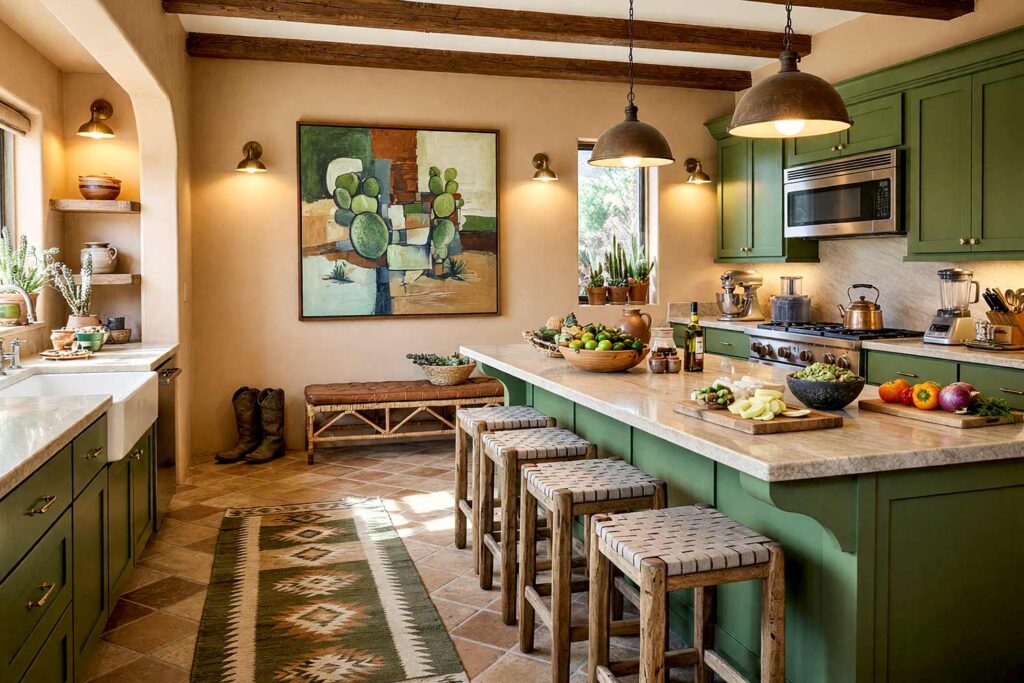
Walls: Sand | Cabinets: Moss green | Ceiling: Warm white | Baseboards/Trim: Sandstone white
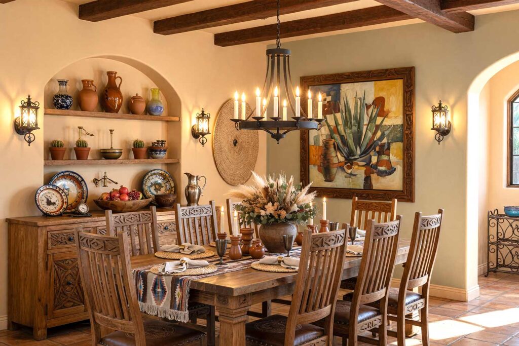
Sand-colored walls are practically made for a Southwestern hacienda mood, and pairing them with moss green cabinetry keeps the room from tipping into an all-beige void. Woven textiles, a low rattan bench, and a cluster of potted cacti catching afternoon sun through a west-facing window keep it grounded and earthy. There’s a dry, herbal scent in the air, like sage rubbed between fingers, and the kind of warm light that makes late afternoons feel unhurried. It’s a room that feels rooted to the desert rather than borrowed from a catalog.
Almond & Slate Gray: Coastal Contemporary Bath
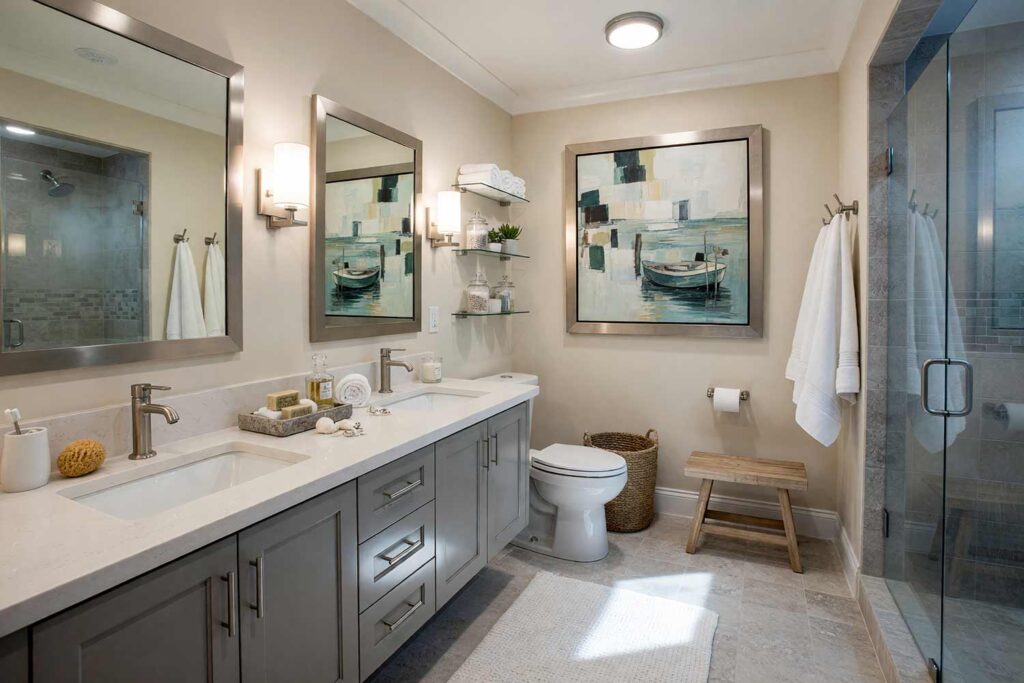
Walls: Almond | Vanity Cabinet: Slate gray | Ceiling: Cloud white | Baseboards/Trim: Cloud white
Almond walls bring soft, sandy warmth into a bathroom, while a slate gray vanity adds the crisp, cool contrast that turns the space into a boutique coastal retreat instead of a builder-grade afterthought. A woven seagrass hamper tucked in the corner, a brushed-finish mirror catching morning light, and the faint mineral smell of a freshly poured stone countertop finish the picture. Steam curls off a hot shower and fogs the glass just enough to feel indulgent — a small room doing a very big job.
Cream & Bone White: French Country Dining Room
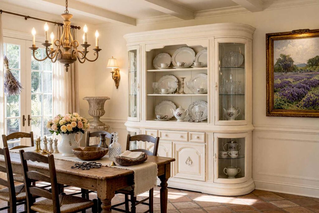
Walls: Cream | China Hutch: Bone white | Ceiling: Soft white | Baseboards/Trim: Bone white
This soft, tonal palette proves that shifting within one neutral wall color family, rather than switching entirely, can look every bit as intentional as a bold contrast play. Cream walls feel lit from within, while a bone white china hutch and trim keep the room airy without sliding into stark. A distressed farmhouse table, a lavender bundle drying near the window, and linen napkins stacked in a woven basket lean effortlessly French countryside. There’s a softness to it, almost nostalgic, like a Sunday dinner that goes on a little longer than planned.
Camel & Deep Charcoal: Art Deco Powder Room
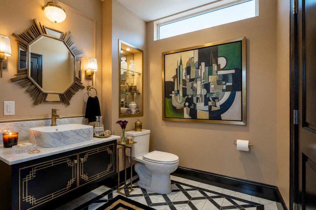
Walls: Camel | Vanity Cabinet: Deep charcoal | Ceiling: Soft white | Baseboards/Trim: Deep charcoal
Small rooms are the best place to push contrast hard, and camel walls against deep charcoal trim and vanity cabinetry create an Art Deco moment that feels glamorous without a single loud color in the mix. A geometric mirror with a sunburst frame, a crystal-cut soap dish, and a dimmable sconce throwing warm, low light finish the space. There’s a faint, expensive-smelling candle burning somewhere nearby — something like amber or leather. It’s a tiny room with enormous confidence, the kind that makes guests linger a beat longer than they need to.
Plaster Pink & Warm White: Eclectic Maximalist Reading Nook
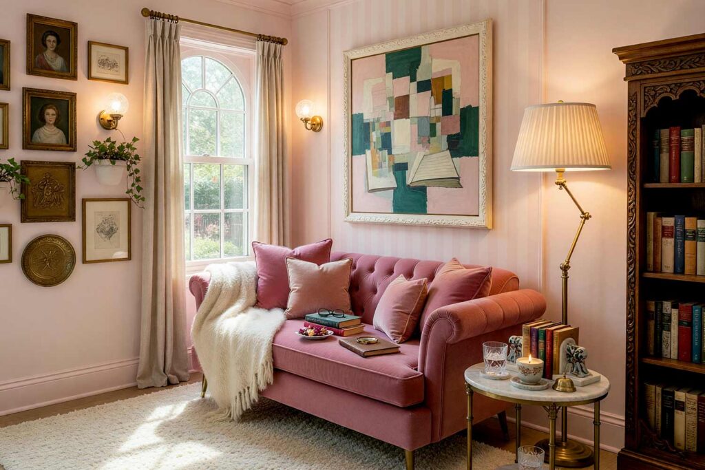
Walls: Plaster pink | Accent-Wall Stripes: Warm white | Ceiling: Warm white | Baseboards/Trim: Warm white
Plaster pink behaves exactly like a neutral wall color should — warm, versatile, foundational — but it injects just enough personality to anchor an eclectic, maximalist reading corner. Alternating plaster pink and warm white in soft vertical stripes on one wall gives the room rhythm without introducing a single loud hue; this guide to painting bold wall stripes is worth a look for scaling the width and spacing correctly. Gallery-hung art, a velvet chaise, and mismatched ceramic bookends collected over years fill out the space, along with a soft, powdery scent, like fresh plaster or a barely-there perfume left on a cushion.
Warm White & Deep Charcoal: Mid-Century Modern Entryway
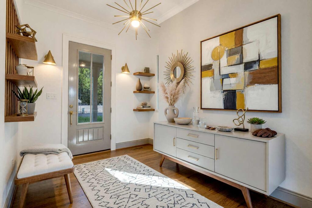
Walls: Warm white | Accent Wall/Console: Light charcoal | Ceiling: Warm white | Baseboards/Trim: Light charcoal
An entryway sets the tone for the whole house, and warm white walls with a light charcoal accent wall or built-in console nail that first-impression mid-century confidence. A low console with sculptural legs, a sculptural pendant light, and a ceramic catch-all bowl by the door round out the moment. There’s a crisp, clean scent, something like fresh linen, that hits the second the front door opens. It’s the kind of entry that makes guests pause for a second before they even take their coat off.
Final Brush Strokes: Making Neutrals Feel Intentional
Neutral interior paint colors are not a compromise, and choosing them should never mean skipping the design conversation. The strongest neutral color schemes use tonal contrast, a committed undertone, and one or two genuinely bold accent decisions to feel architectural rather than accidental. A muted color scheme, applied with intention, reads as more expensive than a room full of loud, competing hues ever could.

Pick an undertone first, commit to it room by room, and don’t be afraid to go dark somewhere unexpected — a powder room, a reading nook, a striped accent wall in a hallway. This roundup of layered neutral color schemes is a great source of extra inspiration for pulling these ideas into a full-house plan. If you get stuck, give me a call.
The best options pair a warm neutral base — like cream, oat, or camel — with high-contrast accents such as chestnut brown or deep charcoal trim, layering tone and texture so the palette feels intentional, architectural, and far from flat.
Yes — plaster pink behaves like a versatile neutral base while still injecting warmth, making it ideal for an eclectic maximalist reading nook layered with warm white striped accents and gallery art.

One Reply to “Beyond Beige: Making Neutral Interior Paint Colors Look Professionally Designed”