
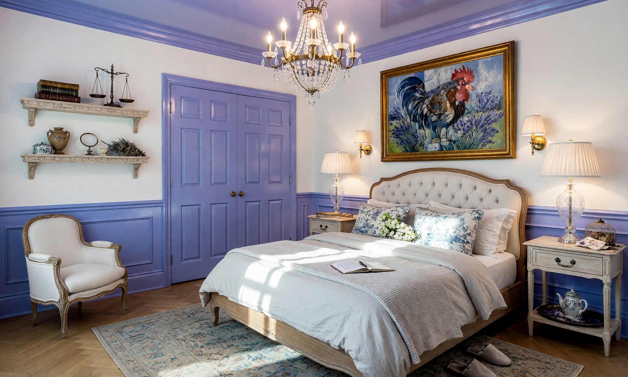
Nothing stops people in their tracks quite like a wall that reflects them back. That’s the whole game with high gloss interior paint — it isn’t just a finish, it’s a mood. While most homeowners default to the safety net of matte and eggshell, a smaller, more daring group is asking for shine, depth, and a little theater. Done right, high gloss interior paint turns an ordinary wall into a mirror-smooth surface that makes deep, moody colors look bottomless and formal rooms feel like they wandered out of a design magazine. This isn’t a trend worth chasing lightly — it’s one of the most transformative techniques in the book, and here’s exactly why it works and where it works best.
Why High Gloss Interior Paint Beats Matte, Every Single Time
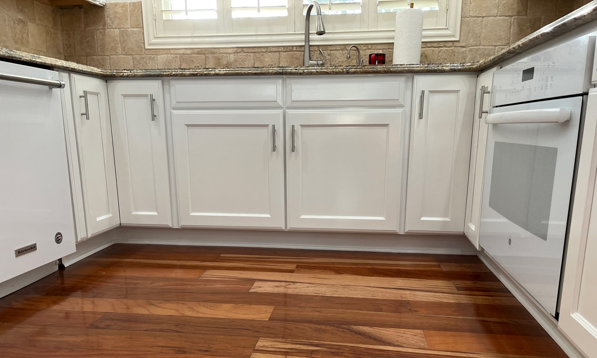
Matte and eggshell are safe because they forgive everything — uneven drywall, old patch jobs, a slightly crooked corner. High gloss interior paint forgives nothing, and that’s the point. A high-gloss finish behaves like a mirror, bouncing ambient light back into a room, which is what makes deep colors like emerald green, navy, or plum look bottomless instead of flat. Picture a Kelly Wearstler-style glossy library, a Parisian apartment lacquered to a liquid shine, or the glass-like finish of a yacht’s saloon. Because gloss magnifies every ripple, it demands genuine skim-coat prep and a steady hand; even the design pros treat it with real respect, insisting walls be sanded smooth first. It’s the same high-low logic behind a bold two-tone kitchen cabinet pairing — shine next to matte makes both look sharper.
High Gloss Interior Paint Color Combinations Worth the Extra Prep Work
This is inspiration, not a how-to. Pick the mood first, then bring in a pro who can handle the prep.
Emerald Green & Ivory: Art Deco Jewel-Box Dining Room
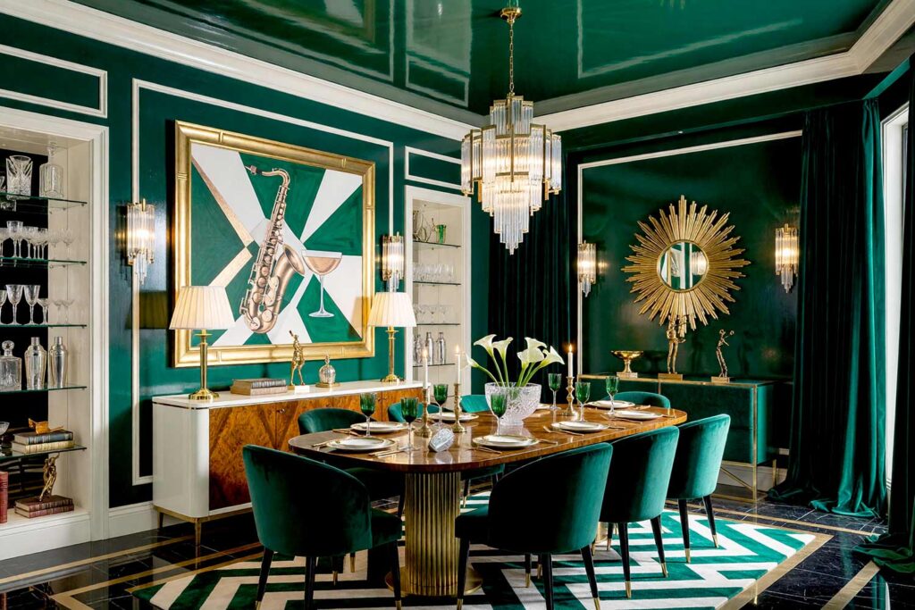
Walls: Emerald green | Ceiling: Emerald green | Trim/Millwork: Ivory | Baseboards/Crown: Ivory
This is the ultimate Art Deco flex — a dining room lacquered top to bottom in emerald green, the high-gloss finish catching candlelight and throwing it back like the inside of a jewelry box. Ivory trim frames the room like piping on a tuxedo, keeping the drama contained. Add a sunburst mirror over the sideboard, a fluted glass pendant, and velvet dining chairs, and the space starts to hum with 1920s glamour. There’s a faint scent of melted candle wax and polished glass, the kind that makes people lower their voices without quite knowing why. It’s not a room for cereal at 7 a.m. — it’s for the nights you actually want to remember.
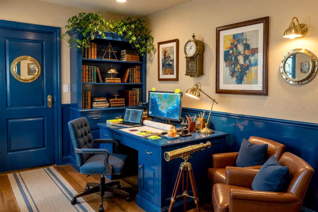
Deep Navy & Bone White: Dark Academia Home Library
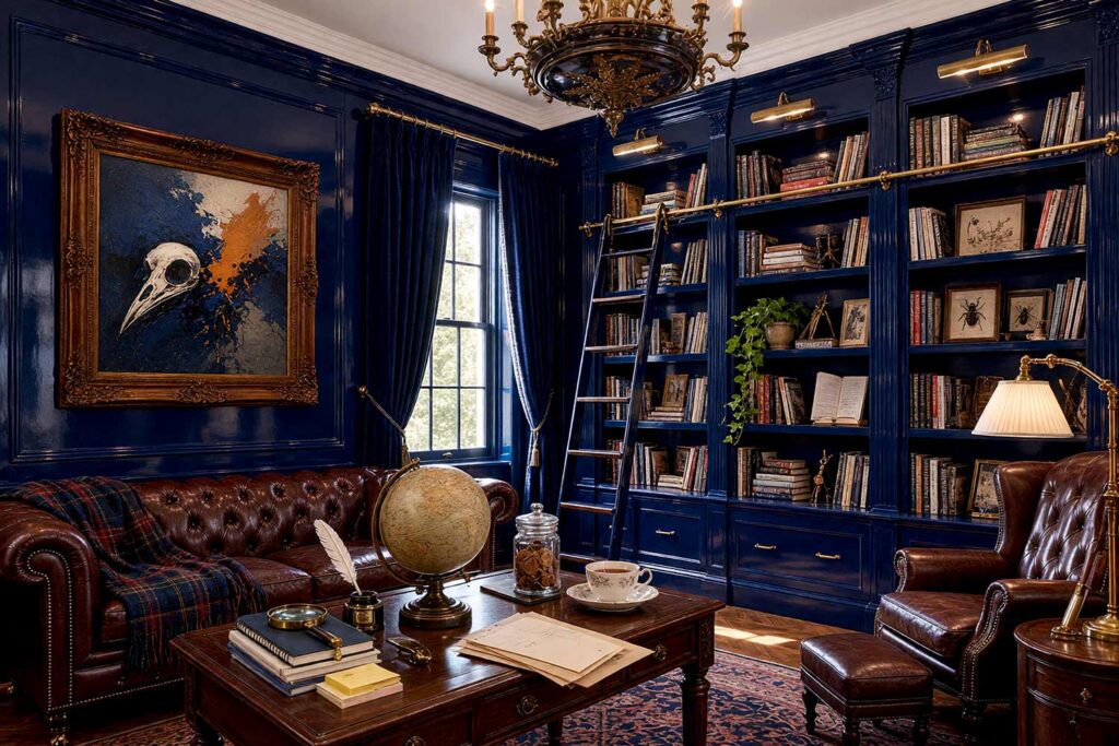
Walls: Deep navy | Built-In Bookshelves: Deep navy | Ceiling: Bone white | Crown Molding: Bone white
Lacquer a home library in deep navy and it becomes a Dark Academia dream — heavy, hushed, and a little haunted in the best way. The glass-like finish on the built-ins makes gilded book spines glow like they’re lit from within, especially against a soft bone white ceiling. Add a leather wingback chair, a reading lamp with a fabric shade, and a rolling ladder, and the room is built for long evenings. For more built-in bookshelf color ideas, this direction is worth a closer look. Old paper and leather seem to settle right into these walls — the kind of room that asks you to stay a little longer than planned.
Onyx Black & Alabaster: Parisian Lacquer Salon
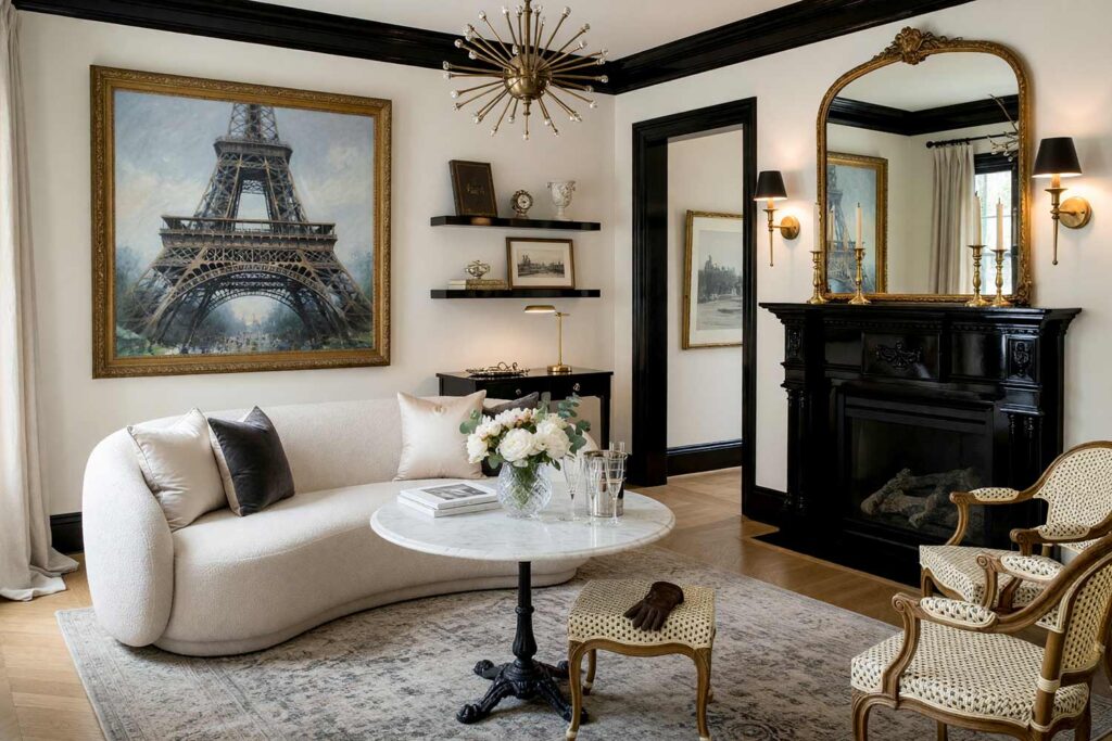
Walls: Alabaster | Doors & Trim: Onyx black | Ceiling: Alabaster | Baseboards: Onyx black
This pairing built entire Parisian apartments’ reputations — soft alabaster walls with every door, baseboard, and piece of trim lacquered in onyx black. The high-gloss finish on the trim reads like poured ink, the same bold trim-and-wall contrast that makes a room feel tailored instead of thrown together. Set a marble bistro table in the corner, a pair of taper candlesticks, and a gilt-edged mirror leaning against the wall, and the room feels like it belongs on the Rive Gauche. There’s a hush to lacquered black doors — fresh paint, cut flowers, the soft click of a door closing just right. It’s quiet, confident luxury that never has to raise its voice.
Wine Burgundy & Golden Ochre: Victorian Grandmillennial Dining Room
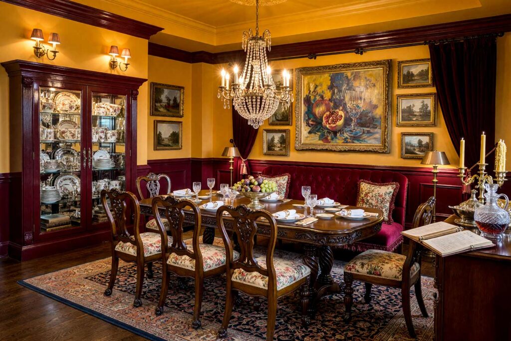
There’s nothing shy about this one. Golden ochre walls glow like candlelight even at noon, while wainscoting lacquered in wine burgundy adds the weight a truly Victorian, Grandmillennial room needs. The lacquered paint catches every flicker from the chandelier overhead and throws it straight back, so dinner parties feel more dramatic. Layer in a gallery wall of gilt-framed paintings, a tufted velvet bench, and a stack of leather-bound books, and the space starts to feel inherited rather than decorated. There’s a rich, spiced scent here — clove, candle smoke, aged paper. This is a dining room that doesn’t ask permission to be extra. It simply is.
Aubergine & Blush Pink: Hollywood Regency Powder Room
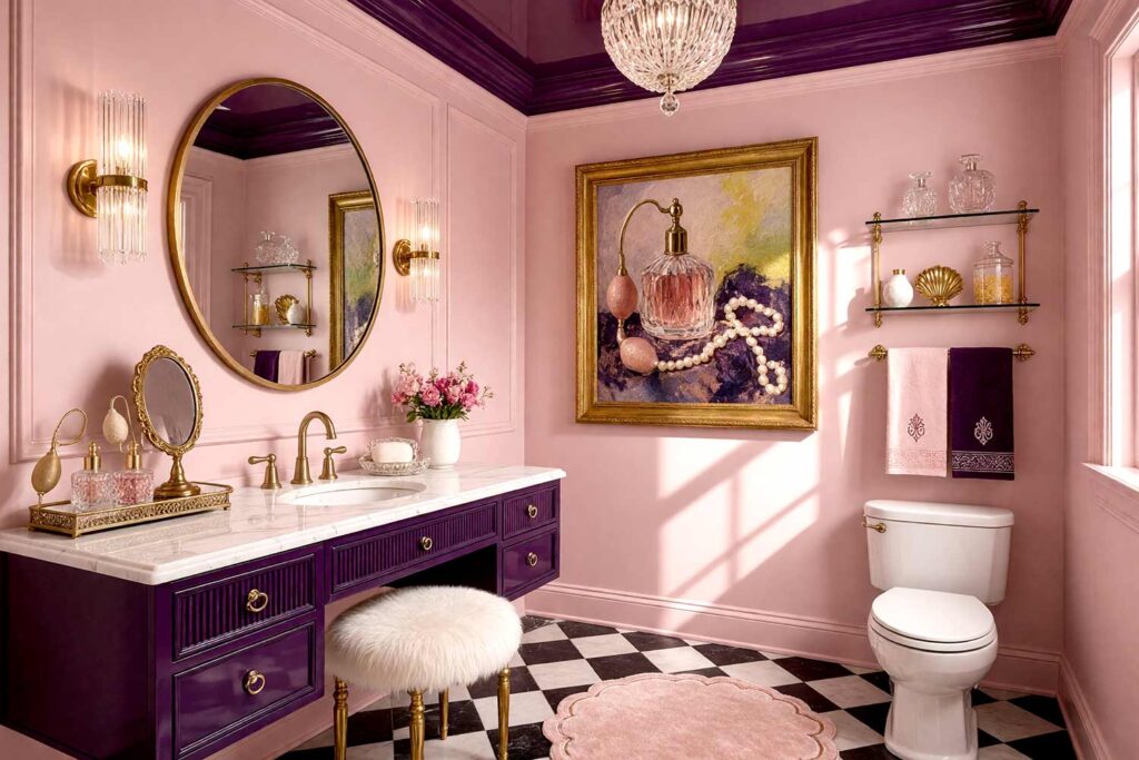
Walls: Blush pink | Ceiling: Aubergine | Vanity/Cabinetry: Aubergine | Trim: Blush pink
Small rooms are exactly where a glass-like finish earns its keep, and a powder room lacquered in aubergine and blush pink proves it. Blush walls glow soft under sconce light, while an aubergine ceiling — yes, lacquered overhead — pulls the eye up and makes a tight room feel taller and more theatrical. This is why painting interior ceilings is such a design hack in action, and a glossy aubergine ceiling takes that idea and turns it up to eleven. (I like This is Spinal Tap references.) Add a mirrored vanity tray, a crystal pendant, and a faux fur stool, and the room smells faintly of perfume the second someone walks in. It’s Hollywood Regency in miniature — small, intimate, and impossible to forget.
Charcoal & Marigold: Southwestern Hacienda Dining Nook
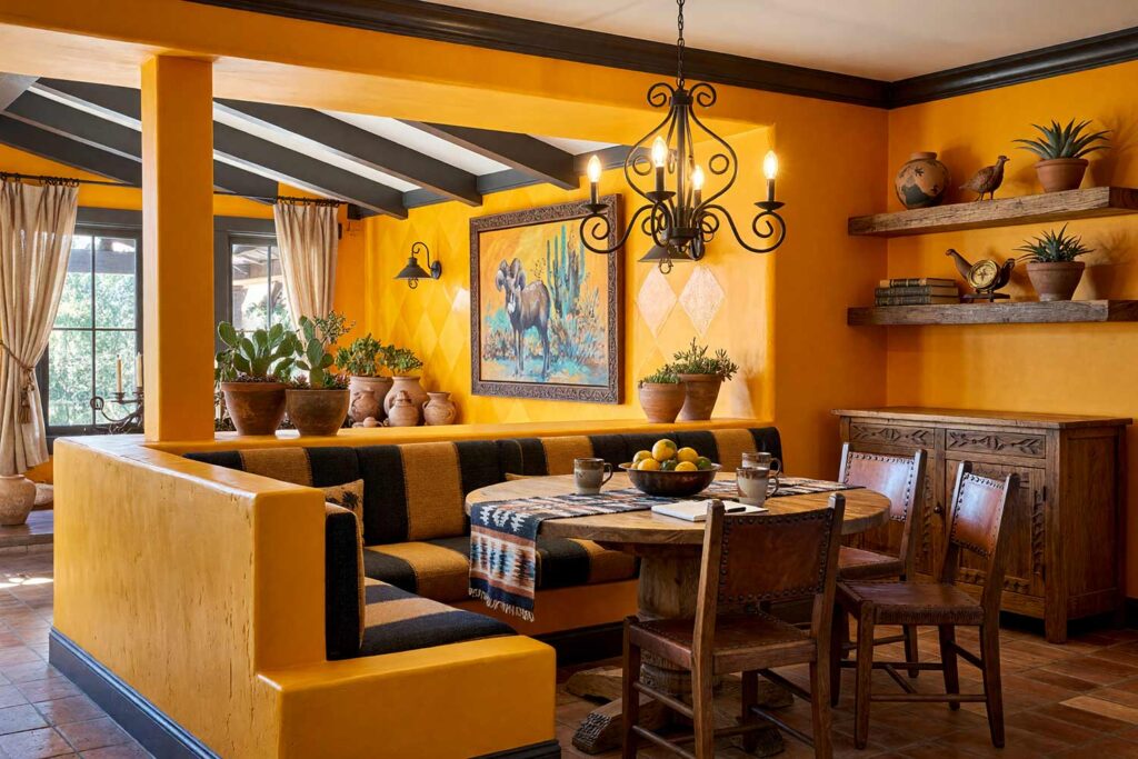
Walls: Marigold | Accent Wall: Marigold with a clear-coat diamond pattern | Ceiling: Soft white | Baseboards/Trim: Charcoal
Here’s a technique worth recommending to homeowners not ready to lacquer an entire room: paint the walls in a satin marigold, then hand-apply a clear high-gloss finish in a diamond pattern over one accent wall. The pattern only reveals itself when light hits it — subtle from across the room, striking up close. Charcoal trim grounds the space in Southwestern hacienda style. Add a woven textile runner, a cluster of terracotta pots by the window, and iron sconces, and the room feels sun-warmed even on a cloudy day. There’s a dry, earthy scent here, like clay left out in the afternoon sun. It’s a room that rewards a second look.
Coral Pink & Chalk White: Palm Springs Poolside Room
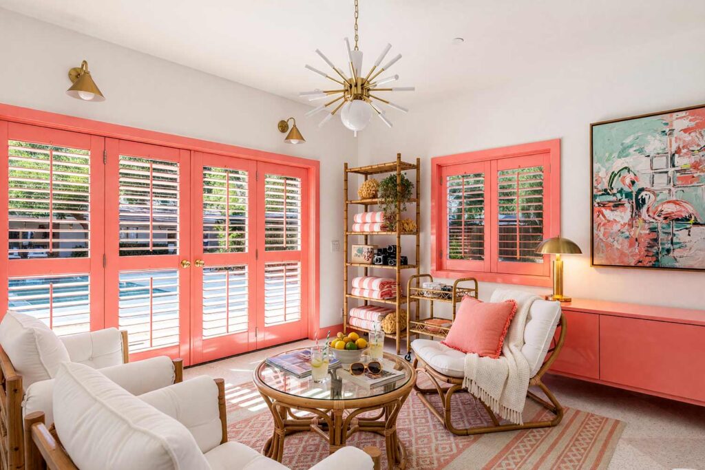
Walls: Chalk white | Louvered Doors/Window: Coral pink | Ceiling: Chalk white | Trim: Coral pink
This is pure Palm Springs — louvered doors lacquered in coral pink, catching desert light and throwing it back with real warmth, set against chalk white walls that keep the whole room feeling breezy. Add a pair of rattan lounge chairs, a cluster of potted palms, and a stack of striped towels folded on an open shelf, and the room starts to feel like a permanent vacation. There’s a bright, citrus-and-chlorine scent that belongs poolside, even indoors. It’s a room that makes an ordinary Tuesday afternoon feel like it’s on vacation, and it never once takes itself too seriously, even when the rest of the house does.
Espresso Brown & Warm Cream: Japandi Built-In Reading Wall
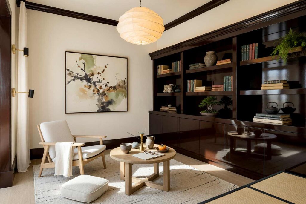
Walls: Warm cream | Built-In Shelving: Espresso brown | Ceiling: Warm cream | Baseboards: Espresso brown
Japandi design leans on restraint, but that doesn’t mean it can’t shine — literally. Warm cream walls stay soft and quiet, while a wall of built-ins in lacquered paint — a deep espresso brown — becomes the room’s one deliberate shine. It isn’t loud; it’s precise, the kind of gloss that only reveals itself when afternoon sun moves across the room. Style the shelves with a single ceramic vase, a stack of linen-bound books, and one small bonsai, and resist the urge to fill every inch. There’s a clean, green-tea scent that fits this room — quiet and considered. It’s not built to impress anyone walking through. It’s built for the person who lives there.
Cobalt Blue & Crisp White: Coastal Boutique Hotel Bar
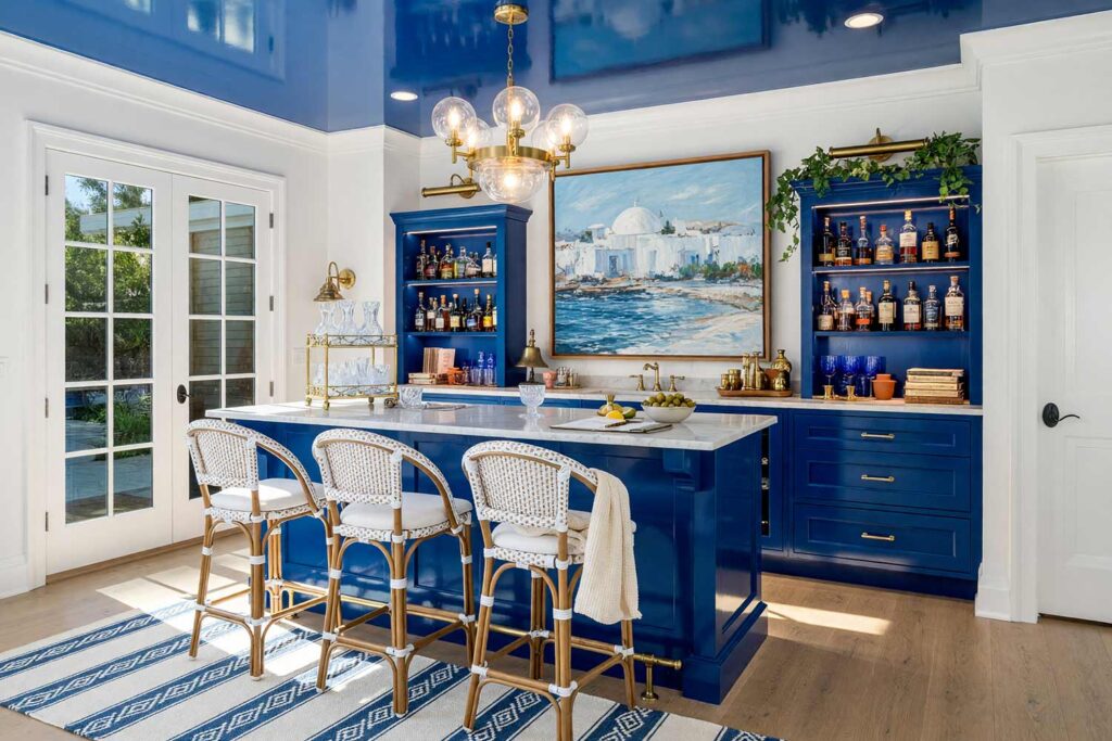
Walls: Crisp white | Bar Cabinetry: Cobalt blue | Ceiling: Cobalt blue | Baseboards/Trim: Crisp white
If a home bar could feel like a boutique hotel on the coast of Greece, this is the combination that gets it there. Crisp white walls keep the room bright and airy, while cobalt blue cabinetry and a matching lacquered ceiling pull it together with a glass-like finish that mimics sunlight bouncing off open water. Add hand-blown glass tumblers, a woven rattan stool, and striped linen napkins, and the space starts to feel like a vacation that didn’t need a plane ticket. There’s a faint scent of citrus and salt that belongs in a room this blue, even landlocked in the middle of the country.
Crimson Red & Ebony: Cinematic Home Theater
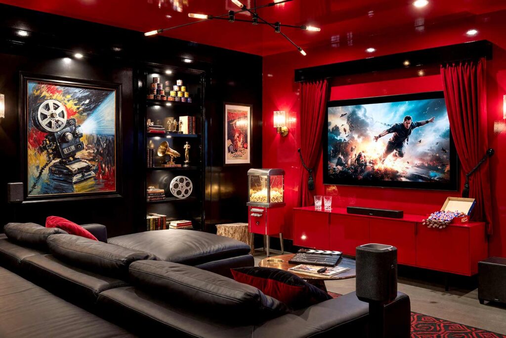
Walls: Ebony | Accent Wall: Crimson red | Ceiling: Crimson red | Baseboards/Trim: Ebony
This is the boldest combination on the list, and that’s meant as a compliment. Ebony walls swallow ambient light the way a real cinema does, while a single accent wall and ceiling lacquered in crimson red deliver all the drama — high gloss interior paint doing exactly what it does best, catching every beam from a projector and throwing it back tenfold. Frame the space with movie posters in slim black frames, a velvet curtain pulled back from the screen, and a row of leather recliners, and the room starts to feel like opening night. There’s a warm, buttery scent of popcorn that seems to belong here on instinct. It’s a room built entirely for the main event, and it knows it.
Final Brush Strokes: Is High Gloss Interior Paint Right for Your Home?
High gloss interior paint isn’t for every wall in every house, and it was never meant to be. It’s meant for the rooms worth remembering — a dining room, a library, a ceiling that makes a small space feel like it’s holding its breath. Lacquered paint keeps earning its place in bold, thoughtfully prepped rooms because nothing else makes a color look this deep, this rich, this deliberate. It takes real prep work and a steady hand, but the payoff is a room that photographs like it belongs in a design magazine and lives like it was made just for the people in it. Designers who work with lacquered walls will tell you the same: it’s all in the prep. If a room in your home feels ready for this kind of drama, that’s a conversation worth having.
Formal dining rooms, home libraries, powder rooms, and ceilings work best — intimate spaces where reflected light reads as luxury rather than glare, especially paired with flawless prep work and deep, jewel-toned colors like navy, emerald, or aubergine.
High gloss interior paint works best in smaller, intimate spaces — dining rooms, powder rooms, libraries, ceilings, trim, and cabinetry — rather than across entire walls throughout a home. Concentrated doses create real drama without overwhelming a space.
High gloss interior paint reflects the most light and looks the shiniest, while semi-gloss offers a softer sheen with more forgiveness for surface flaws. High gloss suits dramatic accent moments; semi-gloss works better across larger, everyday surfaces.