
Painting striped walls has clawed its way back from the sponge-paint dungeon of the 1990s, and it’s returned as something completely different — thick, high-contrast bands of color with the confidence of a boutique hotel lobby rather than the fussiness of a faux-finish class. Forget everything you remember about dabbed sponges and dusty rose color washes. This is graphic, architectural, and unapologetic. A single well-placed stripe can do more for a room’s personality than an entire wall of art, and it costs a fraction of what most homeowners assume.
This isn’t a how-to on taping technique — it’s a look at the aesthetics, the mood-setting power, and the sheer creative range that painting wall stripes unlocks. Whether a room needs height, width, or just a jolt of personality it’s been missing, stripes are the fastest route there.
Why Painting Striped Walls Beats Wallpaper Every Time
Wallpaper peels. It yellows. It’s a wrestling match to remove, and the “custom” pattern a homeowner falls in love with is often sitting on a hundred other walls across the country. Painted wall stripes cost less, hold up longer, and can be repainted the moment a room’s mood shifts — because tastes evolve, and walls should be allowed to evolve with them. The Sherwin-Williams guide to painting horizontal and vertical stripes notes that stripe width and spacing alone can completely shift how a wall reads, from playful to formal to downright dramatic — and that’s before color even enters the conversation.
Stripes also carry a spatial trick most homeowners never think to use. Vertical bands drag the eye upward, and a stubby, low-ceilinged room suddenly feels like it grew a few feet overnight. Horizontal bands stretch a cramped hallway sideways until it feels almost lounge-like. Benjamin Moore’s guide on painting stripes walks through how stripe direction and contrast level change the entire visual weight of a room — proof that this is less a decorating trend and more a genuinely useful optical tool hiding in plain sight.
10 Wildly Different Palettes for Painting Wall Stripes
Ten combinations, ten completely different moods — some quiet, some loud, a couple of them borderline feral. If painting striped walls has been circling in the back of a homeowner’s mind, one of these should be the push to commit. For more pattern inspiration beyond stripes, this piece on painting shapes and patterns that wow is worth a detour too.
Navy Blue & Crisp White: Boutique Hotel Cabana Entry Way
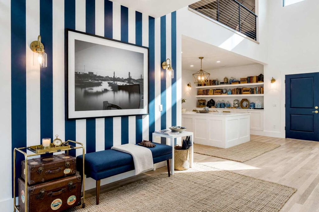
Accent Wall: Navy blue & crisp white stripes | Other Walls/Ceiling: Cloud white | Baseboards/Trim: Crisp white | Door: Navy blue
This is the pairing that reignited the whole conversation around painting striped walls, and it earns the hype. Thick, evenly spaced navy and white bands running vertically floor to ceiling on the accent wall instantly summon that boutique hotel arrival moment — the kind of space where a brass luggage rack and a stack of vintage travel trunks wouldn’t look out of place, each one still wearing a faded steamer-line sticker. A woven jute rug anchors the floor, a linen throw drapes over a bench near the door, and a driftwood-and-sea-salt candle does its quiet work on a side table. Hang one oversized black-and-white photograph of a harbor at dusk on the cloud-white wall opposite the stripes, and the whole entryway starts to feel like the lobby of somewhere you’d actually want to check into. There’s a crispness here that makes ordinary Tuesday mornings feel suspiciously like vacation.
Sage Green & Moss Green: Botanical Meditation Alcove
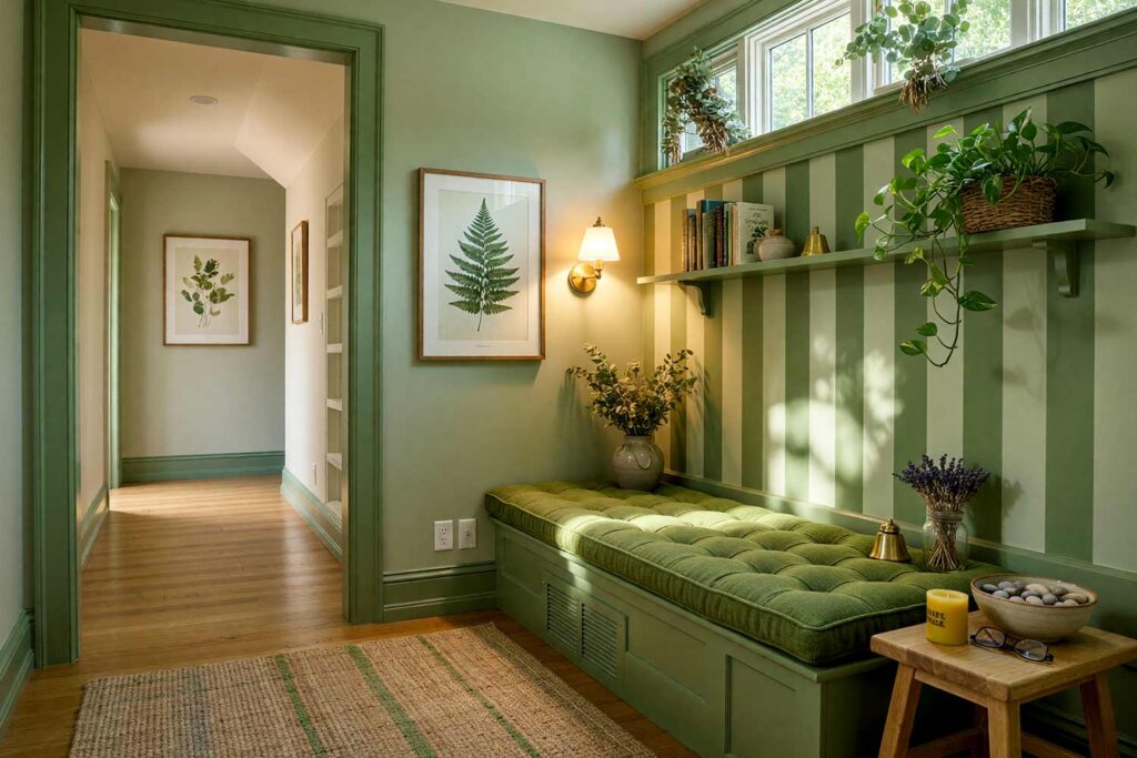
Accent Wall: Sage green & moss green stripes | Other Walls: Sage green | Ceiling: Warm ivory | Baseboards/Trim: Moss green | Floor Cushion: Moss green
Even, meditative stripes moving between sage and moss green wrap a small alcove in the feeling of standing inside a shaded grove. A woven basket holds a single trailing pothos vine that’s clearly been allowed to do whatever it wants, and a stack of smooth river stones sits beside an unlit beeswax candle waiting for evening. The air smells faintly of eucalyptus, carried from a small bundle hanging near the window to dry. Because the greens sit so close together, the stripes read less like a pattern and more like dappled light falling through leaves. This is a corner built entirely for slowing down, where even the walls seem to be taking a slow, deliberate breath.
Terracotta & Warm Cream: Southwestern Hacienda Hallway
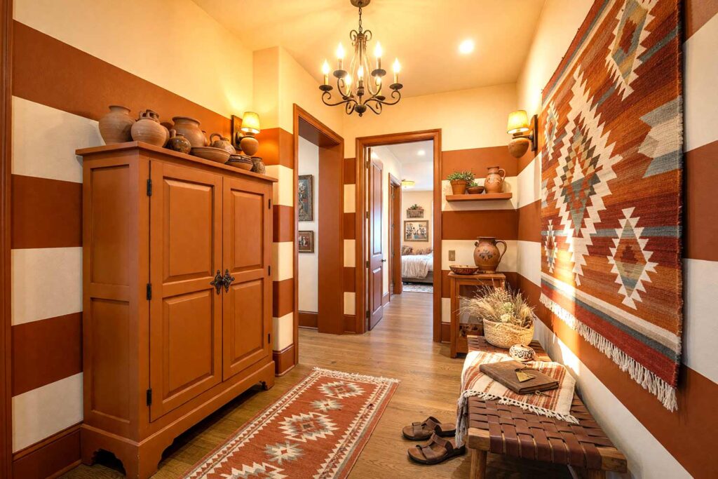
Accent Wall: Terracotta & warm cream stripes | Other Walls/Ceiling: Warm cream | Baseboards/Trim: Sun-baked clay | Armoir: Terracotta
Wide horizontal bands in terracotta and cream turn a dead-end hallway into something lifted straight out of a Santa Fe courtyard. A hand-woven wool wall hanging breaks up the stripes about halfway down, its fringe catching a little dust and a lot of character, while a cluster of hand-thrown clay pottery crowds the top of the terracotta armoire like it’s been collected over decades, not ordered in a weekend. The faint, smoky scent of piñon incense drifts in from another room, mixing with the dry warmth of desert air through an open window. These stripes don’t fight the light pouring in — they absorb it and glow, especially where the cream bands catch the late-afternoon sun. Walk this hallway barefoot at golden hour and it’s hard not to believe a guitar is strumming somewhere just out of sight.
Black & White Zebra Stripe: Glitz-and-Glam Powder Room
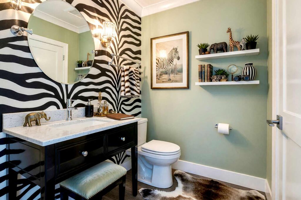
Accent Wall: Uneven black & white zebra-style stripes | Other Walls: Pale sage | Ceiling: Bright white | Baseboards/Trim: Bright white | Vanity: Black lacquer
This is the palette for the homeowner secretly hoarding vintage safari prints or an entire shelf of collected hand-carved animal figurines and finally ready to own it out loud. Deliberately uneven, tapering stripes — hand-drawn rather than taped in perfect symmetry — mimic real zebra hide and bring a glam-meets-wild energy to a small powder room where drama has nowhere to hide. A faux fur zebra-skin rug sprawls in front of the black lacquer vanity, a crystal sconce throws warm, flickering light across the pattern, and a small brass elephant figurine sits watch on the vanity next to a leather-bound guest book. The pale sage walls calm things down just enough to keep the room from tipping into chaos. It’s audacious, it’s a little unhinged, and it makes every guest linger a beat longer than they planned to.
Burnt Orange & Deep Umber Tiger Stripe: Jungle Retreat Study
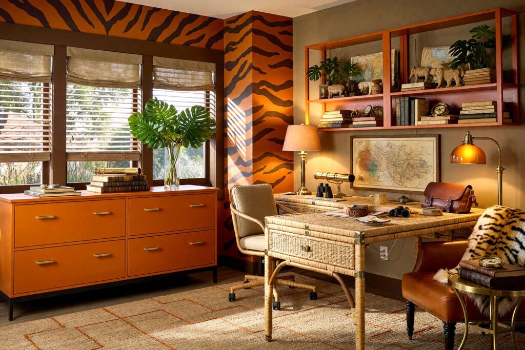
Accent Wall: Irregular burnt orange & deep umber tiger stripes | Other Walls: Khaki | Ceiling: Warm ivory | Baseboards/Trim: Deep umber | Cabinets/Bookshelves: Burnt orange
For the collector of vintage travel maps, brass compasses, or an entire cabinet of curated souvenirs from places most people only dream about, this one is a full-send jungle fantasy. Thick, irregular tiger-stripe bands in burnt orange and umber wrap the accent wall in something primal, while the khaki walls around it feel like base camp canvas. A rattan campaign desk sits center stage, its brass hardware catching the light, flanked by a cluster of oversized monstera leaves and a coiled leather satchel that looks like it’s seen actual expeditions. The air in here practically smells like cedar and old leather-bound atlases, warmed by a low brass floor lamp in the corner. It’s a room that doesn’t just decorate a personality — it dares someone to have one.
Mustard Yellow & Charcoal: Retro Atomic Breakfast Nook
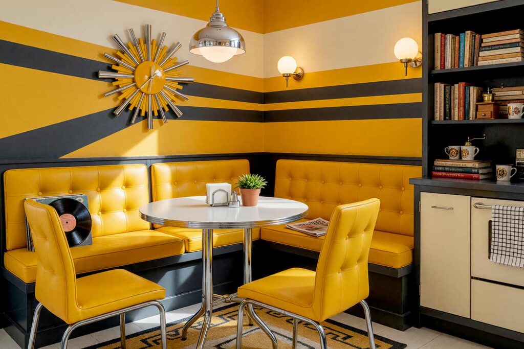
Accent Wall: Mustard yellow & charcoal stripes | Other Walls: Buttercream | Ceiling: Light buttercream | Baseboards/Trim: Charcoal | Bank Seating: Mustard yellow
Bold slightly slanted and horizontal bands in mustard and charcoal bring pure diner-adjacent swagger to a breakfast nook. A starburst wall clock ticks above a chrome-legged bistro table, a stack of vinyl records leans casually against the mustard-yellow bench seating, and a small brass coffee grinder sits on open shelving like a piece of sculpture rather than an appliance. The smell of coffee and toast drifts through a sun-drenched window, mixing with the faint scent of espresso grounds from yesterday’s pour. This is one of those painted wall stripes combinations that flat-out refuses to take itself seriously — it’s the visual equivalent of a well-timed pun. Mornings in here feel like a scene lifted from a mid-century sitcom rerun, right down to the checkered dish towel hanging on the oven handle.
Slate Blue & Buttercream: Coastal Nautical Hallway
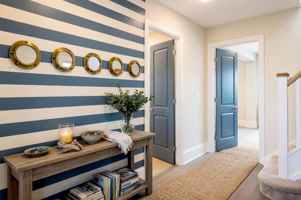
Accent Wall: Slate blue & buttercream stripes | Other Walls: Buttercream | Ceiling: Bright white | Baseboards/Trim: Bright white | Doors: Slate blue
Even, narrow horizontal bands in slate blue and buttercream give a hallway that unmistakable nautical rhythm without slipping into anchor-and-rope cliché. A row of brass porthole mirrors lines the stripes at eye level, each one catching a sliver of hallway light, while a woven rope runner stretches underfoot and a small dish of collected sea glass sits on a narrow console table by the slate blue door. Let a salty breeze — real or candle-scented — drift through the space, carrying just a hint of citrus and brine. This is two tone striped walls doing exactly what it should in a narrow corridor: the horizontal lines pull the walls outward until the whole hallway seems to exhale. Walking through it feels less like passing through and more like finally arriving somewhere.
Deep Plum & Champagne: Cinematic Home Theater
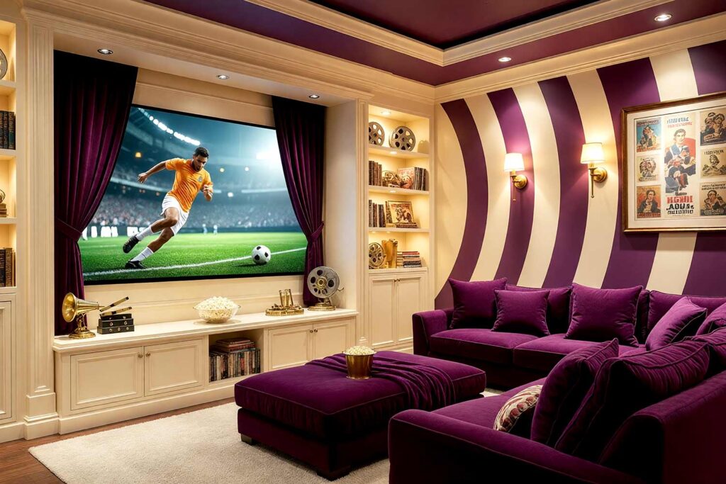
Accent Wall: Deep plum & champagne stripes | Other Walls: Champagne | Ceiling: Deep plum | Baseboards/Trim: Pale champagne | Entertainment Cabinets/Bookshelves: Champagne
Thick curving vertical bands, almost like concentric circles, in deep plum and champagne turn a home theater into something genuinely cinematic, especially for the homeowner with a shelf of vintage film reels or a framed collection of classic movie posters just waiting for the right backdrop. Velvet curtains flank the screen, a bowl of fresh popcorn sits ready on the champagne-colored cabinet, and a low golden sconce never quite reaches full brightness, letting the plum ceiling swallow the shadows overhead. A vintage film reel, mounted like sculpture, catches just enough light to gleam near the doorway. The room carries a plush, theater-lobby hush that smells faintly of popcorn and old velvet upholstery. Painting striped walls this rich doesn’t just decorate a room — it sets the mood before the opening credits even roll.
Emerald Green & Charcoal Topographical: Explorer’s Library
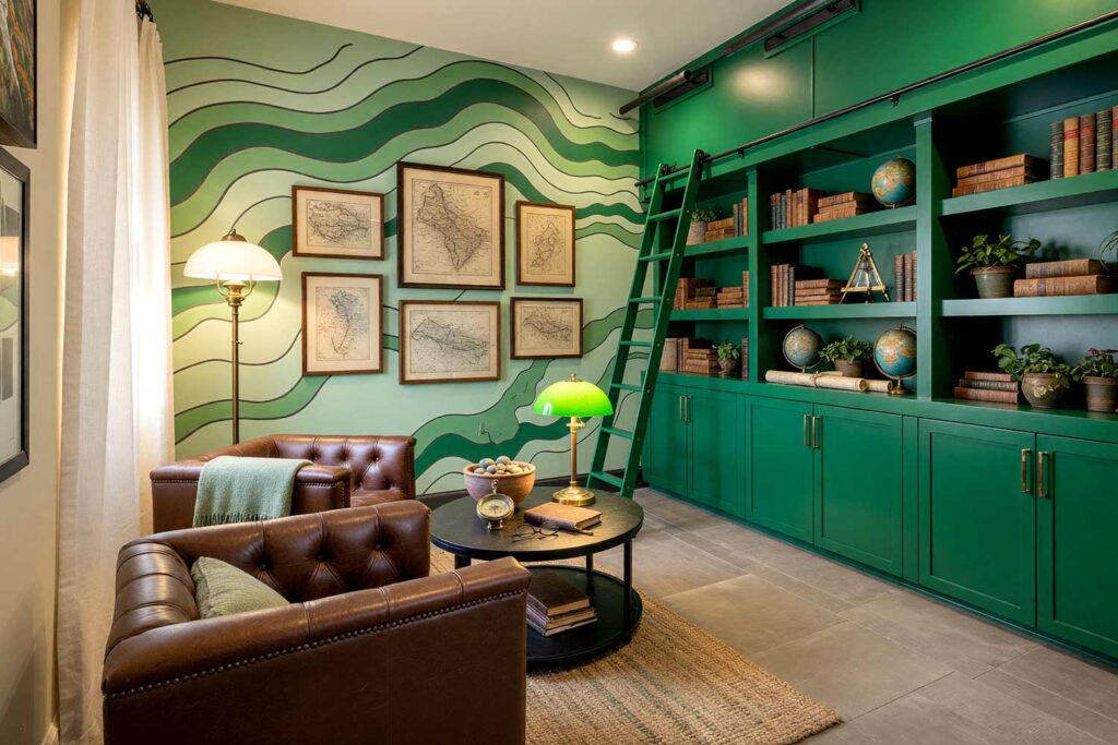
Accent Wall: Emerald green & charcoal topographical-line stripes | Other Walls: Pale green | Ceiling: Warm ivory | Baseboards/Trim: Charcoal | Desk/Cabinets/Bookshelves: Emerald green
This one is built for the homeowner with a wall of vintage maps, an old brass sextant on the shelf, or a globe collection nobody outside the family fully understands — and it deserves a backdrop as unusual as the collection itself. Undulating, contour-line stripes in emerald and charcoal mimic a topographic map instead of a straight-edged pattern, giving the accent wall a sense of movement and depth most flat walls can’t touch. A cluster of antique maps, framed and slightly foxed with age, hangs on the pale green wall opposite, while a leather club chair and a brass library lamp anchor the reading corner. The faint scent of old paper and beeswax polish hangs in the air, mingling with the low hum of a nearby radiator. It’s a room that feels like it’s still exploring, even standing perfectly still.
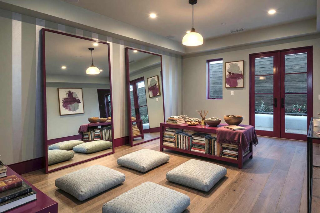
Final Brush Strokes: Make Your Walls Say Something Bold
Painting striped walls isn’t a passing fad — it’s one of the most flexible, budget-friendly ways to completely reshape how a room feels without touching a single stud. Whether the direction is wide and graphic, wild and uneven like a tiger or zebra print, or as precise as a topographic map, painting wall stripes delivers a level of personality that wallpaper simply cannot match, and it holds up to years of real life. For more layered pattern ideas, this piece on adding character with accent walls or this roundup of 12 stunning accent wall ideas is worth exploring next. Pick a mood, pick a pattern, and let the stripes do the talking — the walls have been waiting long enough.
Great combinations include navy and crisp white for a boutique hotel feel, terracotta and cream for Southwestern warmth, emerald and charcoal for a moody library, or tone-on-tone pairings like dove gray and storm gray for understated elegance. The right choice depends on the mood you want the room to have.