
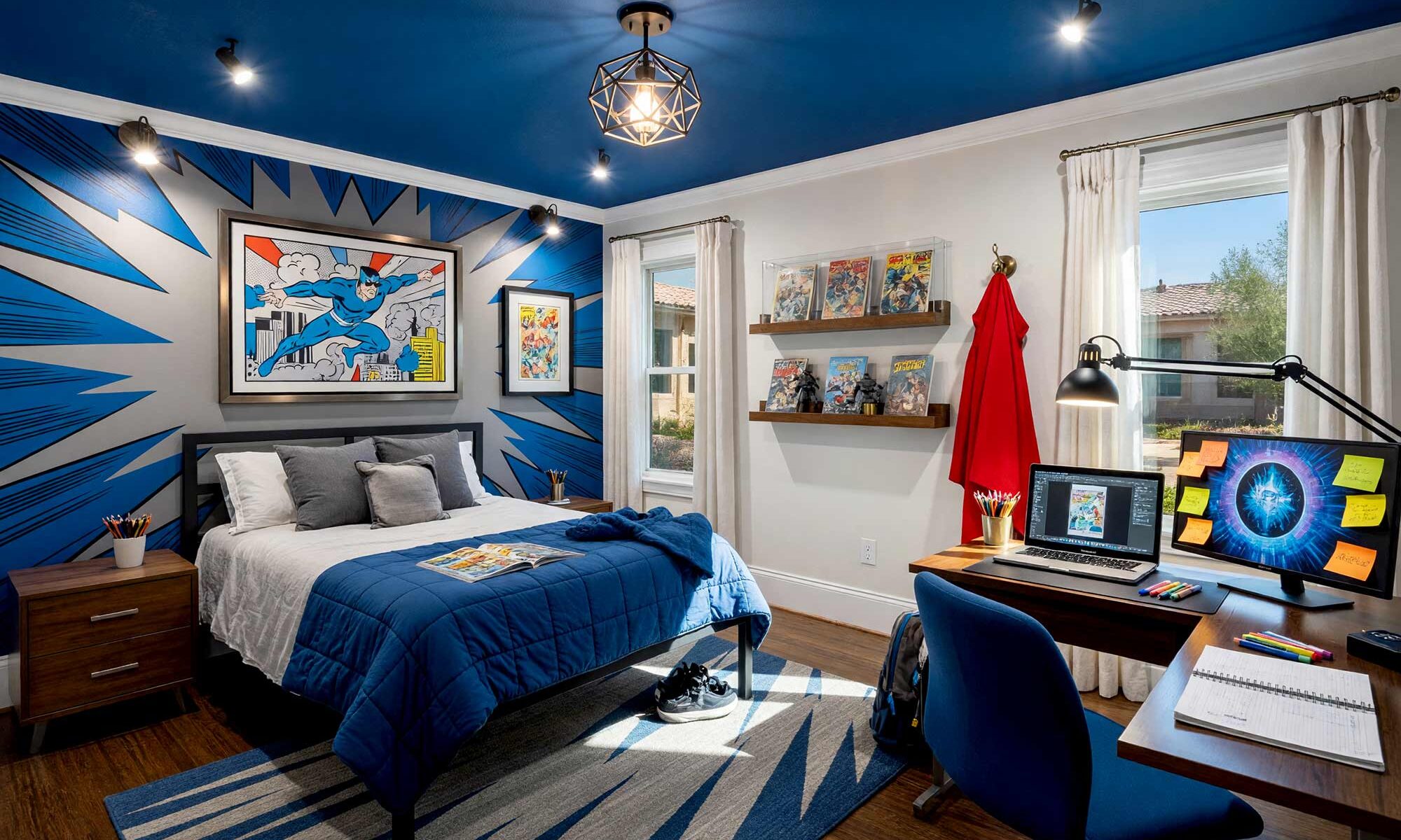
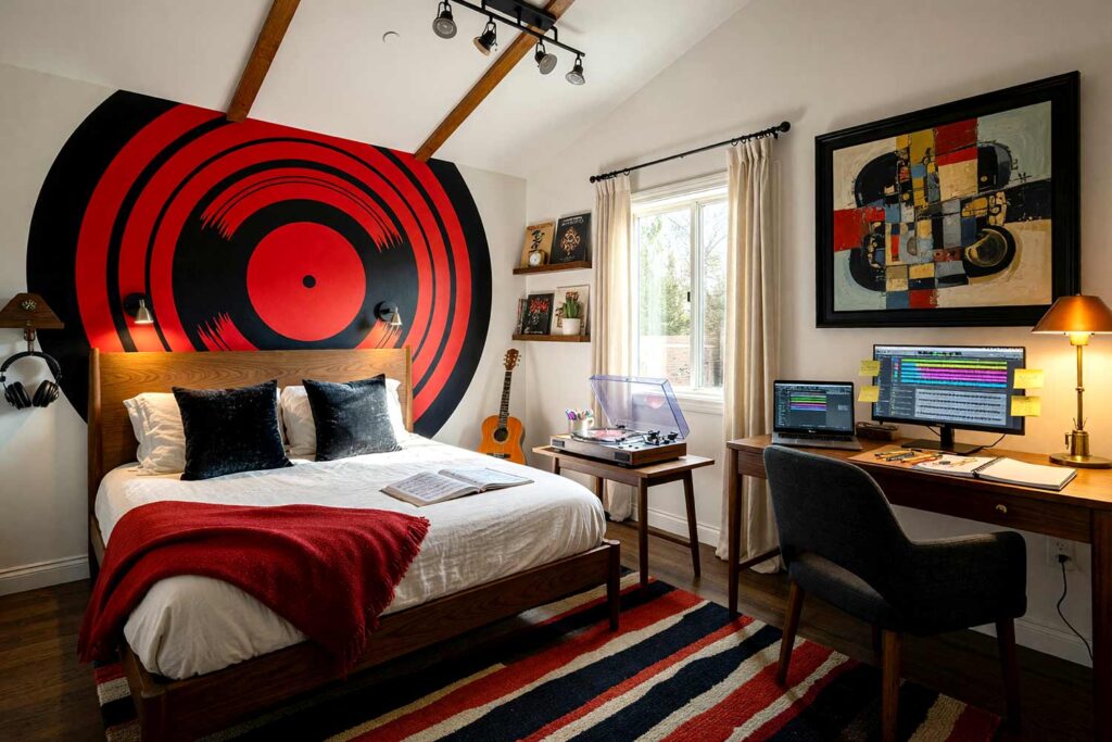
There’s a specific kind of parenting exhaustion that has nothing to do with sleep schedules or picky eating: it’s repainting a bedroom for the third time in six years because the obsession changed again. Dinosaurs became sharks. Sharks became a gaming setup. If you’re standing in the paint aisle wondering whether it’s worth doing this again, stop right there — the smartest kid’s bedroom paint colors aren’t chosen for this month’s favorite character. They’re chosen to survive the next one. Phoenix and Arcadia parents tend to swing toward “safe” or “themed and temporary,” and there’s a better lane in between: a sophisticated neutral base that holds for a decade, paired with one bold feature that’s cheap to repaint as your kid’s personality does. For more inspiration, browse the full idea library for other rooms worth stealing from.
Why Kid’s Bedroom Paint Colors Deserve a Smarter Strategy
Here’s what nobody tells you about decorating a child’s room: the aesthetics matter just as much as in any other room — they just have to survive glitter, cleats, and glow-in-the-dark stars taped onto a fresh wall. I choose a mood or architectural style that says something real about the kid living there. Once a calm, neutral wall color is locked in, the fun happens on one feature instead of the whole room: a striped panel, a painted medallion, a mural band, or a color-blocked shape behind the bed, built from two colors so it never overwhelms. None of it demands new furniture, which is why paint is the most budget-friendly kids room color scheme move a parent can make. For proof a calm foundation can feel intentional, this breakdown of elevating neutral paint choices is worth a look.
Kid’s Bedroom Paint Colors and Palettes That Grow Up With Them
Below are several distinct directions, each built the same way: a calm, neutral wall color, plus one standout feature — a different painting technique in every room — that’s cheap and quick to repaint when the current obsession fades. Pick the mood, not the character.
Dusty Denim Blue & Marigold Gold: Wanderlust Flight Deck
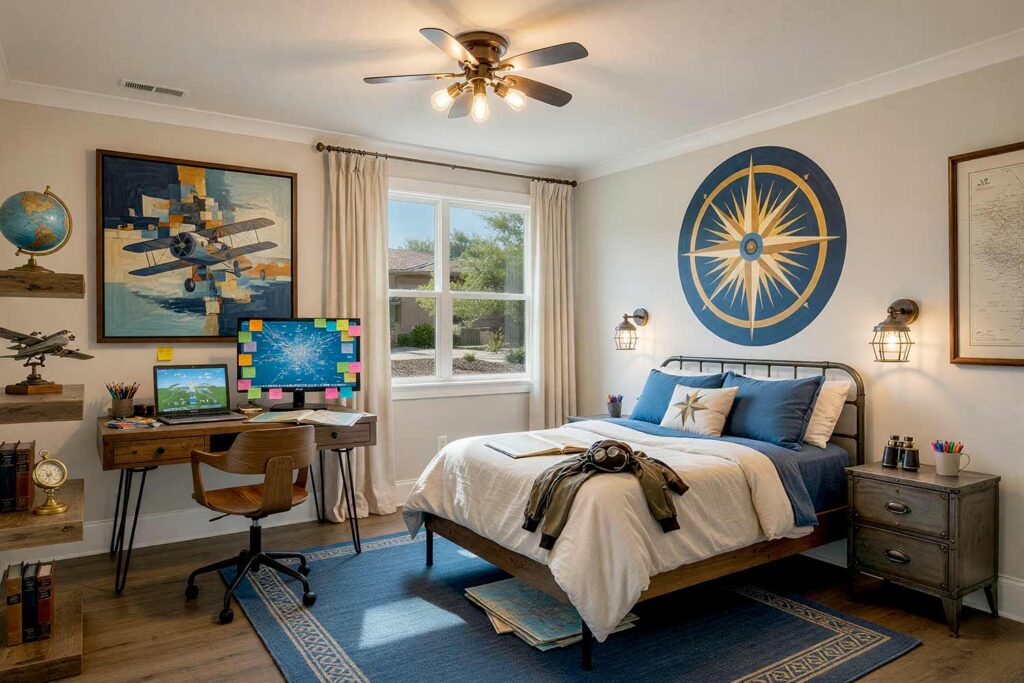
Walls: Warm ivory | Compass Medallion Wall Panel: Dusty denim blue and marigold gold | Ceiling: Soft white | Baseboards/Trim: Soft white
This one is built for a kid who keeps folded maps under the bed and asks where’s that about every plane overhead. Warm ivory walls stay easy on the eyes, while a painted compass medallion behind the bed — outer ring in dusty denim blue, needle and center in marigold gold — becomes the room’s focal point. Surround it with a framed vintage map, a hand-painted globe, or model planes waiting for takeoff. There’s a papery, dusty smell that clings to old atlases. Repaint just the medallion in two years and the story changes overnight. It’s a room that says the world is worth chasing.
Soft Sage Green & Blush Pink: Botanical Garden Retreat
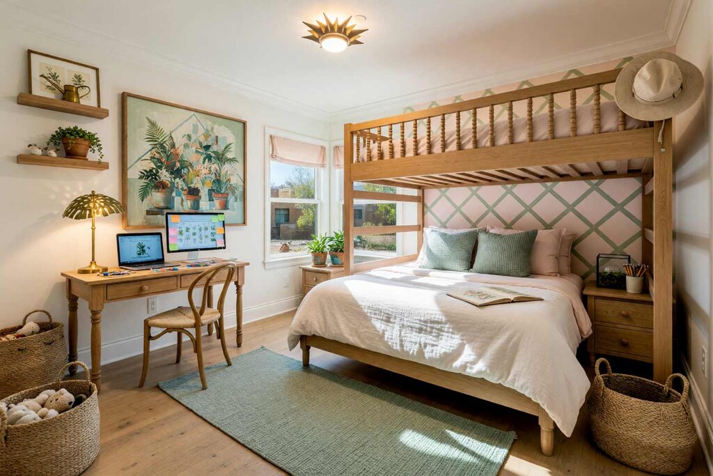
Walls: Soft dove white | Painted Trellis Accent Wall: Soft sage green and blush pink | Ceiling: Soft white | Baseboards/Trim: Warm ivory
Soft dove white walls keep this room calm and adaptable, while one wall gets a painted trellis lattice — sage green lines crossing over a blush pink backdrop — reading like a garden support climbing the wall. It’s one of my favorite children’s bedroom colors treatments because it never announces an age. Dress it up with botanical prints, a leaf-motif lamp, or terracotta pots holding real houseplants. Crack a window and let in that faint, growing-things smell. It’s a space built to keep a kid curious about the outdoors long after the plants outgrow the sill.
Warm Terracotta & Warm Oat: Southwestern Desert Dreamer
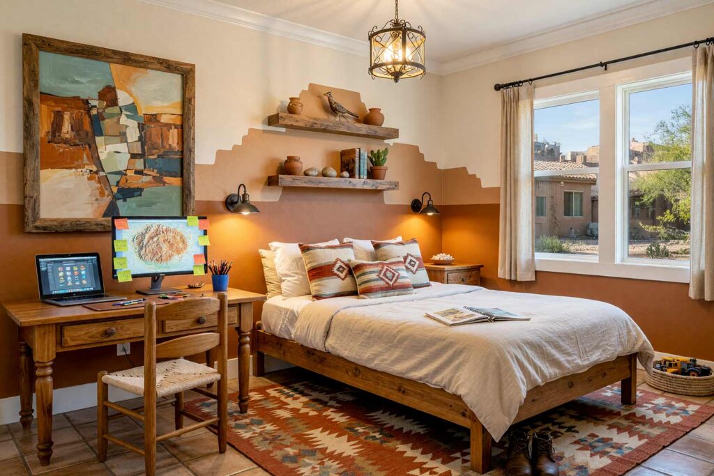
Walls: Warm alabaster | Stepped Mesa Accent Panel: Warm terracotta and warm oat | Ceiling: Soft white | Baseboards/Trim: Soft white
Arcadia families, this one is basically written for our backyard. Warm alabaster walls stay quiet and versatile, while a stepped mesa silhouette behind the bed — terracotta below, warm oat above — channels a hacienda mood without a single stereotype in sight. Layer in a woven textile throw, a small collection of clay pots, or a Navajo-patterned rug, and the room feels rooted rather than assembled. There’s a dry, sun-warmed clay smell I associate with this palette instantly. Repaint just the stepped panel down the road and the mood shifts. This combination ages beautifully because terracotta was never a trend to begin with.
Charcoal Gray & Golden Amber: Industrial Loft Gaming Den
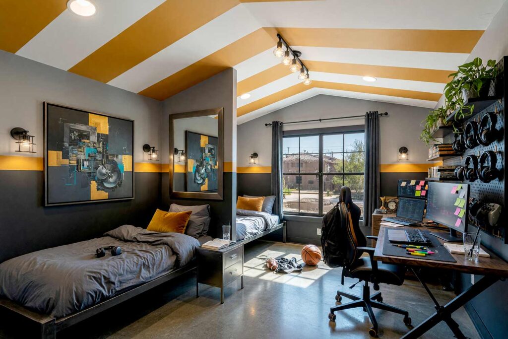
Walls: Soft fog gray | Split-Level Wall Band: Charcoal gray and golden amber | Ceiling: Soft white | Baseboards/Trim: Soft white
For the kid whose obsession is a headset and a leaderboard, soft fog gray walls keep most of the room quiet, while a split-level band does the heavy lifting — charcoal gray along the bottom third, golden amber above, meeting in one crisp line. Add a floor-to-ceiling pegboard for controllers and headsets, and hang a framed poster where the two colors meet. If you’ve never considered a painted arch feature wall or a color-blocked band, this room is proof the technique earns its keep. There’s a faint ozone-and-electronics smell that reads as productive here. Add some golden amber stripes on the ceiling and your kid will have a sleepover pad that no other kid has.
Deep Plum & Dusty Rose: Glitz & Glam Starlet Suite
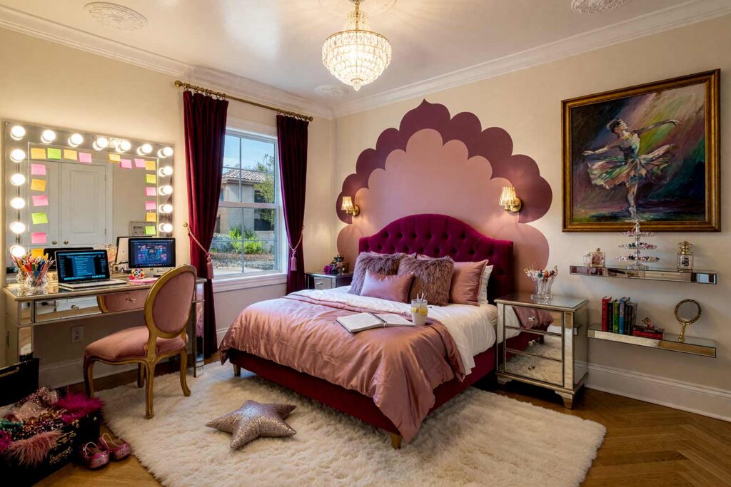
Walls: Warm parchment | Scalloped Canopy Accent Panel: Deep plum and dusty rose | Ceiling: Soft white | Baseboards/Trim: Soft white
This is one of my favorite kids room color scheme requests, built for a kid who narrates their own life like it’s opening night. Warm parchment walls stay easy to live with, while a scalloped canopy shape painted behind the bed — deep plum on the outer scallops, dusty rose filling the center — mimics a four-poster canopy without any fabric. Add a mirrored vanity, dressing-room lights, and a jewelry stand overflowing with plastic gems. There’s a faint scent of hairspray and fresh paint that reads as glamorous. This room doesn’t whisper — it takes a bow every time the door swings open.
Slate Teal & Dark Mustard: Oceanic Explorer’s Cabin
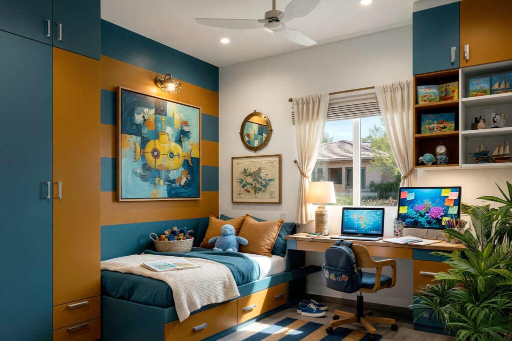
Walls: Cream | Striped Panel Behind Bed: Slate teal and dark mustard | Ceiling: Cloud white | Baseboards: Cloud white
Cream walls give this room a warm, easygoing backdrop, while a striped panel behind the bed does the storytelling — alternating bands of slate teal and dark mustard reading like an old ship’s flag. A porthole-shaped mirror, a rope-wrapped lamp, or a framed maritime chart finishes the look without leaning into anchor clichés. There’s a briny, sea-glass-candle scent I’d choose for this room every time — it makes bedtime feel like the calm after a long day of discovery. It’s a palette that works whether the current obsession is tide pools or nothing nautical at all.
Warm Taupe & Rust Red: Dark Academia Reading Loft
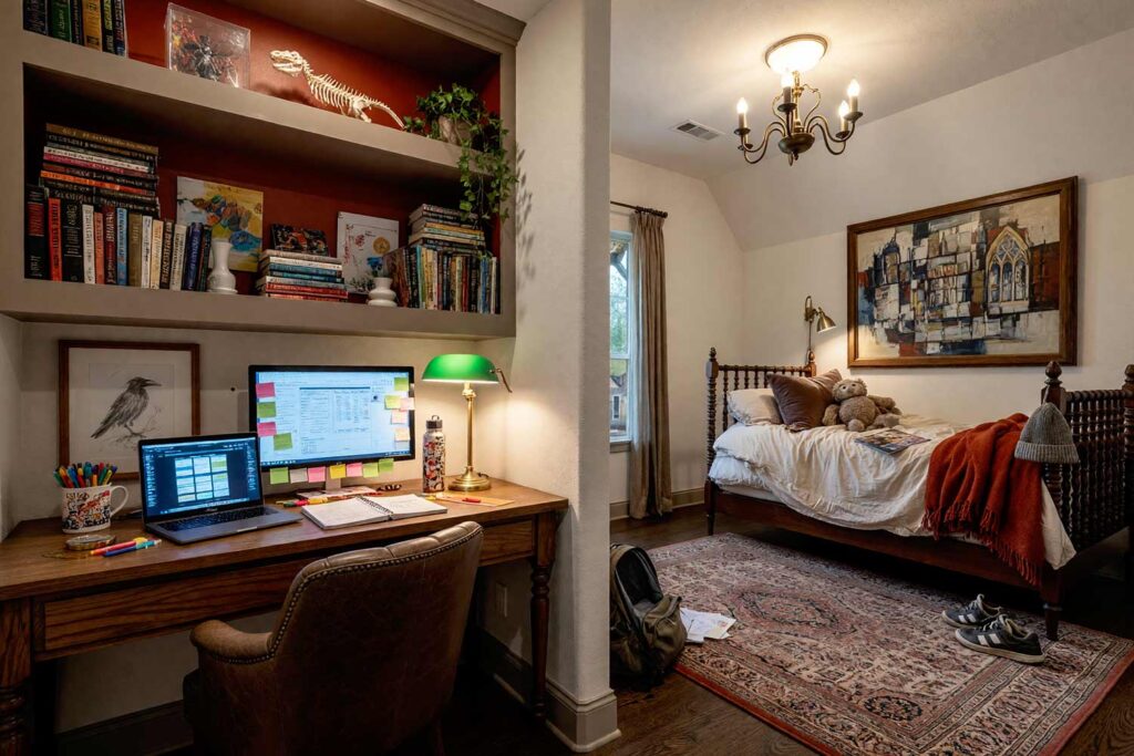
Walls: Soft bone white | Bookshelf/Closet Doors: Warm taupe and rust red | Ceiling: Soft white | Baseboards/Trim: Warm taupe
Soft bone white walls give this room a hushed, library-like calm, while the built-ins carry the drama — bookshelf frames painted warm taupe, with rust red backing the interior shelves for a two-tone depth that belongs in an old university reading room. Add a leather chair and hang a single antique-style illustration nearby, and the space feels like it’s collected stories for decades. There’s an old-paper, woodsmoke smell that pairs perfectly with this set of children’s bedroom colors — the kind that makes a kid want to disappear into a book for a Saturday. It’s quiet, moody, and entirely earned.
Powder Blue & Dusty Coral: Mid-Century Atomic Bunk Room
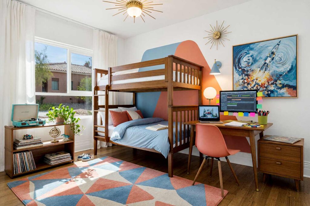
Walls: Cloud white | Boomerang Accent Panel: Powder blue and dusty coral | Ceiling: Cloud white | Baseboards/Trim: Cloud white
Cloud white walls bring genuine mid-century calm, while a retro boomerang shape painted behind the bed — one arm in powder blue, the other in dusty coral — brings atomic-era swagger without covering the whole room in it. Add tapered furniture legs, a starburst clock, and a lamp with a globe shade, and the era is unmistakable. A record player on a low shelf and a stack of vinyl completes the scene. There’s a warm, waxy crayon-and-fresh-paint smell that belongs in a room built for dance parties on a rainy afternoon. It’s playful without ever feeling babyish.
Moss Green & Burnt Sienna: Jungle Canopy Hideaway
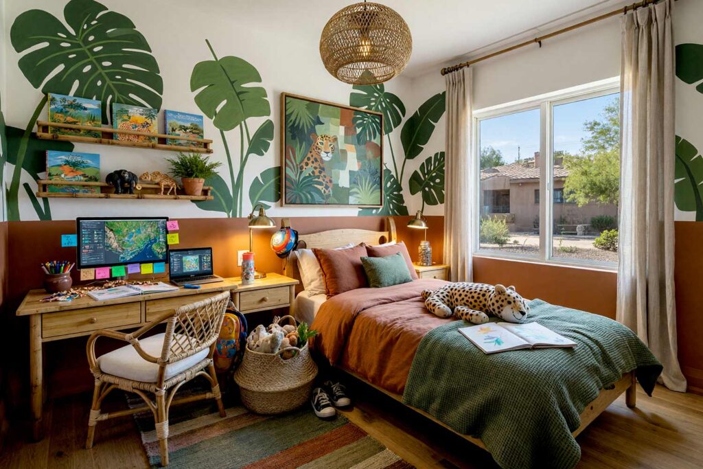
Walls: Soft warm white | Leaf Canopy Mural Band: Moss green and burnt sienna | Ceiling: Soft white | Baseboards/Trim: Soft white
Soft warm white walls keep the room bright, while a painted leaf canopy runs along the upper wall like dappled light through trees — moss green leaves layered over a burnt sienna undertone, instead of the expected sky blue mural. Add a rattan chair, houseplants, and one oversized leaf-print piece of art, and the transformation is complete without a cartoon animal in sight. There’s an earthy, humid houseplant smell that makes the room feel like it’s breathing. For more on how color affects mood, this guide on color psychology in children’s bedrooms is worth reading first.
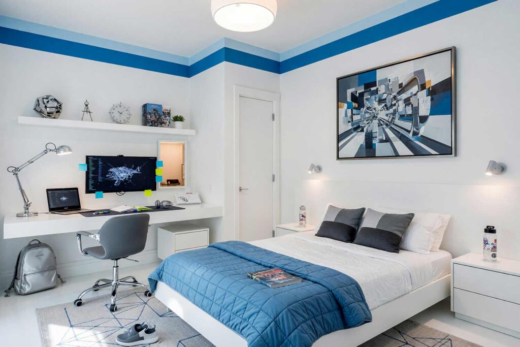
Dove Gray & Deep Navy: Bauhaus Mondrian Blueprint Bedroom
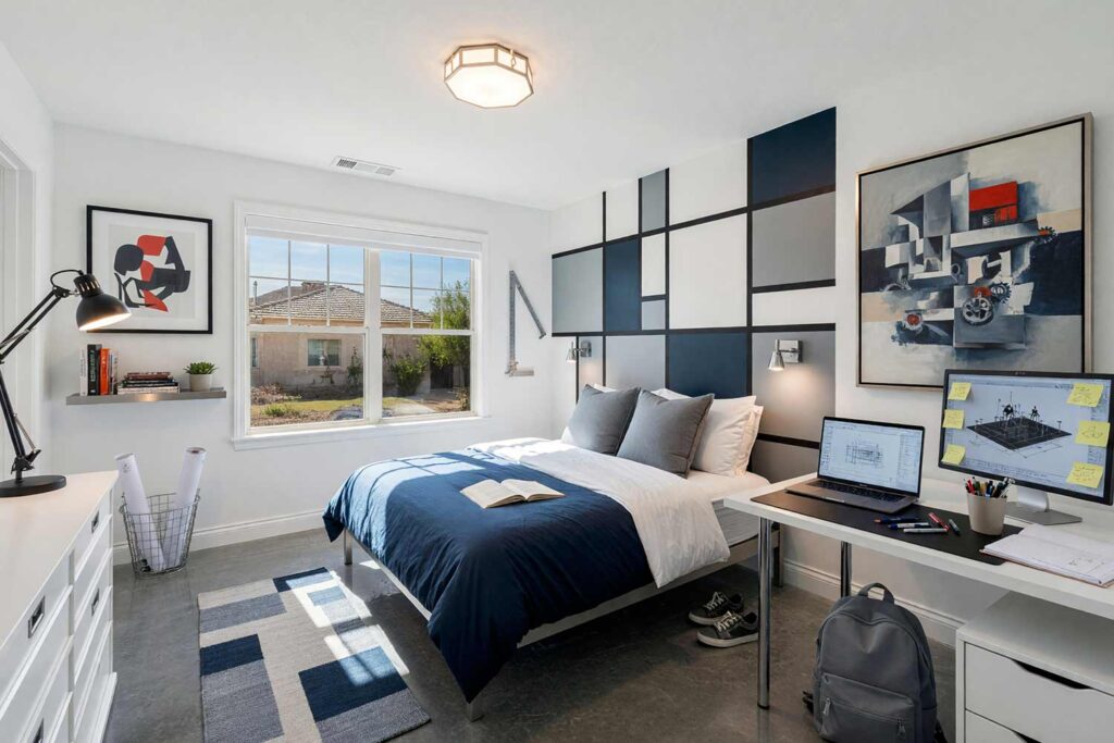
Walls: Crisp white | Geometric Grid Panel: Dove gray and deep navy | Ceiling: Crisp white | Baseboards/Trim: Crisp white
Crisp white walls are practically a blank canvas, letting a modular grid of dove gray and deep navy blocks behind the bed do the talking — a nod to the form-follows-function spirit of Bauhaus design. Skip anything fussy: one steel shelf, a bold graphic print, and hidden storage are all this room needs. There’s a clean, mineral smell here, like a freshly organized studio. It’s one of the most sophisticated kid’s bedroom paint colors pairings here, built to age directly into a teenager’s space.
Whichever direction pulls you in, a sibling’s playroom down the hall can share a color language without matching outright — a shared trim or wall neutral ties rooms together better than identical accents ever could.
Final Brush Strokes: Kids Room Color Schemes Built to Last
Great kid’s bedroom paint colors aren’t about grabbing whatever’s trending and calling it done. They’re about building a room flexible enough to hold a seven-year-old’s dinosaur phase and a fourteen-year-old’s different personality without a full redo. The best kids room color scheme leans into a real mood — desert, nautical, glam, industrial — and lets one paint-only feature carry the weight of change instead of the furniture. These are some of my favorite children’s bedroom colors to design, precisely because they’re built to last. Pick the feeling before the swatch, then build outward. If you’re also weighing colors for a guest bedroom or boutique-style retreat elsewhere in the house, the same thinking applies. Give me a call if you want a hand choosing the right base.
Choose a calm neutral for the walls, then let two accent colors carry one standout feature — a striped panel, a painted medallion, or a mural — that’s cheap to repaint as your child’s interests change over time.
Sage green, dusty blue, warm taupe, and soft terracotta are popular gender-neutral kid’s bedroom paint colors. Each works as a calm base for any child and pairs easily with a bold, changeable accent.
A neutral base like sage green, dove gray, or warm taupe won’t be outgrown, since it’s the accent feature — not the whole room’s kid’s bedroom paint colors — that changes as interests do.