
Last Updated on September 19, 2026
Paint doesn’t have to shout to make a room unforgettable. Some of the richest, most expensive-looking spaces I’ve painted use exactly one color family, just leaned into from every angle. That’s the whole idea behind tone-on-tone interior paint: instead of picking a wall color and calling it a day, you pull three or four values of that same hue and spread them across the walls, trim, ceiling, and doors. The result feels custom, intentional, almost architectural, even though the color story never actually changes. Flat, forgettable rooms turn into something a magazine would shoot, purely because someone had the nerve to commit to one hue and ride it all the way through. If you’ve been stuck in beige purgatory, browsing my running list of painting ideas might be the exit ramp you need.
What Makes a Tone-On-Tone Interior Paint Job Actually Work
The trick to a convincing monochromatic paint scheme isn’t grabbing three swatches that look vaguely related and calling it done. It means picking one pigment and following its full value range, pale, mid, and deep, the way a photographer follows light through a window. Paint pale sage on the walls, a mid-tone sage on the baseboards and trim, and a deep sage on the ceiling and doors, and the room reads as deliberate, not accidental. Or flip it: mid-tone taupe walls, a dark taupe accent wall, a lighter taupe on the trim and doors, and the palest taupe overhead, a layering trick I explored in my piece on drenching a whole room in a single hue. As this House Beautiful roundup of living room colors shows, a tonal palette photographs beautifully because it isn’t fighting itself. I always push clients toward one accent color too, saved for pillows or art, so the room keeps a pulse.
10 Tone-On-Tone Interior Paint Pairings I’d Paint Tomorrow
Here are ten tone-on-tone interior paint pairings that prove one color family can carry a whole room, no accent wall crutches required. Each leans on the same pale-mid-deep logic, but the mood shifts entirely depending on which hue you choose and which surface gets the darkest layer.
Sage Whisper & Juniper Shadow: Desert Zen Retreat
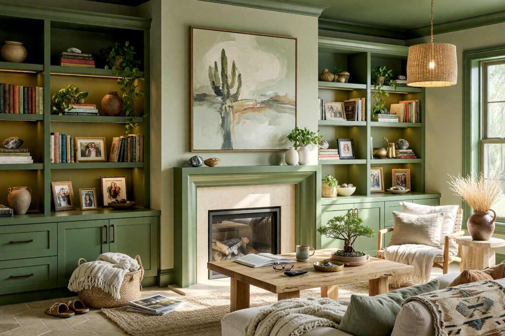
Walls: Sage Whisper | Baseboards/Trim: Cactus Moss | Ceiling & Doors: Juniper Shadow | Cabinets/Built-ins: Cactus Moss
This palette is for anyone who wants a living room that feels like a desert retreat at golden hour. Sage Whisper covers the walls like a soft exhale, Cactus Moss climbs the trim, and Juniper Shadow takes the ceiling and doors, a move I cover more in my piece on painting ceilings as an underrated design hack. Lean into the desert-oasis theme with raw clay pottery on the console and a woven textile over the sofa back. Crack a window and let in that dry Phoenix air. By evening, that deep juniper ceiling catches the lamp light and the room feels like it’s holding its breath.
Oat Taupe & Espresso Taupe: French Country Hideaway
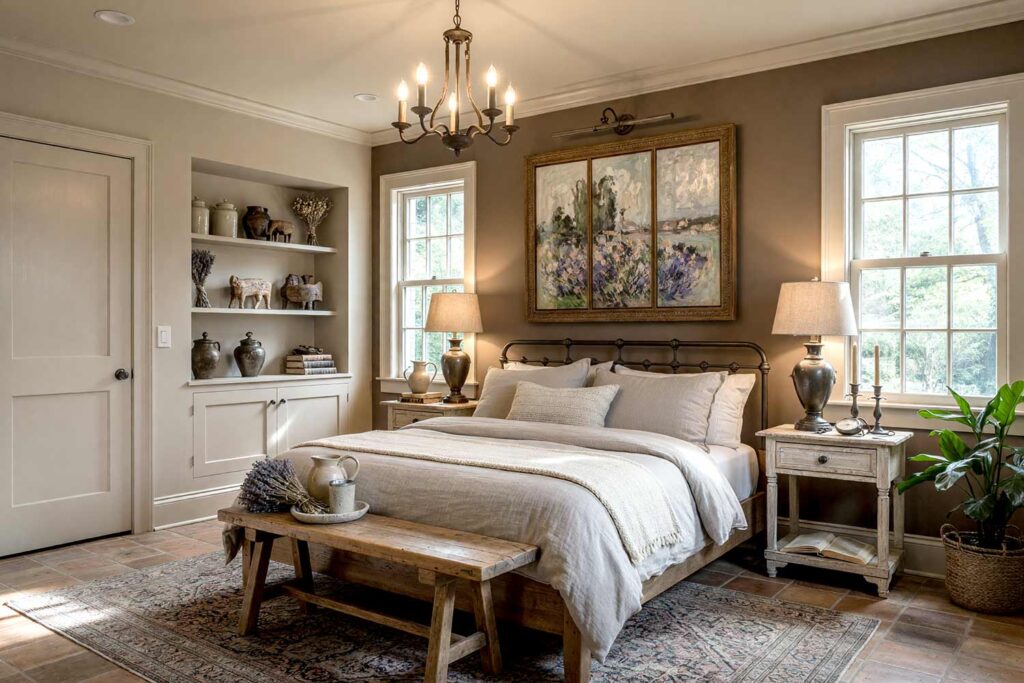
Walls: Mid Taupe | Accent Wall: Espresso Taupe | Baseboards/Trim & Doors: Fog Taupe | Ceiling: Oat Taupe
French Country doesn’t need toile or a chandelier to feel authentic, it just needs restraint, and this taupe family delivers. Mid Taupe wraps the walls, Espresso Taupe anchors one deep accent wall behind the headboard, Fog Taupe softens the trim and doors, and Oat Taupe drifts overhead. Dress the bed in nubby linen and drop dried lavender on the nightstand, the kind of detail that makes a room smell like a countryside inn. A wrought iron sconce above the headboard finishes it. By morning, when the palest ceiling catches first light, the bed feels like a quiet little cocoon.
Pale Adobe & Burnt Terracotta: Mediterranean Revival
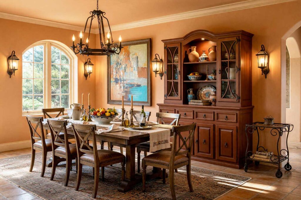
Walls: Sandstone Clay | Ceiling: Pale Adobe | Baseboards/Trim/Crown: Paler Adobe | Built-in Hutch: Burnt Terracotta
Burnt Terracotta on a built-in hutch is an unapologetic move that makes a dining room feel sun-drenched and slower-paced, sinking into a genuinely deeper, more baked register of the same amber-clay rather than drifting toward coral or brown. Sandstone Clay covers the walls with real warmth, Pale Adobe lifts the ceiling into a lighter version of that same hue, and the crown and trim climb even paler still at, the sun-bleached top note of the whole family. That terracotta hutch becomes the room’s whole personality against all that graduated warmth. This is a monochromatic paint scheme built for Mediterranean revival: a wrought iron chandelier overhead, a bowl of hand-painted ceramic fruit on the table. Run your hand along a stucco-textured accent panel near the buffet and feel why this palette works, it’s warm before dinner even starts. Every surface here, crown to ceiling to wall to hutch, holds one verified clay-amber hue across four depths. By dessert, that hutch glows like it’s still catching afternoon sun.
Powder Blue & Midnight Navy: Coastal Nautical Retreat
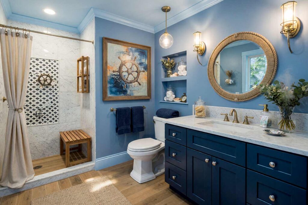
Walls: Slate Denim | Ceiling: Powder Blue | Baseboards/Trim & Door: Powder Blue | Vanity/Cabinetry: Midnight Navy
Midnight Navy (or even Salty Dog) on a bathroom vanity is one of my favorite moves. It makes even a small powder room or bathroom feel like a ship’s quarters with an upgrade. Slate Denim covers the walls, Powder Blue lightens the ceiling, trim, and door, and that navy vanity anchors everything else. Hang a rope-wrapped mirror over the sink and stack towels in a glass apothecary jar. I leaned on similar logic in my piece on curating unexpected laundry room paint colors. Steam up the shower and that eucalyptus smell seals the deal, this bathroom feels like a retreat, not a chore.
Petal Pink & Berry Wine: Grandmillennial Playroom
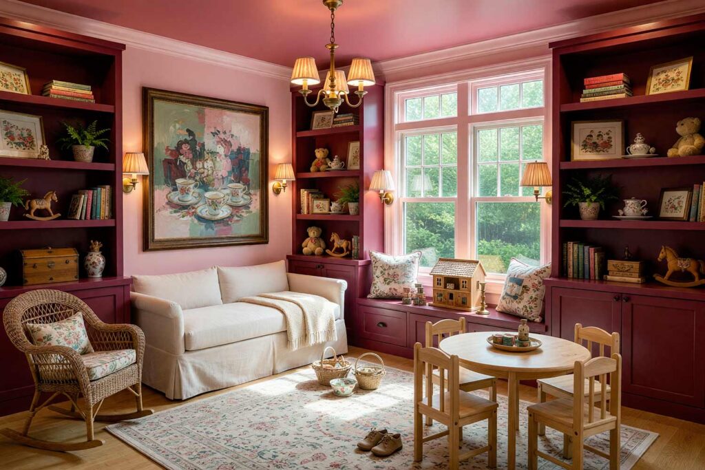
Walls: Petal Pink | Ceiling: Dusty Rose | Baseboards/Trim: Light Petal Pink | Built-in Bookshelves: Berry Wine
Berry Wine bookshelves might be the boldest thing on this list, but paired with soft Petal Pink walls and a slightly deeper Dusty Rose overhead, it reads as confident, not chaotic. This is grandmillennial styling: a chintz-print pillow on a wicker rocking chair, a needlepoint pillow framed above the reading nook, every hue pulled from the same tonal palette. Run your fingers over a chenille blanket at the foot of the daybed and the room suddenly feels soft in a way photos can’t capture. It’s a playroom that feels like a boutique hotel suite dressed up but still meant for scuffed knees and afternoon naps.
Fog Gray & Graphite Charcoal: Industrial Loft Command Center
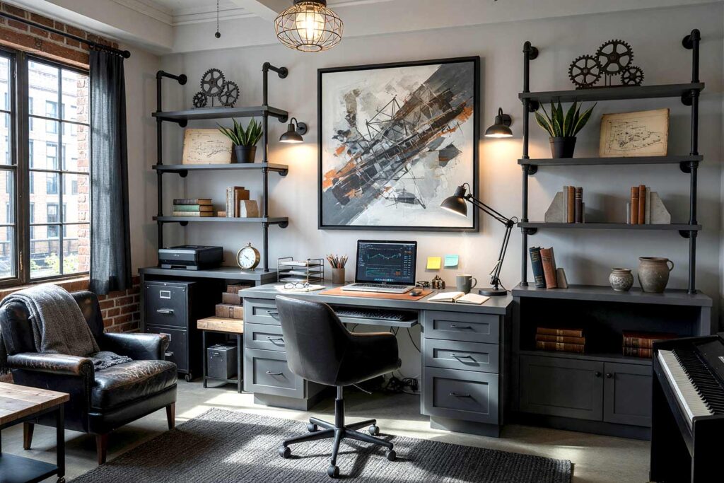
Walls: Dove Gray | Ceiling: Fog Gray | Baseboards/Trim & Built-in Desk: Graphite Charcoal
Graphite Charcoal on a built-in desk and trim turns a home office into something closer to a warehouse loft than a spare bedroom with a laptop. Dove Gray covers the walls, Fog Gray lightens the ceiling, and the charcoal woodwork holds the moody end of the spectrum. Hang a caged pendant over the desk and mount open pipe shelving for books and plants. As this breakdown of mastering a tone-on-tone look notes, restraint in hue makes a room feel curated. By dusk, when the desk lamp clicks on, this workspace feels like the one room built entirely on purpose.
Golden Wheat & Umber Amber: Retro Atomic Kitchen
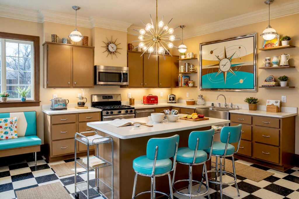
Walls: Golden Wheat | Cabinets: Golden Ochre | Ceiling: Light Golden Wheat | Baseboards/Trim: Umber Amber
Golden Ochre cabinets against Golden Wheat walls make a kitchen feel like it time-traveled out of 1962, in the best way. Umber Amber grounds the baseboards and trim, giving the tone-on-tone interior paint story some weight down low, while the ceiling stays a little lighter so the room doesn’t close in. Add a starburst wall clock above the range and a shelf of tiki mugs by the window. Morning light through gauzy curtains hits that ochre cabinetry like the kitchen is glowing from the inside. It’s the kind of room that makes people linger over coffee a little longer than they meant to.
Lilac Mist & Deep Aubergine: Art Deco Entryway
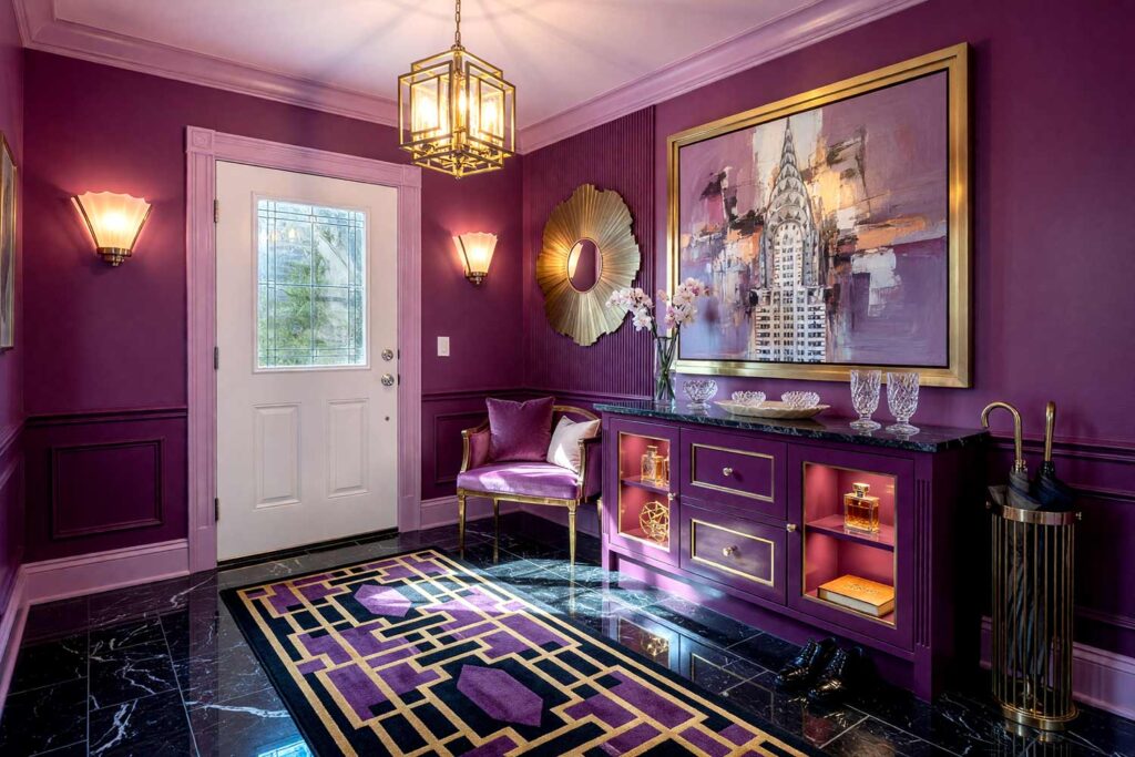
Walls: Mid Plum | Wainscoting: Dark Plum | Ceiling: Light Lilac Mist | Baseboards/Trim: Lilac Mist | Built-in Console/Millwork: Deep Aubergine
Deep Aubergine millwork in an entryway is a bold first impression, and paired with two shades of Plum walls and a soft Lilac Mist ceiling, it reads as glamorous, not gloomy. This is Art Deco distilled into paint: a fan-shaped mirror catching the light by the door, a geometric-patterned runner leading guests deeper into the house. The aubergine console glows almost jewel-like under a single sconce. Every value here comes from the same plum family, exactly what makes the entry feel curated instead of clashing. Guests pause an extra second before they take off their coat, and that pause is the whole point.
Seafoam Mist & Peacock Teal: Tropical Sunroom Escape
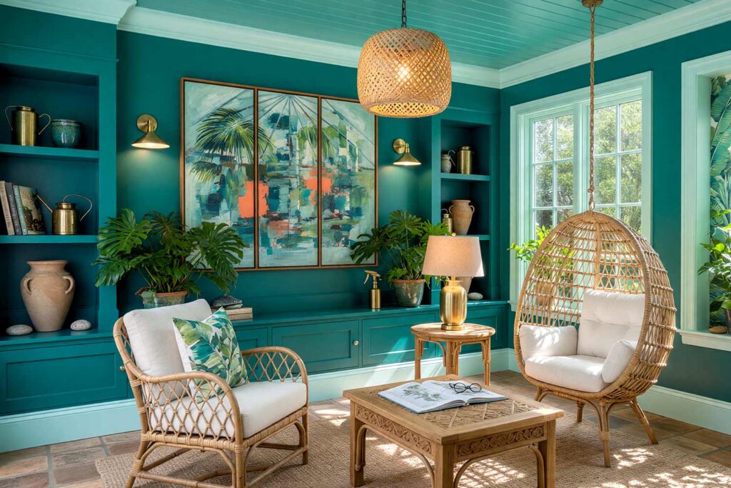
Walls: Mid Teal | Ceiling: Seafoam Mist | Baseboards/Trim & Window Casings: Seafoam Mist | Built-in Planter Ledge: Peacock Teal
Peacock Teal on a built-in planter ledge is my favorite kind of showing off, it turns houseplants into part of the tonal palette. Mid Teal covers the walls, Seafoam Mist lifts the ceiling, trim, and window casings, and that deep peacock shade under the greenery makes every leaf look more saturated. Hang banana leaf wallpaper in one accent nook and sling a rattan chair in the corner. There’s a warmth here, almost a hothouse quality, when sun hits all that teal at once. This monochromatic paint scheme feels lush, like the room is quietly breathing green and blue in the same breath.
Toffee Brown & Cocoa Bean: Dark Academia Study
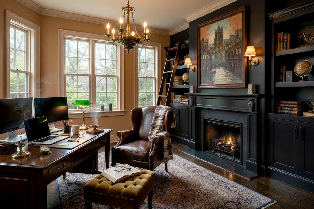
Walls: Toffee Brown | Ceiling: Parchment Brown | Baseboards/Trim: Toffee Brown | Fireplace Mantel/Surround: Cocoa Bean
Cocoa Bean on a fireplace surround might be the moodiest move on this list, and I mean that as the highest compliment. Toffee Brown wraps the walls, Parchment Brown lifts the ceiling just enough to keep the room from feeling like a cave, and that near-black mantel anchors everything like it’s been smoked by a hundred winters. Add a cracked-leather wingback chair angled toward the hearth and a stack of worn atlases nearby. There’s a specific smell this room earns, old paper and dying embers, that this palette somehow evokes. By firelight, it feels less like an office and more like somewhere you’d go to vanish into a novel for a few hours.
Final Brush Strokes: Committing to One Color, All the Way Through
Tone-on-tone interior paint isn’t the safe choice, even though it sounds like it might be. It’s actually a commitment: choosing one hue and trusting it enough to carry an entire room in three or four different weights. That’s harder than picking one color for the walls and a bright white for everything else, and it pays off every time. Whatever hue speaks to you, whether it’s a mossy green, a warm rust, or a moody navy, push it further than feels comfortable. Paint the ceiling. Paint the trim a shade off from the walls. Save one loud accent color for the pillows and call it a day. A room built this way doesn’t just look finished… it looks like it knows exactly what it is.
Tone-on-tone interior paint layers three or four values, pale to deep, of one exact color across walls, trim, ceiling, and doors for a rich, layered look. One saved accent color for accessories keeps the room feeling alive, not flat.
Yes — plaster pink behaves like a versatile neutral base while still injecting warmth, making it ideal for an eclectic maximalist reading nook layered with warm white striped accents and gallery art.