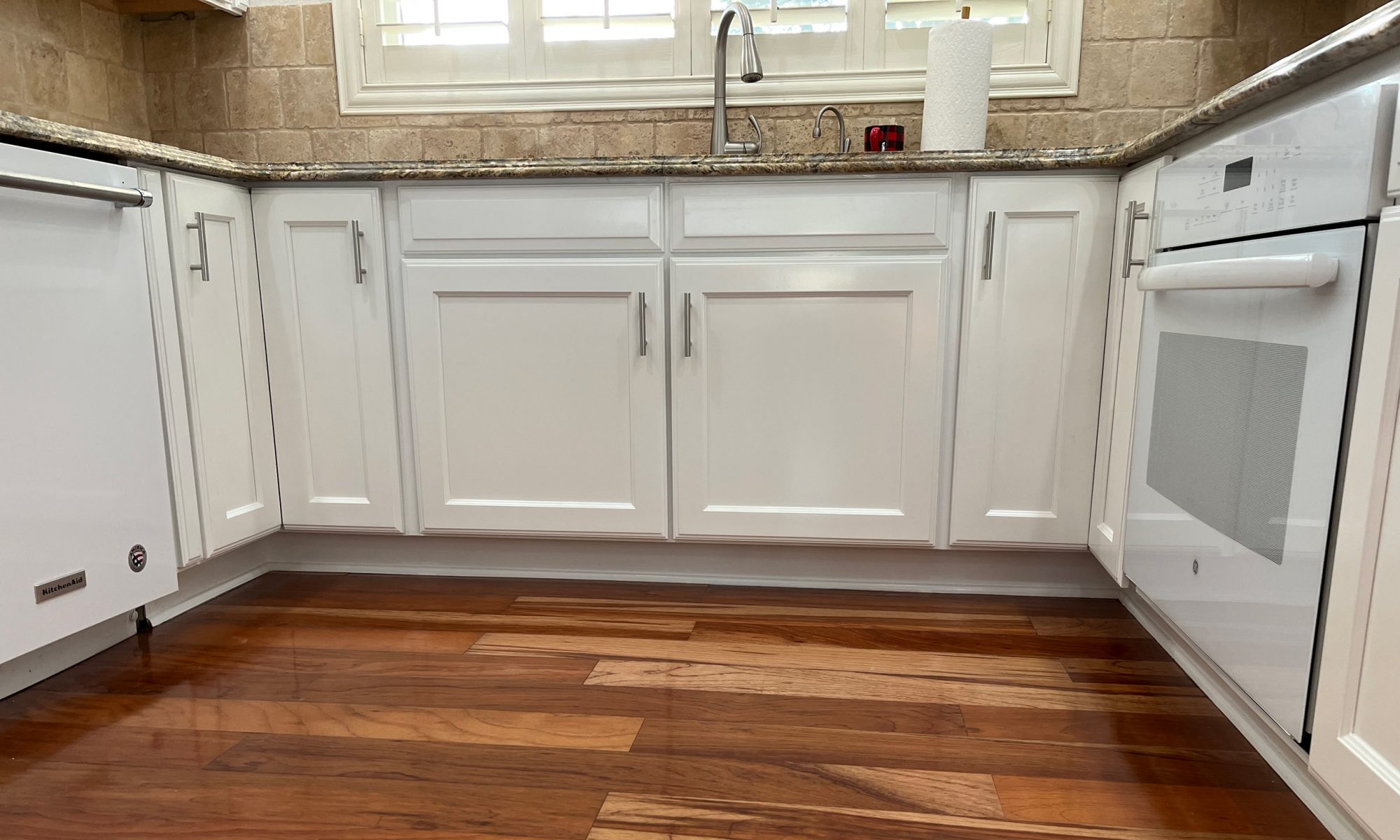

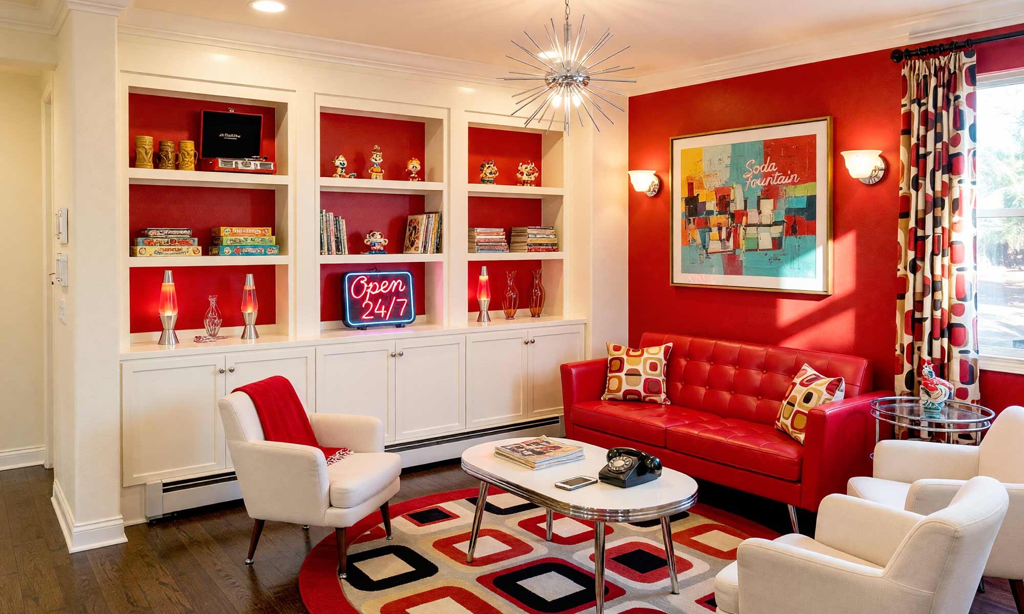
A built-in bookshelf is basically a blank canvas that everyone forgets is a canvas. It gets treated like trim — an afterthought painted whatever leftover white was in the garage — when it could be the loudest, most personality-packed feature in the whole room. Painting built-in bookshelves is one of those rare upgrades that costs almost nothing and changes almost everything, and yet it barely gets talked about compared to kitchen cabinets or accent walls.
Here’s the part that should get you excited: the color you pick for those shelves does more than decorate. It can shrink a room or blow it wide open, flatten it or give it real dimension, whisper politely or absolutely shout. That’s the fun part of painting built-in bookshelves, and it’s exactly what we’re getting into.
Why Painting Built-In Bookshelves Changes the Whole Room
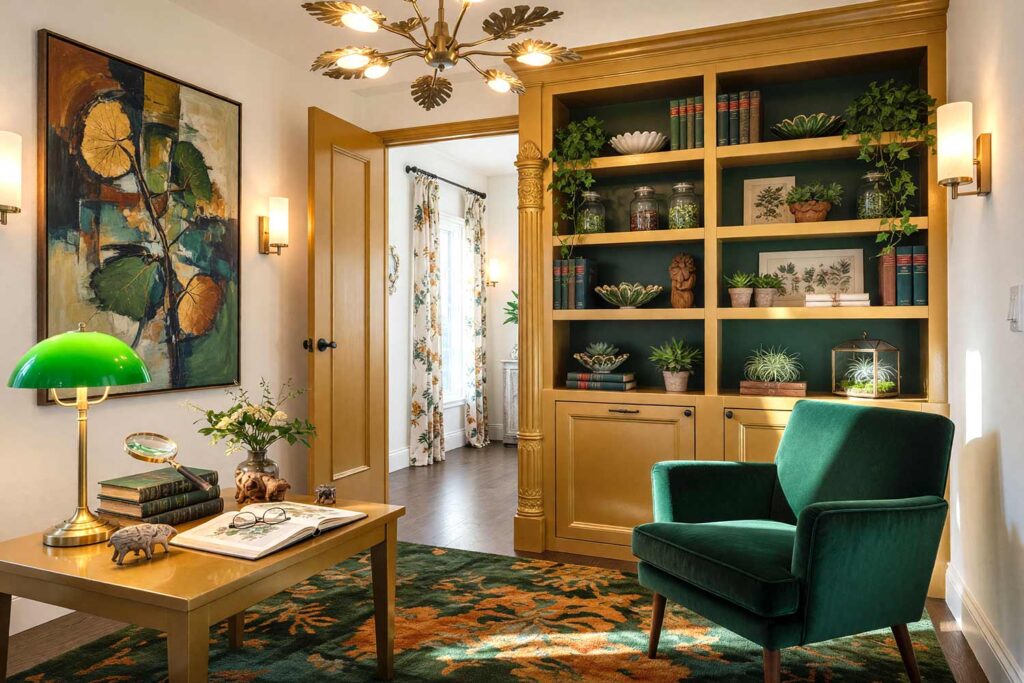
Every bookshelf paint color ideas conversation eventually lands on the same fork in the road: camouflage or pop. Paint your built-ins the exact same color as the surrounding wall, and the visual boundary between shelf and wall just disappears — a cramped den suddenly reads twice as big because your eye has nothing to stop it. Go the other direction, pop the shelving with bold contrast, and now it’s sculpture. It’s the thing every guest comments on when they walk into a room where painting built-in bookshelves was clearly a priority.
There’s also a sneaky little trick worth stealing: paint only the back panel of the bookshelf a moody charcoal or deep navy, leave the rest alone, and you’ve faked an illusion of shadow and depth that makes shallow shelves look like they run deeper than they actually do, a move design editors at Houzz have highlighted as one of the easiest depth hacks around. Trim decisions get personal from here — should your built-ins match the baseboards and crown molding, or stand apart as their own accent feature?
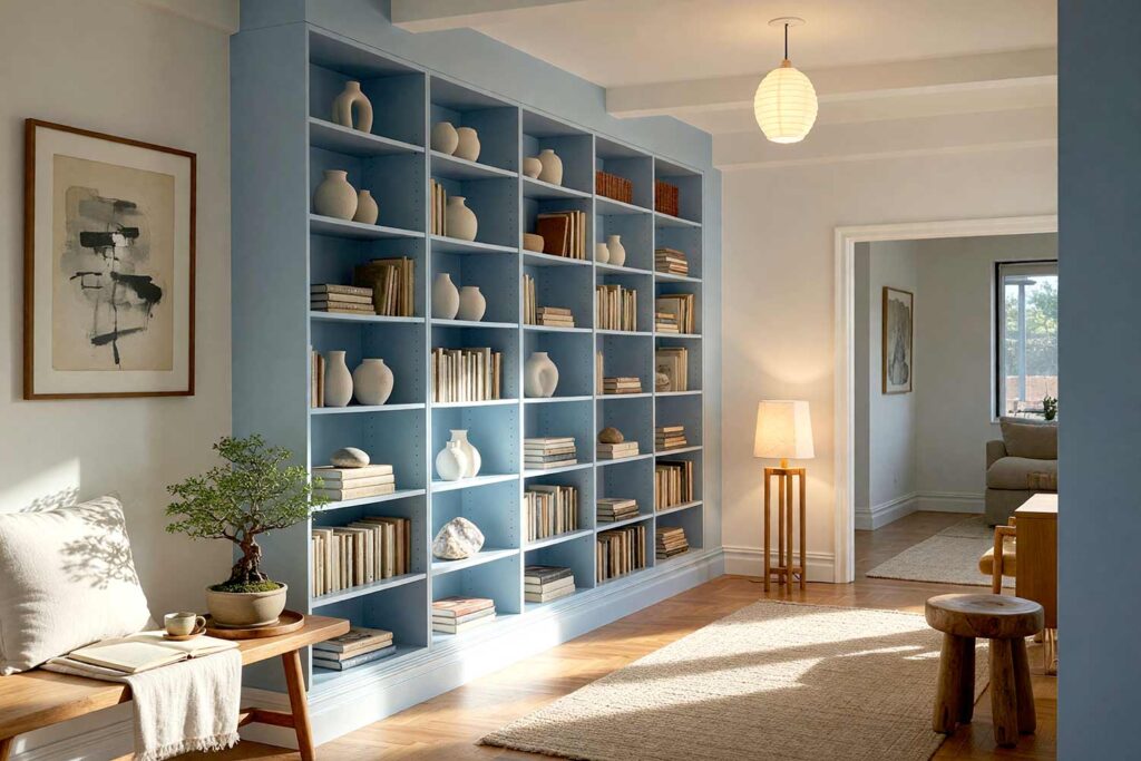
There’s no rulebook. A recent breakdown on matching built-ins to wall color makes the case that it comes down to whether you want the shelf to disappear into the architecture or interrupt it on purpose. If your walls sit in that safe greige-and-off-white zone, this is your excuse to bring in a saturated accent that finally earns its keep — and if you’re curious how far contrast trim can go, the boldest rooms all share one secret is worth a look before you commit. And if your shelving flanks a fireplace or sits atop lower cabinetry, you’ve got one more call to make: single continuous color, or a two-tone split treating the base like furniture and the open shelving like art.
This is really a mood project disguised as a paint project. The right color ideas for painting bookshelves can nod to Art Deco glamour, Southwestern warmth, or dark academia drama without a single wall coming down, and if that’s got you thinking bigger, cabinet makeover magic beyond the kitchen shows how far that same logic stretches into other rooms. Painting built-in bookshelves really is one of those small projects with an outsized payoff.
10 Bookshelf Paint Color Ideas That Anchor Any Room
Ink Navy & Warm Alabaster: The Dark Academia Library
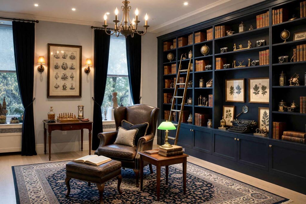
Walls: Soft dove gray | Cabinets/Bookshelves: Ink navy | Back Panel: Charcoal ink | Ceiling: Off-white | Baseboards/Trim: Warm alabaster
This is dark academia distilled into paint — moody, book-stuffed, and made for disappearing into a novel for an entire weekend. The charcoal back panel deepens every shelf into a shadow box, giving a prized collection of leather-bound classics or vintage cameras a stage worthy of a gallery. Add a rolling brass ladder, a worn leather chair, and a small stack of antique medical illustrations framed on the one open sliver of wall nearby. Even the reading lamp feels like a supporting character in this scene. It’s the kind of room that makes you want to cancel plans, brew something strong, and just sit with a book you’ve already read twice, purely for the atmosphere surrounding you.
Terracotta Clay & Sage Whisper: Southwestern Hacienda
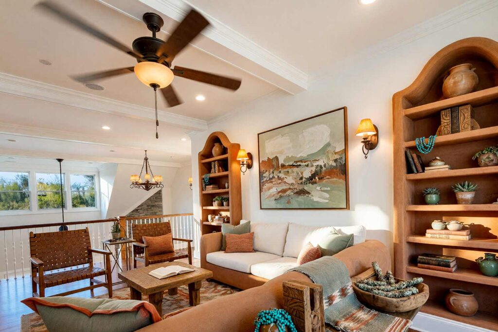
Walls: Bone white | Cabinets/Bookshelves: Terracotta clay | Ceiling: Warm white | Baseboards/Trim: Bone white
Desert living gets its due here — terracotta cabinetry feels dug straight from the earth, and sage-toned accessories cool things down just enough. This is Southwestern hacienda through and through: a cluster of raw clay pots, a woven textile draped over the lower shelf, maybe a small display of hand-carved wooden bookends or a strand of turquoise beads looped over a shelf edge. The whole vignette feels sun-warmed even indoors, like it absorbed a little desert heat before you brought it home. Bookshelf paint color ideas rarely feel this grounded, this textural, or this effortlessly tied to the landscape just outside your window.
Buttercup Yellow & Graphite: Mid-Century Modern Cheer
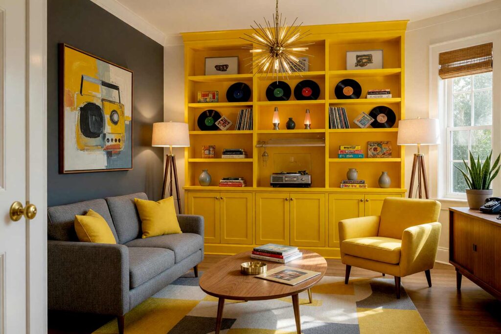
Accent Wall: Graphite | Cabinets/Bookshelves: Buttercup yellow | Walls/Ceiling: Soft off-white cloud | Baseboards/Trim: Crisp white
Pure mid-century optimism, no apology necessary. A graphite accent wall behind buttercup cabinetry channels tapered-leg furniture and starburst clocks without tipping into costume territory — it’s also the perfect backdrop for a shelf of vinyl records and a turntable setup, letting a well-loved album collection finally get some visual credit instead of hiding in a cabinet. Toss in a scattering of vintage board games stacked at odd angles, or a single atomic-era lava lamp glowing on the end shelf, and the whole wall starts to feel like a curated time capsule. This is one of those built-in bookcase design ideas that rewards confidence and a little kitschy nostalgia.
Deep Plum & Blush Petal: Boutique Hotel Glamour
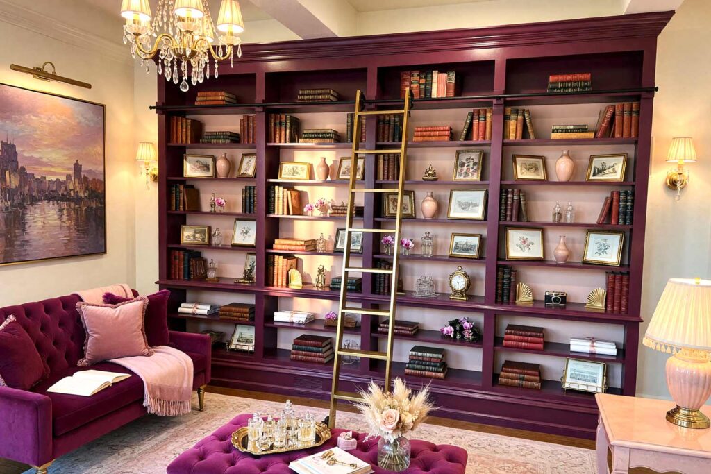
Walls: Warm cream | Cabinets/Bookshelves: Deep plum | Back Panel: Blush petal | Ceiling: Warm cream | Baseboards/Trim: Warm cream
Deep plum shelving against a blush back panel feels like walking into a boutique hotel lobby at golden hour — a little theatrical, thoroughly indulgent. It’s the kind of backdrop that makes a curated stack of coffee-table art books, a small collection of framed vintage postcards, or a single antique perfume bottle look intentional rather than cluttered. Add a tasseled lamp and a low, tufted bench nearby, and suddenly the room feels like it has a concierge on standby. This built-in bookcase design idea makes guests ask who designed the room, and honestly, you get to take full credit.
Forest Green & Cream: Craftsman Fireplace Flank
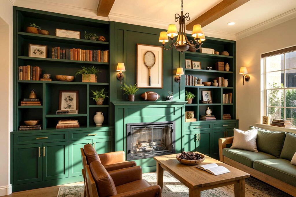
Walls: Warm oat | Cabinets/Bookshelves (flanking fireplace): Forest green | Fireplace Surround: Forest green (continuous) | Ceiling: Soft warm white | Baseboards/Trim: Cream
Here, the shelving and the fireplace surround share one unbroken forest green, so the whole wall reads as a single, deliberate architectural statement rather than three separate features competing for attention. This is Craftsman style at its most livable — exposed beam ceilings, mission-style furniture, and a rack of vintage tennis rackets or antique leather footballs mounted nearby would feel completely at home. Even a simple row of hardcover field guides on natural history takes on more weight against this backdrop. It’s the kind of room that feels lived-in on day one, not staged, and only gets better with a little clutter added over time.
Coral Sunset & Ivory Cloud: Tropical Escape
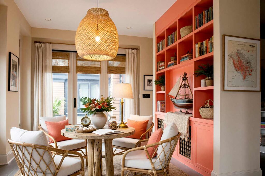
Walls: Sandy beige | Cabinets/Bookshelves: Coral sunset | Ceiling: White linen | Baseboards/Trim: Ivory cloud
Coral cabinetry against ivory trim brings real vacation energy into a reading nook — jungle-meets-coastal, sunny without trying too hard. It’s a natural home for travel souvenirs picked up on actual trips, a half-hull ship model, a compass or brass sextant angled just so, or a shelf of hardcover novels bought at every airport bookstore along the way. Drape a woven throw over the lower shelf and let a single potted palm lean into frame from the side. This is one of those color ideas for painting bookshelves that feels like the retreat you didn’t know your den was missing, and it never once feels like it’s trying too hard to get there.
Slate Blue & Golden Ochre: Art Deco Statement
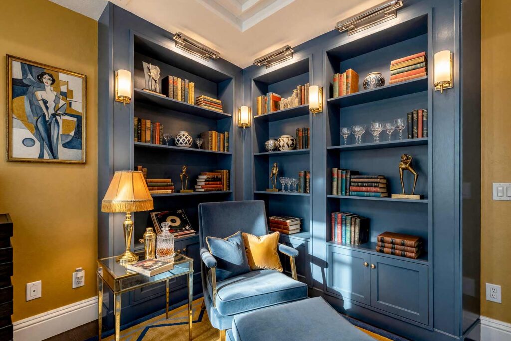
Walls: Golden ochre | Cabinets/Bookshelves: Slate blue | Ceiling: Soft off-white | Baseboards/Trim: Crisp white
A golden ochre accent wall behind slate blue cabinetry is Art Deco glamour condensed into two colors, the kind of combination that makes a small collection of geometric-patterned pottery, a single mirrored side table, or even a set of vintage cocktail glasses look like they belong in a 1920s supper club. Add a fringed lampshade and a low-slung velvet chair, and the whole corner starts humming with a little jazz-age confidence. These bookshelf paint color ideas prove that drama doesn’t require a whole room of contrast, just one bold wall and the nerve to commit to it fully.
Burnt Sienna & Warm White: Eclectic Maximalism Fireplace Flank
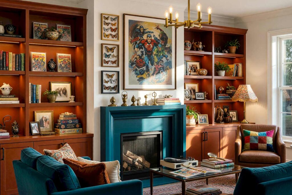
Walls: Warm white | Cabinets/Bookshelves (flanking fireplace): Burnt sienna | Fireplace Surround (accent): Deep teal | Ceiling: Warm white | Baseboards/Trim: Warm white
For the homeowner who collects rather than curates, burnt sienna shelving flanking a deep teal fireplace surround creates just enough separation to let each element shine on its own without competing for attention. This is eclectic maximalism at its boldest — gallery-wall art, mismatched textiles, and a shelf of comic books, pinned butterflies, or acrylic action-figure cases would all feel perfectly at home crowding these shelves floor to ceiling. Nothing here needs to match perfectly; the charm comes from the layering itself, one more oddity stacked on the last, until the whole wall feels like a story you could spend an hour reading just by looking at it.
Soft Lavender & Dove White: British Countryside Estate
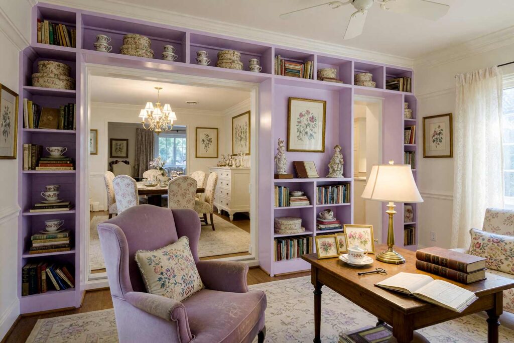
Walls: Pale oat | Cabinets/Bookshelves: Soft lavender | Ceiling: Dove white | Baseboards/Trim: Dove white
Soft lavender cabinetry reads like a country estate library — refined, faintly moody, thoroughly charming. This is grandmillennial styling at its gentlest: needlepoint pillows, a stack of chintz-covered hatboxes, and a shelf dedicated to antique teacups, pressed botanical prints, or a small run of leather-bound diaries collected over generations without looking staged for a moment. A brass-less reading lamp and a slightly worn wingback chair finish the picture nicely. It’s the kind of room that feels inherited rather than decorated, even if you bought every single piece last weekend at an estate sale.
Olive Drab & Burnt Rust: Industrial Loft Edge
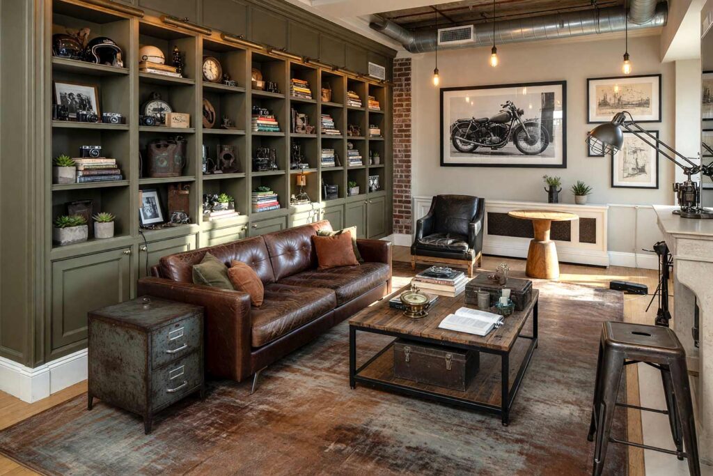
Walls: Light greige (or exposed brick) | Cabinets/Bookshelves: Olive drab | Ceiling: Stark white | Baseboards/Trim: Stark white
Raw, a little rebellious, and made for a converted loft space. Olive drab cabinetry against burnt rust accents leans hard into industrial territory — exposed pipes, Edison bulbs, and a shelf of vintage cameras, motorcycle memorabilia, or a set of antique oil cans displayed like museum pieces complete the intentionally unpolished look. Even a stack of worn paperbacks feels more interesting here, like it survived a warehouse fire and came out cooler for it. If dare-to-paint fresh cabinet ideas is your speed, this palette belongs on your shortlist of color ideas for painting bookshelves.
Final Brush Strokes: The Booklover’s Retreat
Painting built-in bookshelves is one of the most underrated ways to give a room real personality without touching a wall, and the right bookshelf paint color ideas turn a dusty, ignored corner into the best-looking spot in the house. Whether you camouflage them into the walls or make them pop with bold contrast, the built-in bookcase design ideas above are meant to spark something, not hand you a rigid formula. If you’ve been eyeing a bland built-in wondering what it’s missing, the answer might just be a can of paint and a little nerve — browse the full article library for more inspiration on giving your home more personality, one surface at a time. When it comes to painting built-in bookshelves, the only real mistake is leaving them white and forgettable.
Match shelves to your wall color to erase visual boundaries, or paint just the back panel a dark navy or charcoal for an illusion of depth — both transform the room’s focal point instantly.