Last Updated on September 13, 2025
First impressions aren’t just memorable – they’re transformative. Your front door colors set the emotional tone for every arrival, every homecoming, every welcome. When considering painting your front door, remember it’s the first hello your home offers to the world, and like any meaningful greeting, it should speak from the heart. Just like I summarized here a month ago, when chosen thoughtfully, your front door color doesn’t just enhance your home’s exterior – it creates a moment of pure delight that lingers long after you’ve stepped inside.
Why Your Front Door Color Matters More Than You Think
Think of your front door color as your home’s first conversation with visitors. Whether you’re painting front doors or planning a complete entrance makeover, it’s that initial handshake, that warm embrace, that sets the tone for every experience within. Like a perfectly chosen accessory that elevates a simple outfit to a statement piece, your front door color has the power to transform your entire home’s personality. It’s not just about aesthetics – it’s about creating an emotional connection that begins the moment someone walks up your path.
The Architecture Connection
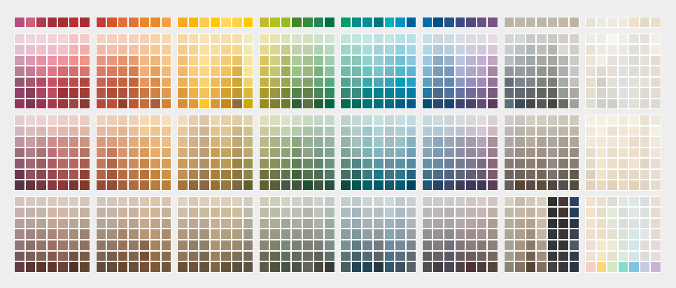
Every home has its own rhythm, its own natural flow that calls for specific front door colors. Before front door painting begins, consider how your home’s architecture guides the perfect color choice. Spanish colonial homes resonate with rich, traditional tones that echo their historical dignity. Modern homes dance with bold, contemporary hues that amplify their forward-thinking design. When painting your front porch and entrance area, the key lies in finding colors that not only complement your home’s structural poetry but enhance its emotional impact. The colors below are from Sherwin-Williams, thought other paint manufacturers have similar hues.
10 Front Door Colors That’ll Transform Your Home’s Personality
Bolero Burgundy: The Power Player
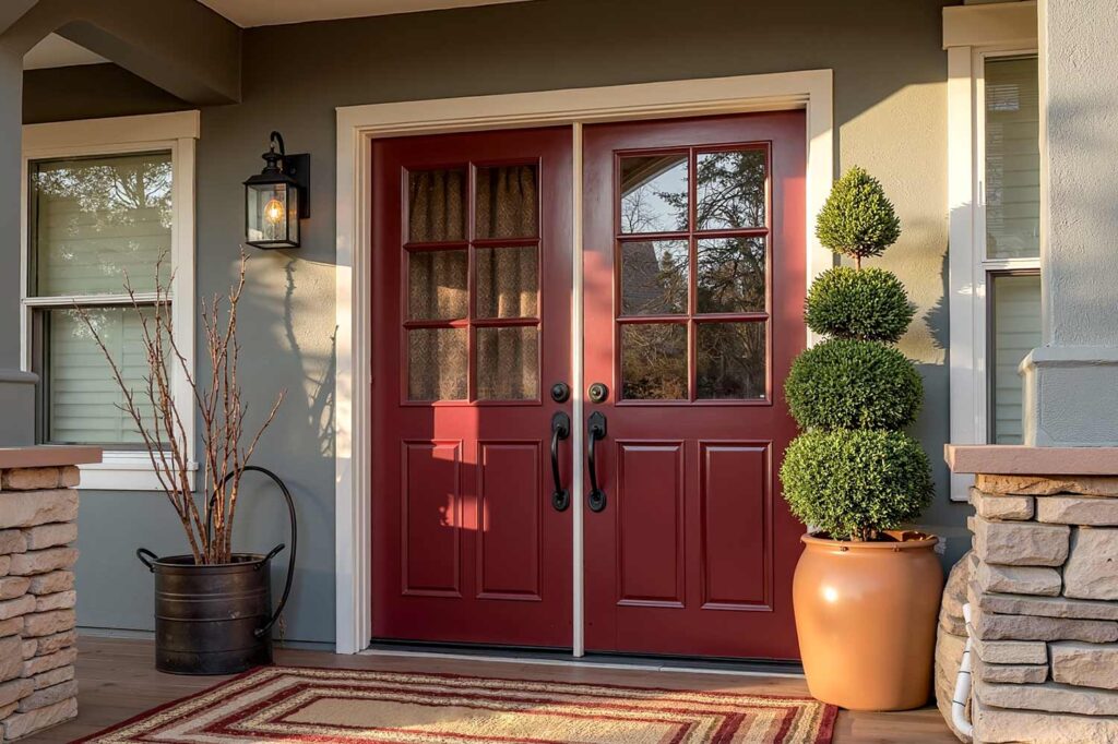
Like a fine wine that gets better with age, this rich burgundy creates an entrance that feels both timeless and alive. When painting front doors in this sophisticated shade against warm gray walls, it evokes the feeling of walking into a cherished library or an exclusive wine cellar. The crisp white trim acts like a perfect frame, drawing the eye naturally to this sophisticated focal point. When the evening light catches the deep red undertones, there’s a warmth that seems to reach out and welcome you home, promising comfort and elegance within.
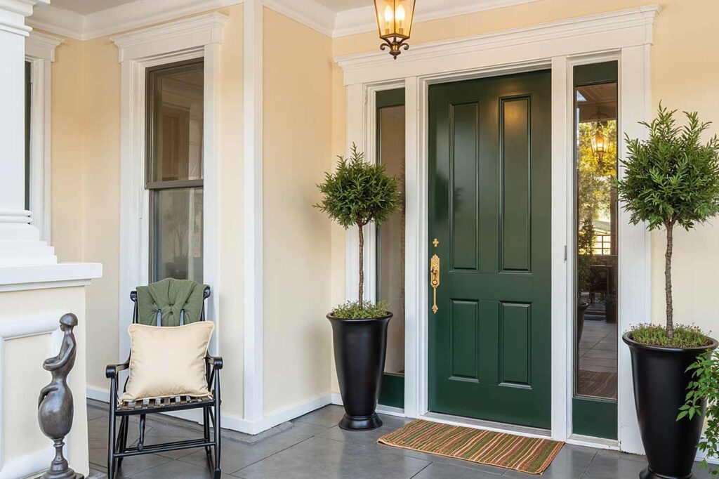
Black Satin: The New Classic
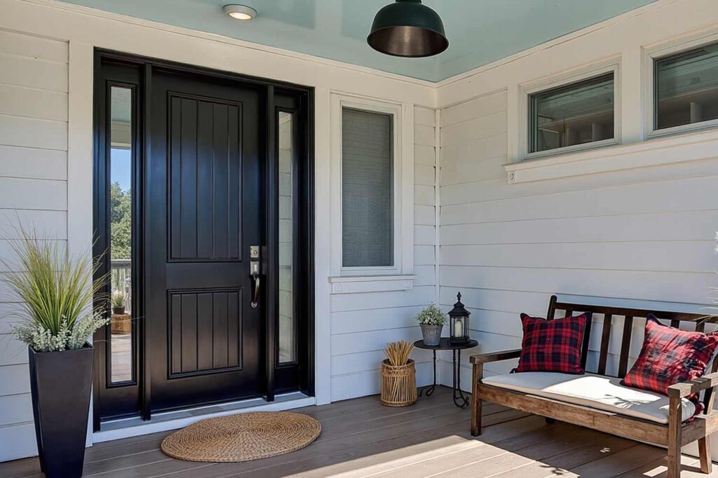
This isn’t just black – it’s a statement of quiet confidence, like a perfectly tailored tuxedo that never goes out of style. Front door painting in this timeless shade, when paired with light-colored walls, creates a sense of grounding and permanence. The layered trim detail, with black inner trim flowing to bright white outer trim, adds depth that feels like you’re being drawn into a warm embrace. Under a traditional light blue porch ceiling, the entrance becomes a transition space that whispers of both tradition and modernity.
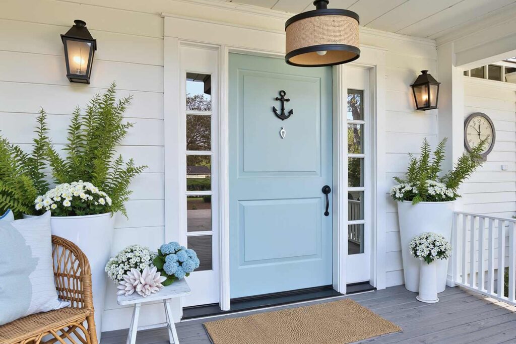
Salty Dog: The Coastal Charmer
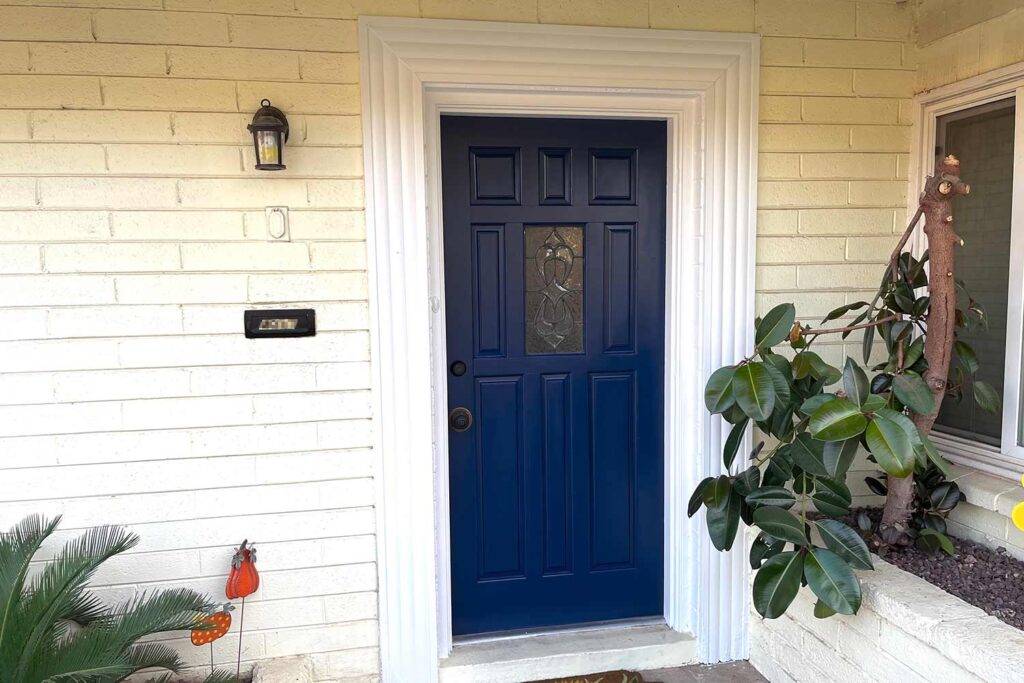
Like the deep blues of a perfect summer twilight, this naval hue brings a sense of calm and timeless sophistication to any entrance. When painting your front porch and door in complementary coastal tones, it creates the feeling of stepping onto a luxury yacht or approaching a seaside manor. The bright white trim acts like sea foam against rocks, while subtle gold hardware catches light like sun on waves. This combination doesn’t just welcome – it transports.
Frostwork Green: The Nature’s Nobility
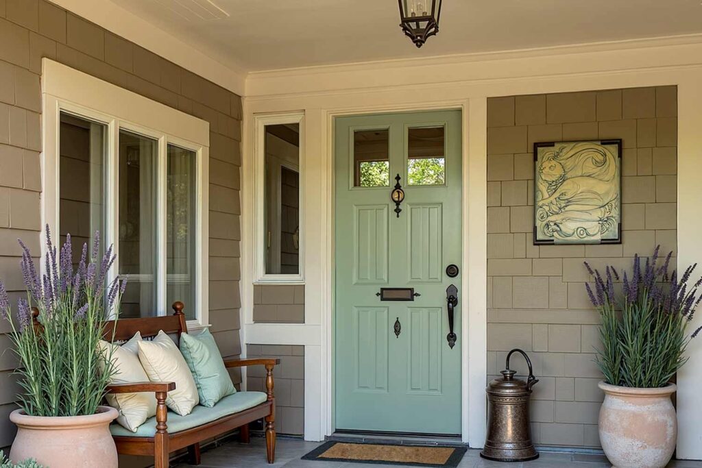
Like morning mist rising from a garden, this light grayish green brings a sense of natural serenity to your entrance. When painting front doors in this ethereal shade against taupe walls, it creates the feeling of stepping into a carefully tended English garden, where sophistication meets organic beauty. The ivory trim and dark bronze hardware details work like morning sunlight filtering through leaves, while the warm cream porch ceiling seems to capture and hold the day’s gentlest moments. This combination doesn’t just welcome – it grounds and refreshes.
Vibrant Teal: The Conversation Starter

Like the mesmerizing depths of a tropical lagoon, this bold teal (almost turquoise) captures imagination and stirs the soul. Front door painting in this striking hue against gray or white walls creates an entrance that feels alive with possibility. The crisp white trim frames the color like nature frames a perfect waterfall, while the bright white porch ceiling amplifies the sense of discovery. Walking up to this door feels like stumbling upon a hidden oasis – unexpected, delightful, and utterly unforgettable.
Contemporary Gray: The Urban Sophisticate
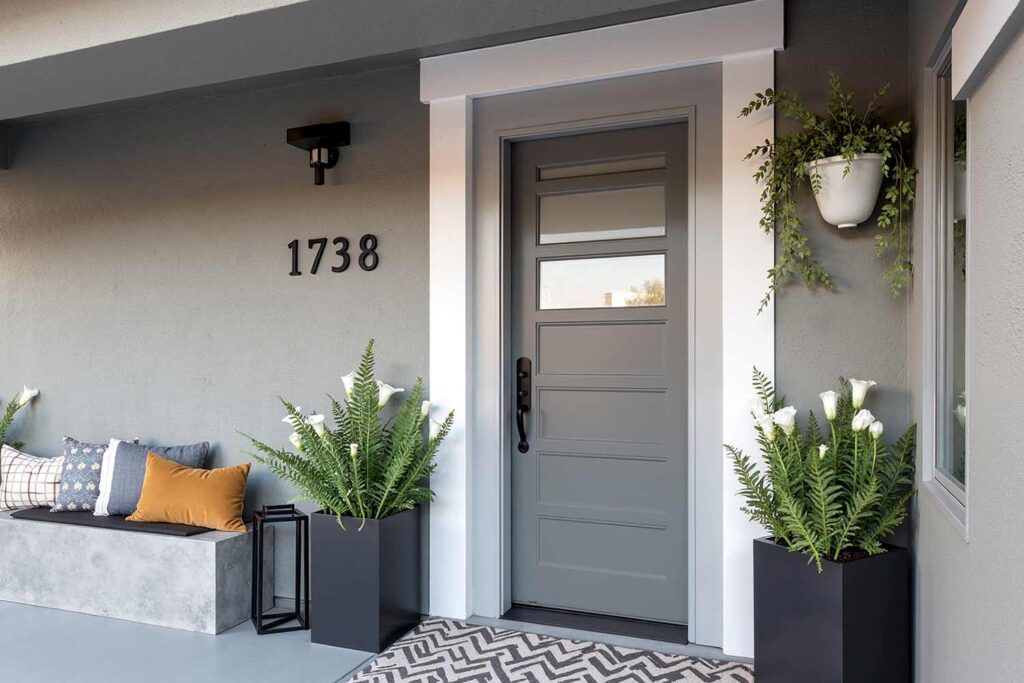
This isn’t your ordinary gray – it’s the color of storm clouds breaking into silver linings, of steel and stone transformed into art. When painting your front porch and door in coordinated grays, the layered approach creates a sense of depth that draws you in like a modern art gallery. The multi-layered trim detail feels like walking through successive frames of a story, each layer revealing new subtleties. Under the gray porch ceiling, the entire entrance becomes a meditation on sophisticated simplicity.
Ivory Lace: The Quiet Rebel
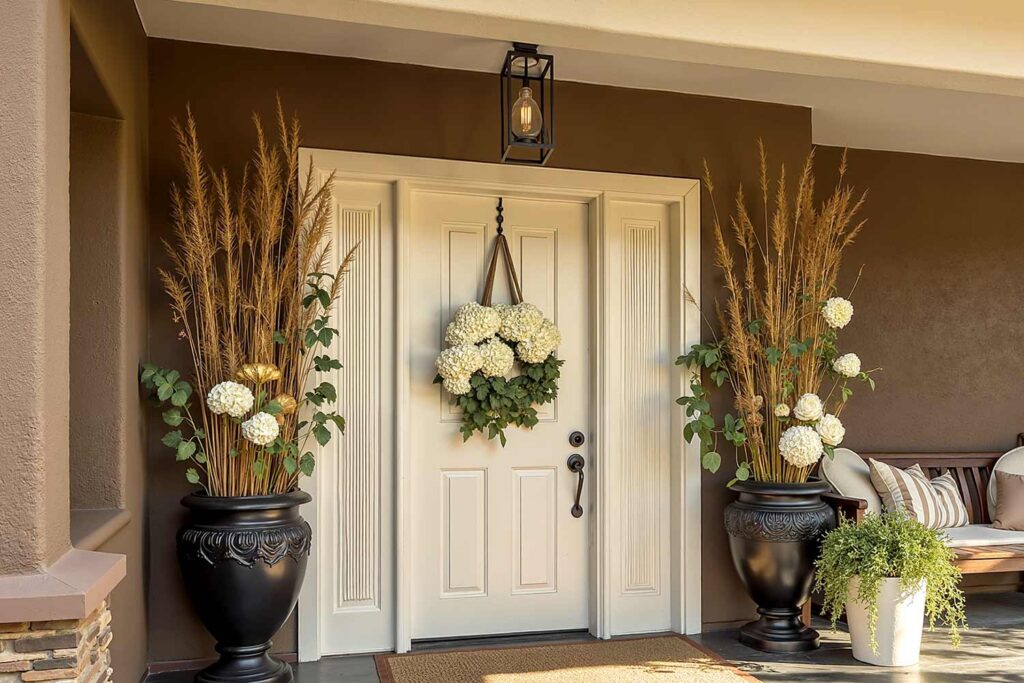
Like moonlight captured in paint, this sophisticated ivory creates an entrance that glows with inner warmth. When painting front doors in this luminous shade against deep brown or sage green walls, it feels like discovering a pearl in an oyster – precious, rare, and perfectly formed. The pure white primary trim flowing into cream secondary details creates layers of luminosity, while the matching ivory porch ceiling seems to hold and amplify natural light. This is an entrance that doesn’t demand attention – it earns it through pure grace.
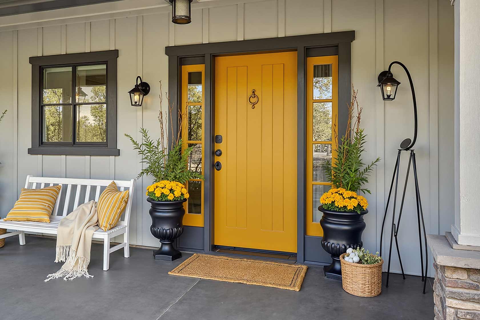
Forsythia Yellow: The Joy Spreader
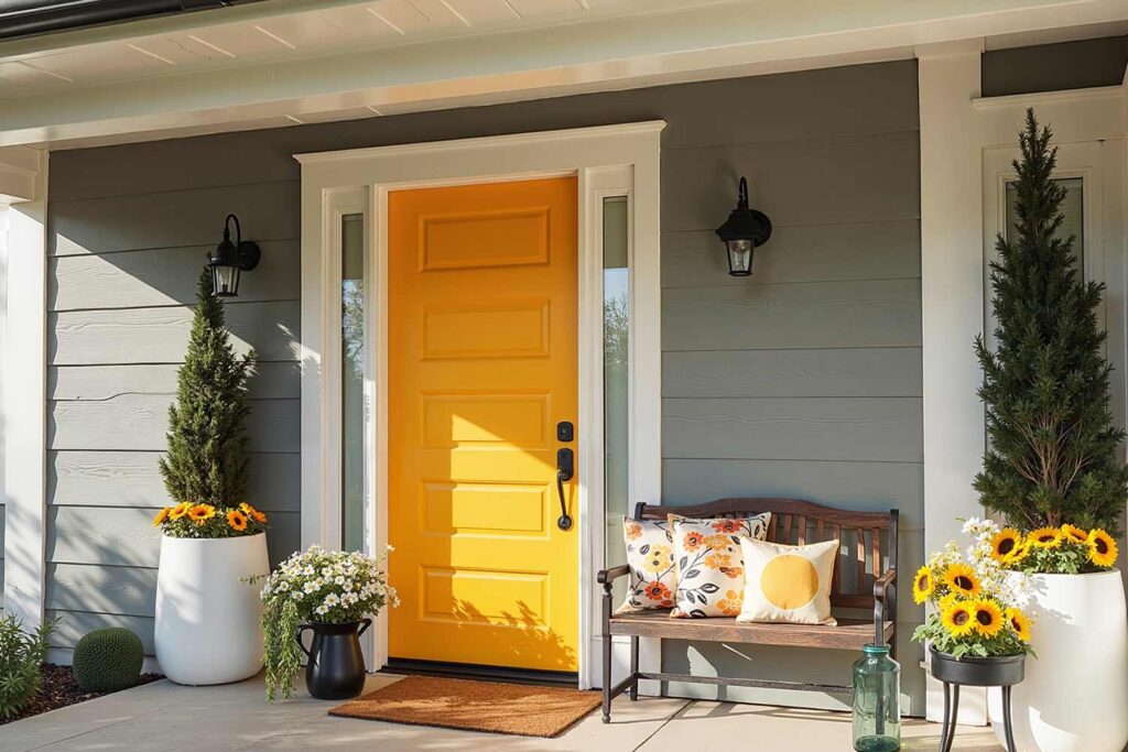
Like captured sunshine, this vibrant hue radiates pure optimism. Front door painting in this cheerful shade against cool gray walls creates an entrance that feels like walking into the warmest day of summer. The bright white trim acts as clouds framing a perfect sunset, while adding pop in the shadows of late afternoon light. Under the bright white porch ceiling, the whole composition seems to pulse with positive energy, promising warmth and welcome within.
Terracotta Persimmon: The Desert Dream
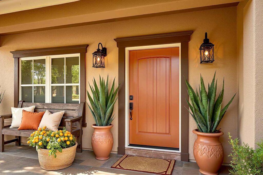
Like the first rays of dawn touching adobe walls, this warm hue brings ancient wisdom to modern spaces. After painting your front porch in complementary earth tones, this terracotta shade against beige or cream walls creates an entrance that feels both grounded and uplifting. The dark brown inner trim and white outer trim work like shadow and light in a desert canyon, creating depth that draws you naturally forward. The beige porch ceiling completes the effect, making every approach feel like arriving at a sanctuary.
Deep Dark Purple: The Royal Flush
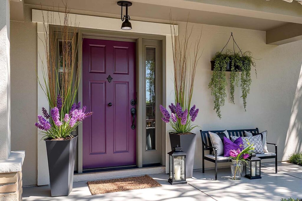
Like twilight made tangible, this deep purple creates an entrance that bridges day and night, classic and contemporary. When painting front doors in this regal hue against light gray or taupe walls, it feels like discovering a rare gem. The dark gray inner trim transitioning to bright white outer trim creates the effect of depth, while the darker gray or taupe porch ceiling seems to add the distance of an evening sky. This is an entrance that doesn’t just welcome – it enchants.
Making Your Final Selection from So Many Front Door Colors
Choosing your perfect front door color is like selecting the perfect opening line to your home’s story. Whether you’re painting front doors for the first time or refreshing your existing entrance, it should resonate with your personal style while creating an emotional connection for everyone who crosses your threshold. Remember, your front door color isn’t just about making a statement – it’s about creating a feeling, a moment, a memory that begins even before the door swings open.
The perfect front door color transforms not just your home’s exterior, but the entire experience of coming home. It’s that moment of satisfaction when you round the corner and feel your shoulders relax, knowing you’ve created something truly special. After all, isn’t home where your story begins?