
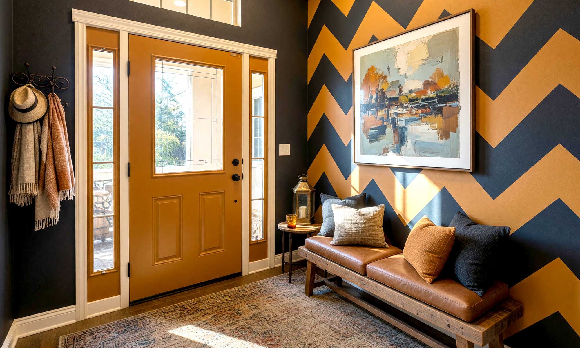
There’s a moment — just five seconds — when your front door swings open and your guest steps inside. Their eyes adjust, they breathe it in, and the entire emotional tone of your home is set. Not by the furniture. Not by the art on the walls. By the paint. Foyer paint colors carry more psychological weight than most people realize, and yet most foyers sit there painted the same builder’s white or greige that came with the house — completely untouched, and completely wasted.
That changes today.
Why the Foyer Is the Most Underrated Room in the House
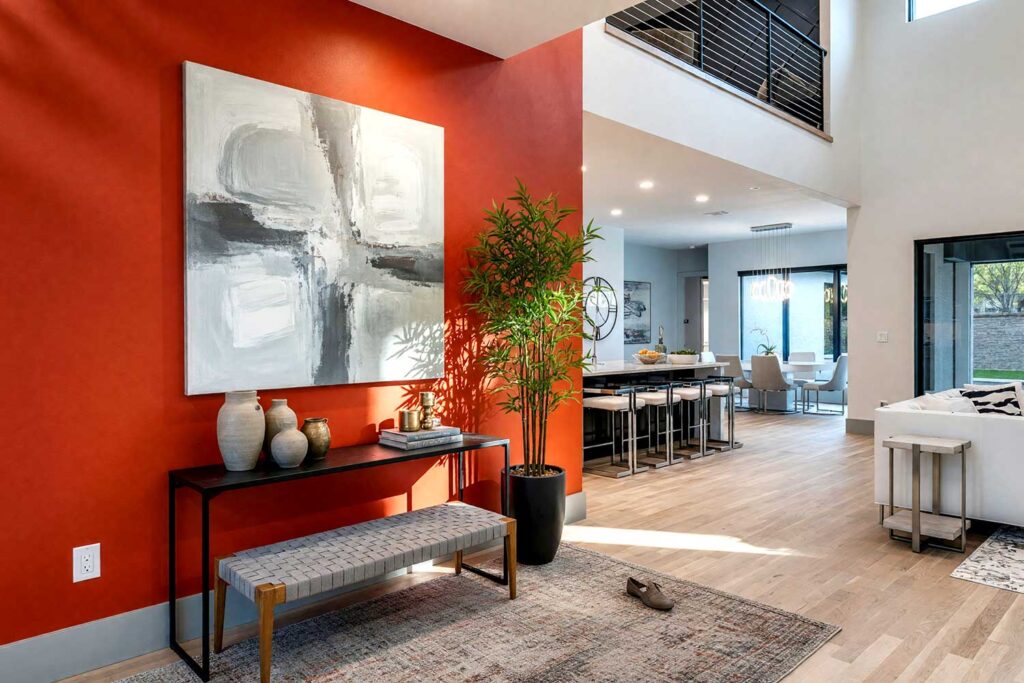
Your exterior front door already sets the stage from the curb. But the interior foyer is where the emotional handshake actually happens. It’s where your home whispers — or shouts — welcome. And there’s a technique I love: paint the foyer in a deep, dramatic color. Not the living room — just the foyer. When guests walk through that enveloping space and step into an adjacent room in a lighter tone, that room feels massive. The contrast does the work, like stepping from a moody cocktail lounge into a sun-drenched courtyard. It’s a visual compression-and-release that never gets old. Beyond going dark, a vibrant accent wall, a painted ceiling, or bold stripes are equally powerful moves — each one a way to express who you are before you’ve said a word. Before you commit to a color, ask yourself: what mood do you want the first five seconds to create?
10 Dramatic Interior Foyer Paint Colors to Transform Your Entryway
1. Midnight Plum & Burnt Copper: The Moody Sophisticate
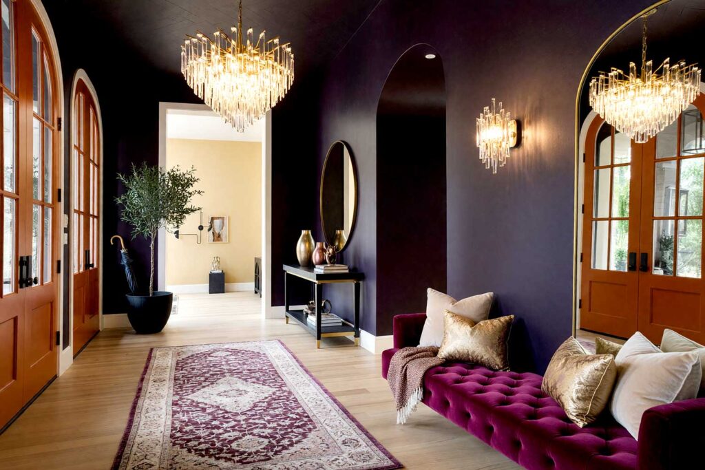
Foyer Walls: Midnight plum (a deep blue-purple, nearly black)
Door: Burnt copper (a warm, oxidized metallic-painted finish in burnt orange-brown)
Door Trim: Antique ivory
Ceiling: Deep charcoal
Baseboards: Glossy antique ivory
Adjacent Living Room Walls: Warm cream with gold undertones
Step into a foyer painted in midnight plum and the rest of the world disappears. It’s theatrical — a little bit velvet-rope energy. The burnt copper door catches whatever light exists and glows against it. When guests cross into the adjacent cream-toned living room, the contrast is genuinely startling in the best possible way. These are the kinds of foyer paint colors that make people stop mid-sentence to notice the room they’re standing in. For more on how bold interior color choices transform connecting spaces throughout your home, the hallway ideas article is worth a look before you pick your palette.
2. Absinthe Green & Black Cherry: The Botanical Rebel
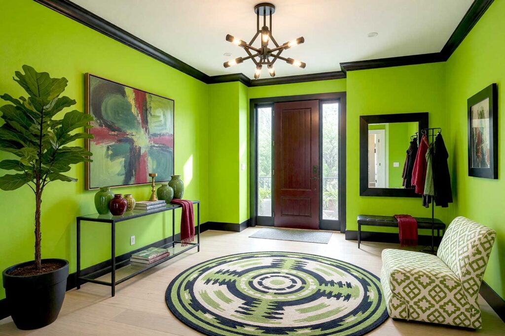
Foyer Walls: Absinthe green (a saturated, almost neon yellow-green)
Door: Black cherry (a deep burgundy-red with near-black depth)
Door Trim: Glossy jet black
Ceiling: Warm white
Baseboards: Jet black
Not everyone’s first instinct with foyer paint colors is going green — but absinthe green hits differently. It’s lush, energetic, and just strange enough to be completely unforgettable. The black cherry door shouldn’t work against that wall. And yet it absolutely does, the way unexpected outfit pairings somehow become the thing everyone copies. Jet black trim keeps it sharp and fully intentional. Paint the ceiling warm white and suddenly the whole foyer breathes.
3. Oxblood Red & Hammered Gold: The Grand Victorian Revival
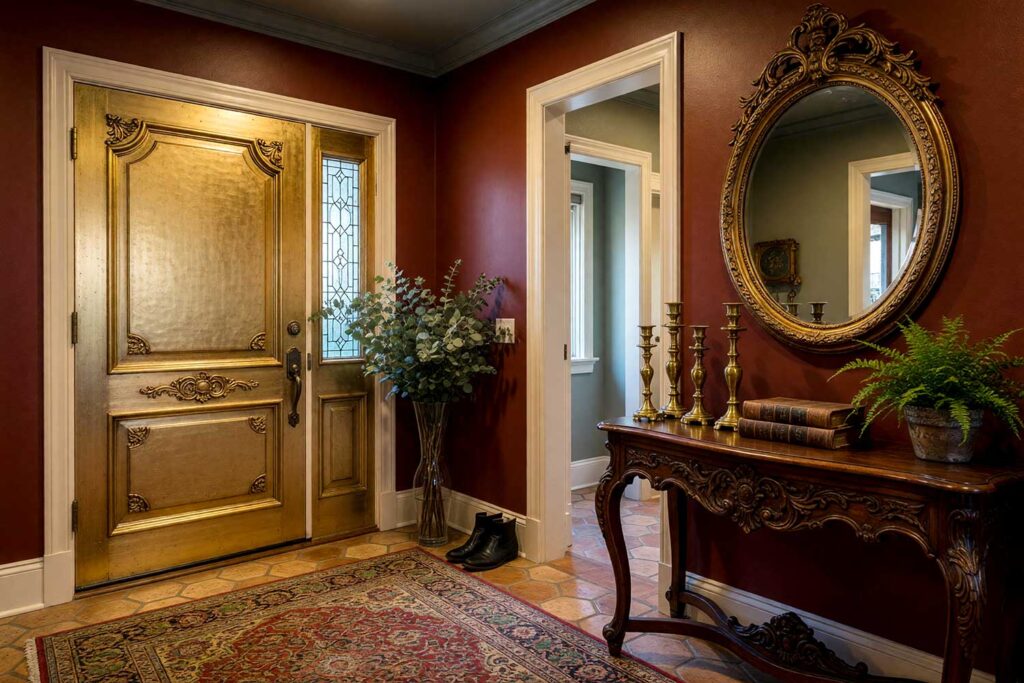
Foyer Walls: Oxblood red (a rich, dark red with brown and burgundy tones)
Door: Hammered gold (a painted matte-metallic gold, not shiny goldleaf)
Door Trim: Warm ivory
Ceiling: Moody charcoal with a hint of green
Baseboards: Warm ivory
Adjacent Room Walls: Soft sage gray-green
Oxblood has been having its moment for a few years now, and when used as a foyer color, it earns every bit of the attention. It’s ancestral, deeply warm, and completely committed. A matte hammered gold door feels like a painting in itself — one you had commissioned. When guests move from this palette into a sage gray-green room, the temperature shift is palpable. This is exactly what the best entryway paint schemes do: make the next room feel like a reveal. For a deeper dive into how to execute a moody entryway from concept to finish, this is a great resource to have open while you plan.
4. Aged Indigo & Clay Coral: The Earthy Maximalist
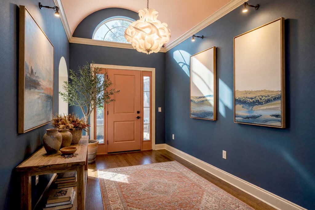
Foyer Walls: Aged indigo (a dusty, slightly faded deep blue with purple undertones)
Door: Clay coral (a muted terracotta-meets-salmon, not bright orange)
Door Trim: Warm sand
Ceiling: Soft peach blush — the secret weapon here
Baseboards: Warm sand
Adjacent Room Walls: Creamy white with warm undertones
A soft peach blush ceiling above aged indigo walls is quietly stunning — it acts like a warm sunrise above a dark sea. Nobody expects it, and that’s the whole point. Clay coral on the door keeps the warmth building, and sandy trim ties it together without announcing itself. These foyer paint colors are for the homeowner who collects experiences, travels broadly, and wants their home to say the same. The accent ceiling here is a bold move that costs almost nothing extra and changes everything.
5. Tone-on-Tone Sage Stripes: The Refined Minimalist
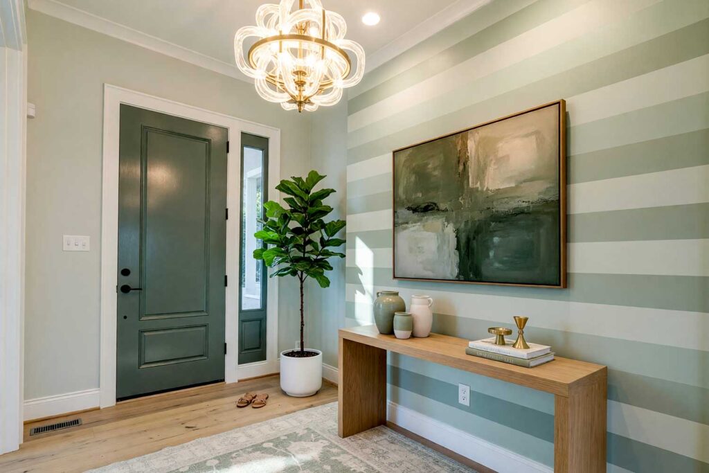
Foyer Walls: Light sage (a pale, cool gray-green — airy and almost neutral)
Accent Wall: Precise wide horizontal stripes alternating light sage, medium-light sage and medium sage
Door: Deep eucalyptus (a rich, saturated gray-green — several values darker than either stripe tone)
Door Trim: Crisp warm white
Ceiling: Light sage (matching the wall base color)
Baseboards: Crisp warm white
The entire power of this combination lives in restraint. The two sage tones are close enough in hue that the stripes read as texture from across the room — it’s only when you’re standing in the space that the pattern fully reveals itself. That’s intentional. The finish contrast does as much work as the color difference: matte stripes absorb light quietly while the satin stripes catch it and shift. Precision is everything here — tape your lines, use a level, and take your time at the edges. A single sloppy seam dismantles the whole effect. The deep eucalyptus door is the moment the palette commits — it tells guests that the subtlety of those stripes was a deliberate choice, not a timid one. Crisp warm white trim and baseboards give the eye a clean place to rest, and the sage ceiling wraps the space into a single cohesive envelope without feeling dark or heavy.
6. Dark Graphite Charcoal & Cerise: The Minimalist Provocateur
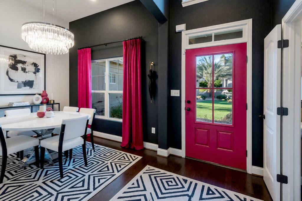
Foyer Walls: Graphite charcoal (a true dark gray, nearly black)
Door: Cerise (a bold, jewel-tone pinkish-red)
Door Trim: Satin white
Ceiling: Soft pale gray
Baseboards: Satin white
Adjacent Room Walls: Bright white with cool undertones
Clean, sharp, and just slightly shocking. Graphite walls let the cerise door own every cubic inch of attention in the room — there’s nowhere else to look, and you don’t want to look anywhere else. Matte white trim and baseboards keep the lines crisp and the palette from feeling heavy. This is a foyer that works especially hard in modern, minimal architecture where the geometry is doing half the work already. When guests step into the bright white adjacent room, the foyer becomes a frame — like a bold print in a gallery. And if you want to carry this kind of bold color language all the way through the house, interior doors with painted personality are the natural next move.
7. Juniper & Warm Saffron: The Nordic Lodge
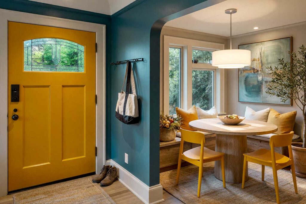
Foyer Walls: Juniper (a deep, cool blue-green with gray)
Door: Warm saffron (a rich golden-yellow)
Door Trim: Pale limestone
Ceiling: Matte deep juniper — same as walls, fully wrapped
Baseboards: Pale limestone
Adjacent Room Walls: Soft warm taupe
A wrapped ceiling — walls and ceiling in the same dark color — creates a cocoon effect that is unlike almost anything else in residential design. It makes the foyer feel intentional rather than transitional. Saffron cuts through the darkness with pure brilliance, and pale limestone trim grounds it without softening the drama. This is one of those foyer paint colors choices that makes a small entry feel like a deliberate destination — and if you’re curious which dark tones designers consistently reach for, this breakdown of dark entryway colors is worth a read. Guests won’t rush through this one.
8. Tobacco Brown & Electric Teal: The Unexpected Foyer Paint Colors
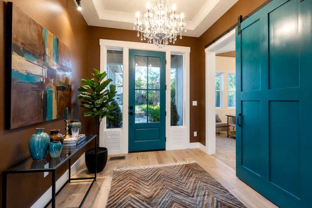
Foyer Walls: Tobacco brown (a warm, toasty medium-dark brown)
Door: Electric teal (a vivid, slightly cool blue-green)
Door Trim: Bright white
Ceiling: Pale sand
Baseboards: Bright white
Adjacent Room Walls: Soft warm ivory
Nobody expects teal and brown together at this level of saturation — and that’s exactly why it works. The contrast is vivid and grounding at the same time: earthy meets electric. Tobacco brown walls have a richness that doesn’t feel heavy the way very deep entry hall paint colors can. Electric teal on the door is the moment the personality surfaces. And if you want to push it further: paint alternating vertical stripes in tobacco brown and electric teal on a single accent wall using matte and satin finishes of each color — the tone-on-tone shift reads as graphic and architectural without overwhelming the space.
9. Iced Violet & Chartreuse: The Art House Entry
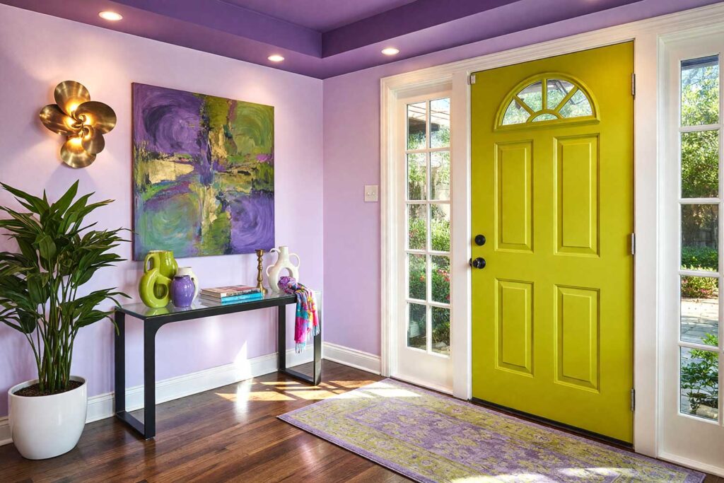
Foyer Walls: Iced violet (a pale, cool lavender — almost mauve but cooler)
Door: Chartreuse (a vivid yellow-green — yes, really)
Door Trim: Cool soft white
Ceiling: Deep amethyst purple
Baseboards: Cool soft white
This one is for the bold. Iced violet is ethereal; chartreuse is a disruption. Together, they announce that the person who lives here has a distinct point of view and enjoys every moment of it. The deep amethyst ceiling echoes the wall color without matching it — a sophisticated move that rewards people who actually look up. Want a slightly softer version? Paint just the wall behind the entry console in chartreuse, keep the remaining walls iced violet, and let the accent wall carry the drama. Against the warm taupe of the adjacent room, these foyer paint colors become a genuine experience.
10. Warm Terracotta & Lacquered Cobalt: The Desert Modern
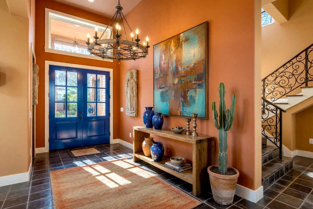
Foyer Walls: Warm terracotta (a saturated, earthy orange-red)
Door: Lacquered cobalt (a high-gloss, vivid true blue)
Door Trim: Creamy off-white
Ceiling: Dusty clay (a lighter, slightly muted version of the wall color)
Baseboards: Creamy off-white
Adjacent Room Walls: Warm sand with amber undertones
Terracotta walls in a foyer feel immediate and alive — grounded in the earth, warm from the moment you step in. The lacquered cobalt door is the visual shock, the thing your eye lands on and simply can’t leave. High-gloss cobalt against matte terracotta is a finish contrast as much as a color contrast — two techniques working together for maximum effect. The dusty clay ceiling wraps the space without darkening it, and creamy off-white trim keeps the whole palette from reading too rustic. Entry hall paint colors this confident are especially powerful in homes with clean lines and warm natural materials.
Final Brush Strokes: The Right Foyer Paint Colors Change Everything
The foyer isn’t a hallway. It’s not a waiting room. It’s the first sentence of the story your home tells, and that sentence should be worth reading. Foyer paint colors done with intention — whether you go dark and dramatic, bold and contrasting, or ceiling-wrapped and immersive — transform the way every room beyond them is perceived. Guests will feel it before they process it. You’ll feel it every single time you come home. For more inspiration on how bold color choices set the stage from the outside in, these front door transformation ideas pair beautifully with an interior foyer refresh. That five-second window when someone crosses your threshold is yours to design. Don’t leave it painted the same color it was when you moved in.
Your foyer sets the emotional tone for your entire home. Bold foyer paint colors — like deep plum, marigold, oxblood red, or aged indigo — create a dramatic first impression and make adjacent lighter rooms feel larger and brighter by contrast.