Something shifted in home design recently, and I’m completely obsessed with where it’s heading. After years of greige walls, endless whites, and “safe” neutral palettes ruling every room, homeowners are finally reaching for something with real soul. Retro interior paint colors are back — not as a dusty museum piece or a kitschy throwback, but as a bold, intentional design statement. We’re talking mustard yellows that fill a room like late-afternoon sunlight, avocado greens that feel weirdly sophisticated, and burnt oranges that make you want to sink into a low-profile sofa and never leave. These vintage paint colors are finding their way into modern homes with results that genuinely turn heads. If you want to understand the full possibility space of interior color, this deep dive into the joy of interior house painting is a great place to start.
Why Retro Interior Paint Colors Hit Differently in a Modern Space
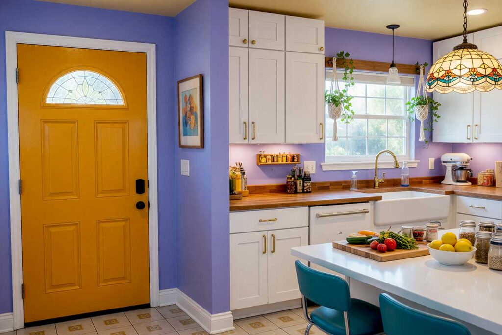
The magic of blending nostalgic paint colors into a contemporary home isn’t about recreating a time capsule — it’s about borrowing the best parts of those decades and making them entirely yours. Mid-century modern architecture, open floor plans, and clean geometric lines are the perfect backdrop for a retro color palette. The warm, earthy tones of the 70s — burnt oranges, harvest golds, deep avocado — pair with natural wood tones, exposed beams, and concrete floors in a way that feels almost effortless. And those bold 80s hues — neon pink, electric teal, Memphis-inspired pastels — pop against crisp white walls and minimalist furniture in a way that feels genuinely electric. The homes that nail this look aren’t trying to look old. They’re using vintage paint colors as a personality layer — a statement that says, “I have taste, and I’m not afraid of color.” That’s the sweet spot. If you’re thinking specifically about your living room, this piece on transforming your living room with color will spark even more ideas.
10 Retro Interior Paint Colors Combinations That Prove Old-School Is the New Cool
These ten combinations are pure inspiration — each one built around a distinct retro color palette and designed to be adapted for your home, your architecture, and your personality. I’ve paired each main color scheme with coordinating suggestions for your walls, ceiling, door, door trim, and baseboards, because in color design, the details are where the real magic lives.
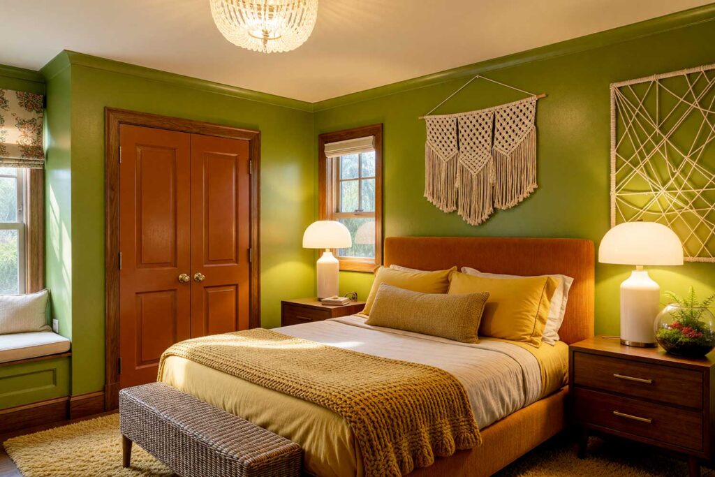
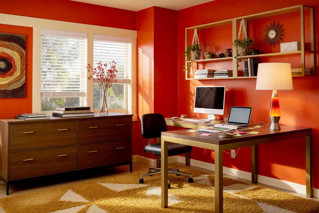
1. Mustard Sunrise
Walls: Deep mustard yellow
Ceiling: Warm terracotta
Door: Espresso brown
Door trim: Ivory cream
Baseboards: Ivory cream
Deep mustard yellow walls carry a golden-hour warmth that no lamp can replicate. Then here’s the unexpected move: a warm terracotta ceiling. It sounds like too much — until it absolutely doesn’t. That pairing creates an enveloping, intentional depth that stops people mid-sentence when they walk in. Espresso brown on the door grounds the whole composition, while ivory cream trim and baseboards give the palette room to breathe.
2. Avocado & Rust Revival
Walls: Avocado green
Ceiling: Buttery cream
Door: Burnt rust/sienna
Door trim: Walnut brown
Baseboards: Off-white
Full 70s energy. Zero apologies. Avocado green walls might sound risky, but paired with a buttery cream ceiling, they read as earthy and grounded rather than dated. The showstopper is a burnt rust door — unexpected, bold, and electrically beautiful against the green. Walnut brown door trim reinforces the warmth, and off-white baseboards provide just enough contrast to keep the palette from feeling heavy.
3. Plum & Tangerine Glam
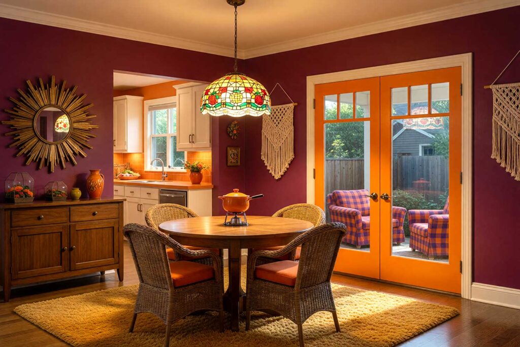
Walls: Deep eggplant/plum
Ceiling: Warm ivory
Door: Tangerine orange
Baseboards/ Door trim: Warm ivory
This is 70s drama turned all the way up. Deep eggplant walls are moody, luxurious, and surprisingly livable. A warm ivory ceiling lifts the room without stealing attention. Then — a tangerine orange door. Yes, really. It’s the kind of contrast that makes guests stop mid-conversation. These nostalgic paint colors together produce a jewel-box effect that’s equal parts retro and timeless. Antique gold door trim adds the finishing flourish, and warm ivory baseboards close the loop quietly. See what bold color choices look like in real spaces.
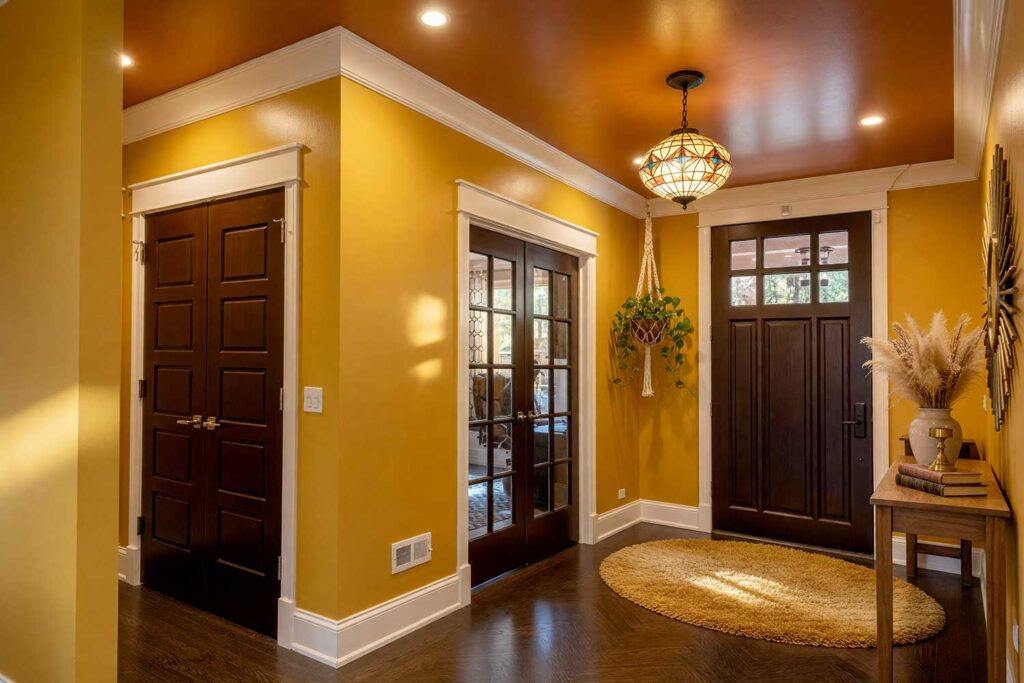
4. Burnt Orange Geometry
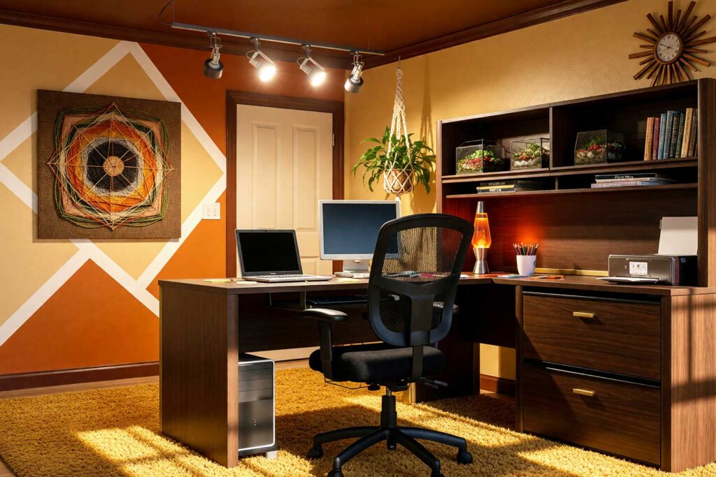
Walls: Warm wheat (with burnt orange geometric accent wall)
Ceiling: Chocolate brown
Door: Cream/antique white
Door trim/Baseboards: Deep chocolate brown
The 70s were obsessed with geometric shapes — and this combination leans into that hard. Keep your main walls in warm wheat/camel, neutral enough to breathe, then dedicate one accent wall to a bold, geometric block of burnt orange. The real drama? A chocolate brown ceiling. Dark ceilings are having a serious moment right now, and this one earns every bit of attention it gets. A cream door with deep chocolate trim creates contrast without competition.
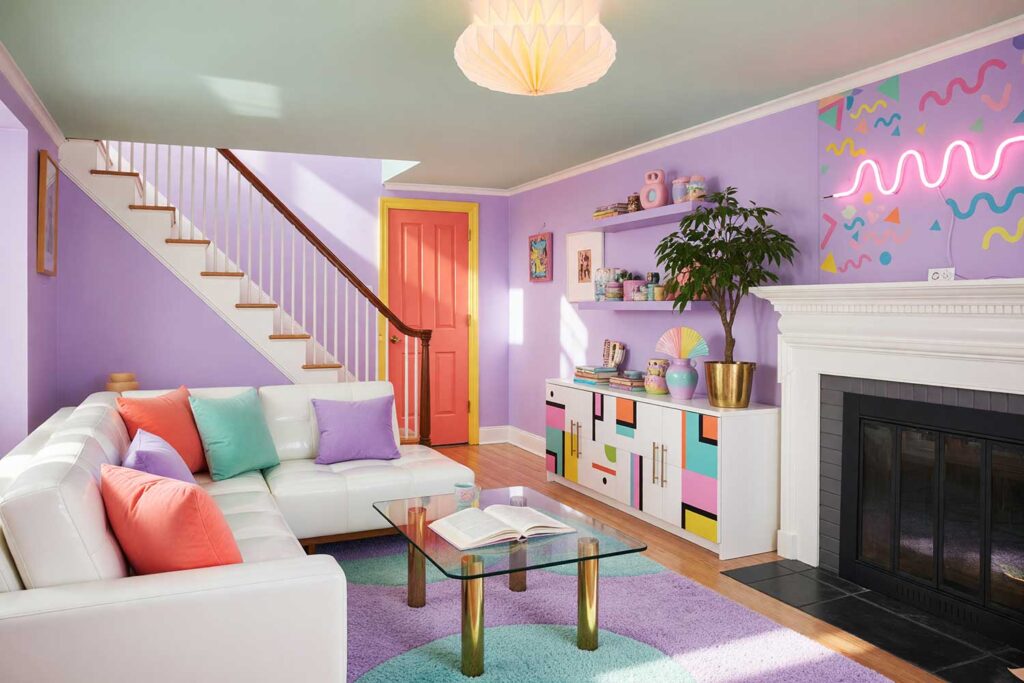
5. Electric Teal & Neon Pink
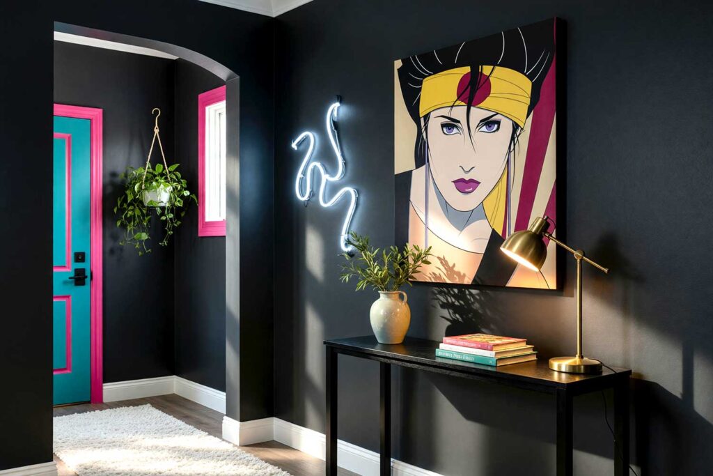
Walls: Deep charcoal gray
Ceiling: Crisp white
Door: Electric teal
Door trim: Hot pink
Baseboards: Crisp white
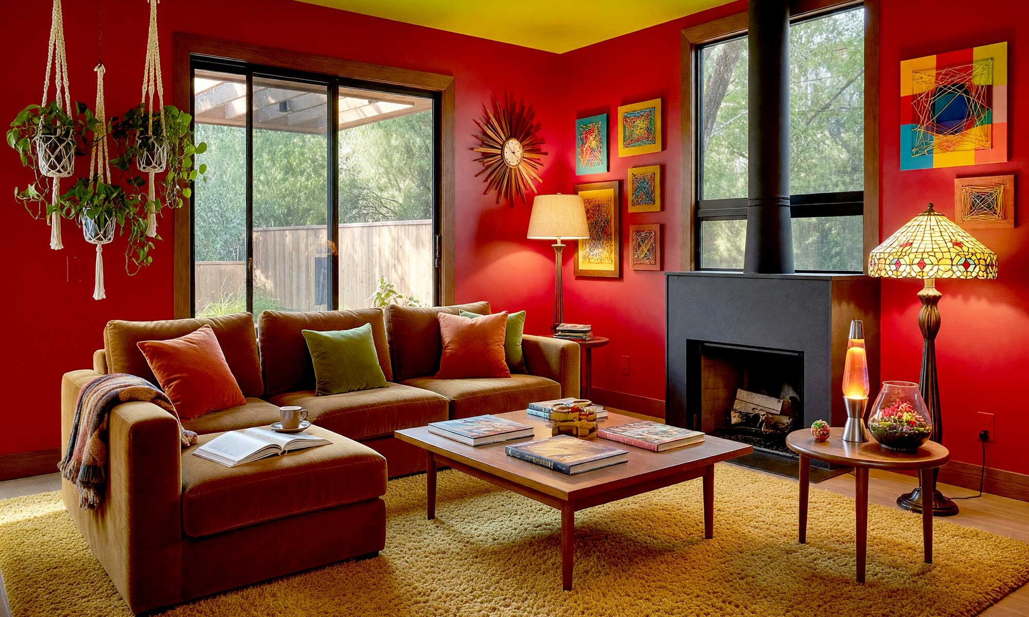
Welcome to 1985. Deep charcoal walls set a moody, cinematic stage — and then an electric teal door walks in like it owns the place. Hot pink door trim sounds completely unhinged until you see it, and then you cannot imagine it any other way. Crisp white ceiling and baseboards keep the whole composition from spinning out of control. This retro color palette is pure Memphis design energy — bold, graphic, and entirely deliberate. These retro interior paint colors are, without question, a masterclass in controlled chaos. Architectural Digest has explored how retro-inspired palettes are reshaping modern interiors — and this combination is Exhibit A.
6. Memphis Pastel Party
Walls: Soft lavender
Ceiling: Pale mint green
Door: Coral/salmon
Door trim: Sunny yellow
Baseboards: Bright white
Soft lavender walls and a pale mint green ceiling sound like a children’s room — until you commit to them deliberately and fully. A coral door and sunny yellow door trim bring the Memphis-era 80s energy into sharp, joyful focus. Bright white baseboards snap the whole room into the present. This retro color palette is for the homeowner who wants something genuinely playful without being aggressive — a space that makes you smile every single time you walk in.
7. Periwinkle & Marigold
Walls: Periwinkle blue-violet
Ceiling: Pale gold/champagne
Door: Deep marigold
Door trim: Crisp white
Baseboards: Crisp white
This one channels 70s psychedelic energy filtered through a sophisticated, almost editorial lens. Periwinkle blue-violet walls are rich without being heavy, and a pale gold/champagne ceiling adds warmth without competing. A deep marigold door is the undisputed hero of this composition — the kind of bold choice that makes a room feel curated rather than accidental. Crisp white trim and baseboards let every other color breathe. Vintage paint colors don’t get much more quietly luxurious than this. If this palette has you thinking about your kitchen, this cabinet color inspiration piece is absolutely worth a look.
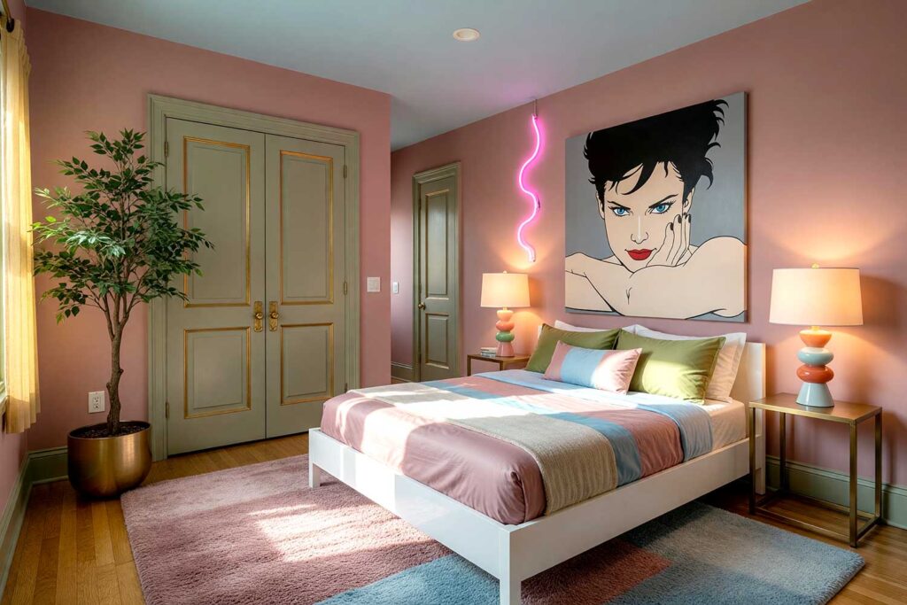
8. Dusty Rose & Sky Blue
Walls: Dusty rose/mauve
Ceiling: Pale sky blue
Door Trim/Baseboards: Pale olive green
Door trim: Antique gold
This combination surprises everyone who sees it done right. Dusty rose/mauve walls feel warm and nostalgic — deeply 80s without being cliché. The twist is a pale sky blue ceiling. That contrast shouldn’t work, and yet it absolutely, undeniably does. An olive green door introduces an earthy dimension that bridges both decades, antique gold door trim feels luxurious without trying too hard, and pale olive green baseboards hold the whole palette together. Layered nostalgic paint colors like this create a visual complexity that any single-color scheme simply cannot match. The Spruce has a fantastic exploration of how vintage tones are making their modern comeback — and this combination is exactly why the revival is real.
9. Magenta & Harvest Gold

Walls: Deep magenta/fuchsia
Ceiling: Harvest gold
Door: Sage green
Door trim: Warm white
Baseboards: Warm white
Pure 80s maximalism. Deep magenta/fuchsia walls are bold enough to redefine an entire room — the kind of color that makes beige feel like a personal affront. A harvest gold ceiling leans into that warm, sun-drenched intensity and somehow makes the magenta even more alive. Then comes the plot twist: a sage green door. It’s grounding, earthy, and completely unexpected against all that saturated warmth. These retro interior paint colors together feel simultaneously glamorous, free-spirited, and just a little bit defiant — which is exactly how the best interiors should feel.
10. Sunburst Yellow & Deep Teal
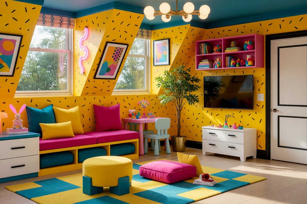
Walls: Sunflower yellow
Ceiling: Deep teal
Door: Crisp white
Door trim/Accent Design: Black
Baseboards: Crisp white
This is the one that stops a room. Sunflower yellow walls are pure, radiant energy — warm, joyful, and a little audacious. A deep teal ceiling anchors all that brightness with an unexpected depth and sophistication. A crisp white door is the calm in the storm, and black door trim adds a graphic, modern edge that keeps this retro color palette from veering into the wrong kind of “retro.” Add in the Keith Haring-inspired hatch work, and it’s bold. It’s intentional. And it has absolutely no interest in blending in.
Final Brush Strokes: Making Retro Interior Paint Colors Work for Your Modern Home
Color is the fastest, most impactful, and most affordable renovation you’ll ever make — and right now, retro interior paint colors are giving modern homes something that years of beige simply cannot deliver: personality. The fact that a deep teal ceiling or a tangerine door can make someone walk into a room and genuinely feel something — that’s not a coincidence. That’s the power of intentional color, and it’s yours to claim.
Whether you’re drawn to the earthy, grounded warmth of a 70s-inspired retro color palette or you’re ready to go full Memphis with electric neons and stacked pastels, the secret is this: commit to it. Half-measures never work when you’re going bold. If any one of these combinations sparked something — a vision, a “what if,” a “maybe that’s my dining room” — that’s exactly the instinct worth following. Your walls are a blank canvas with a serious point of view just waiting to happen. Give them one. And call me if you get stuck.
Retro interior paint colors like mustard yellow, avocado green, burnt orange, and electric teal blend beautifully into modern homes. Pair them with contrasting ceilings, bold doors, and coordinating trim to add personality-driven nostalgia without turning your space into a time capsule.