One secret to head-turning curb appeal isn’t bold contrast—it’s strategic subtlety. Forget everything you thought you knew about exterior house colors. The most sophisticated homes on the block aren’t wearing jarring combinations that scream for attention; they’re dressed in tone-on-tone color schemes that whisper elegance. This design secret—layering different shades within the same color family—transforms ordinary architecture into visual poetry.
When morning light kisses a facade where deep charcoal meets smoky gray, architectural details emerge from hiding, flat surfaces develop dimension, and suddenly your home exterior painting project becomes a masterpiece of subtle drama. The magic happens in these tonal shifts: they create depth that makes average homes look architect-designed, and they do it without the risk of trendy exterior color ideas you’ll regret by next season. Ready to give your home a personality that stops traffic?
The Psychology Behind Exterior House Colors: What Your Home Says
The exterior house colors you choose broadcast your personality to the world long before anyone steps inside. Warm hues like terracotta and gold radiate energy and welcome, while cool blues and greens create a sense of tranquility and retreat. Neutrals offer sophistication and timelessness. But tone-on-tone schemes? They whisper of confidence and subtle elegance.
When planning your home exterior painting project, consider how different color families affect emotions. Blue tones promote calmness and trust—perfect for creating a peaceful sanctuary. Green connects us to nature and renewal, ideal for homes nestled among trees. Neutrals speak to refinement and versatility. The beauty of tone-on-tone exterior color ideas is that they allow you to embrace these emotional responses while adding depth and interest through subtle variations.
Your color choices aren’t just aesthetic—they’re a silent conversation with everyone who passes by, expressing your values and lifestyle without saying a word.
Beyond Beige: Why Tone-on-Tone Creates Irresistible Curb Appeal
Forget stark contrasts and predictable combinations. The magic of tone-on-tone exterior home painting lies in the subtle shifts between shades. When light hits different tones within the same color family, it creates natural shadow and highlight effects that emphasize your home’s architectural features without shouting for attention.
Think of it as contouring for your house—the darker shade recedes while the lighter one advances, creating natural dimension that makes flat surfaces come alive. This layering effect turns ordinary siding into a sophisticated canvas and makes even the simplest home architecture look deliberately designed.
Unlike high-contrast schemes that can become dated, tone-on-tone exterior color ideas have staying power because they work with light and shadow rather than fighting against them. The result is curb appeal that feels both fresh and timeless—the holy grail of exterior house colors.
Architectural Harmony: Matching Exterior Color Ideas to Your Home’s Style
Every architectural style has a color language that speaks to its heritage and character. Craftsman homes sing with earthy greens and browns that connect them to their nature-inspired roots. Colonial homes command respect with dignified neutrals punctuated by crisp white trim. Modern minimalist designs embrace the drama of monochromatic dark grays and blacks.
The most successful exterior home painting projects honor these traditions while adding personal touches. Your home’s bones matter—the lines, proportions, and historical context all influence which tone-on-tone exterior color ideas will enhance rather than fight against your architecture.
Regional influences also play a key role. Coastal homes embrace different palettes than desert dwellings or mountain retreats. The surrounding landscape provides natural cues for exterior house colors that feel right at home in their environment.
Before You Choose: Consider Your Home’s Character
Before committing to any exterior color ideas, take inventory of your home’s fixed elements. The roof color, stonework, and hardscaping all need to harmonize with your new palette. A warm-toned roof might clash with cool-toned siding, while natural stone elements might limit your color options.
Light exposure dramatically affects how colors read throughout the day. That perfect gray that looked sophisticated on the sample might appear purple in the morning light or dull in the afternoon shade. Testing your tone-on-tone combinations in different lighting conditions is essential for successful home exterior painting.
Consider your neighborhood context too—your house shouldn’t be a rebel without cause. You want to stand out for all the right reasons, expressing personality while maintaining harmony with surrounding homes. The beauty of tone-on-tone exterior house colors is that they can be both distinctive and diplomatic.
10 Inspirational Home Exterior Painting Combinations: Tone-on-Tone Magic
Architecture: Modern Expressions
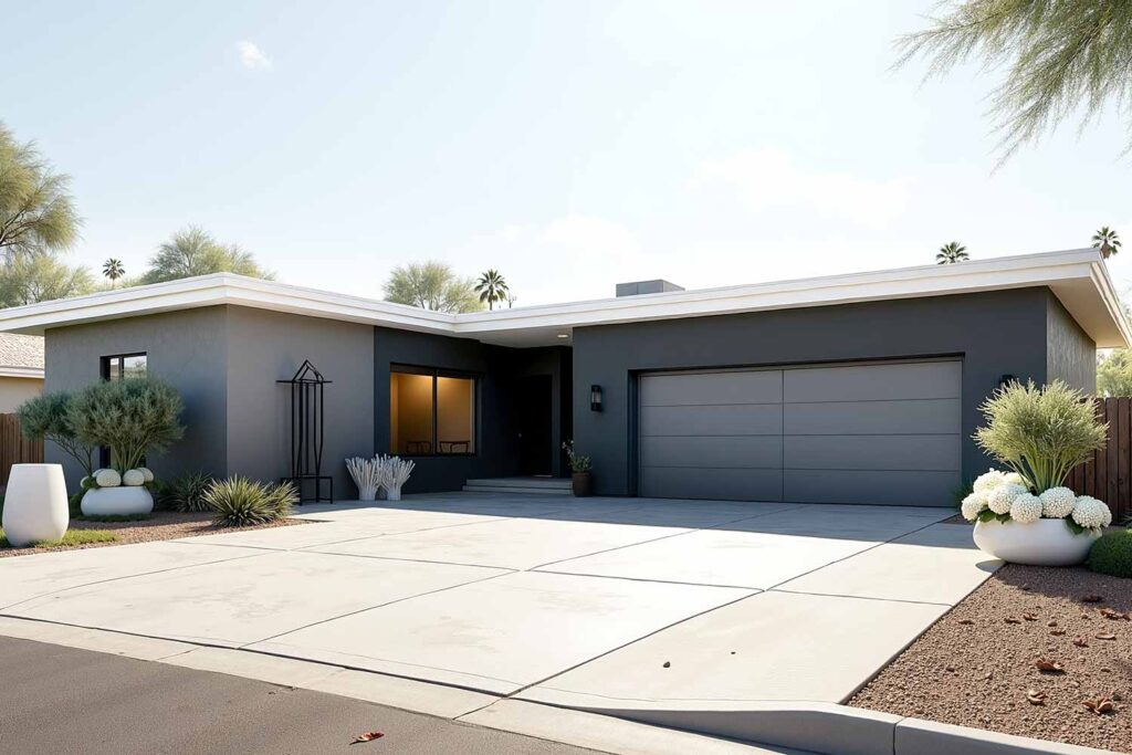
Sophisticated Charcoal Drama
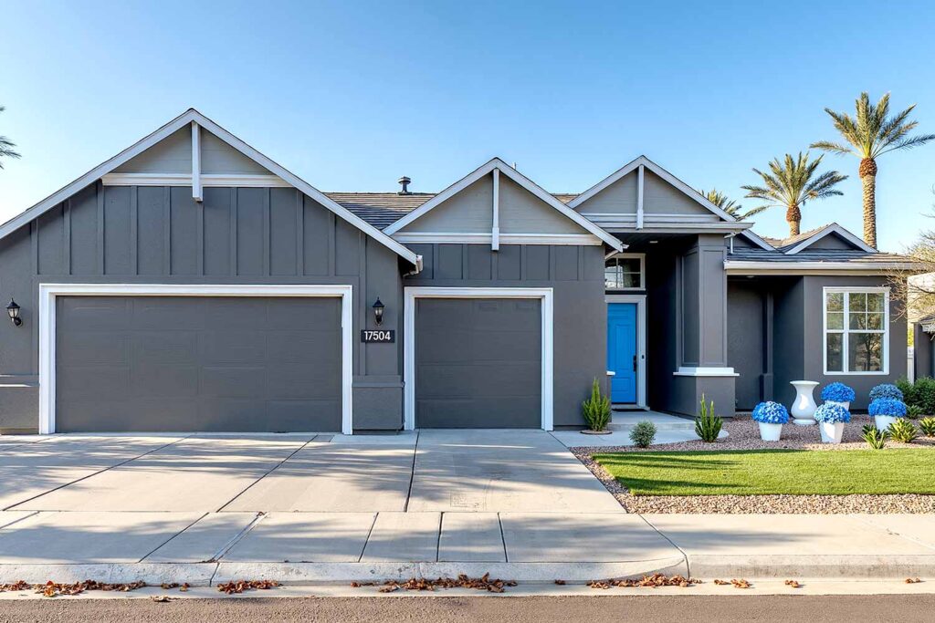
Coat the main body in a deep charcoal that shifts with changing light, using lighter charcoal gray for accent walls and architectural features. The crisp white trim adds clean definition while a bright door creates an eye-catching focal point against the layered grays.
Body Color: Deep charcoal | Accent Shade: Lighter gray | Trim: Crisp white | Front Door: Bright yellow or electric blue
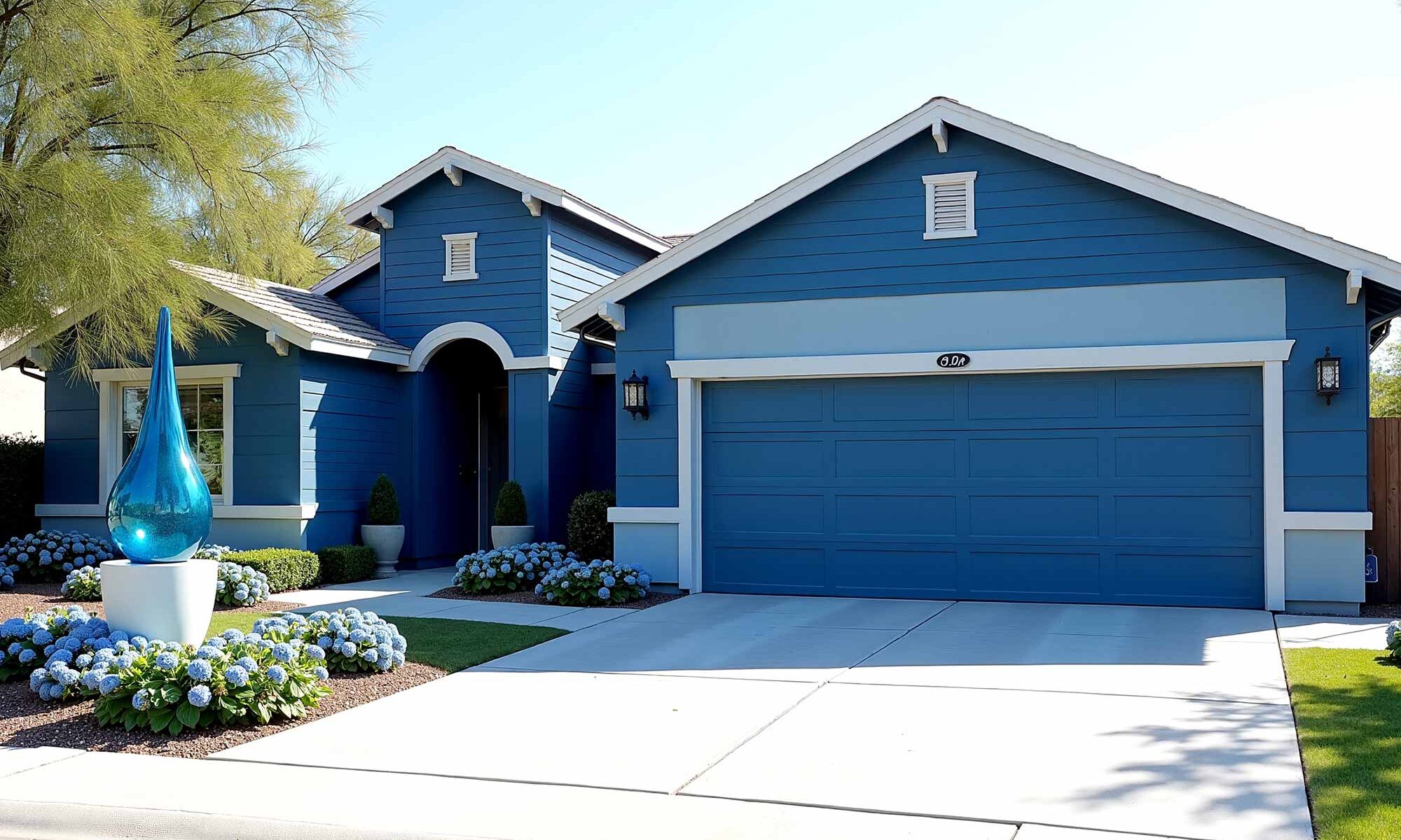
Cool Blue Minimalism
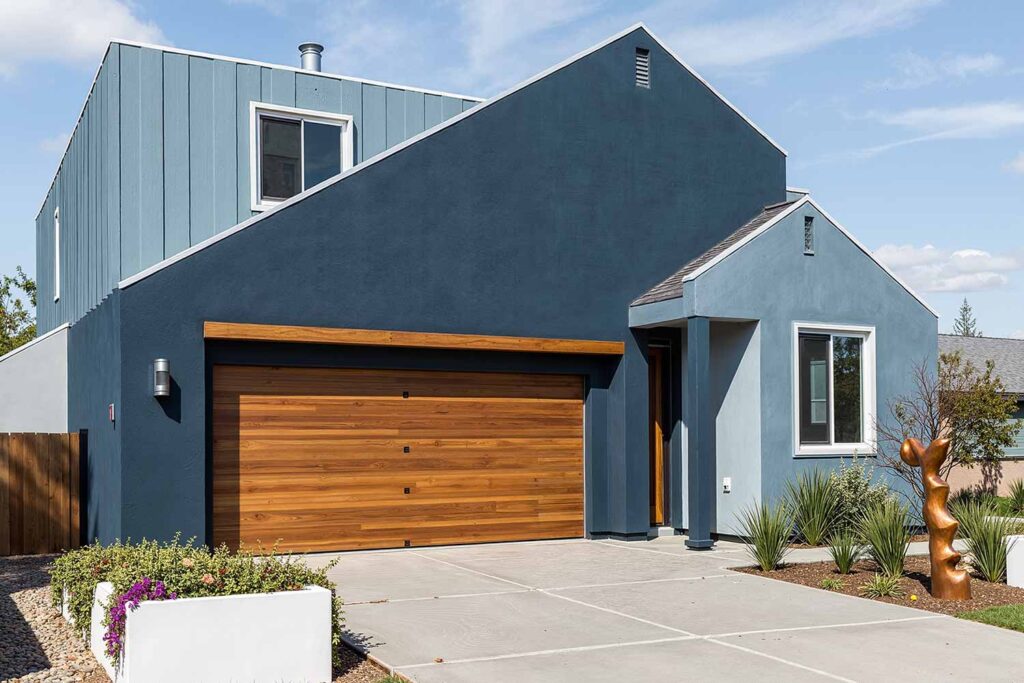
Wrap your home in a slate blue with gray undertones, paired with lighter slate blue for the upper story or gables. White trim creates a clean framework while a natural wood door adds organic warmth to this serene, sophisticated palette.
Body Color: Slate blue with gray undertones | Accent Shade: Lighter slate blue | Trim: Crisp white | Front Door: Natural wood or matte black
Architecture: Craftsman Character
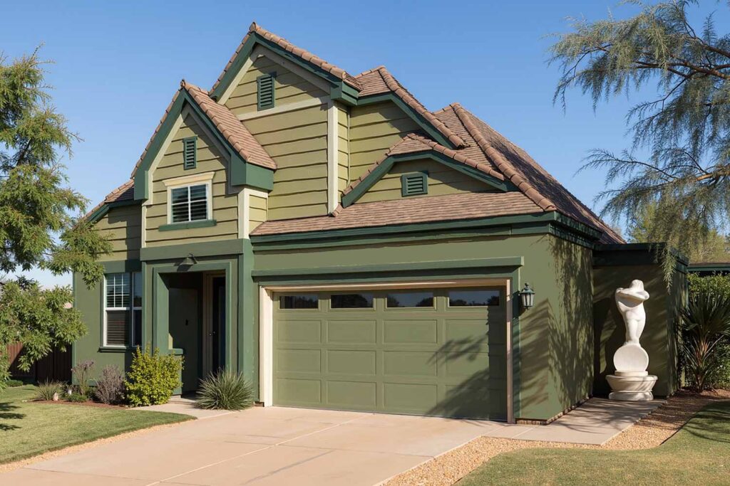
Earthy Green Harmony
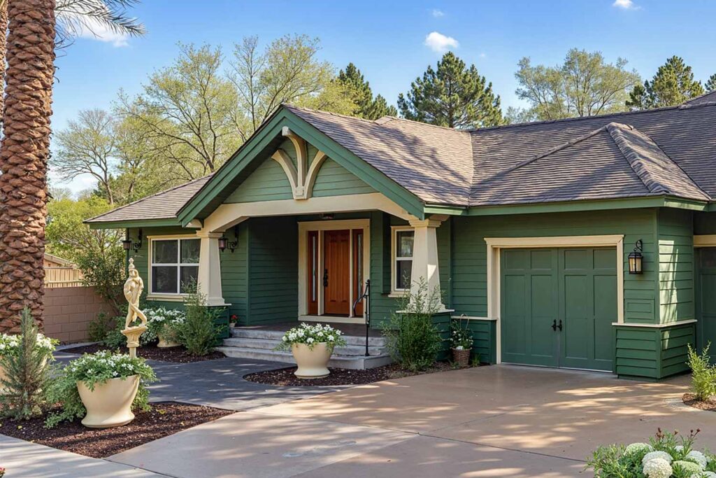
Embrace nature with a forest green main body complemented by lighter forest green accents on gables and architectural details. Cream trim highlights crafted woodwork while a rust or wood door grounds this organic palette in Craftsman tradition.
Body Color: Forest green | Accent Shade: Lighter forest green | Trim: Cream or off-white | Front Door: Deep rust or natural wood
Warm Neutral Layers
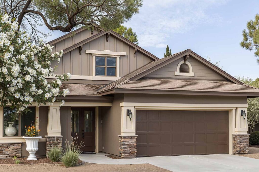
Envelop your home in rich taupe with chocolate undertones, using lighter taupe for upper stories or decorative elements. Off-white trim provides gentle definition while a deep door color anchors this sophisticated neutral combination.
Body Color: Rich taupe with chocolate undertones | Accent Shade: Lighter taupe | Trim: Off-white | Front Door: Dark chocolate brown or deep teal
Architecture: Contemporary & Transitional
Moody Blue Evolution

Dress your home in sophisticated navy blue that shifts with changing light, using lighter navy for secondary sections. Bright white trim creates crisp definition while a vibrant door color provides the perfect contemporary counterpoint.
Body Color: Navy blue | Accent Shade: Lighter navy | Trim: Bright white | Front Door: Coral or lime green
Architecture: Classic & Traditional
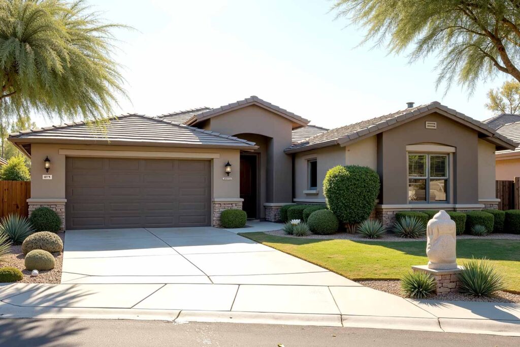
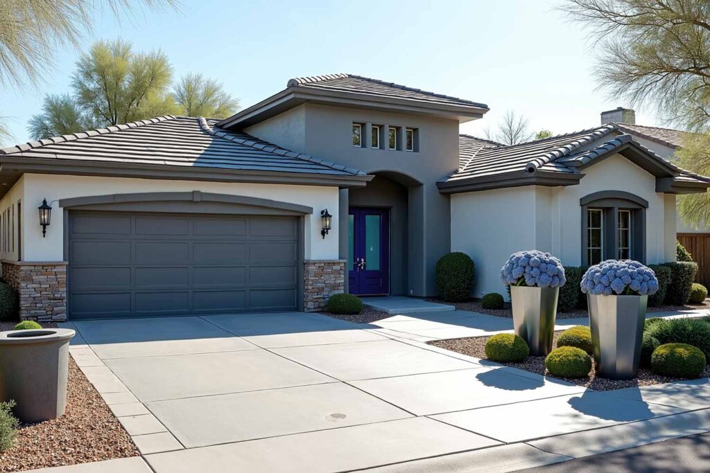
Sophisticated Gray Tradition
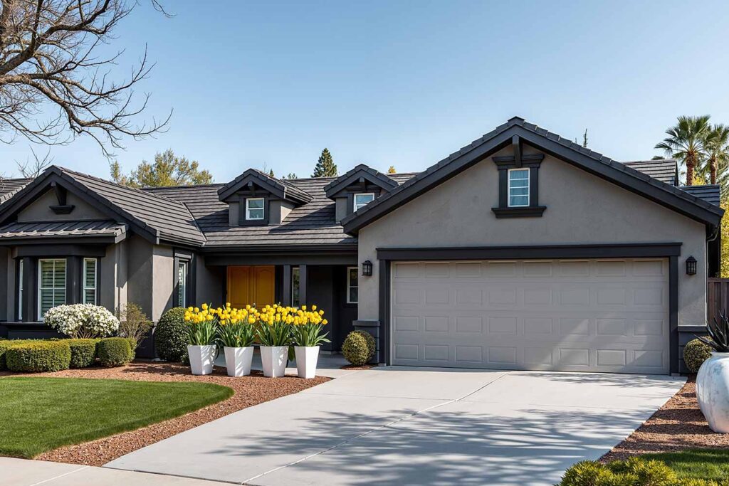
Wrap your home in medium gray with warm undertones, using lighter gray for decorative elements. Black trim highlights architectural details while a contrasting door adds personality to this timeless palette.
Body Color: Medium gray with warm undertones | Accent Shade: Lighter gray | Trim: Black or charcoal gray | Front Door: Black or yellow
Architecture: Cozy & Inviting Styles
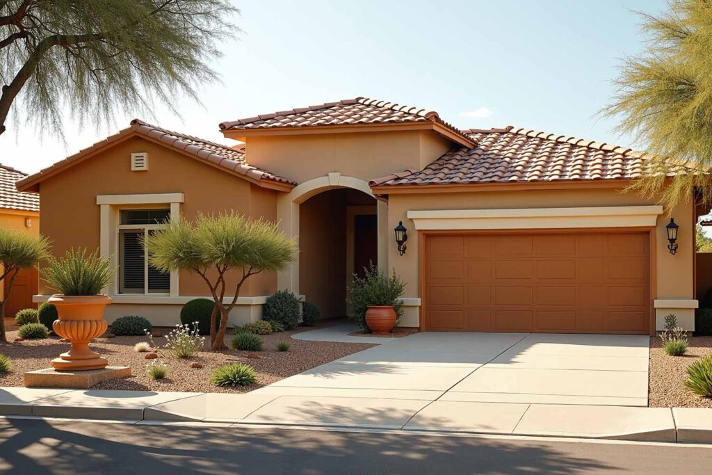
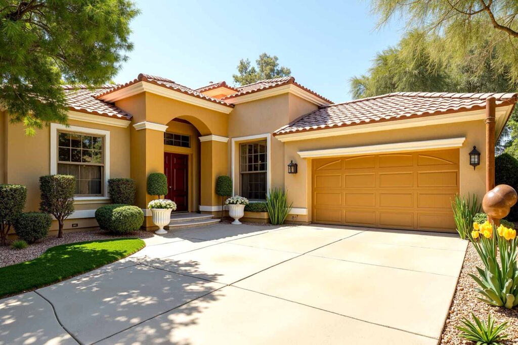
Warm Terracotta Embrace
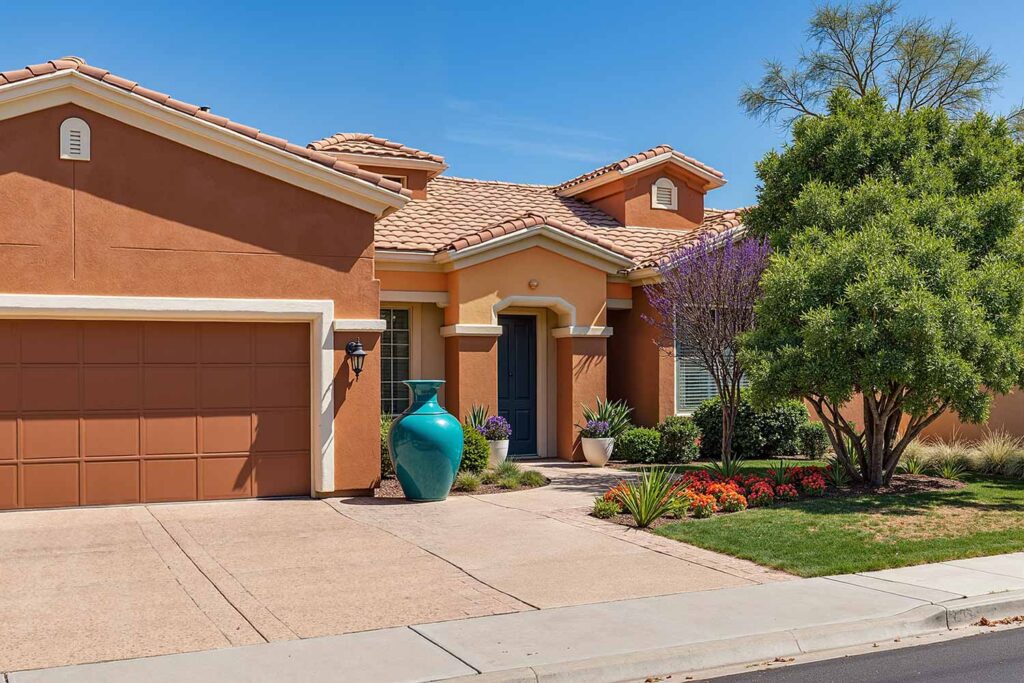
Surround your home in warm terracotta with earthen depth, using lighter terracotta for secondary walls. Cream trim adds soft definition while the door color either complements or contrasts with this sun-baked palette.
Body Color: Warm terracotta | Accent Shade: Lighter terracotta | Trim: Cream | Front Door: Teal or dark brown
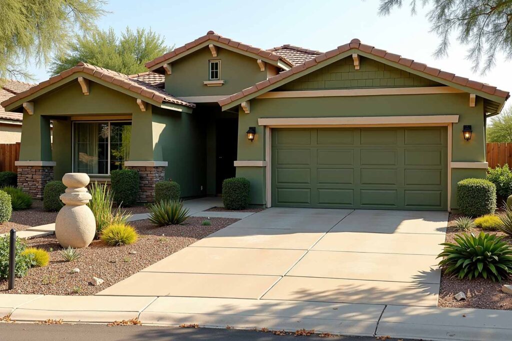
Subtle Green Serenity
Clothe your home in olive green with brown undertones, using lighter olive for accent walls and features. Off-white as well as dark green trim frames windows and doors while the front door color enhances the nature-inspired theme.
Body Color: Olive green with brown undertones | Accent Shade: Lighter olive green | Trim: Off-white and dark green | Front Door: Darker green or natural wood
Architecture: Specialty & Regional Styles
Desert Modern
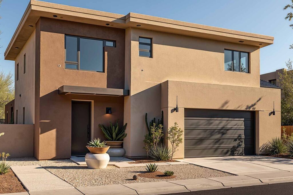
Cover your home in warm sand that shifts with desert light, using lighter or darker sand for architectural features. Sand and bronze trim frames windows while an earthy door color connects this palette to arid landscapes.
Body Color: Warm sand | Accent Shade: Lighter or lighter sand | Trim: Sand | Front Door: Deep bronze or rust
Farmhouse Fresh
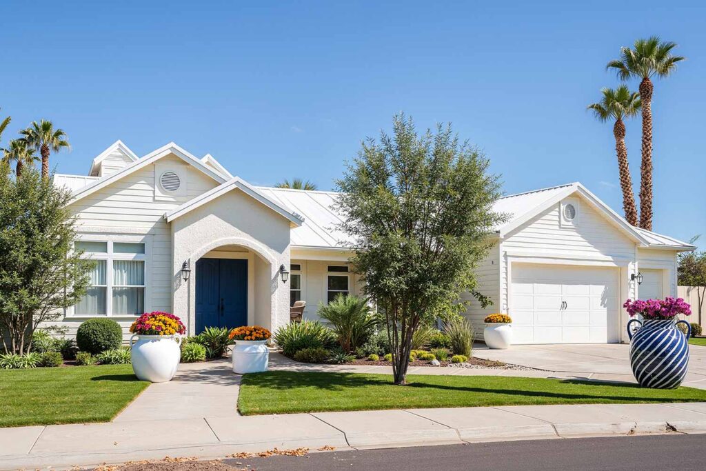
Wrap your farmhouse in soft white with warm undertones, using creamy off-white for secondary areas. Bright white trim provides definition while a classic door color grounds this light, airy palette with traditional appeal.
Body Color: Soft white with warm undertones | Accent Shade: Creamy off-white | Trim: Bright white | Front Door: Black or navy
Finding Your Perfect Exterior Color Ideas
Tone-on-tone exterior house colors aren’t just a trend—they’re a sophisticated approach to home exterior painting that stands the test of time. By layering shades within the same color family, you create depth and interest that enhances your home’s architectural character while expressing your personal style. Whether you’re drawn to moody blues, earthy greens, or sophisticated neutrals, these exterior color ideas offer endless possibilities for transformation.
As you consider your next exterior home painting project, remember that the most successful color stories respect your home’s bones while adding your unique signature. Testing colors in different lighting conditions and considering fixed elements will ensure a result that delights for years to come. Ready to transform your home with tone-on-tone magic? The perfect color story is waiting to be told.