Last Updated on October 11, 2025
Caution: These aren’t your neighbor’s boring beige walls. Prepare to discover interior paint colors so provocative they’ll make you question everything you thought you knew about home design and color combinations. These transformative hues don’t just decorate your space—they reinvent how you feel every day inside your own four walls.
Color is the most powerful tool in my painting arsenal—period. As a painting contractor, I’ve seen firsthand how interior paint colors can transform not just walls, but entire lives. The right unusual shade doesn’t just look different—it fundamentally alters your emotional experience of home. Research shows that color influences 90% of our initial impression of a space, yet most homeowners default to the same predictable palette, missing out on the extraordinary transformation possible through color psychology.
In 2025, interior paint colors are breaking free from traditional constraints. The most fascinating spaces combine unexpected hues that create powerful emotional experiences while still maintaining livability. These aren’t just colors; they’re psychological interventions disguised as interior paint colors. Each one carefully selected from Sherwin-Williams’ catalog to maximize both visual impact and emotional response. If you want to see how other paint manufacturers’ colors compare to Sherwin-Williams colors, try this resource: Paint Color Match.
Bold Statements That Create Unforgettable Spaces
Major Blue (SW 6795) & Snowbound (SW 7004): Intellectual Drama
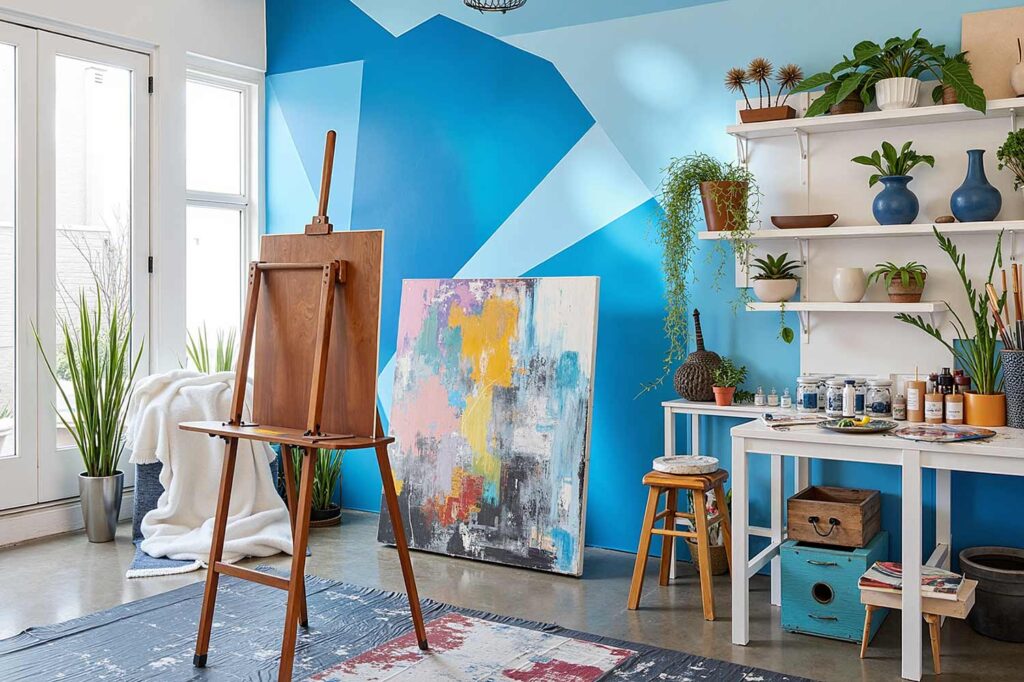
This bold pairing challenges traditional color rules by combining a bright, shocking blue with a crisp white tone. The psychological effect is immediate—Major Blue promotes introspection and intellectual thought while the Snowbound accent adds clarity and definition. A perfect setting for an artist. This combination works magnificently in home offices, creative studios, and meditation rooms where both focus and inspiration are essential. The blue requires abundant natural or artificial lighting to prevent the space from feeling overwhelming, so consider track lighting or strategically placed floor lamps to illuminate the complexity of these hues. You’ll find yourself thinking more clearly yet more creatively in spaces featuring this dramatic duo.
Plum Brown (SW 6272) & Alabaster (SW 7008): Regal Sophistication
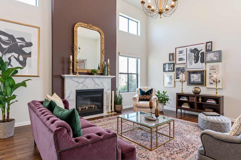
This unexpected pairing marries the rich depth of a purple-infused brown with the subtle warmth of a creamy white. The psychological effect is transformative—the Plum Brown evokes intellectual curiosity and emotional depth while the Alabaster creates breathing room and reflective space. This combination thrives in master bedrooms, reading nooks, and formal living areas where both intimacy and sophistication are desired. The dark tone demands thoughtful lighting design—consider wall sconces with warm bulbs to enhance the plum’s complexity while allowing the alabaster to softly reflect light. You’ll experience both emotional groundedness and elevated thinking in rooms adorned with this sophisticated color story.
Alchemy (SW 6395) & Carnelian (SW 7580): Unexpected Richness
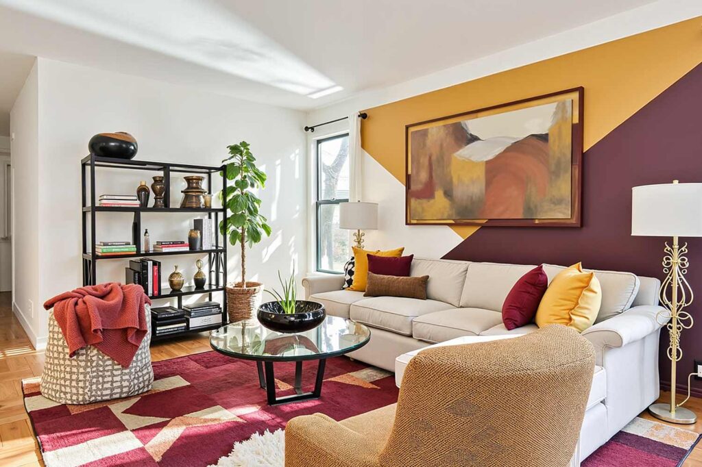
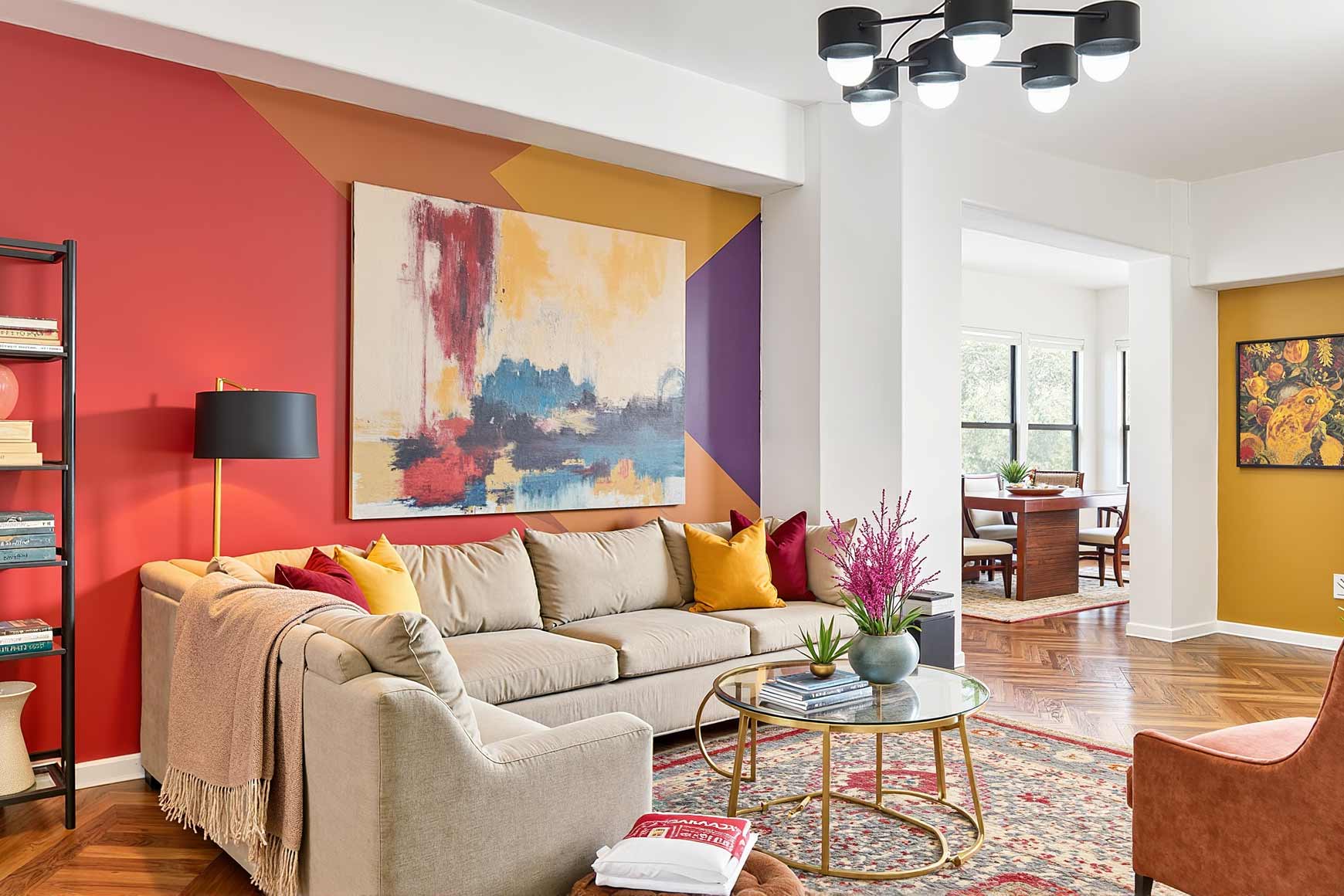
This daring combination defies conventional wisdom by pairing a golden mustard with a deep saturated violet with warm red undertones. The psychological impact resonates immediately—the Alchemy creates energy and optimism while the Carnelian grounds the space with earthy stability. This bold duo transforms dining rooms, creative workspaces, and conversation areas where both stimulation and comfort enhance the experience. The warm tones require balanced lighting—pendant lights with dimmers allow you to adjust the mood from energetic to intimate as needed. You’ll find conversations flowing more freely and creative thinking enhanced in spaces where these unusual interior paint colors work their alchemical magic.
Nature-Defying Green Variations
Jasper (SW 6216) & Coral Rose (SW 9004): Timeless Energy
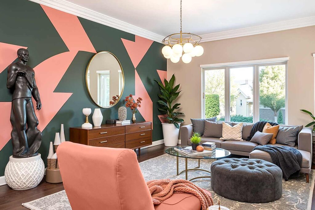
This revolutionary pairing combines a dark and mysterious muted green-gray (almost black) with a vibrant but dusty coral in a way that completely reinvents both colors. The psychological effect is fascinatingly balanced—the Jasper brings meditative calm while the Coral Rose introduces vitality and social energy. This combination transforms living rooms, sunrooms, and entertaining spaces where both relaxation and stimulation enhance the experience. These colors shine under varied lighting conditions—natural daylight reveals their subtle complexities while evening lamplight brings out their rich undertones. You’ll notice both your stress levels dropping and your conversation becoming more animated in spaces featuring this perfectly contradictory color story.
Tansy Green (SW 6424) & Blue Nile (SW 6776): Sophisticated Drama
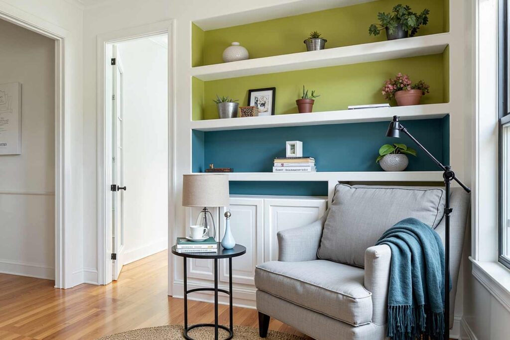
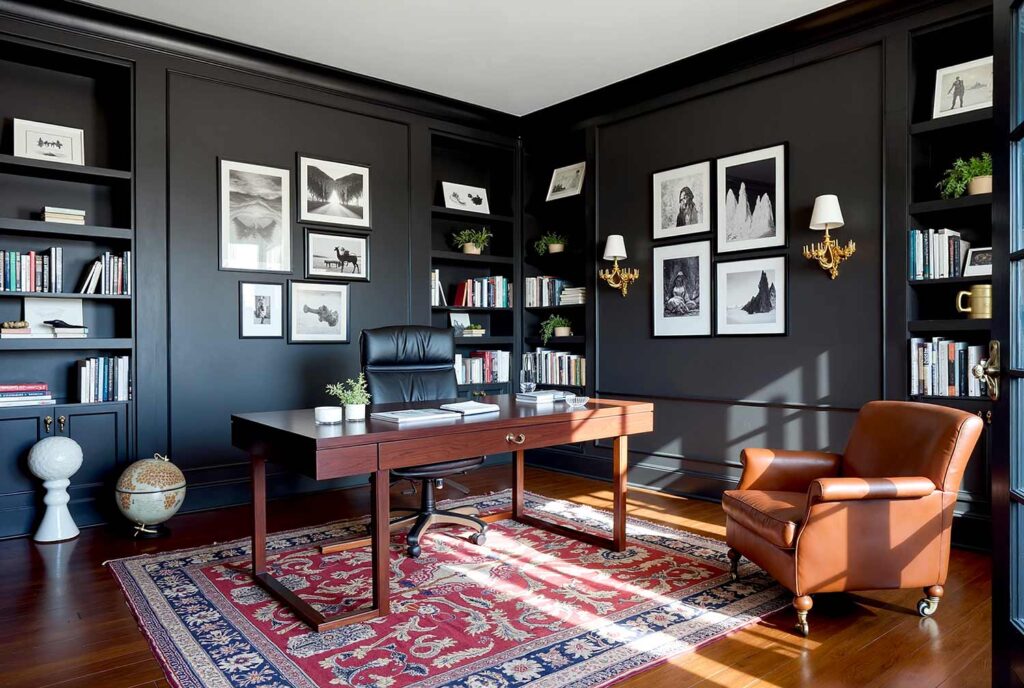
This boundary-pushing combination pairs an olive-inspired green with a mysterious medium-toned blue. The psychological interplay creates immediate depth—the Tansy Green introduces natural wisdom and patience while the Blue Nile adds intellectual curiosity and emotional depth. This pairing transforms libraries, studies, and contemplative corners where thoughtful reflection enhances the experience. These unusual interior paint colors benefit from directed lighting—consider adjustable reading lamps and picture lights to create pools of illumination that highlight their rich complexity. You’ll find your thoughts becoming more organized yet more innovative in spaces featuring this sophisticated color dialogue.
Unexpected Neutrals That Are Anything but Boring
Natural Linen (SW 9109) & Concord Grape (SW 6559): Neoclassical Revolution
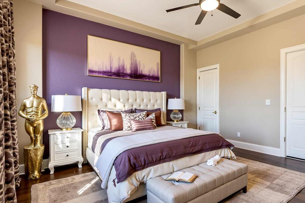
This revolutionary pairing challenges what “neutral” means by combining a sophisticated warm beige with an unexpected burst of purple. The psychological impact is subtly powerful—the Natural Linen creates mental clarity and stability while the Concord Grape introduces creative thinking and emotional depth. This combination elevates professional spaces, sophisticated bedrooms, and artistic areas where both structure and imagination enhance the experience. These colors require thoughtful illumination—layered lighting with both ambient and accent sources will reveal their full complexity throughout the day. You’ll experience both emotional stimulation and mental organization in spaces featuring this unexpectedly harmonious pairing.
Agreeable Gray (SW 7029) & Aleutian (SW 6241): Subtle Sophistication
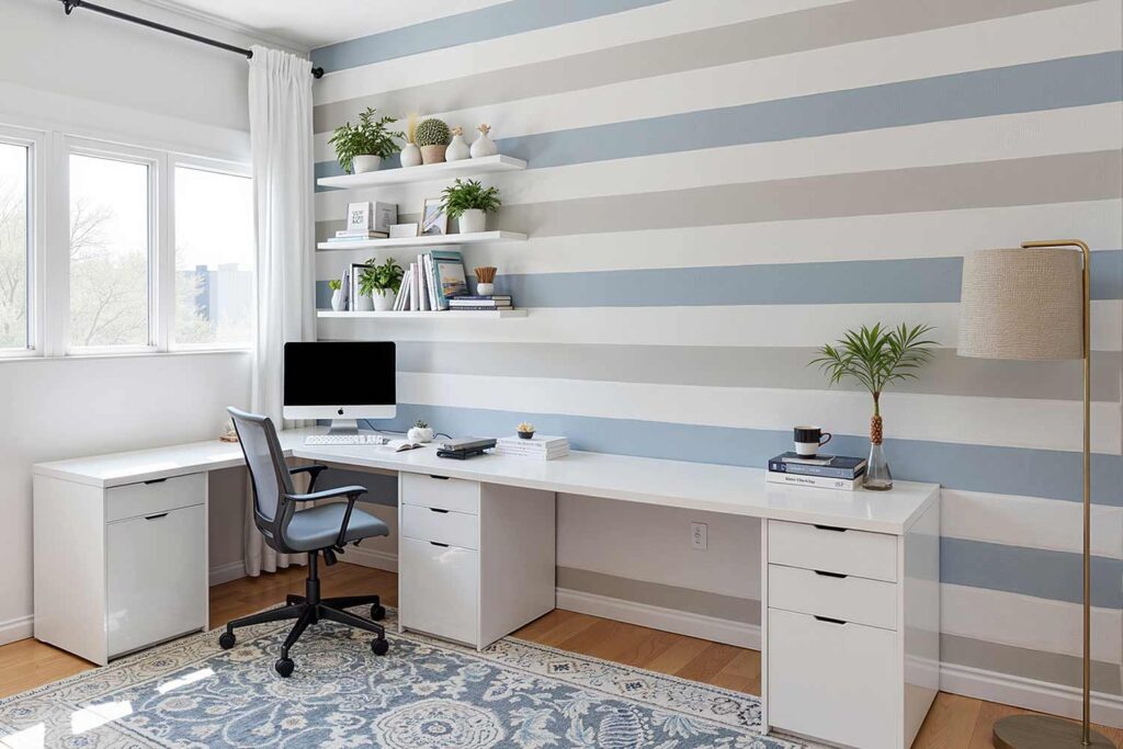
This nuanced combination pairs a chameleon-like warm gray with a complex blue-gray that defies simple description. The psychological effect is subtle yet profound—the Agreeable Gray creates a sense of balance and harmony while the Aleutian adds depth and introspection. This pairing transforms bedrooms, living spaces, and transitional areas where both calm and sophistication enhance the experience. These colors adapt beautifully to changing light—morning reveals their warmer undertones while evening brings out their cooler aspects. You’ll notice your breathing slowing and your thoughts becoming clearer in spaces featuring these unusual interior paint colors that prove neutrals need never be boring.
Transformative Color Stories
Red Bay (SW 6321) & Rainwashed (SW 6211): Warm Sophistication
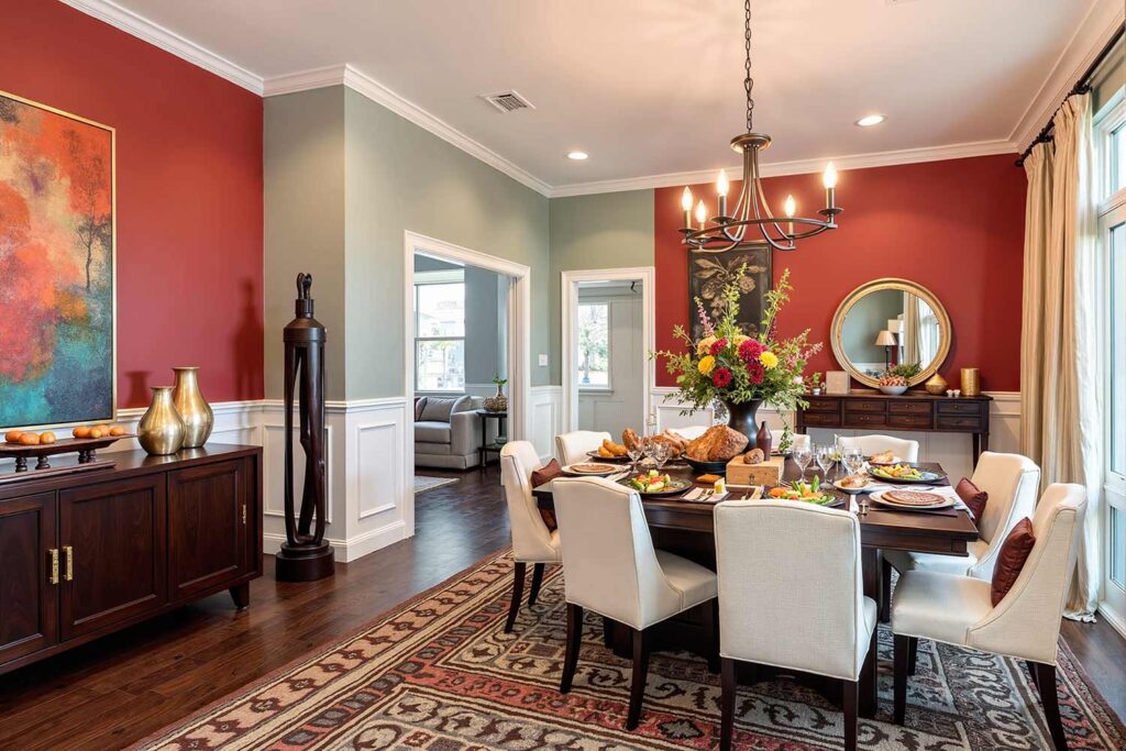
This unexpected combination marries a rich, historic red with a refreshing pale blue-green-gray. The psychological contrast creates immediate interest—the Red Bay stimulates energy and appetite while the Rainwashed introduces calm reflection and mental clarity. This pairing transforms dining rooms, family gathering spaces, and creative areas where both stimulation and thoughtfulness enhance the experience. These colors require balanced lighting—warm-toned bulbs will emphasize the red’s richness while cool daylight showcases the subtle complexity of the Rainwashed. You’ll find conversations more animated yet somehow more meaningful in spaces featuring this color combination that balances stimulation with serenity.
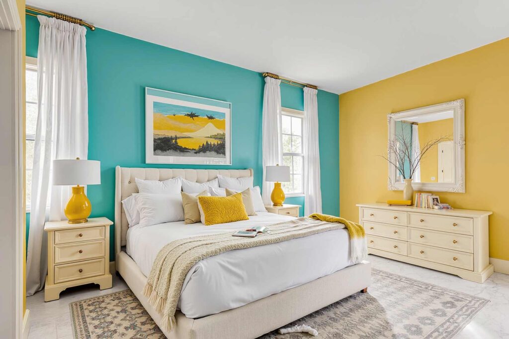
Alchemy (SW 6395) & Oceanside (SW 6496): Unexpected Energy
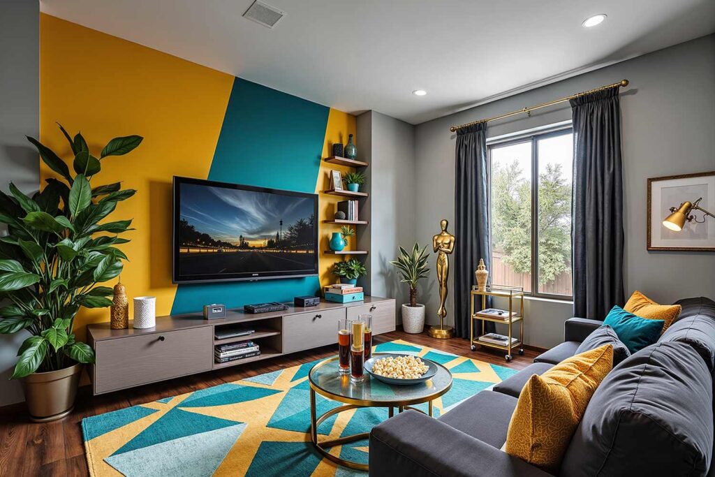
This revolutionary combination pairs a golden yellow with a vibrant teal blue in a way that completely transforms both colors. The psychological impact is immediately energizing—the Alchemy introduces optimism and creativity while the Oceanside adds emotional depth and adventurous thinking. This pairing transforms kitchens, creative workspaces, and entertainment areas where energy and inspiration enhance the experience. These colors shine under abundant light—large windows showcase their vibrancy while adjustable lighting allows you to control their intensity. You’ll find both your creative thinking and your emotional openness expanding in spaces featuring this energizing yet sophisticated color story.
Turkish Coffee (SW 6076) & Aleutian (SW 6241): Grounding Complexity
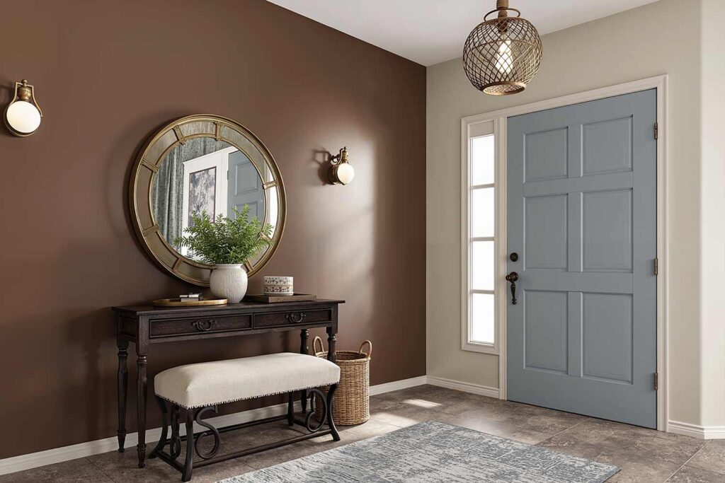
With a nod to the 1960s, this sophisticated combination pairs a rich, deep brown with a complex blue-gray in a way that creates extraordinary depth. The psychological effect is subtly powerful—the Turkish Coffee creates groundedness and security while the Aleutian adds intellectual depth and emotional intelligence. This pairing transforms professional spaces, sophisticated living areas, and contemplative corners where both stability and complexity enhance the experience. These unusual interior paint colors benefit from warm lighting that brings out the coffee’s richness while maintaining the Aleutian’s mysterious undertones. You’ll find both your emotional security and your intellectual curiosity nurtured in spaces featuring this grounding yet sophisticated color story.
The Psychology Behind Breaking Color Rules
The most extraordinary spaces have one thing in common—they’ve intentionally broken traditional color rules while maintaining psychological harmony. Research consistently shows that color directly impacts our emotional state, cognitive function, and even our perception of time and space.
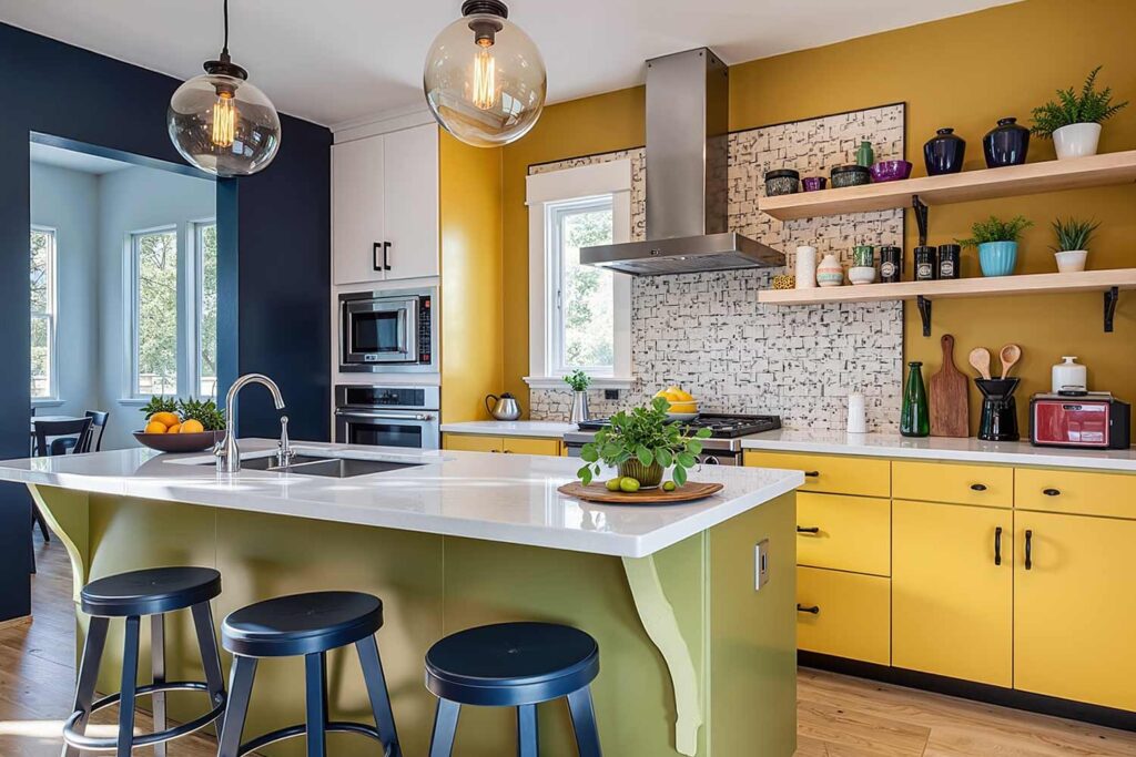
When selecting unusual interior paint colors for your home, consider not just what looks good but how you want to feel in the space. That deep purple might be gorgeous, but if you need a space that promotes focus rather than relaxation, it might not be the right choice regardless of its beauty.
Key Insight: The most successful unusual color applications match the psychological impact of the color with the function of the space. This alignment creates rooms that not only look extraordinary but feel exactly right for their purpose.
Final Brush Strokes: Creating Your Unique Color Story
After seeing so many homes transformed through color, I’ve discovered that the most memorable spaces are those that dare to be different while still feeling intentional. These unusual interior paint colors aren’t just about standing out—they’re about creating environments that support and enhance your life in meaningful ways.
Will you choose the sophisticated drama of Tansy Green and Blue Nile for your home office? The unexpected richness of Alchemy and Carnelian for your bedroom? Or perhaps the grounding complexity of Turkish Coffee and Aleutian for your living room? Whatever you choose, remember that the right unusual interior paint colors can transform any space from ordinary to extraordinary.
Your walls are more than just surfaces—they’re opportunities to create environments that reflect who you are and support how you want to live. Let’s break some color rules together and create spaces that are as unique and extraordinary as you are.


