
Color transforms everything it touches. The right two-tone exterior house colors don’t just change your home’s appearance—they completely re-imagine its identity. That bland facade you’ve grown accustomed to? It’s secretly a blank canvas waiting to become the most striking home on your block. The architectural details currently hiding in plain sight? They’re ready to command attention through the simple magic of contrast.
Every morning, neighbors walk past homes that whisper when they could shout. The difference is strategic color—thoughtfully paired hues that celebrate your home’s unique character. Two-tone exterior house colors aren’t just paint choices; they’re visual storytelling tools that communicate who you are without saying a word.
Note: All colors listed in this article are from Sherwin-Williams.
The Visual Impact of Two-Tone Exteriors
Breaking the Monotony of Single-Color Facades
The human eye craves visual interest. A single-color exterior can’t deliver the dimensional depth that immediately draws attention. Two-tone exterior house colors create natural visual breaks, guiding the eye across your home’s surface and highlighting its proportions. Modern exterior paint combinations often pair contrasting depths—think deep Naval with bright Pure White—to create optical illusions that enhance your home’s best features while minimizing less desirable ones.


Creating Architectural Definition Through Color
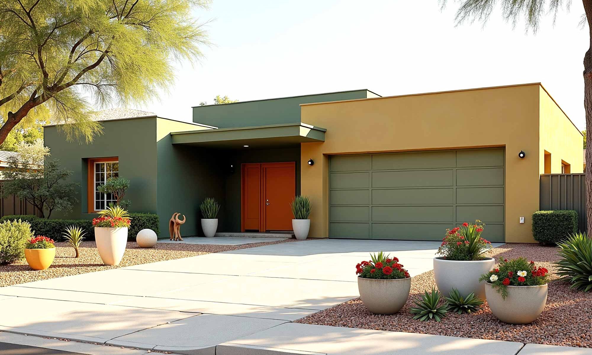
Your home has bones—structural elements that define its character. Bold exterior color schemes showcase these elements rather than hiding them. When darker shades are applied to recessed areas and lighter tones to protruding features, the home’s depth becomes immediately apparent. That craftsman porch column isn’t just functional—it’s a statement piece. That farmhouse gable isn’t merely structural—it’s a defining character trait of your home’s personality.
The Psychology Behind Color Contrast
Architectural color schemes tap into our emotional responses. Warm, earthy contrasts feel grounding and organic. Cool, crisp pairings project contemporary confidence. Subtle, tone-on-tone combinations whisper sophistication. The power of two-tone exterior house colors lies not just in the individual shades but in the conversation between them—the visual equivalent of a firm handshake or a warm smile.
Matching Mood and Personality Through Color
Bold and Confident Color Statements
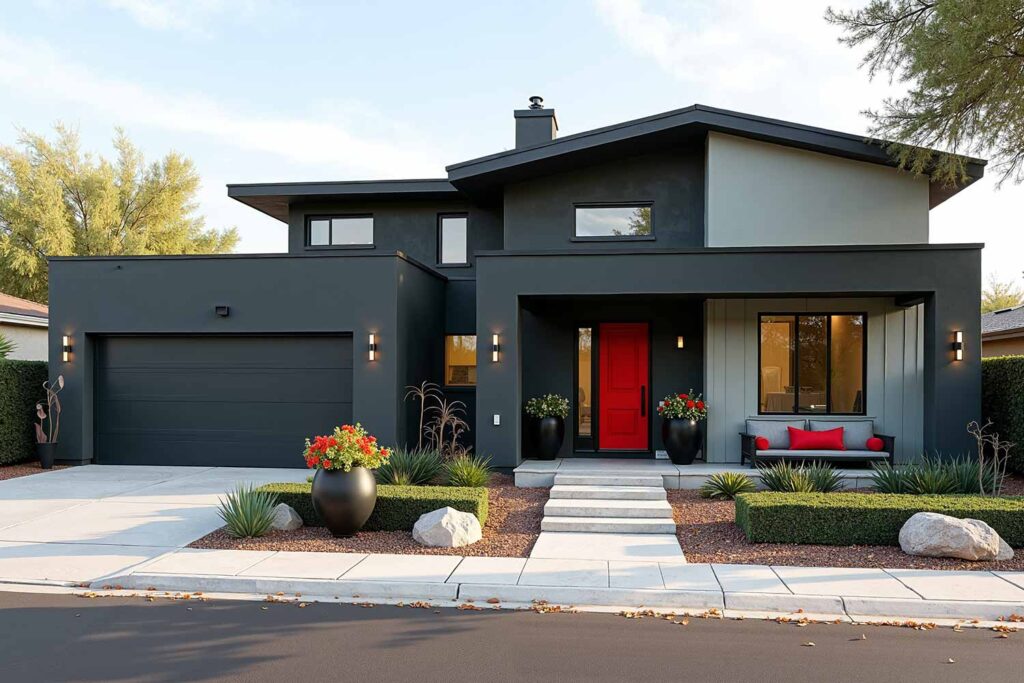
For homeowners who value individuality, bold exterior color schemes offer the perfect canvas for self-expression. Naval paired with Pure White creates dramatic depth. Roycroft Bottle Green alongside warm wood tones brings natural luxury. Tricorn Black and Extra White—perhaps the most timeless of all exterior color pairings—delivers unfailing graphic impact.


These high-contrast combinations aren’t just visually striking; they’re declarations of confidence. In neighborhoods filled with safe beiges and predictable whites, these homes become landmarks and conversation starters.
Serene and Sophisticated Two-Tone Schemes
Not all two-tone approaches need to shout. Some of the most elegant exterior color pairings whisper their sophistication through subtle variations. Agreeable Gray paired with much deeper Iron Ore creates depth without drama. Accessible Beige alongside Black Bean delivers quiet luxury. These combinations create homes that feel timeless rather than trendy.


Modern exterior paint combinations in this category often feature tone-on-tone relationships—variations within the same color family that create textural interest rather than stark contrast. The effect is undeniably elegant, perfect for homeowners who value understated distinction.
Playful and Energetic Exterior Expressions
Color is inherently joyful, and some of the most memorable architectural color schemes embrace this quality wholeheartedly. Tradewind with Curry accents creates coastal cheerfulness. Contented with Lagoon details delivers garden-inspired charm. These playful combinations express the happiness that home should represent.


Bold exterior color schemes in this category often incorporate unexpected accent colors that might be too bold for large surfaces but create perfect moments of delight in smaller doses. A bright Decisive Yellow door within an otherwise neutral palette creates a focal point that makes both residents and visitors smile every time they approach.

Architectural Harmony: Matching Colors to Home Styles
Modern and Contemporary: Clean Lines, Bold Contrasts
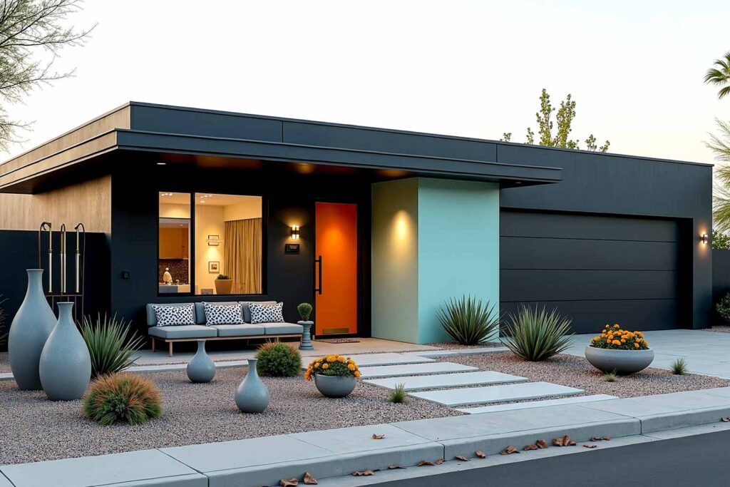
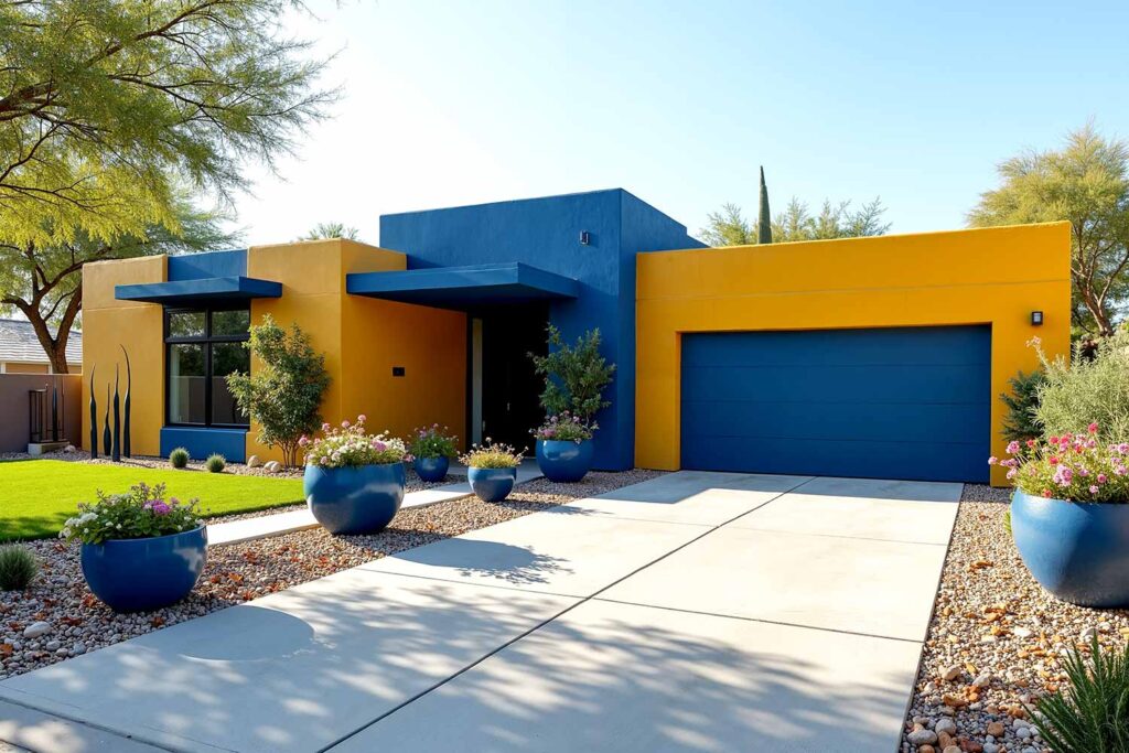
Modern architecture thrives on clarity and definition. Two-tone exterior house colors for contemporary homes typically embrace high contrast—Tricorn Black windows against Extra White stucco, Iron Ore siding with natural wood accents. These modern exterior paint combinations honor the home’s clean lines while adding visual interest that prevents minimalist designs from feeling cold or institutional.
The key to successful modern two-tone approaches lies in restraint. Two well-chosen colors applied with architectural intention create more impact than multiple competing hues.
Craftsman Homes: Earthy Sophistication
Craftsman architecture celebrates handcrafted details and natural materials. The most harmonious exterior color pairings for these homes tap into earth-inspired palettes—Roycroft Bottle Green, Black Bean, Cavern Clay—often alongside Greek Villa that highlights intricate woodwork and trim.


Two-tone exterior house colors for craftsman homes typically feature deeper shades on the lower portion, creating a grounding effect, with lighter tones above that draw attention to decorative gables and eaves.
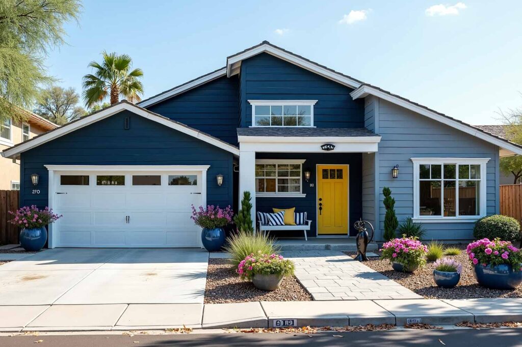
Traditional and Colonial: Fresh Takes on Classic Combinations
Traditional homes carry historical context that deserves acknowledgment. Fresh interpretations of classic combinations—Naval with Greek Villa rather than stark Pure White, or Iron Ore in place of traditional black—respect architectural heritage while creating a home that feels current.
Bold exterior color schemes for traditional homes might incorporate unexpected accent colors on shutters and doors—perhaps Cordovan rather than expected green, or Curry instead of traditional red.

12 Inspiring Two-Tone Exterior Transformations
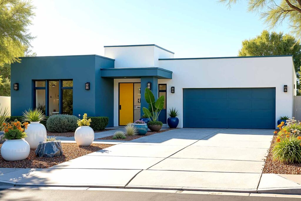
1. Naval Blue & Crisp White: Modern Coastal Sophistication
Main: Naval SW 6244 | Accent: Icicle SW 6238 | Trim: Pure White SW 7005 | Door: Decisive Yellow SW 6902 | Porch Ceiling: Atmospheric SW 6505
This combination offers timeless maritime elegance with a contemporary twist. The deep navy provides a rich, anchoring background that makes architectural details pop against bright white trim. The unexpected yellow door adds a moment of sunshine, while the traditional blue porch ceiling nods to coastal traditions.
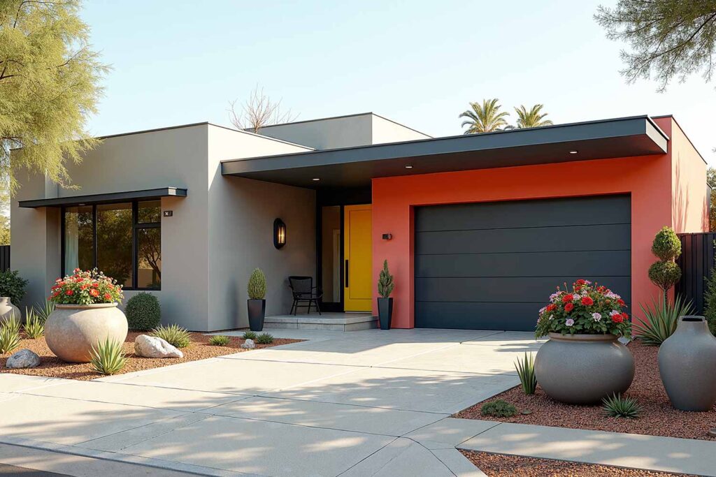
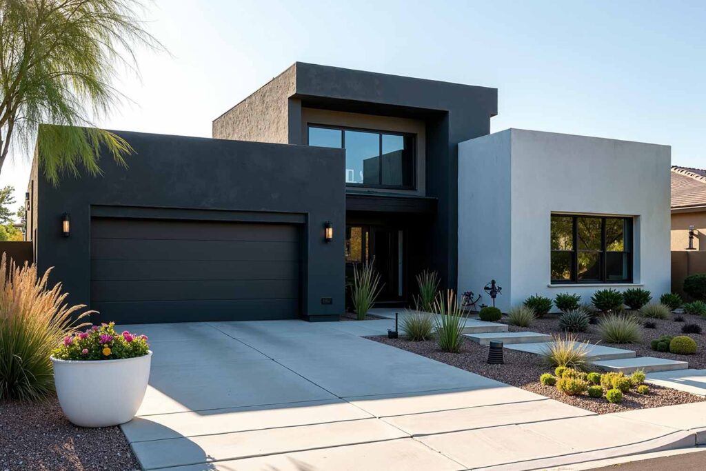
2. Charcoal Gray & Black: Contemporary Edge
Main: Peppercorn SW 7674 | Accent: Willow Tree SW 7741 | Trim: Tricorn Black SW 6258 | Door: Natural wood stain or Real Red SW 6868
This modern exterior paint combination delivers sophisticated urban appeal. The close relationship between the charcoal and black creates subtle definition that reveals architectural details without high contrast. A natural wood door adds organic warmth to this otherwise cool palette.
3. Sage Green & Warm White: Natural Elegance

Main: Contented SW 6191 | Accent: Opaline SW 6189 | Trim: Greek Villa SW 7551 | Door: Naval SW 6244 | Porch Ceiling: Sea Salt SW 6204
This exterior color pairing bridges traditional and contemporary sensibilities. The soft sage creates a gentle backdrop that blends with landscaping. Warm white trim adds definition without harshness, while the naval blue door provides a moment of depth.
4. Black & Natural Wood: Modern Organic
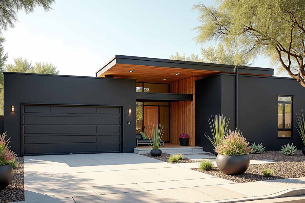
Main/Trim: Tricorn Black SW 6258 | Accents: Natural cedar or cypress | Door: Same wood tone as accents
Bold exterior color schemes don’t need multiple paint colors. This dramatic combination relies on material contrast rather than hue variation, pairing sophisticated black with the natural warmth of wood. The effect is both modern and timeless.
5. Terracotta & Cream: Mediterranean Warmth
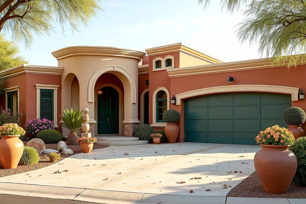
Main: Cavern Clay SW 7701 | Accent: Ligonier Tan SW 7717 | Trim: Alabaster SW 7008 | Door: Rookwood Dark Green SW 2816 | Porch Ceiling: Butter Up SW 6681
This sun-kissed combination evokes Mediterranean and Southwest architectural traditions. The earthy terracotta main color feels grounding, while creamy trim brightens and defines. The unexpected green door adds a refreshing botanical note.
6. Two-Tone Blues: Coastal Contemporary
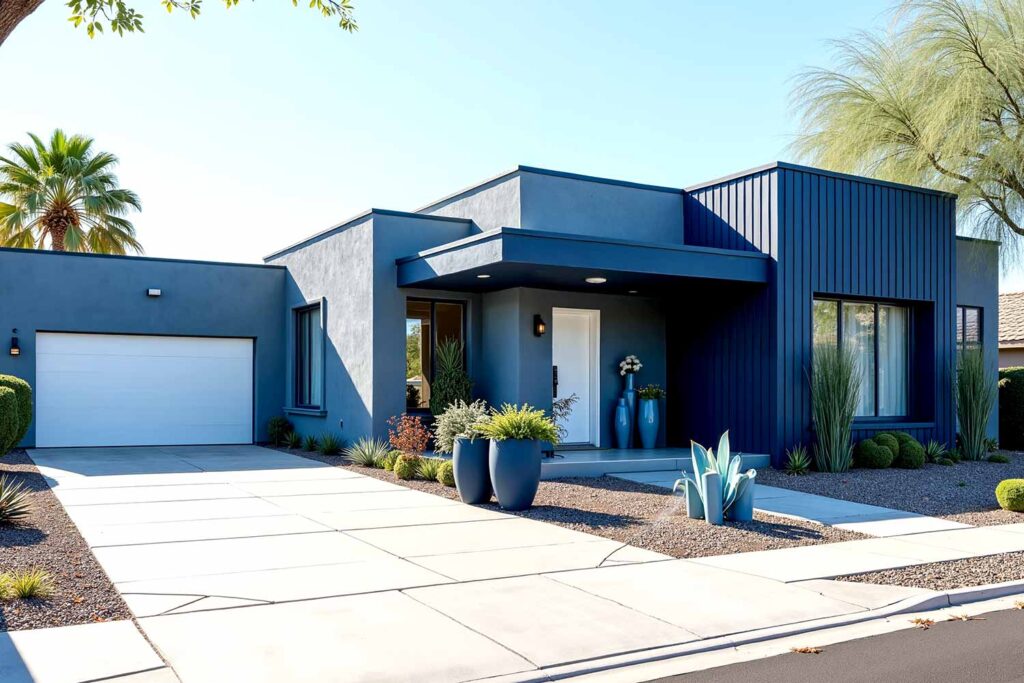
Main: Indigo Batik SW 7602 | Trim/Accents: Naval SW 6244 | Door: Pure White SW 7005
This monochromatic approach proves that two-tone exterior house colors can come from the same color family. The variation between the medium and deep blues creates subtle dimension that highlights architectural details through shadow and depth rather than stark contrast.
7. Forest Green & Black: Bold Nature-Inspired
Main: Roycroft Bottle Green SW 2847 | Accent: Oak Creek SW 7718 | Trim: Tricorn Black SW 6258 | Door: Natural wood or black
This deeply saturated combination creates dramatic sophistication. The forest green appears nearly black in shadow but reveals rich undertones in direct light, creating natural variation throughout the day. Black trim creates definition through subtle contrast.
8. Warm Beige & Rich Brown: Elevated Earth Tones
Main: Accessible Beige SW 7036 | Accent: Cadet SW 9143 | Trim: Black Bean SW 6006 | Door: Lagoon SW 6480 or Naval SW 6244
This combination proves that neutral doesn’t mean boring. The dimensional relationship between the warm beige and deep brown creates sophisticated contrast that works with virtually any architectural style. An unexpected teal door provides a refreshing focal point.
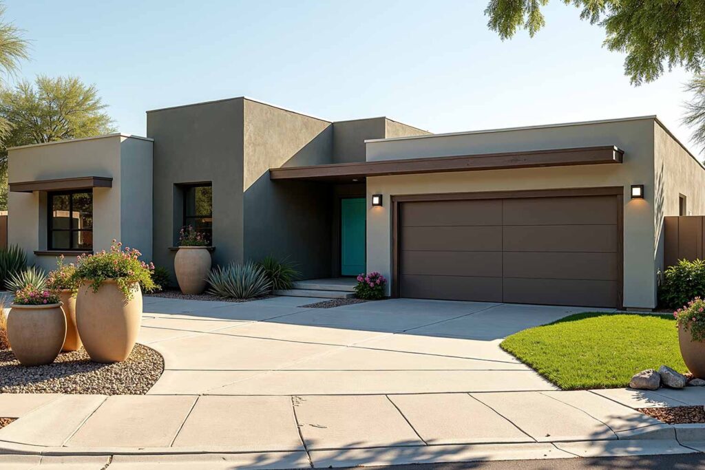
9. Light Gray & Charcoal: Sophisticated Neutrals
Main: Agreeable Gray SW 7029 | Accent: Coral Rose SW 9004 | Trim: Iron Ore SW 7069 | Door: Daffodil SW 6901 or Tricorn Black SW 6258
This modern exterior paint combination offers versatile elegance suitable for almost any home style. The relationship between the light and dark grays creates subtle dimension that reveals architectural details without overwhelming them. The choice between a sunny yellow door or glossy black offers flexibility.
10. Burgundy, Olive & Soft White: Rich Classic

Main: Cordovan SW 6027 | Accent: Cornwall Slate SW 9131 | Trim: Extra White SW 7006 | Door: Tricorn Black SW 6258 or Iron Ore SW 7069
Bold exterior color schemes sometimes revisit historical inspirations with fresh interpretations. This rich burgundy creates a sense of traditional elegance without resorting to expected red brick tones. The soft white trim brightens and defines.
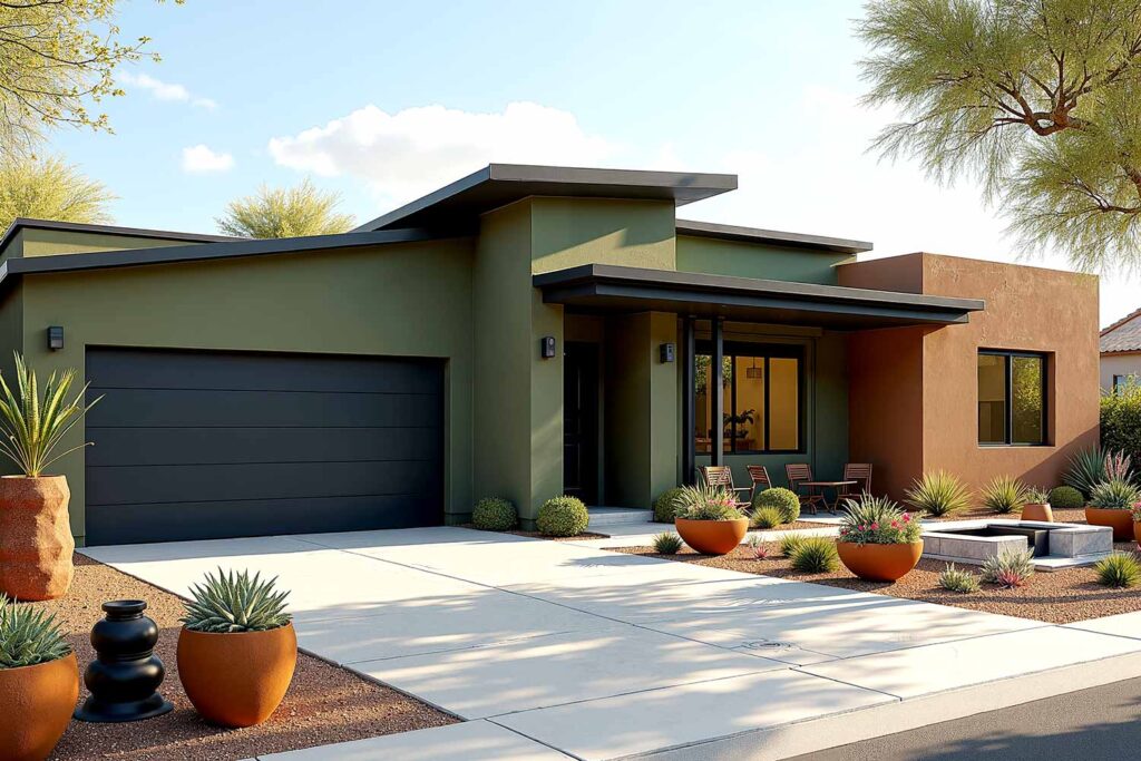
11. Olive & Gray: Understated Organic
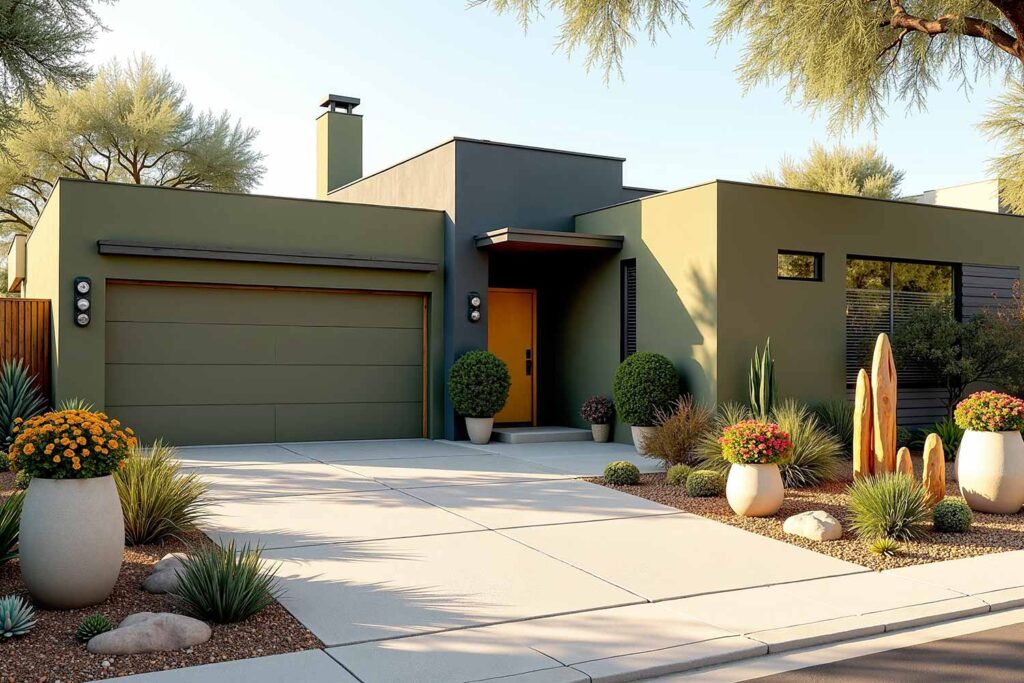
Main: Relentless Olive SW 6425 | Accent: Night Owl SW 7061 | Trim: Tricorn Black SW 6258 | Door: Curry SW 6671 or Tempe Star SW 6229 | Porch Ceiling: Sea Salt SW 6204
This nature-inspired palette feels simultaneously fresh and timeless. The muted olive main color blends beautifully with landscaping, while black trim provides crisp definition. The mustard door option adds sunny warmth, while teal offers refreshing contrast.
12. Bright White & Bold Blue: Fresh Contemporary
Main: Extra White SW 7006 | Trim/Accents: Rainstorm SW 6230 | Door: Same blue as trim or Decisive Yellow SW 6902
This reverse approach to traditional two-tone exterior house colors uses white as the dominant shade and color as the accent—perfect for contemporary homes seeking a clean, gallery-like appearance. The deep blue reads almost like denim, adding touches that define architectural features.
Creating Curb Appeal with Unexpected Combinations
Breaking Neighborhood Patterns
The most memorable homes diverge thoughtfully from established patterns. This doesn’t mean creating visual discord; it means understanding the neighborhood’s character and introducing thoughtful variation. If your street features predominantly neutral homes, even moderately bold exterior color schemes will make your property stand out.
Color Placement for Maximum Impact
Where you place color matters as much as which colors you choose. Two-tone exterior house colors create their magic through strategic placement that highlights architectural strengths. Deep colors visually recede, making them ideal for setting back less-appealing features. Light colors advance, drawing attention to features you want to highlight.
Consider using deeper shades for the main body and lighter tones for projecting elements like bay windows or entrance porticos. This approach creates natural shadow effects that add dimension even on cloudy days.
Final Brush Strokes: Two-Tone Exterior House Colors
Two-tone exterior house colors aren’t merely aesthetic choices—they’re strategic decisions that transform how your home communicates with the world. They highlight architectural character, express personal style, and create memorable first impressions that standard single-color approaches simply cannot achieve.
The most successful exterior color pairings don’t follow trends blindly; they consider architectural integrity, environmental context, and personal expression in equal measure. Bold exterior color schemes make statements worth making. Modern exterior paint combinations respect tradition while embracing contemporary sensibilities. Architectural color schemes reveal the unique character of each home.

Your home’s exterior is its handshake with the world—the first impression it makes on visitors, neighbors, and passersby. Make it authentically memorable. Make it confidently yours. Make it impossible to ignore. The perfect two-tone exterior awaits—not as a distant possibility but as your home’s true identity, ready to be revealed. And as always, call me if you need help.