
Transform your forgotten hallway into the most captivating space in your home with these hallway painting ideas and striking color combinations that do more than just look good—they change how you feel every time you walk through your home. Color transforms spaces, but nowhere is this magic more potent than in your hallway—that transitional space that sets the tone for your entire home experience.
Research shows that up to 90% of first impressions form based on color alone, making your hallway’s palette the silent narrator of your home’s story. The right paint choice can turn a forgettable corridor into the soul of a home, creating an emotional journey that begins the moment someone steps through your door.
The psychology behind color is profound in these spaces; research shows that different hues trigger specific emotional responses and can dramatically alter spatial perception. Your hallway isn’t just a path from one room to another—it’s the thread that ties your home’s narrative together. The colors you choose here don’t just speak to your style; they whisper to your subconscious, affecting your mood each time you pass through.
Ready to transform your hallway from forgotten to unforgettable? These Sherwin-Williams combinations and hallway painting ideas aren’t just trending for 2025—they’re designed to revolutionize how you experience your home.
Warm and Inviting Palettes
Grounded (SW 6089) & Sunbleached (SW 9585): Desert Warmth
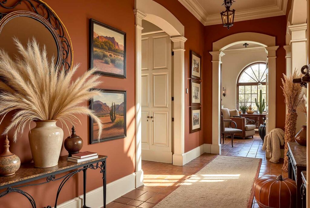
The rich, earthy terracotta of Grounded creates an immediate sense of stability while the soft, muted beige Sunbleached adds breathing room and light. This combination mimics desert landscapes, triggering feelings of grounding and warmth—perfect for narrow hallways that need to feel more expansive yet cozy. This is one of the more traditional of hallway painting ideas. The pairing works magnificently in spaces with minimal natural light, creating an artificial sunset glow. Accent with minimalist rattan lighting fixtures and desert-inspired textiles to complete this transformative duo.
Alchemy (SW 6395) & Alabaster (SW 7008): Sunset Glow

The deep mustard yellow of Alchemy doesn’t just illuminate your hallway—it infuses it with optimism and creativity. Paired with the soft, warm white of Alabaster, this combination creates a perpetual golden hour in your home. The psychological effect is immediate: mustard tones stimulate communication and positive energy while the white provides mental clarity. Perfect for hallways connecting social spaces, this pairing makes the journey between rooms a mood-enhancing experience. Consider brass accents and abstract art to amplify the creative energy.
Bosc Pear (SW 6390) & Pure White (SW 7005): Golden Welcome
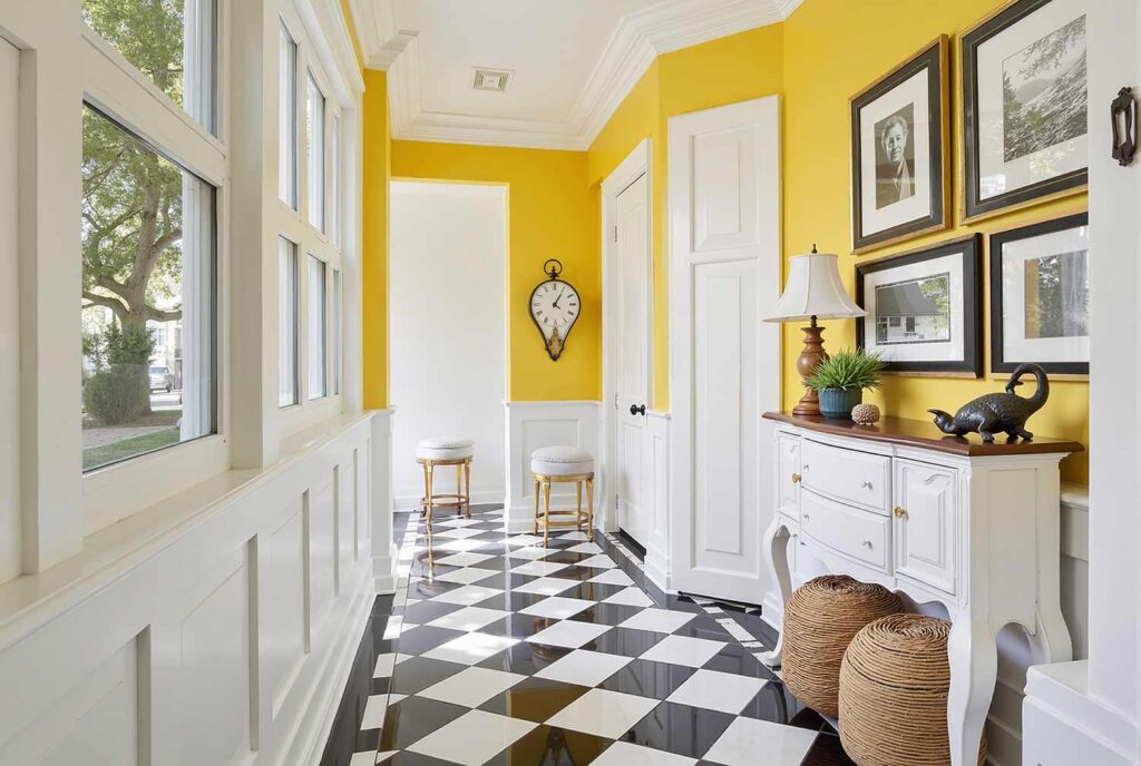
This creamy yellow with golden warmth creates an immediate sense of welcome—a psychological trigger that signals “you’ve arrived somewhere special.” The crisp Pure White trim adds definition and contemporary balance. Research shows yellow stimulates the production of serotonin, literally creating happiness as you move through the space. This combination performs miraculously in north-facing hallways that need light amplification. The contrast creates architectural interest even in hallways without distinctive features—turning simplicity into intentional minimalism.
Nature-Inspired Combinations
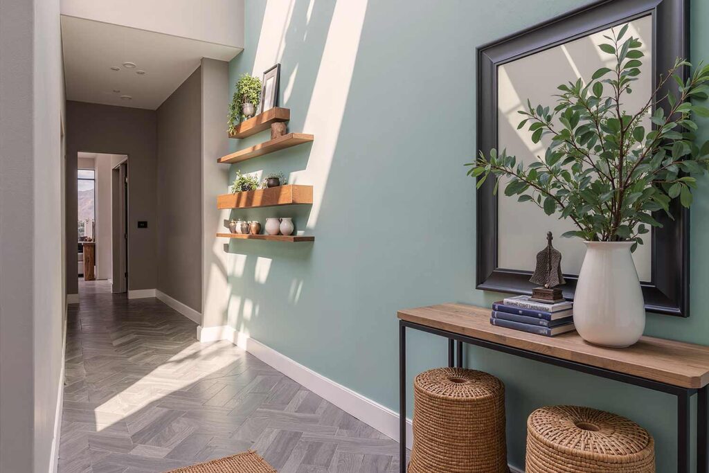
Evergreen Fog (SW 9130) & Pure White (SW 7005): Botanical Beauty
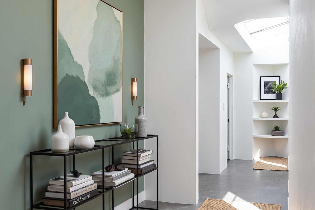
This 2022 Color of the Year hasn’t lost its power—the muted green with gray undertones creates a sophisticated backdrop that feels both current and timeless. The crisp Pure White trim adds architectural definition while maximizing light reflection. Studies show this particular shade of green-gray improves concentration and reduces anxiety—ideal for hallways connecting home offices or study spaces. This combination transforms narrow corridors into gallery-like spaces that showcase art and objects with museum-quality sophistication.
Naval (SW 6244) & Malabar (SW 9110): Ocean Depths
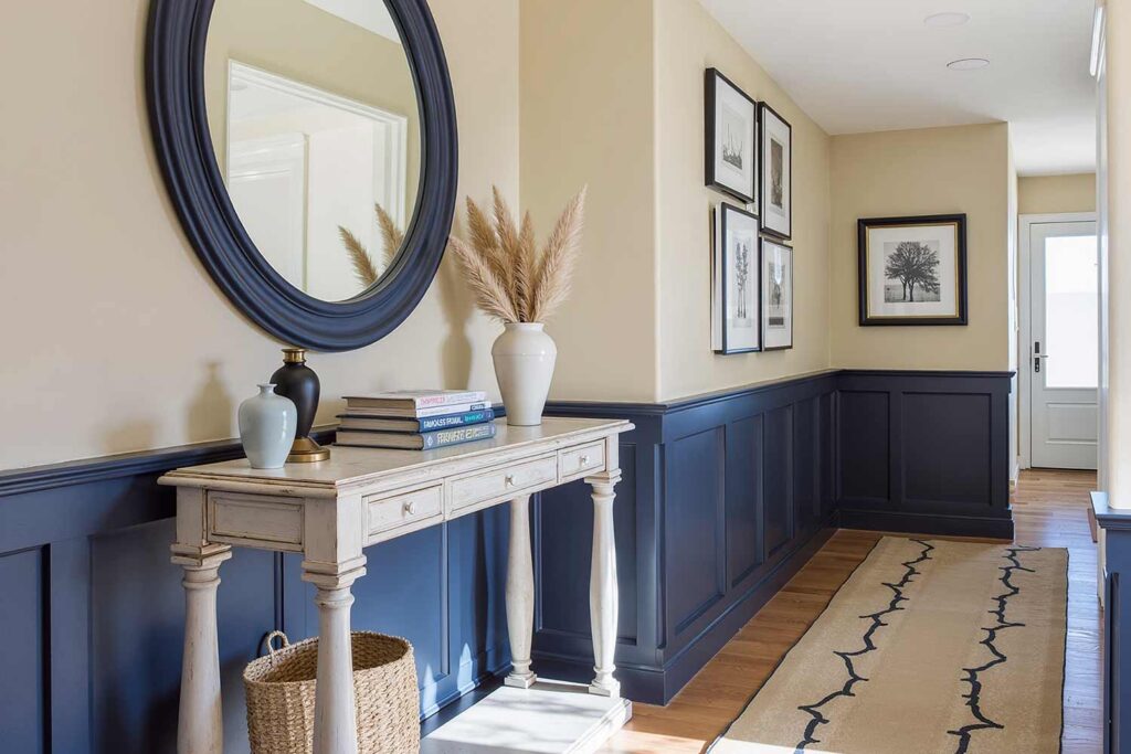
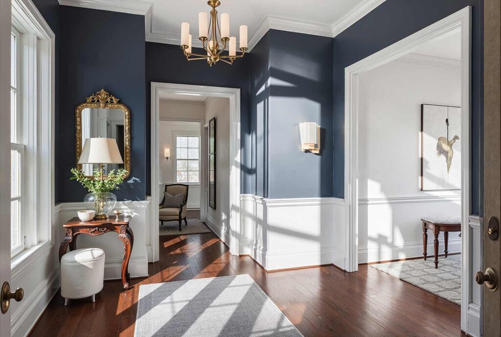
The deep navy blue of Naval doesn’t just add drama—it adds psychological depth. Research indicates that navy blue triggers feelings of trust and competence, making this an excellent choice for hallways in professional home settings. Paired with the sandy beige neutral of Malabar, this combination creates a coastal sophistication that balances boldness with accessibility. The contrast works particularly well in hallways with chair rails or wainscoting, using the darker color below to ground the space while the lighter tone above expands the ceiling height.
Sophisticated Neutrals
Dorian Gray (SW 7017) & Rainwashed (SW 6211): Rustic Charm
This medium sophisticated warm gray creates an immediate sense of refinement, while the soft blue-green accent adds unexpected depth. The combination creates a sophisticated rustic aesthetic that studies show triggers nostalgia and comfort—feelings increasingly sought in modern interior design. Ideal for connecting traditional and contemporary spaces, this pairing bridges different design languages throughout your home. The subtle color temperature contrast creates visual interest without overwhelming the senses, perfect for longer hallways where visual fatigue becomes a design consideration.
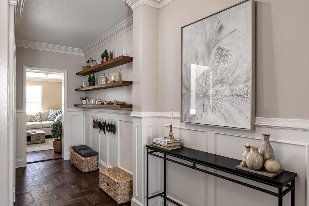
Repose Gray (SW 7015) & Snowbound (SW 7004): Timeless Appeal
This light gray with subtle undertones paired with cool, modern white creates a sophisticated neutral backdrop that psychology studies show promotes mental clarity and calm. The subtle contrast adds architectural interest while maximizing light reflection—making this an exceptional choice for darker hallways needing luminosity. This combination creates a gallery-like effect that showcases art and objects with museum-quality precision, turning your hallway into a curated experience rather than merely a transitional space.
Agreeable Gray (SW 7029) & Alabaster (SW 7008): Modern Classic
This warm, cozy gray paired with soft, warm white creates a sophisticated yet approachable backdrop that research indicates promotes feelings of security and comfort. This combination performs exceptionally well in hallways connecting public and private spaces, creating a subtle psychological transition between the two zones. This is one of the safest of these hallway painting ideas. The warm undertones maintain consistency in both north and south-facing exposures—making this an ideal choice for hallways with varying light conditions throughout the day.
Bold Statement Pairings
Plum Dandy (SW 6284) & Chartreuse (SW 0073): Dramatic Flair
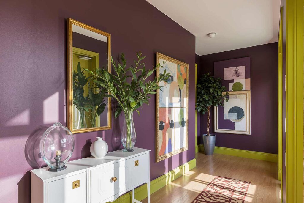
The rich, dark purple paired with vibrant yellow-green creates an intentionally provocative combination that demands attention. Beyond mere aesthetics, this pairing creates psychological stimulation that studies show improves memory and cognitive function—transforming your hallway into an energizing experience. Reserved for the truly confident homeowner, as this is one of the raciest of these hallway painting ideas, this combination works best in well-lit spaces where both colors can reveal their complex undertones. Use the purple as your dominant tone with chartreuse as an accent for maximum sophistication with minimum visual overwhelm.
Heartthrob (SW 6866) & Naval (SW 6244): Autumn Sophistication
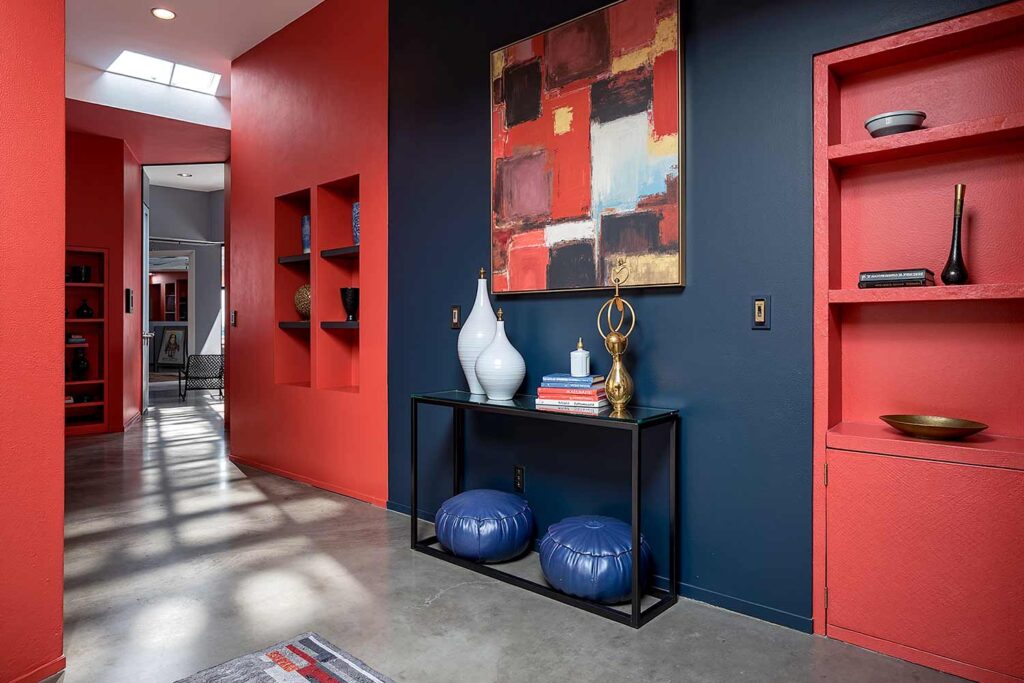
This vibrant, energetic red paired with deep navy blue creates immediate dramatic tension that research shows increases alertness and energy. This combination transforms forgettable hallways into memorable moments—particularly effective in entries and foyers where first impressions matter. The color psychology creates a sense of passion tempered by trustworthiness—an emotional journey in just a few steps. Reserve this bold pairing for spaces with excellent lighting where both colors can display their full depth and character.
Final Brush Strokes
Your hallway—that space you’ve likely overlooked—holds transformative potential beyond its square footage. The right color combination doesn’t just change how your hallway looks; it fundamentally alters how you experience your entire home. These Sherwin-Williams pairings aren’t just suggestions; they’re gateways to different emotional experiences as you move through your space.
The psychological impact of color isn’t just marketing—it’s neurological science that affects your daily lived experience. Consider which emotional journey you want to create in your home’s connective tissue, and call me if you need help with more hallway painting ideas. Will you opt for energizing vibrancy, calming neutrality, or sophisticated drama? Whatever you choose, remember—your hallway isn’t just a path between destinations; with the right color, it becomes a destination itself.